


The grid-template-columns property is just a small part of the CSS Grid. To understand this property in particular, you first need to have an understanding of what the CSS Grid is.
To bring you up to speed, the Grid layout basically offers a grid-based layout system. To design pages or templates, you can use rows and columns instead of using techniques like float: right;.
In this article, we’ll explore grid-template-columns in CSS, understanding what it is and how to best use it. Let’s get started!
What are grid-template-columns?
Simply put, grid-template-columns is a property that specifies the number of columns in a grid layout as well as the widths of said columns. The values of this property are separated by spaces, and each value specifies the size of its respective column:
grid-template-columns: auto auto auto;
grid-template-columns: auto auto;
grid-template-columns: 20% 20% 20% 20%;
The line above is a basic demo of how you might use grid-template-columns. The three auto separated values represent three columns with the same width. The same applies for the following two auto values. As for the four 20% values, the columns will have a width that is 20 percent of the parent element.
The syntax is pretty simple, but there are more values than just percentages and auto. Consider the following code:
grid-template-columns: none|auto|max-content|min-content|length|initial|inherit;
Every single value that is separate by the pipe is a possible value that you can use for the grid-template-columns property. Each has its own purpose, which we’ll go over later in the article.
It’s also important to understand that this property is animatable. grid-template-columns can be used in animations and transitions, meaning the columns can change gradually from one value to another:
<!DOCTYPE html>
<html>
<head>
<style>
.grid-container {
  display: grid;
  grid-template-columns: auto auto auto auto;
  grid-gap: 10px;
  background-color: black;
  padding: 10px;
  animation: mymove 5s infinite;
  border-radius: 2vw;
}

.grid-container > div {
  background-color: white;
  text-align: center;
  padding: 20px 0;
  font-size: 30px;
  border-radius: 1.5vw;
}

@keyframes mymove {
  20% {grid-template-columns: auto}
  40% {grid-template-columns: auto auto}
  50% {grid-template-columns: auto auto auto;}
  60% {grid-template-columns: auto auto}
  80% {grid-template-columns: auto}
}
</style>
</head>
<body>

<h1>Animation of the grid-template-columns Property</h1>

<p>The animation will change the number of columns from 1 to 3 then back to 1 and finally the original 4. on repeat </p>

<div class="grid-container">
  <div class="item1">1</div>
  <div class="item2">2</div>
  <div class="item3">3</div>
  <div class="item4">4</div>
  <div class="item5">5</div>
  <div class="item6">6</div>
  <div class="item7">7</div>
  <div class="item8">8</div>
</div>

</body>
</html>
This is just a simple demo of how you can use this property with animations and transitions.
Understanding the values
Let’s go back to the following line:
grid-template-columns: none|auto|max-content|min-content|length|initial|inherit;
We’ll look into every value so that you understand what is happening to the columns in your layout. First, we’ll get initial and inherit out of the way because they’re not really that interesting for this particular property. initial simply sets the grid-template-columns property to its default value, which in this case is just none. The inherit value basically inherits whatever value this property has on its parent element.
none is a default value that generates columns when required, evaluating the width based on the container size and the size of the content inside of the column.
max-content adjusts the column width based on the biggest item in the column. min-content adjusts the column width based on the smallest item in the column. length sets the given value as the width of the columns.
Using the code below as my simple HTML, I’ll tweak the CSS for every value of the property:
<!DOCTYPE html>
<html>
<head>
<link rel="stylesheet" href="index.css" />
</head>
<body>
<h1>The grid-template-columns property</h1>
<div id="test-div">
<div class="item1">First</div>
<div class="item2">Second</div>
<div class="item3">Third</div>
<div class="item4">Fourth</div>
<div class="item5">Fifth</div>
<div class="item6">Sixth</div>
</div>
</body>
</html>
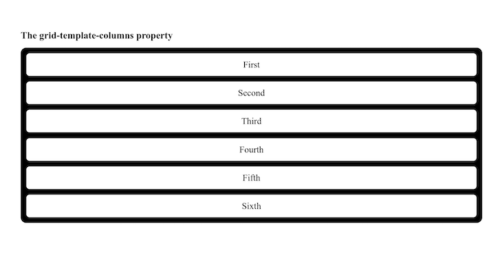
none
When it comes to none, there is no explicit grid. Basically, the columns’ size will either take the full width or be determined by another property, grid-auto-columns. The code below shows the none property and how it manipulates the output:
body {
  background-color: white;
  padding: 10vw;
}
#test-div {
  height: auto;
  display: grid;
  border-radius: 1vw;
  gap: 1vw;
  background-color: black;
  padding: 1vw;
  grid-template-columns: none;
}
#test-div div {
  background-color: white;
  text-align: center;
  padding: 20px 0;
  font-size: 30px;
  border-radius: 0.5vw;
}
Below is the output:
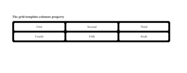
auto
When you have auto as the value of the property, it simply divides the entire width by the number of columns you have. Each will have the same width. In the code below, take note that the value of the grid-template-columns property uses auto three times. Therefore, you’ll have three columns of the same width:
body {
  background-color: white;
  padding: 10vw;
}
#test-div {
  height: auto;
  display: grid;
  border-radius: 1vw;
  gap: 1vw;
  background-color: black;
  padding: 1vw;
  grid-template-columns: auto auto auto;
}
#test-div div {
  background-color: white;
  text-align: center;
  padding: 20px 0;
  font-size: 30px;
  border-radius: 0.5vw;
}
The output is below:
With the auto value, you can dive a little deeper. If you have another value for the property, say, grid-template-columns: auto 3px auto 50px; , the UI will have four columns. The first one will have the same width as the third, while the second and fourth will have uniquely specified widths. Now, this should tell you that auto takes whatever space is available and divides it equally among any column with said value.
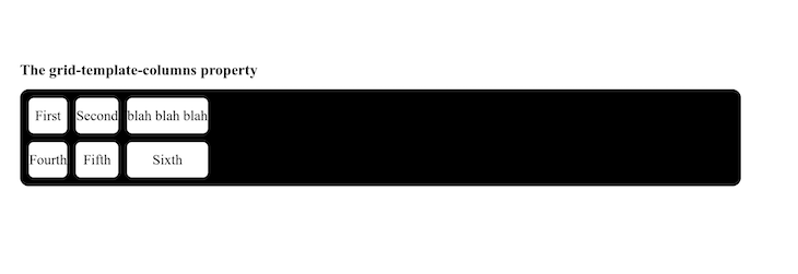
max-content
max-content requires a little bit of HTML tweaking because it will take the width of the largest content. The code below show six different divs with some random content. Like in the previous examples, the value that you specify any number of times on the grid-template-columns property will determine the number of columns you get:
<!DOCTYPE html>
<html>
  <head>
    <link rel="stylesheet" href="index.css" />
  </head>
  <body>
    <h1>The grid-template-columns property</h1>
    <div id="test-div">
      <div class="item1">First</div>
      <div class="item2">Second</div>
      <div class="item3">blah blah blah</div>
      <div class="item4">Fourth</div>
      <div class="item5">Fifth</div>
      <div class="item6">Sixth</div>
    </div>
  </body>
</html>
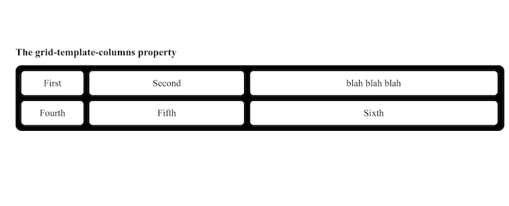
In this code, grid-template-columns: max-content max-content max-content; results in three columns. That being said, even if they have the same values, the width of the columns will be determined by how wide the content spans within the div. Therefore, the content within determines the width of the div:
body {
  background-color: white;
  padding: 10vw;
}
#test-div {
  height: auto;
  display: grid;
  border-radius: 1vw;
  gap: 1vw;
  background-color: black;
  padding: 1vw;
  grid-template-columns: max-content max-content max-content;
}
#test-div div {
  background-color: white;
  text-align: center;
  padding: 20px 0;
  font-size: 30px;
  border-radius: 0.5vw;
}
The output is as follows:
Notice that blah blah blah is the largest content, therefore, it determines the widths of the three columns. This same concept applies to the min-content value. However, the problem is that you’ll have some overflows.
length
length does not mean the literal word, length. length basically stands for the actual value given within the CSS. These include any and all CSS units you may want to use; they all apply, whether you use vw, rem, em, fr, etc. Every single column value defined will be reflected within your UI:
body {
  background-color: white;
  padding: 10vw;
}
#test-div {
  height: auto;
  display: grid;
  border-radius: 1vw;
  gap: 1vw;
  background-color: black;
  padding: 1vw;
  grid-template-columns: 10vw 25vw 40vw;
}
#test-div div {
  background-color: white;
  text-align: center;
  padding: 20px 0;
  font-size: 30px;
  border-radius: 0.5vw;
}
The code above will give the first column a width of 10vw, the second a width of 25vw, and the third a width of 40vw. The output is shown below:
You can use these values either together or uniformly. The freedom is with you as the designer. Take your time, play around with these values, and remember to have fun with it.
Summary
Like I said at the very beginning of this article, grid-template-columns is just one aspect of the whole grid system. In this article, we learned how to manipulate column widths using the none, auto, max-content, min-content, and length values.
If this gets you excited, then you can dive deep into everything that comes with the display: grid line in your CSS. The possibilities are endless. Happy coding!
The post Understanding <code>grid-template-columns</code> in CSS appeared first on LogRocket Blog.
from LogRocket Blog https://ift.tt/obZJOLU
Gain $200 in a week
via Read more


