


Grids have been used in design for centuries as a way to create order and stability, and grids are still essential tools for modern web designers.
Grid systems help to create order and stability on the page, and they can be adapted to different screen sizes and devices. There are a few different types of grid systems that can be used in modern web design that we’ll get into later.
In this article, we’ll talk about:
- What is a grid system?
- Why do we need grids?
- History and principles of UX grid systems
- 4 common types of grids
- Where do we see grid systems in the modern world?
- Designing for the modern user
- Grid systems best practices
What is a grid system?
A grid is a system for organizing a design layout. We see examples of grid systems practically everywhere: in print, on websites, and on mobile apps. Grid systems in design serve the purpose of visual organization, enhancing readability, and improving user experience.
Designers use grid systems as a way to control the position of elements on a page. Grids give designers a framework to work within, providing guidelines for where to place elements on the page. This helps to create visual stability and order, making it easier for users to understand the layout and navigate the design.

Why do we need grids?
When a project or effort is well-defined, meaning all criteria and requirements have been established before its start, it is more likely to succeed. Nothing is worse for an artist than endeavoring to create a piece and being plagued by a creative block. Grids help solve this problem by providing an intentional starting point.
Grid design dates back to the written word’s roots. As we begin to understand grids and the purpose they serve, we readily realize what a strong tie they have to typography. As Josef Müller-Brockmann said in his book Grid Systems in Graphic Design, “Grid and text are inseparable.” Grid systems informally evolved from the readability of text on paper.
History and principles of UX grid systems
When you think of a book and the words on its page, no doubt the column grid comes to mind. The text is written in a straight line, evenly spaced, and easy to read — we see an example of this looking at the Dead Sea Scrolls, dating back to 150BCE–70CE.
The most fundamental of all grid systems, the column grid, has persevered throughout the centuries. The invention of the western printing press saw movable metal type blocks inking and printing text onto paper using a column grid.
A couple of hundred years after the invention of the printing press, we started to see newspapers circulate widely. To this day, newspapers employ multiple column sizes that do not conflict with each other. This grid layout directs readers’ attention where it needs to go without overwhelming the reader.
In more recent years, the pioneers of the Swiss style, a lauded design process that involves asymmetrical layout and sans serif typefaces, understood that meaningful typographic design begins with a mathematical grid.
Müller-Brockmann, perhaps one of the most well-known designers associated with the Swiss movement, experimented heavily with grids in loose, typographic layouts. He said, “One must learn how to use the grid — it is an art that requires practice.”
Thus, grid systems have been employed across the world in various formats for centuries, and their history can be traced back to the written word’s roots.
4 common types of grids
Manuscript grid
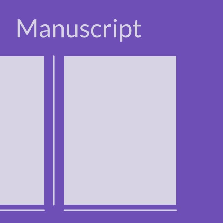
Manuscript grids are the simplest grid form, sometimes called a block grid. This type is mainly used in media print and can be composed of one single rectangular grid or multiple grids arranged vertically.
Column grid
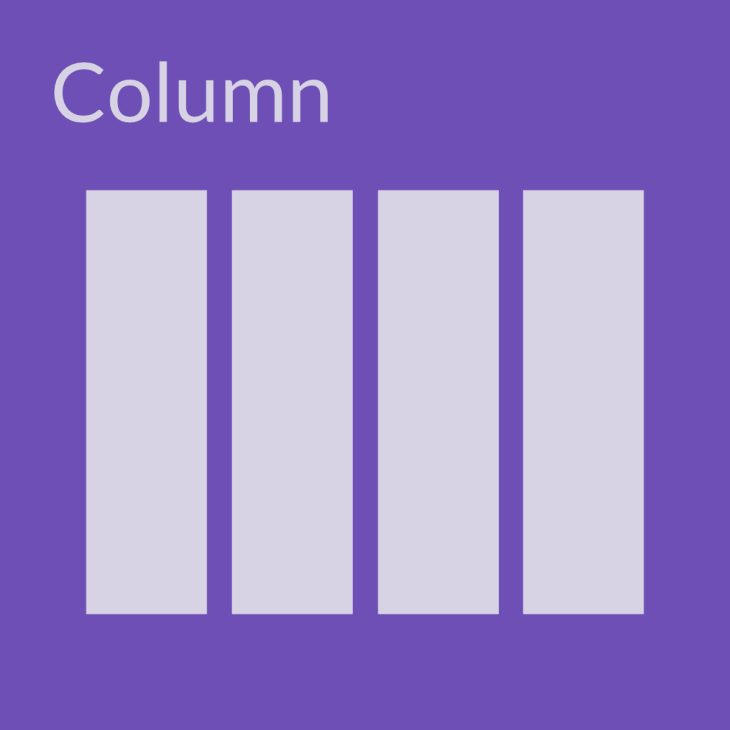
The column grid system comprises a set number of vertical rectangular fields placed on a format.
Modular grid
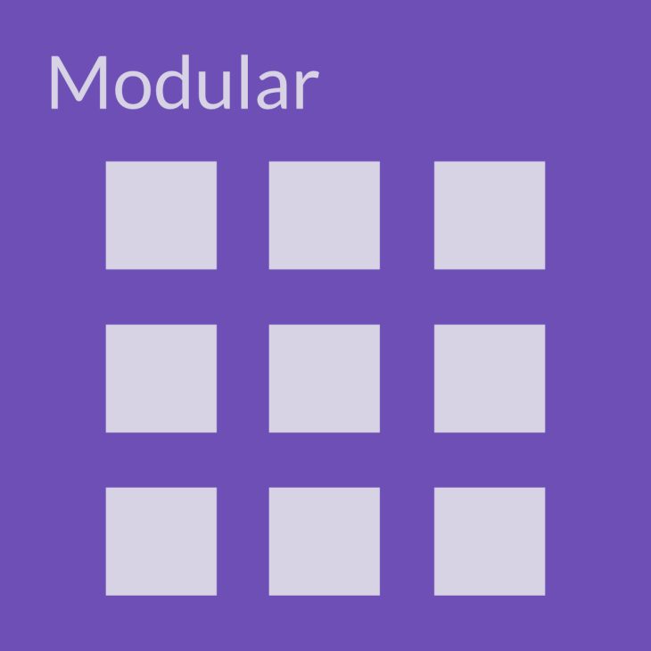
Consisting of columns and rows, the modular grid system is composed of modules where the columns and rows intersect.
Hierarchical grid
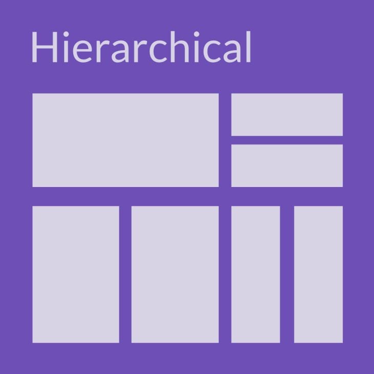
The hierarchical grid system pushed the envelope with irregularly placed grids (re: Swiss style). We don’t see equal spaces between the modules, which are also not arranged according to columns and rows. This design allows for more flexibility and variety.
Where do we see grid systems in the modern world?
Hint: everywhere.
From websites to mobile apps, magazines, restaurant menus, interior design … the list goes on.
UX designers understand that everyone uses phones or computer screens daily. How a user receives and processes information from a screen is what we design for today.
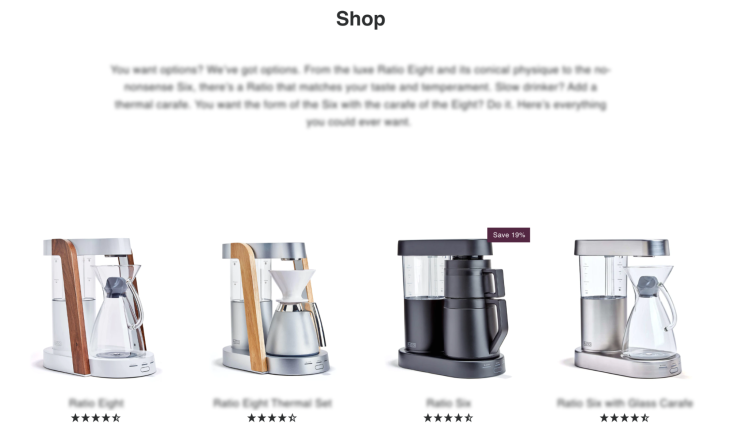
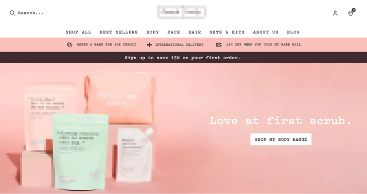
Ecommerce websites are a great example of how crucial user-friendly design is. How a potential customer interacts with a site can result in a new order or an abandoned cart. As a digital shopfront, the user’s experience from Point A to Point B must be self-explanatory and easy to follow.
And of course, there are social media apps. Take Instagram for example, where we see the use of hierarchical, column, and modular layouts. While scrolling through posts on your main feed, images are front and center taking up the width of your phone screen.
On the other hand, a profile view provides a concise snapshot of what someone’s been up to. Using a modular grid, posts are separated into columns and rows, allowing the viewer to take in chunks of information at once.
Survey forms are a prime example of how using grid systems determine UX flow. Typically, we answer surveys that use matrix grids. Similar to the modular grid, the matrix grid presents the survey participant with questions and answers divided into columns and rows. By presenting the bulk of information at once, the amount of work required by the participant shrinks visually.
Designing for the modern user
When designing for the modern user, there’s a lot to consider. How do you scale your sites to fit multiple screens and resolutions? Is it functional and aesthetically pleasing? Does your design have a clear purpose?
Design collaboratively
When initially designing your grid layout and product design, consider using tools that allow your team to work collaboratively. Teams can work on one project simultaneously, evaluating changes in real time.
Having a foundation of where elements should be placed allows team members to create a cohesive final design collaboratively. Teams that actively work together and follow proven processes tend to avoid rework, saving time and money.
Sketch a wireframe
Digital design also involves knowing how and where to place grids to provide a consistent framework and user experience. Starting with the grid itself, there are multiple aspects to consider when building a website or app, some being:
- How many columns should there be?
- Are the spacing and lines between the grids, gutters, and margins equal?
- How does the grid relate to the format?
- Is my design creating impact or noise?
If you’re struggling to pin down what sort of grid system to use or how many columns to base your design on, sketch it out first. Throw your idea of what you want the end product to look like on paper. This will help you gain a better understanding of what to do next.
When placing the content on your page, consider adding more visual weight to what’s more important. Do this by stretching that design component across multiple modules, giving it a bigger presence.
And never end a design element in the gutter.
Incorporate usability testing
As humans, we understand that the machines and processes we make are only as good as their usability.
In the 1940s, Toyota made it its mission to promote the value of human input. Workers were encouraged to pull a cord to stop the assembly line if they had an idea that would improve the existing processes in place. This is usability testing in its purest form in action.
Usability testing is the process of gathering critical feedback about your user’s behavior while navigating a product or process. There are many user testing tools you can start using today. In usability testing, your key objectives are to understand the following:
- How easily can this process be navigated?
- Is the user able to navigate the process successfully?
- How well did the user navigate the process?
- Are there issues? If so, what is the severity of the issues?
- Does the user feel good about the process?
- Is there a way to do it better?
While grids provide the basic framework of good usability, without user research, you cannot be sure if your design will be successful.
Grid systems best practices for UX
Websites
First impressions count. Your company website is a potential customer’s first impression of you.
Designing your website with a modular grid system reduces the chance of random design choices, helps align elements, and achieves an aesthetically pleasing result.
Here are some best practices to keep in mind while designing your website:
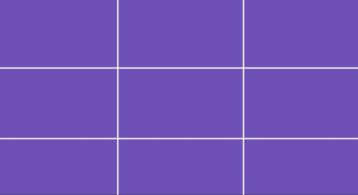
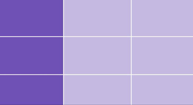
Follow the rule of thirds
This strategy divides a design area into thirds vertically and horizontally, creating nine equal sections on the format. By placing your design components in thirds, a potential customer’s focus will be automatically directed to objects of interest.
Establishing flow and a cohesive design with your landing page is crucial in making a good first impression and customer conversion.
Honor the golden ratio
Considered golden for a reason, this precise formula optimizes scale, balance, and layout. When determining the size and length of your columns, consider the following microdesign formula:
The golden rectangle length is 1.6180 x width of the element.
Don’t be afraid of white space
White space allows for breathing room and scalability in your design. It helps prioritize and organize the information you want to convey. The material design method (considered an industry standard) uses an 8x8pt grid, calculating white space.
Design dynamically
Website content must scale responsively across different screen sizes and resolutions. You can achieve this by using a responsive grid.
Follow Walt Disney’s advice: Keep up with the latest technologies. There are a plethora of tools that will help you implement responsive design on your website.
Mobile apps
When designing the layout for a mobile app, don’t forget your brainstorming hat at the door. Responsive design is a key element to meeting the needs of your consumer base. UX designers commonly practice design empathy, which is the practice of understanding and designing for your customers’ needs.
Consider what your app will look like across all screen sizes. Be sure to include landscape and portrait modes as well. Here’s the down-low on designing a grid for an app:
Know your screen sizes
To meet the needs of your user, design for each of these screen resolutions as a baseline:
- Desktop: 1440×1024
- Tablet: 768×1024
- Mobile: 320×640
Choose the correct amount of columns
While the twelve-column grid is an industry standard, not all user experiences are created equal. Add or subtract columns based on what you need. Keep the gutter width the same for consistency.
Usability testing
Don’t stop designing once the app is released. A well-developed app is a constantly evolving one.
Be sure to take in and implement feedback from your customers. This could look like removing a button no one uses or adding a highly requested feature. Like Toyota, don’t disregard the value of human input.
Ecommerce apps
Have you ever browsed a company’s website on your phone, navigated to their shop, and found yourself disappointed and annoyed by poor site performance?
When designing for ecommerce, implementing a mobile-friendly, responsive design is critical to conversion. A modular grid will be your best friend through this process and help curate your visitor’s experience. Keep the following in mind when designing your ecommerce site:
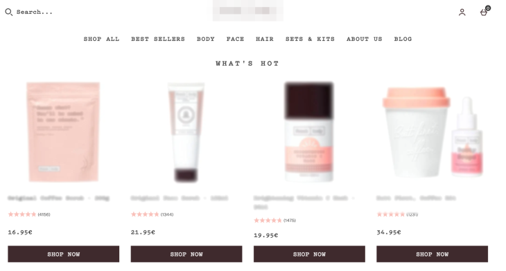
Ditch the slideshow
Studies reveal consumers quickly ignore slideshow banners and instead scroll down to the content below. Split your featured products into three or four columns.
Use high-quality images
High-quality photos increase the perception of a trustworthy brand.
Use bigger images
A potential customer is likely scanning your site for a product that catches their eye. The amount of quality information you can convey during this scanning period will either increase or decrease your conversion rate.
Mobile-responsive design
Accessibility is key. Design your ecommerce site for different screen resolutions.
Final thoughts
As you can see, grid systems provide a way to order content in an easily digestible format. No matter what type of site you’re designing, grid systems are a fantastic tool to achieve beautiful and responsive design. Remember to consider your content, audience, and use case when designing your grid system. With these things in mind, you’ll be on your way to grid success!
What grid system will you implement in your next design?
The post The modern UX grid system: Principles and best practices appeared first on LogRocket Blog.
from LogRocket Blog https://ift.tt/sakr3A5
Gain $200 in a week
via Read more


