


Building a great user experience is essential to your app’s success. No matter how great a product you sell, if your app isn’t offering a positive UX, you’re going to struggle. In this tutorial, you’ll learn how to build an intuitive product photo gallery with Flutter and provide a better buying experience.
We will build an example app that lists the products in an engaging way — tapping on a product, we will animate a product details page where you can set its quantity and add it to the cart. At the top, you will also see the number of items added to the cart, and when you click on it, you can see a list of all the products added to it.
By the end of this tutorial, you’ll learn how to build for wider screens, allow search for products, toggle the view, manage the state of the shopping cart, and add the material motion while navigating between screens for a smooth user experience.
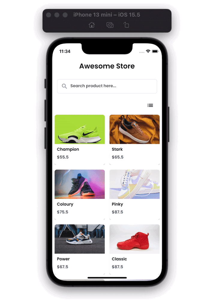
Here’s how our Flutter ecommerce photo gallery will look when completed:
Here’s what we are going to cover in this tutorial:
- Creating the project
- Creating screens
- Adding products
- Building the cart
- Adding responsiveness
- Toggle product display view
- Searching product
- Adding animations (Material motion system)
Creating the project
Before you begin, you must install the Flutter SDK and create a basic project. Let’s see how to do that.
First, get the Flutter SDK from this link. Once installed, check if everything is okay by hitting the following command in the terminal:
flutter doctor
(Note: If anything is flagged with a red mark, you must address them before you proceed further)
Now, create a directory where you would like to create this project and enter the following command. This will create a fresh new project in the specified directory.
flutter create ecomm_app
To open, edit the file contents and run/debug/test the project, you need to install the IDE. You can choose from any of the following editors:
Open the projectfolder/lib/main.dart and run the starter app from IDE by hitting the play button. You can also run it from the command line by entering the following command:
flutter run
// Tip: If you are running multiple devices, you can run the
// following:
flutter run -d "<device_name>"
Creating screens
The example app consists of three screens: the product listing, product details, and cart page.
Let’s see how these screens fit into the flow:
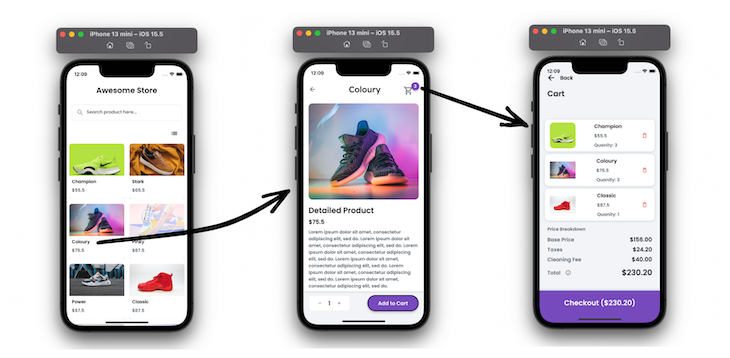
First, you will see all the products. Tapping on any item opens the details page. You can add items to the cart and navigate to the cart page.
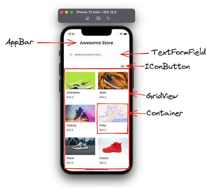
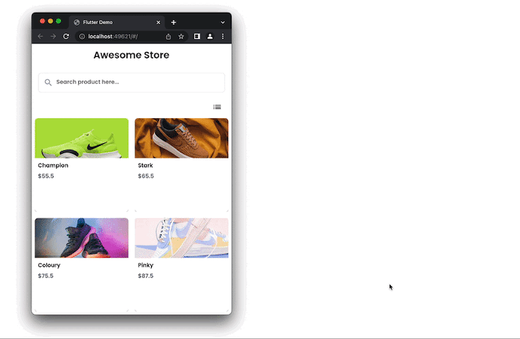
Product listings
The first screen shows all the products with their name, image, and price. Here you can search for the products and toggle the view between grid view and list view. On tapping the item, it opens the product details page.
Here are some of the essential widgets that you can use to build the first screen:
Here is the exact code for creating this container:
Container(
  //width: MediaQuery.of(context).size.width * 0.45,
  decoration: BoxDecoration(
    color: AppTheme.of(context).secondaryBackground,
    boxShadow: [
      BoxShadow(
        blurRadius: 4,
        color: Color(0x3600000F),
        offset: Offset(0, 2),
      )
    ],
    borderRadius: BorderRadius.circular(8),
  ),
  child: Padding(
    padding: EdgeInsetsDirectional.fromSTEB(0, 0, 0, 12),
    child: Column(
      mainAxisSize: MainAxisSize.max,
      children: [
        Row(
          mainAxisSize: MainAxisSize.max,
          children: [
            Expanded(
              child: ClipRRect(
                borderRadius: BorderRadius.only(
                  bottomLeft: Radius.circular(0),
                  bottomRight: Radius.circular(0),
                  topLeft: Radius.circular(8),
                  topRight: Radius.circular(8),
                ),
                child: Image.network(
                  product.image,
                  width: 100,
                  height: 100,
                  fit: BoxFit.cover,
                ),
              ),
            ),
          ],
        ),
        Padding(
          padding: EdgeInsetsDirectional.fromSTEB(0, 4, 0, 0),
          child: Row(
            mainAxisSize: MainAxisSize.max,
            children: [
              Padding(
                padding: EdgeInsetsDirectional.fromSTEB(8, 4, 0, 0),
                child: Text(
                  product.name,
                  style: AppTheme.of(context).bodyText1,
                ),
              ),
            ],
          ),
        ),
        Padding(
          padding: EdgeInsetsDirectional.fromSTEB(0, 2, 0, 0),
          child: Row(
            mainAxisSize: MainAxisSize.max,
            children: [
              Padding(
                padding: EdgeInsetsDirectional.fromSTEB(8, 4, 0, 0),
                child: Text(
                  '\$${product.price}',
                  style: AppTheme.of(context).bodyText2,
                ),
              ),
            ],
          ),
        ),
      ],
    ),
  ),
);
Product details
The product details page shows the product information. It allows you to set the quantity of the product and add it to the cart. You can also open the shopping cart from this page.
Here are some of the essential widgets that you can use to build the product details screen:
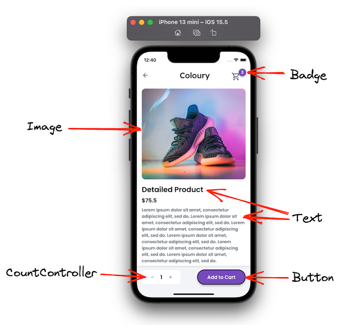
The badge widget is not the standard widget; instead, it is added from a library called Badges. This automatically animates the badge when the value is updated.
Here’s the code displaying the badge over the shopping cart item:
Badge(
  badgeContent: Text(
    '${cartItem.length}',
    style: AppTheme.of(context).bodyText1.override(
          fontFamily: 'Poppins',
          color: Colors.white,
        ),
  ),
  showBadge: true,
  shape: BadgeShape.circle,
  badgeColor: AppTheme.of(context).primaryColor,
  elevation: 4,
  padding: EdgeInsetsDirectional.fromSTEB(8, 8, 8, 8),
  position: BadgePosition.topEnd(),
  animationType: BadgeAnimationType.scale,
  toAnimate: true,
  child: IconButton(
    icon: Icon(
      Icons.shopping_cart_outlined,
      color: AppTheme.of(context).secondaryText,
      size: 30,
    ),
    onPressed: () {
      Navigator.push(
        context,
        MaterialPageRoute(
          builder: (context) => CheckoutWidget(),
        ),
      );
    },
  ),
)
Cart
This page shows the list of all the items added to the cart with an ability to remove any item from the cart. Here you can show all pricing summaries and a checkout option.
Here are some of the important widgets that you can use to build the cart screen:
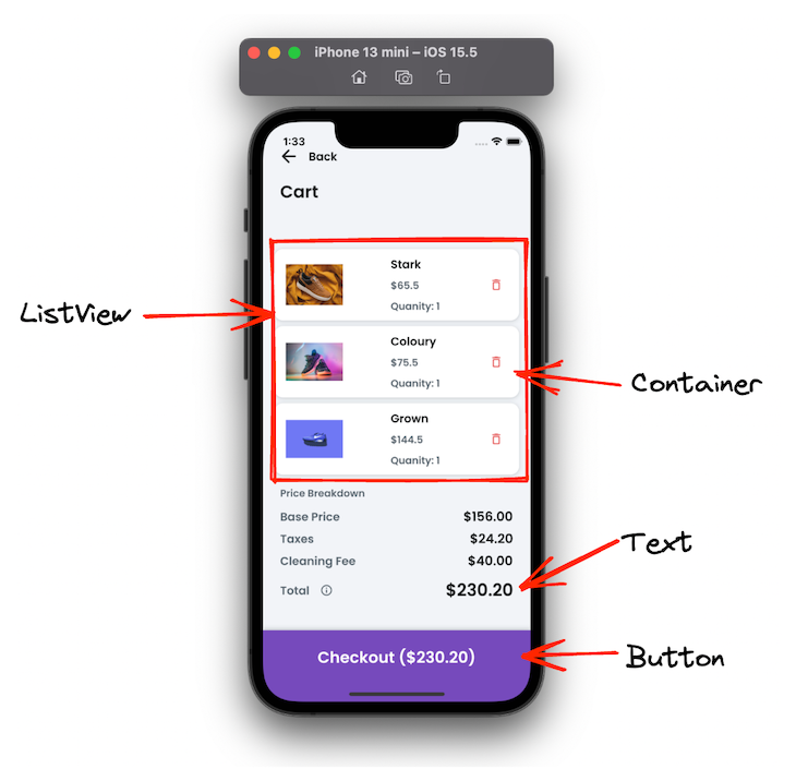
Here’s how you can display a list of all items in a cart:
ListView.builder(
    padding: EdgeInsets.zero,
    primary: false,
    shrinkWrap: true,
    scrollDirection: Axis.vertical,
    itemCount: cartItems.length,
    itemBuilder: (BuildContext context, int index) {
      return Padding(
        padding: EdgeInsetsDirectional.fromSTEB(16, 8, 16, 0),
        child: Container(
          width: double.infinity,
          height: 100,
          decoration: BoxDecoration(
            color: AppTheme.of(context).secondaryBackground,
            boxShadow: [
              BoxShadow(
                blurRadius: 4,
                color: Color(0x320E151B),
                offset: Offset(0, 1),
              )
            ],
            borderRadius: BorderRadius.circular(12),
          ),
          child: Padding(
            padding: EdgeInsetsDirectional.fromSTEB(16, 8, 8, 8),
            child: Row(
              mainAxisSize: MainAxisSize.max,
              mainAxisAlignment: MainAxisAlignment.spaceBetween,
              children: [
                Hero(
                  tag: 'ControllerImage',
                  transitionOnUserGestures: true,
                  child: ClipRRect(
                    borderRadius: BorderRadius.circular(12),
                    child: Image.network(
                      cartItems[index].image,
                      width: 80,
                      height: 80,
                      fit: BoxFit.fitWidth,
                    ),
                  ),
                ),
                Padding(
                  padding: EdgeInsetsDirectional.fromSTEB(12, 0, 0, 0),
                  child: Column(
                    mainAxisSize: MainAxisSize.max,
                    mainAxisAlignment: MainAxisAlignment.center,
                    crossAxisAlignment: CrossAxisAlignment.start,
                    children: [
                      Padding(
                        padding: EdgeInsetsDirectional.fromSTEB(0, 0, 0, 8),
                        child: Text(
                          cartItems[index].name,
                          style: AppTheme.of(context).subtitle2.override(
                                fontFamily: 'Poppins',
                                color: AppTheme.of(context).primaryText,
                              ),
                        ),
                      ),
                      Text(
                        '\$${cartItems[index].price}',
                        style: AppTheme.of(context).bodyText2,
                      ),
                      Padding(
                        padding: EdgeInsetsDirectional.fromSTEB(0, 8, 0, 0),
                        child: Text(
                          'Quanity: ${cartItems[index].quantity}',
                          style: AppTheme.of(context).bodyText2,
                        ),
                      ),
                    ],
                  ),
                ),
                IconButton(
                  icon: Icon(
                    Icons.delete_outline_rounded,
                    color: Color(0xFFE86969),
                    size: 20,
                  ),
                  onPressed: () {
                  // Remove item
                  },
                ),
              ],
            ),
          ),
        ),
      );
    });
Adding products
Once the UI is ready, you can fill the product list by adding various products. In a real-world scenario, you would fill this list with the items retrieved from your backend server, but we’ll add products locally in a variable for simplification purposes.
First, create a product class that holds fields such as id, name, image, price, and quantity.
class Product {
  final int id;
  final String name;
  final String image;
  final double price;
  int quantity;

  Product({required this.id, required this.name, required this.image, required this.price, this.quantity = 0});
}
Now, create a list of various products by using the class above. Like this:
final List<Product> products = [
  Product(
      id: 1,
      name: 'Champion',
      image:
          'https://images.unsplash.com/photo-1606107557195-0e29a4b5b4aa?ixlib=rb-1.2.1&ixid=MnwxMjA3fDB8MHxwaG90by1wYWdlfHx8fGVufDB8fHx8&auto=format&fit=crop&w=764&q=80',
      price: 55.5),
  Product(
      id: 2,
      name: 'Stark',
      image:
          'https://images.unsplash.com/photo-1549298916-b41d501d3772?ixlib=rb-1.2.1&ixid=MnwxMjA3fDB8MHxwaG90by1wYWdlfHx8fGVufDB8fHx8&auto=format&fit=crop&w=1624&q=80',
      price: 65.5),

];
Similarly, you can add more products if you wish to. Once this list is ready, its time to pass and use it to inflate the GridView widget, as shown below:
GridView.builder(
  itemCount: products.length,
  itemBuilder: (context, index) => ProductTile(
    itemNo: index,
    product: products[index],
  ),
  gridDelegate: SliverGridDelegateWithFixedCrossAxisCount(
    crossAxisCount: 2,
    childAspectRatio: 1,
  ),
)
Building the cart
The core feature of any ecommerce app is the ability to add products to the cart for purchasing. To build this feature, you can incorporate state management in your app.
For this app, we will use the state management technique called, Bloc, because you can separate the business logic from the UI and it is easier to write and reuse tests.
Here, we have covered how to use the Bloc design pattern in a blog post.
Bloc state management requires you to add three essential classes: bloc, event, and state. To add or remove items to the cart, we will add the following classes:
CartBloc
This is where the business logic (adding and removing items) resides.
class CartBloc extends Bloc<CartEvent, CartState> {
  CartBloc() : super(ProductAdded(cartItem: []));

  final List<Product> _cartItems = [];
  List<Product> get items => _cartItems;
  bool isGridView = true;

  @override
  Stream<CartState> mapEventToState(CartEvent event) async* {
    if (event is AddProduct) {
      _cartItems.add(event.productIndex);
      yield ProductAdded(cartItem: _cartItems);
    } else if (event is RemoveProduct) {
      _cartItems.remove(event.productIndex);
      yield ProductRemoved(cartItem: _cartItems);
    } else if (event is ChangeGallaryView) {
      isGridView = event.isGridView;
      yield ChangeGallaryViewState(isGridView: isGridView);
    }
  }
}
(Note: The _cartItems is a single source of truth for managing cart items)
CartEvent
This is used to send items to the cart bloc.
abstract class CartEvent extends Equatable {
  const CartEvent();

  @override
  List<Object> get props => [];
}

class AddProduct extends CartEvent {
  final Product productIndex;

  const AddProduct(this.productIndex);

  @override
  List<Object> get props => [productIndex];

  @override
  String toString() => 'AddProduct { index: $productIndex }';
}

class RemoveProduct extends CartEvent {
  final Product productIndex;

  const RemoveProduct(this.productIndex);

  @override
  List<Object> get props => [productIndex];

  @override
  String toString() => 'RemoveProduct { index: $productIndex }';
}
CartState
This is used to send items to the UI.
abstract class CartState {
  final List<Product> cartItem;
  final bool isGridView;
  const CartState({this.cartItem = const [], this.isGridView = true});

  @override
  List<Object> get props => [];
}

class CartLoadInProgress extends CartState {
  CartLoadInProgress({required super.cartItem});
}

class ProductAdded extends CartState {
  final List<Product> cartItem;

  const ProductAdded({required this.cartItem}) : super(cartItem: cartItem);

  @override
  List<Object> get props => [cartItem];

  @override
  String toString() => 'ProductAdded { todos: $cartItem }';
}
From the UI (a button with “Add to Cart” text), you can insert the following code to add the item to the list:
onPressed: () {
  Product p = widget.product;
  p.quantity = countControllerValue!.toInt();
  BlocProvider.of<CartBloc>(context).add(AddProduct(p));
}
To remove the product from the cart, you can simply fire the event to remove the item, as per the following:
onPressed: () {
  BlocProvider.of<CartBloc>(context).add(RemoveProduct(cartItems[index]));
}
To retrieve the cart items, you can wrap the GridView or ListView inside the Bloc builder, and the list is updated whenever the item is added or removed.
BlocBuilder<CartBloc, CartState>(builder: (_, cartState) {
  return ListView.builder();
}),
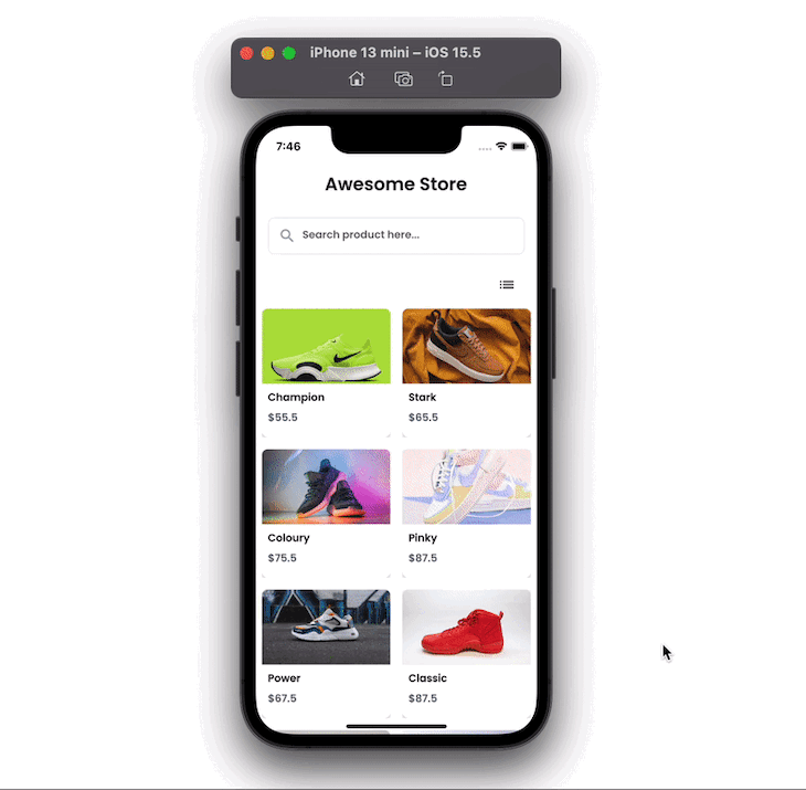
Adding responsiveness
You may want to accommodate the web version of your app, too. That means users should not feel like they are using a mobile app on a browser; rather, it should feel like it’s a native web app.
For this app, we can show more items when the app is used on a wider screen. You may be surprised to know that this can be achieved with just a minor change in the code.
Here’s how you can do that:
return LayoutBuilder(builder: (context, constraints) {
  return GridView.builder(
    itemCount: products.length,
    itemBuilder: (context, index) => ProductTileAnimation(
      itemNo: index,
      product: products[index],
    ),
    gridDelegate: SliverGridDelegateWithFixedCrossAxisCount(
      crossAxisCount: constraints.maxWidth > 700 ? 4 : 2, //<-SEE HERE
      childAspectRatio: 1,
    ),
  );
});
You can wrap the GridView widget inside the LayoutBuilder, which provides the constraints, that are used to determine the width and height. Using the constraints, we can build various user interfaces.
For our example, in the code above, whenever the screen resolution changes to 700 or greater in width, we display four items on the cross-axis.
Here is how it works:
Toggle product display view
Sometimes you might want to allow users to toggle the current view (i.e., GridView) and display it in the ListView.
To do so, you can create one boolean variable (probably inside the bloc) and toggle its value. Based on this variable, you can define two widgets — GridView and ListView — and change the icon.
Here’s how you do it for changing the icon:
BlocBuilder<CartBloc, CartState>(builder: (_, cartState) {
  bool isGridView = cartState.isGridView;
  return IconButton(
      onPressed: () {
        BlocProvider.of<CartBloc>(context).add(ChangeGallaryView(!isGridView));
      },
      icon: !isGridView ? Icon(Icons.grid_on) : Icon(Icons.list));
})
Here’s the code to choose which list to display:
BlocBuilder<CartBloc, CartState>(builder: (_, cartState) {
  bool isGridView = cartState.isGridView;
  if (isGridView) {
    return LayoutBuilder(builder: (context, constraints) {
      return GridView.builder(
        itemCount: products.length,
        itemBuilder: (context, index) => ProductTile(
          itemNo: index,
          product: products[index],
        ),
        gridDelegate: SliverGridDelegateWithFixedCrossAxisCount(
          crossAxisCount: 2,
          childAspectRatio: 1,
        ),
      );
    });
  } else {
    return ListView.builder(
        itemCount: products.length,
        itemBuilder: (BuildContext context, int index) {
          return ProductTile(
            itemNo: index,
            product: products[index],
          );
        });
  }
});
Searching product
To allow users to search from a list, you can leverage the onChanged event of the TextFormField. This gives you the latest characters entered into TextFormField. You can use it to filter the main list and then provide the search result in a new list, as shown below:
TextFormField(
  controller: textController,
  obscureText: false,
  onChanged: (_) => EasyDebounce.debounce(
    'tFMemberController',
    Duration(milliseconds: 0),
    () {
      isSearchStarted =
          textController!.text.isNotEmpty && textController!.text.trim().length > 0;
      if (isSearchStarted) {
        print('${textController!.text.trim()}');
        searchedProducts = products
            .where((item) =>
                item.name.toLowerCase().contains(textController!.text.trim().toLowerCase()))
            .toList();
      }
      setState(() {});
    },
  ),
)
The isSearchStarted variable is used to indicate whether to show the search result or not.
ProductList(
  products: isSearchStarted ? searchedProducts : products,
)
Adding animations (Material motion system)
Adding animations may be desired to improve user experience. Instead of having a default navigation transition, you could add animation that smoothly opens the product details page when you tap on it.
You can use the pre-built set of animations from the Material motion system by adding the animations library to your app.
To do so, wrap your widget inside the OpenContainer and provide the page you want to animate to inside the openBuilder parameter.
Here’s the code:
ContainerTransitionType _transitionType = ContainerTransitionType.fade;
OpenContainer<bool>(
  transitionType: _transitionType,
  openBuilder: (BuildContext _, VoidCallback openContainer) {
    return ProductDetailWidget(
      product: product,
    );
  },
  closedShape: const RoundedRectangleBorder(),
  closedElevation: 0.0,
  closedBuilder: (BuildContext _, VoidCallback openContainer) {
    return Container(
      // Product tile
    );
  },
)
Here’s how it looks:
The complete source code for this Flutter ecommerce app can be found on GitHub here.
Conclusion
Creating an intuitive user experience is essential for an ecommerce app. This tutorial showed you how to develop great looking screens and display products in an engaging way.
We also learned how to use the state management techniques like Bloc to manage cart items, and how you can enhance the app by adding features like toggling, search, and animations.
The post Build an intuitive ecommerce product gallery with Flutter appeared first on LogRocket Blog.
from LogRocket Blog https://ift.tt/jdt3M0V
Gain $200 in a week
via Read more


