Building products is a risky and resource-consuming endeavor. Luckily, there are tools designed to help us de-risk the whole process.
Say we are building a mobile app. It would be foolish to start writing the code from day one. After all, we don’t yet know what exactly we’re building, let alone what it should look like. Iterating on an actual app is the most expensive form of iteration.
That’s why designers employ various techniques, such as wireframing, creating mockups, and prototyping, to test ideas quickly before building an actual product. But what’s the difference between a wireframe, a mockup, and a prototype?
Let’s take a closer look at each and see how they compare.
Table of contents
- What is a wireframe?
- What is a mockup?
- Low- vs. medium- vs. high-fidelity mockups
- Mockup vs. prototype
- Key takeaways
What is a wireframe?
A wireframe is a quick sketch that demonstrates an idea. It’s done using a graphical tool, windows paint, or even a pen and piece of tissue.
There are three main reasons to write a wireframe:
- It helps us visualize our thinking — As they say, a picture is worth 1,000 words. Some things are just significantly easier to show than to describe
- It aligns people — Wireframes give teams something specific to refer to. It mitigates the risk of people visualizing completely different things and gets everyone on the same page
- It structures discussions — The ability to point to a specific design element is a game-changer
Say we’re discussing what the flow of our app should look like. If we just talk about it, we’ll have difficulty reaching any decision. But if everyone sketches out what they imagine the user flow to look like, we’ll have something specific to evaluate and compare.
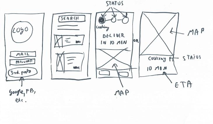
Time required: About 2 minutes.
What is a mockup?
A mockup is a wireframe taken to the next level. It’s usually done in a graphic program by either a UX designer/product manager (low-fidelity) or a UI designer (medium/high-fidelity).
The purpose of a mockup depends heavily on its fidelity, so let’s break it down.
Low-fidelity
A low-fidelity mockup is a digitalized, more thought-through version of the wireframe. A UX designer or product manager usually does these.
The goal of low-fidelity wireframes is to show what the app’s structure is supposed to look like. It helps you evaluate the overall user experience.
Low-fidelity mockups are used to assess:
- User flows
- Information architecture
- Navigation

Time required: About 15 minutes.
Medium-fidelity
Medium-fidelity mockups are born when we take our low-fidelity mockups and start adding colors and branding.
While we still assess things such as the overall structure, information architecture, etc., we also focus on the overall look and feel of the app: How does the visual representation feel? What type of message does it send? Is it accessible and intuitive?
We don’t yet focus on details. The copy isn’t perfect; pictures are placeholders and buttons still need some rounding. A high-level assessment is what we’re looking for.
Medium-fidelity mockups are used to assess:
- Overall look and feel
- Branding
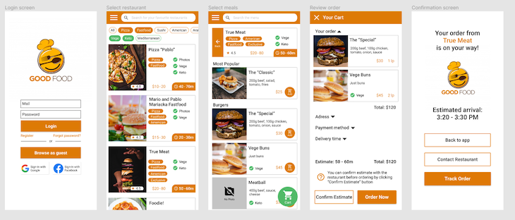
Time required: About 2 hours.
High-fidelity
A high-fidelity mockup is our end-product candidate. Every dot and pixel is already in its place. Now we can get picky and focus on details and finishing touches.
Once we’re done, the high-fidelity mockup can be handed over to the development team for implementation.
High-fidelity wireframes are used to assess:
- Aesthetics
- Design details
- Graphics and copy
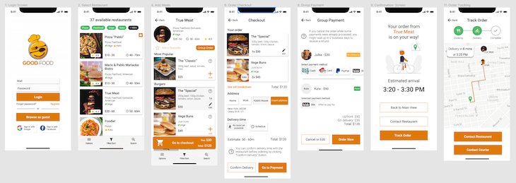
Time required: About 5 hours.
Low- vs. medium- vs. high-fidelity mockups
How do you decide which level of fidelity to focus on? The answer is simple: you don’t.
Different levels of fidelity not only serve different purposes, but are also additive. We use a low-fidelity mockup as a basis for a medium-fidelity one, which then is turned into a high-fidelity end-product.
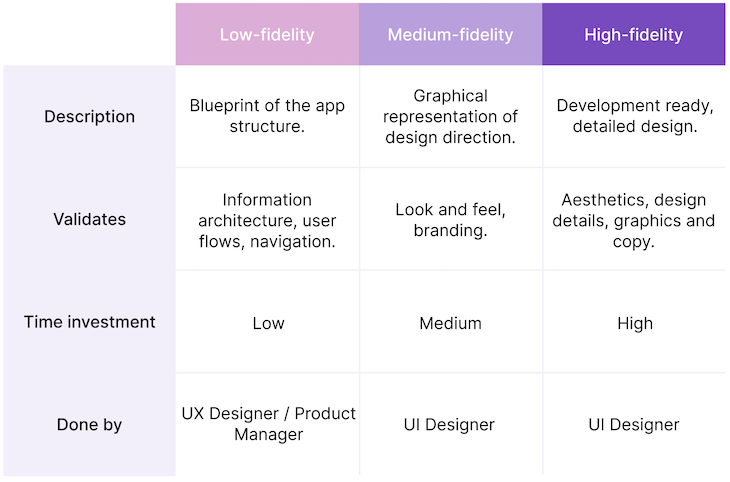
It might be tempting to jump into high-fidelity mockups immediately, but it’s rarely worth it.
First, any changes to hi-fi mockups are more expensive than changes to lo-fi mockups or even wireframes.
It’s also hard to focus on the big picture when evaluating hi-fi mockups. It’s easy to get fixated on the shade around the CTA button, even if we’re not yet sure if we want to have a CTA there. That’s one of the reasons lo-fi mockups are colorless and straightforward: to promote a focus on the big picture vs. irrelevant details.
We need both low-fidelity and high-fidelity mockups to truly get the most out of the design phase.
Mockup vs. prototype
The prototype is born when we add interactions to a mockup. Just like in the case of mockups, the fidelity of prototypes varies greatly.
We can literally use pieces of paper to build a low-fidelity prototype and test the initial reaction. On the other hand, the fully-fledged and detailed prototype is often indistinguishable from the actual application.
An example of a paper prototype.
Contrary to static mockups, prototypes allow us to experience interaction as a whole. We can tap on things, see how the designs change, and generally “feel” the product. We wouldn’t get the same experience (nor feedback) if we just showed the mockup to our potential customers and asked them to judge it.
If we’re building a truly innovative user flow, we should start prototyping it as early as possible. However, if we design a battle-tested user journey, such as a typical e-commerce flow, we can save money and focus on high-fidelity prototyping.
How to wireframes, mockups, and prototypes fit together?
Wireframes, mockups, and prototypes play a crucial role in product development, and they all serve a different purpose.
Wireframes help us visualize our thinking and improve collaboration. Mockups then allow us to assess and collect feedback on information architecture, look and feel, and intrinsic details. We can support the process with prototypes to gather even more detailed feedback.
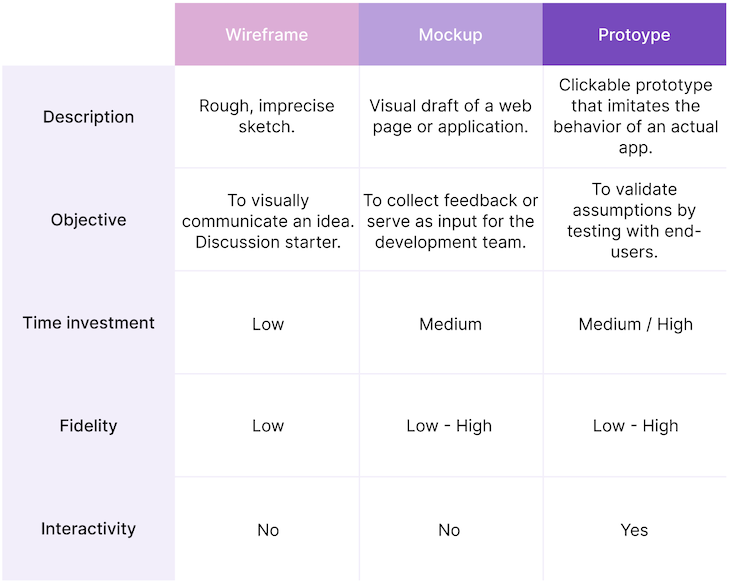
In a perfect world, where time and money are no object, you should take all of the following steps:
- Start with wireframes to create understanding
- Build a low-fidelity mockup to assess the high-level structure
- Confirm with a paper prototype
- Build a medium-fidelity mockup to determine the overall look and feel
- Confirm with a digital prototype
- Build a high-fidelity mockup to evaluate the results
- Simulate a real app experience with a detailed prototype
- Build an app
In practice, however, it’s okay to skip some steps. It all depends on your confidence, resources, and the risk you’re willing to take.
The post Wireframe vs. mockup vs. prototype: How are they different? appeared first on LogRocket Blog.
from LogRocket Blog https://ift.tt/unqNA2B
Gain $200 in a week
via Read more


