


I bet you’ve noticed that most apps today require you to set a password that meets a specific set of rules. The rules might be a minimum length, including or excluding special characters, capital or lowercase letters, etc — in most cases, those few rules are just enough to make sure your password is strong. But we can go one step further and use a library called zxcvbn to check our password strength.
What is zxcvbn?
zxcvbn is a password strength estimator inspired by password crackers. Through pattern matching and conservative estimation, it recognizes and weights 40,000 common passwords, common names surnames, popular words from Wikipedia, common words in different languages and different countries, and other common patterns, such as dates, repeats (aaa), sequences (abcd), keyboard patterns (qwertyuiop), and more.
Here are a few things the password checker does that we’ll be covering in this post:
- Allow user to input any password
- Check the password score on each input change
- Provide visual feedback using a colored progress bar and a message
- Enable submit button when a specified score is achieved
What you’ll find in this article
In this article, I would like to show you how to:
- Create a basic form template with Tailwind CSS
- Build the password score component with
zxcvbn - Handle button state
- Add a color-coded, animated progress bar to the form
I’ve set up a demo over at StackBlitz so you can see what we’re aiming for.
Ok, that’s what we want, so let’s make it happen!
Step 1: Create a basic form template with Tailwind CSS
Let’s start by creating a basic template for the form. We will use Tailwind CSS to make styling easier and faster.
In the template section of our PasswordInputForm component, add an input and a button:
<!-- PasswordInputForm.vue -->
<template>
  <div class="container mx-auto w-64">
    <input
      class="block w-full my-1 p-2 border border-grey-30 rounded leading-normal text-grey-80"
      type="text"
    />
    <button
      class="mt-6 px-6 py-1 leading-lg select-none bg-blue-400 text-white font-semibold border border-blue-500 rounded"
    >
      Submit
    </button>
  </div>
</template>
Now that we have some markup to work with, let’s add a few properties to our component that will allow us to make it more interactive. In the script section of our component, add the password and isPasswordStrong properties, both of which are reactive and mutable ref objects.
// PasswordInputForm.vue
<script>
import { ref } from "vue";

export default {
  setup() {
    const password = ref("");
    const isPasswordStrong = ref(false);

    return { password, isPasswordStrong };
  },
};
</script>
The last thing we need to do at this stage is bind the newly created properties to the template. We bind our password property to the input element using the v-model directive, which allows us to track the current value each time a user changes the input, and assign that value to our reactive password ref.
<!-- PasswordInputForm.vue -->
<input
  class="block w-full my-1 p-2 border border-grey-30 rounded leading-normal text-grey-80"
  type="text"
  v-model="password"
/>
We can also use isPasswordStrong to enable or disable the blue Submit button in our demo based on the prop’s value. We can do that by conditionally setting appropriate classes to the button.
<!-- PasswordInputForm.vue -->
<button
  class="mt-6 px-6 py-1 leading-lg select-none bg-blue-400 text-white font-semibold border border-blue-500 rounded"
  :class="[
    {
      'cursor-not-allowed opacity-50 pointer-events-hover': !isPasswordStrong,
    },
  ]"
>
  Submit
</button>
With that done, we end up with a basic template that looks like this:
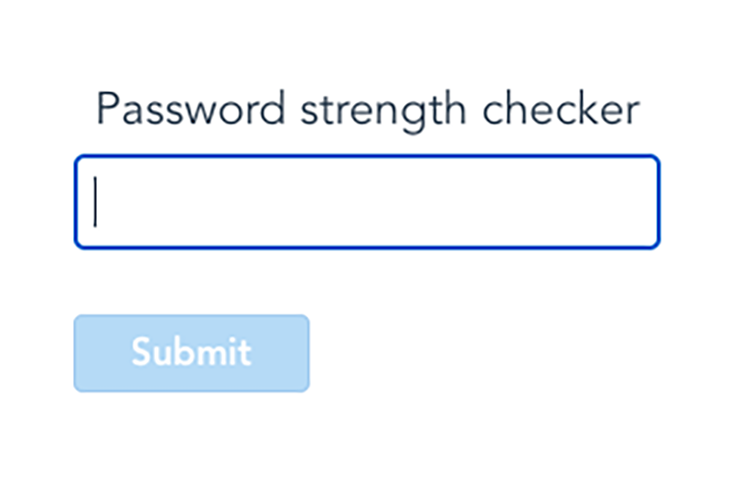
Password strength checker – Step 1 – StackBlitz
Starter project for Vue.js
Step 2: Build the password score component with zxcvbn
Our input is ready. When we change the input, it reflects the appropriate property on the component’s instance. Let’s implement the code logic that will allow us to get the score of our password.
We will enclose all that logic into a separate component called PasswordScore. In this step, we will also show the user a message that indicates the current password’s strength.
Same as before, we will start with a simple template for our component.
<!-- PasswordScore.vue -->
<template>
  <div class="relative select-none">
    <p class="absolute mt-1 text-sm">
      // Here we will show the message to the user
    </p>
  </div>
</template>
In the script section, add a props option that defines what our component will accept from the outside world. We only need a value prop to tell us what the current user’s input is, so we can mark that property as required — this will force us to always pass that property from the parent component to the child component.
<!-- PasswordScore.vue -->
<script>
export default {
  props: {
    value: {
      type: String,
      required: true,
    },
  }
}
</script>
We have the value in the component. Now, we need to use the zxcvbn library to retrieve the score for that value.
The first step is to import the required library elements into our component. We do that at the top of our script section.
<!-- PasswordScore.vue -->
<script>
import { zxcvbn, zxcvbnOptions } from "@zxcvbn-ts/core";
import zxcvbnCommonPackage from "@zxcvbn-ts/language-common";
import zxcvbnEnPackage from "@zxcvbn-ts/language-en";

export default {
  ...
}
</script>
Next, we need to initialize the library by setting appropriate options to it. We want to initialize the library immediately when the component gets created. To fire logic on component creation, we just need to put it inside the setup function of that component. For the detailed description of the available options you can pass to zxcvbn, I recommend checking the zxcvbn documentation.
// PasswordScore.vue
export default {
  ...

  setup() {
    const options = {
        dictionary: {
          ...zxcvbnCommonPackage.dictionary,
          ...zxcvbnEnPackage.dictionary,
        },
        graphs: zxcvbnCommonPackage.adjacencyGraphs,
        translations: zxcvbnEnPackage.translations,
      };
      zxcvbnOptions.setOptions(options);
    }
}
</script>
Using the zxcvbn score library
Okay, we are all set to start using the score library. Let’s stop and think for a second about what we want to do: get the score for the input value each time the value changes.
The best way to get a value based on another, reactive value is to use a computed property. So, let’s define a computed property called score. Import a computed helper from Vue and assign a value to a const using that helper.
// PasswordScore.vue
export default {
  import { computed } from "vue";
  ...

  setup(props) {
    ...
    const score = computed(() => {
      const hasValue = props.value && props.value.length > 0;

      if (!hasValue) {
        return 0;
      }

      return zxcvbn(props.value).score + 1;
    });
    ...
  }
  ...
}
In the computed property, first check if the value even exists or if it is an empty string. If the latter is true, we can save ourselves some time and just return 0.
If the value is not empty, we use zxcvbn, pass our value to it. Watch how we use props here — props are passed to the setup function as a first argument, and then retrieved using props.xyz. zxcvbn will then return an object with a score property.
Great! Our score computed property will recompute each time the value of our input changes and return a score value for us. But how we can display that value to users?
Displaying the zxcvbn score value
Let’s implement two more computed properties to help us show a message to the user that will indicate the current score.
The first one will hold all of the potential descriptions and color codes we can show to the user.
// PasswordScore.vue
export default {
  import { computed } from "vue";
  ...

  setup(props) {
    ...
    const descriptions = computed(() => [
      {
        color: "bg-red-600",
        label: "Weak, my 2 years old son can break it!",
      },
      { color: "bg-red-300", label: "Still weak, keep on trying!" },
      { color: "bg-yellow-400", label: "We are getting there..." },
      { color: "bg-green-200", label: "Nice, but you can still do better" },
      {
        color: "bg-green-400",
        label: "Congratulations, you made it!",
      },
    ]);
    ...
  }
  ...
}
The second one extracts and returns the description we want to show to the user. This works the same as above: first, we check if the value exists and it’s not an empty string; then, if it exists, we return the appropriate element from the descriptions array. If it doesn’t exist, we return a generic message that can encourage the user to use the input.
// PasswordScore.vue
export default {
  import { computed } from "vue";
  ...

  setup(props) {
    ...
    const description = computed(() =>
      props.value && props.value.length > 0
        ? descriptions.value[score.value - 1]
        : {
            color: "bg-transparent",
            label: "Start typing to check your password",
          }
    );
    ...
  }
  ...
}
Okay, now that we have the description ready, we still need to show it to the user. Let’s use Vue’s template syntax to do it.
<!-- PasswordScore.vue -->
<template>
  <div class="relative select-none">
    <p class="absolute mt-1 text-sm">

    </p>
  </div>
</template>
There is one more thing we need to remember: every property defined in the setup function that we want to use in our template also needs to be returned by the setup function.
// PasswordScore.vue
export default {
  import { computed } from "vue";
  ...

  setup(props) {
    ...
    return { description };
    ...
  }
  ...
}
Since we want to use our PasswordScore component in the PasswordInputForm component, we need to import the PasswordScore component the same way we imported the score library and register it using the components option, which makes it available to the component instance.
<!-- PasswordInputForm.vue -->
<script>
...
import PasswordScore from './PasswordScore.vue';

export default {
  components: {
    PasswordScore,
  },
  ...
};
</script>
Then, we can use that component in the template section, like below.
<!-- PasswordInputForm.vue -->
<template>
  <div class="container mx-auto w-64">
    ...
    <PasswordScore
      :value="password"
      class="mt-2 mb-6"
    />
    ...
  </div>
</template>
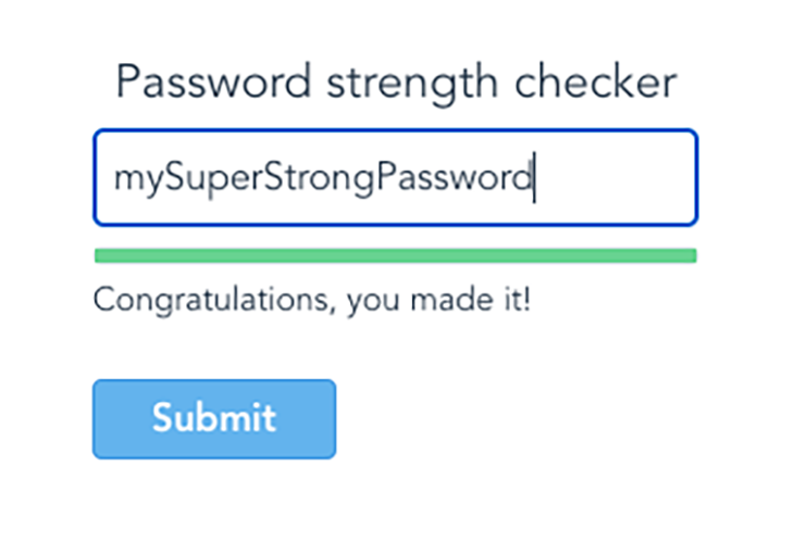
That’s all for step two! After this step, we should see something like this:
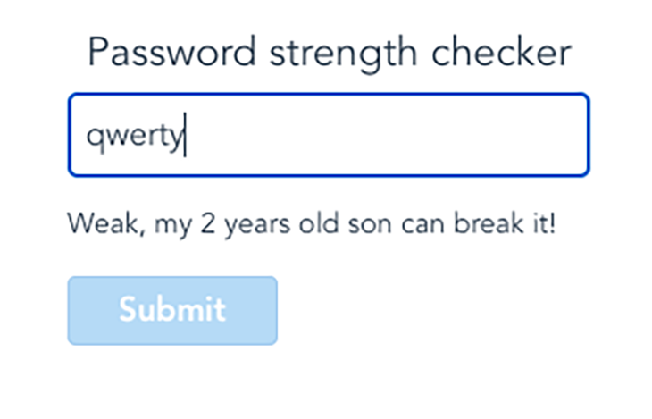
Password strength checker – Step 2 – StackBlitz
Starter project for Vue.js
In the next step, we will work with the Submit button to make it clickable when the score is good enough for our standards.
Step 3: Handle button state
In this step, we will enable the Submit button when the score has a value of ≥4, and disable it again when it goes below that threshold.
To do this, we need to detect when our threshold is met. This is also something we can do using a computed property!
This time, we will call it isPasswordStrong, a naming convention I strongly recommend using for all boolean type variables, as it makes coding and reading code much easier in the long-term.
// PasswordScore.vue
export default {
  import { computed } from "vue";
  ...

  setup(props) {
    ...
    const isPasswordStrong = computed(() => score.value >= 4);
    ...
  }
  ...
}
Now that we have that value, we need to communicate with the parent component that the value changes and the button should be either enabled or disabled based on the threshold we set. We can do this by emitting an event.
To emit an event, we need to define it first with the emits property on our component. Ultimately, we will define two events:
- When the password becomes strong (
passed) - When the password becomes weak (
failed)
// PasswordScore.vue
export default {
  import { computed } from "vue";
  ...

  setup(props) {
    ...
    emits: ["passed", "failed"],
    ...
  }
  ...
}
Let’s continue setting up so that we emit those events when the value of isPasswordStrong changes. We can’t do that inside the computed property because computed properties should never cause any side effects — and in our case, emitting an event and changing a button state is a side effect.
Using Vue watchers
But, fear not! Vue comes with just the right tool for that case: a watcher. Watchers look for changes to our component’s reactive properties and allows us to execute any logic when that change occurs.
First, we need to import a helper from Vue, which is achieved the same way as we imported our computed properties.
// PasswordScore.vue
export default {
  import { computed, watch } from "vue";
  ...
}
Then, we define our watcher inside the setup function.
// PasswordScore.vue
export default {
  import { computed, watch } from "vue";
  ...

  setup(props, { emit }) {
    ...
    watch(isPasswordStrong, (value) => {
      value ? emit("passed") : emit("failed");
    });
    ...
  }
  ...
}
When defining a watcher, we pass two arguments to it:
- The reactive property we want to watch
- A callback that we want to execute when the value of that property changes
The callback has access to the current and previous values of the property we are watching, but in our case, we only need the current value.
With the current value in hand, we can now emit appropriate event to the parent component in our callback.
Where does the emit method come from?
There is one more thing I should point out: the emit method comes from a second parameter that is passed to the setup function. The second parameter is a context object, which holds a few more useful elements, but I will leave it to you to dig deeper into it on your own. 
So, we emitted the event to our parent component. Now, we need to catch that event and handle it in the parent component.
We already watch for events in any child components using the inbuilt v-on directive (or @ shorthand). Let’s instead watch for the two events emitted by the PasswordScore component.
<!-- PasswordInputForm.vue -->
<template>
  <div class="container mx-auto w-64">
    ...
    <PasswordScore
      :value="password"
      class="mt-2 mb-6"
      @passed="isPasswordStrong = true"
      @failed="isPasswordStrong = false"
    />
    ...
  </div>
</template>
When we detect that an appropriate event has occurred, we set the value of our isPasswordStrong reactive property. That will trigger a change in the classes applied to the button, resulting in the button either being disabled or enabled accordingly.
<!-- PasswordInputForm.vue -->
<button
  class="mt-6 px-6 py-1 leading-lg select-none bg-blue-400 text-white font-semibold border border-blue-500 rounded"
  :class="[
    {
      'cursor-not-allowed opacity-50 pointer-events-hover': !isPasswordStrong,
    },
  ]"
>
  Submit
</button>
Okay, we now have a form that checks the score of the input, shows the result to the user in the form of a textbox message, and enables the button when the password is strong enough. It should look something like this:
Password strength checker – Step 3 – StackBlitz
Starter project for Vue.js
This would be enough, but we want to make it a bit more catchy. Next, we will add a nice progress bar that animates and changes color each time the score changes.
Step 4: Add a color-coded, animated progress bar to the form
Let’s start with the template for our progress bar. We will keep it all in a separate component called BaseProgressBar.
In the template section of our new component, add two div elements:
- A static wrapper that will show the border of our progress bar
- A more dynamic wrapper that will change:
- Its width based on a
widthcomputed property - Its color, based on a
colorproperty passed from thePasswordScorecomponent
- Its width based on a
<template>
  <div class="flex h-2 border border-grey-30 rounded">
    <div
      :style="{ width: `${width}%` }"
      :class="[color]"
      class="progress-bar flex h-full"
    />
  </div>
</template>
To set the width of our progress bar, we use inline style binding and assign a percentage value based on our current score value to a raw style width property of our div element. For the color, we use HTML class binding and assign a Tailwind class that is responsible for changing the background color of our div.
In the script section, we add another props option that defines three properties:
max: The maximum allowed value for ourvaluepropertyvalue: The current value we want to show in relation to themaxvaluecolor: The background color Tailwind class that is used to change the color of our progress bar
Now, in the setup function, we define a computed property that is responsible for calculating the current width of the bar based on the max and value properties.
<!-- BaseProgressBar.vue -->
<script>
import { computed } from 'vue';

export default {
  props: {
    max: {
      type: Number,
      required: true,
    },

    value: {
      type: Number,
      required: true,
    },

    color: {
      type: String,
      default: 'bg-transparent',
    },
  },

  setup(props) {
    const width = computed(() => (props.value / props.max) * 100);
    return { width };
  },
};
</script>
That’s it, our progress bar is ready! Now, we need to use it in the PasswordScore component.
Same as before, we import the component and register it:
<!-- PasswordScore.vue -->
<script>
...
import BaseProgressBar from './BaseProgressBar.vue';

export default {
  components: {
    BaseProgressBar,
  },
  ...
}
</script>
Lastly, we use that component in the template section. Pass the properties to the component using attribute binding:
value: Ourscorevaluemax: The maximum score value, which we can retrieve from the length of ourdescriptionscolor: Our current description color
<!-- PasswordScore.vue -->
<template>
  <div class="relative select-none">
    <BaseProgressBar
      :value="score"
      :max="descriptions.length"
      :color="description.color"
    />
    <p class="absolute mt-1 text-sm">

    </p>
  </div>
</template>
Password strength checker – StackBlitz
Starter project for Vue.js
And, there we go. Our password score checker is ready!
Summary
Let’s recap what we just accomplished. We created two components: one for a password check form and one that uses our password and zxcvbn to get the score for that password. We then implemented logic that enables or disables our Submit button based on the score. Finally, we added a progress bar that provides a feedback to the user about the current score.
Phew, we covered a lot! Hopefully this gives you both a new trick in your toolbox as well as a hands-on use case for Vue.
The post How to create a password strength checker with Vue appeared first on LogRocket Blog.
from LogRocket Blog https://ift.tt/Es87k3F
via Read more


