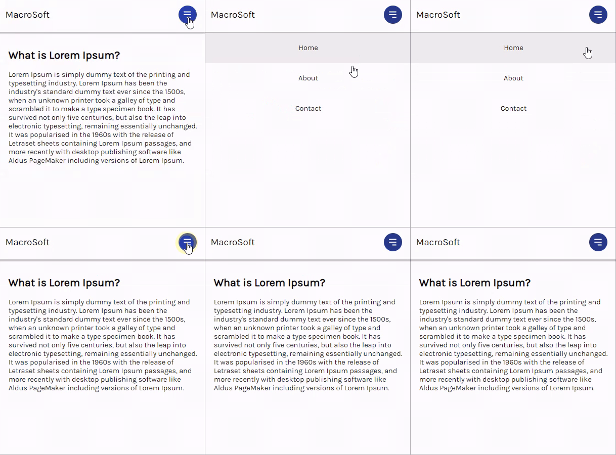
Styling responsive navigation menus for end users is hardly ever an easy process. Frontend developers have to consider certain parameters — like device breakpoints and accessibility — to create a pleasant navigation experience. It can get more challenging in frontend frameworks like React, where CSS-in-JS tends to get tricky.
In this post, you will learn how to create a responsive navbar with CSS and React Hooks. You can fiddle with the source code and view the live project here.

- Creating the project
- Understanding the navigation layout
- Styling the navbar component
- Responsiveness with media queries
- Toggling the navbar view with
useState
Prerequisites
To follow along with this tutorial, you’ll need:
- Basic understanding of React and React Hooks
- Some CSS knowledge — particularly Flexbox
Now, let’s set up a new React application!
Creating the project
To bootstrap a new React project in CodeSandbox, open a new browser tab and type in react.new. This will create a starter React application:
// App.js
import "./styles.css";
export default function App() {
  return (
    <div className="App">
      <h1>Hello CodeSandbox</h1>
      <h2>Start editing to see some magic happen!</h2>
    </div>
  );
}
Currently, the default stylesheet for your app is located at the root, in styles.css. Let’s edit this file to give our own feel to the page layout:
// styles.css
@import url("https://fonts.googleapis.com/css2?family=Karla:wght@200;400&display=swap");

* {
  box-sizing: border-box;
  margin: 0;
  padding: 0;
}

body {
  font-family: "Karla", -apple-system, BlinkMacSystemFont, "Segoe UI", "Roboto",
    "Oxygen", "Ubuntu", "Cantarell", "Fira Sans", "Droid Sans", "Helvetica Neue",
    sans-serif;
  -webkit-font-smoothing: antialiased;
  -moz-osx-font-smoothing: grayscale;
}

.container {
  max-width: 90%;
  margin-right: auto;
  margin-left: auto;
  padding: 1rem;
}

article h1 {
  margin: 1rem 0;
}
The rules above sets Karla as the primary font of the document and includes a container class for padding and aligning content on the page.
With that done, let’s write some markup in App.js to display content:
// App.js
import Navbar from "./components/Navbar";
import "./styles.css";

function App() {
  return (
    <div>
      <Navbar />
      <div className="container">
        <article>
          <h1>What is Lorem Ipsum? </h1>
          Lorem Ipsum is simply dummy text of the printing and typesetting industry...
        </article>
      </div>
    </div>
  );
}

export default App;
Notice the Navbar component import on the second line. I’ve created the Navbar.js file through CodeSandbox’s sidebar in the following file path: src/components/Navbar.js.
The content of this file, so far, is the component’s default export statement, allowing you to import it into App.js:
// Navbar.js
export default function Navbar() {
  return (
    <nav>Navigation</nav>
    )
}
Understanding the navigation layout
Our goal is to create a responsive navbar that initially displays the nav menu — ul element — in a horizontal layout. On reaching a mobile viewport, the menu repositions under the navbar and spans the remaining height and width of the screen.
This layout will be achieved through a conflation of both Flexbox and CSS positioning rules.
Write the markup from the subsequent code block into Navbar.js:
// Navbar.js
export default function Navbar() {
  return (
    <nav className="navigation">
      <a href="/" className="brand-name">
        MacroSoft
      </a>
      <button className="hamburger">
        {/* icon from heroicons.com */}
        <svg
          xmlns="http://www.w3.org/2000/svg"
          className="h-5 w-5"
          viewBox="0 0 20 20"
          fill="white"
        >
          <path
            fillRule="evenodd"
            d="M3 5a1 1 0 011-1h12a1 1 0 110 2H4a1 1 0 01-1-1zM3 10a1 1 0 011-1h12a1 1 0 110 2H4a1 1 0 01-1-1zM9 15a1 1 0 011-1h6a1 1 0 110 2h-6a1 1 0 01-1-1z"
            clipRule="evenodd"
          />
        </svg>
      </button>
      <div
        className="navigation-menu">
        <ul>
          <li>
            <a href="/home">Home</a>
          </li>
          <li>
            <a href="/about">About</a>
          </li>
          <li>
            <a href="/contact">Contact</a>
          </li>
        </ul>
      </div>
    </nav>
  );
}
The markup above includes the brand-name, hamburger icon, and the navigation-menu, which are the three elements of our navbar.
Now let’s proceed to style this component.
Styling the navbar component
Create the stylesheet for the navbar component in the following file path: src/styles/navbar.css
And import it into Navbar.js:
// Navbar.js
import "../styles/navbar.css"
export default function Navbar() {
  return(
    {/* navbar markup */}
  )
}
We’ll begin with the navigation class:
// navbar.css
.navigation {
  height: 60px;
  width: 100%;
  display: flex;
  align-items: center;
  position: relative;
  padding: 0.5rem 0rem;
  background-color: #fff;
  color: black;
  box-shadow: 0 2px 2px 2px rgba(9, 9, 9, 0.23);
}
In here, we’ve set the navbar’s width to 100% so that it spans the full width of the device. By making this element a flex container and assigning a specific height property to it, Flexbox lets us use the align-items property to center the flex items vertically.
Also, setting position to relative on this element ensures that the position value of any child element is determined relative to it. You’ll see this in effect momentarily.
Let’s style brand-name and navigation-menu:
// navbar.css
.brand-name {
  text-decoration: none;
  color: black;
  font-size: 1.3rem;
  margin-left: 1rem;
}
.navigation-menu {
  margin-left: auto;
}
The major rule in the code block above is margin-left: auto rule applied to navigation-menu. This pushes the menu to the far right by taking up the available space to the left of it.
Now we can style child elements of navigation-menu:
// navbar.css
.navigation-menu ul {
  display: flex;
  padding: 0;
}
.navigation-menu li {
  // removes default disc bullet for li tags and applies margin to left & right side
  list-style-type: none;
  margin: 0 1rem;
}
.navigation-menu li a {
  // increases the surface area of the anchor tag to span more than just the anchor text
  text-decoration: none;
  display: block;
  width: 100%;
}
display: flex on the ul element turns it into a flex container. The child li elements are then arranged in a row, which is the default value of the flex-direction property. The other rules serve to make the navigation links look better.

Let’s go on to style the menu icon with the hamburger class:
// navbar.css
.hamburger {
  // removes default border on button element
  border: 0;
  height: 40px;
  width: 40px;
  padding: 0.5rem;
  border-radius: 50%;
  background-color: #283b8b;
  cursor: pointer;
  transition: background-color 0.2s ease-in-out;
// positions the icon to the right and center aligns it vertically
  position: absolute;
  top: 50%;
  right: 25px;
  transform: translateY(-50%);
  display: none;
}
.hamburger:hover {
  background-color: #2642af;
}
Here, we’ve used CSS positioning to position the menu icon on the right side of the navbar.
Remember the parent nav element has position set to relative. Therefore, with the position property of the icon set to absolute, we can center the icon vertically along the borders of the parent element using the top and transform properties. Read more on CSS positioning if you’re curious how this works.
Since we want the menu icon to stay hidden until a mobile viewport is reached, let’s set its display property to none and proceed to style the mobile layout with CSS media queries.
Responsiveness with media queries
Media queries are a CSS feature that lets you specify how your content layout will respond to different conditions — such as a change in viewport width.
Queries are written using the @media rule, followed by the target media type and the breakpoint at which to apply the styles:
@media screen and (max-width: 768px) {
  // rules go here
}
Here, max-width: 768px ensures the styles are implemented only when the device width is at 768px or lower.
Let’s now display the hamburger icon:
// navbar.css
@media screen and (max-width: 768px) {
  .hamburger {
    display: block;
  }
}
And hide the ul element in navigation-menu:
// navbar.css
@media screen and (max-width: 768px) {
  .navigation-menu ul {
    display: none;
  }
}
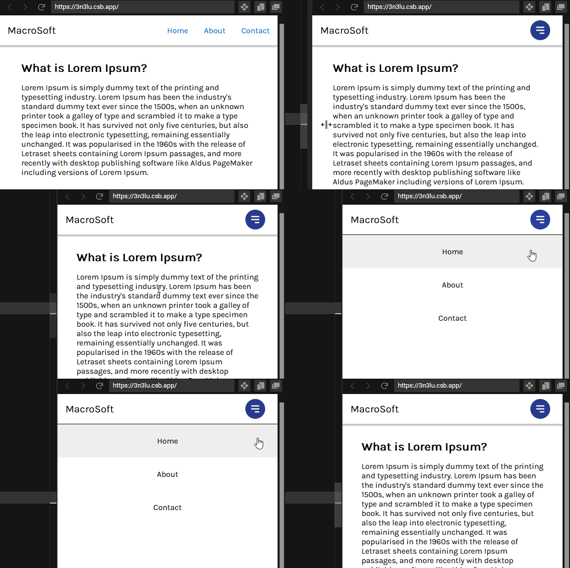
Your mobile layout should look like this so far:

Generally, a navbar has two possible views: expanded and hidden. You can implement this into your application by having separate classes control these two navbar views.
We’ll start by styling the expanded version of the menu. Subsequently, you will see how to toggle between these two views with Hooks:
// navbar.css
@media screen and (max-width: 768px) {
  .navigation-menu ul {
    // navigation menu is positioned to start 60px from the top of the document (which is directly below the navbar)
    position: absolute;
    top: 60px;
    left: 0;
    // stacks the li tags vertically
    flex-direction: column;
   // makes menu span full height and width
    width: 100%;
    height: calc(100vh - 77px);
    background-color: white;
    border-top: 1px solid black;
  }
  .navigation-menu li {
    // centers link text and strips off margin
    text-align: center;
    margin: 0;
  }
  .navigation-menu li a {
    color: black;
    // increases the surface area of the anchor tag to span the full width of the menu
    width: 100%;
    padding: 1.5rem 0;
  }
  .navigation-menu li:hover {
    background-color: #eee;
  }
}
Above, we’ve positioned the navbar 60px from the top of the document — directly below the navbar. To determine the height of this element, I’ve made use of the CSS calc function, and I’ll explain why.
Ideally, we want the menu to span the full height of the document by using the viewport height unit vh. But because viewport units take all elements on the page into consideration, the 60px navbar contributes to the overall height of the page, causing the navigation menu to take its extra viewport units from the bottom of the screen, thereby producing a vertical scrollbar.
The calc function helps us counter this by allowing us to perform calculations when specifying CSS property values. Therefore, subtracting 60px from 100vh produces the accurate height for the navigation menu.
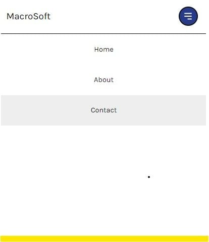
The preceding styles should result in the layout below (the yellow area marks the end of the document):

However, because we want another class to control the display of the navigation menu, we’ll set its display to none:
// navbar.css
@media screen and (max-width: 768px) {
  .navigation-menu ul {
    /* previous styles */
    dipslay: none;
  }
}
And create an expanded class, attached to navigation-menu, that sets the display property back to block:
// navbar.css
@media screen and (max-width: 768px) {
  .navigation-menu.expanded ul {
    display: block;
  }
}
At this stage, you can only observe the two states of the navbar by manually editing the markup in Navbar.js to include the expanded class.
Unless your user is a devtools expert, you wouldn’t want to stop developing at this point. Let’s use the menu icon to toggle between the different navbar views using React’s useState Hook.
Toggling the navbar view with useState
In order to monitor the current state of the navigation menu, we’ll introduce state into the Navbar component.
Create an isNavExpanded state and give it an initial value of false as such:
// Navbar.js
import { useState } from "react;
import "../styles/navbar.css";
export default function Navbar(){
  const [isNavExpanded, setIsNavExpanded] = useState(false)

  return (
    <nav className="navigation">
      <a href="/" className="brand-name">
        MacroSoft
      </a>
      <button className="hamburger" >
        {/* hamburger svg code... */}
      </button>
      {/* nav menu code... */}
    </nav>
  )
}
Now let’s use the onClick event handler on the button element to toggle the isNavExpanded state:
// Navbar.js
import { useState } from "react;
import "../styles/navbar.css";
export default function Navbar(){
  const [isNavExpanded, setIsNavExpanded] = useState(false)

  return (
    <nav className="navigation">
      <a href="/" className="brand-name">
        MacroSoft
      </a>
      <button
        className="hamburger"
        onClick={() => {
          setIsNavExpanded(!isNavExpanded);
        }}
      >
        {/* hamburger svg code... */}
      </button>
      {/* nav menu code... */}
    </nav>
  )
}
Here, we’ve called an anonymous arrow function within the onClick event handler. This function uses the updater function setIsNavExpanded to reverse the current value of the isNavExpanded state.
This means isNavExpanded will toggle between true and false whenever the icon is clicked.
You can now use the JavaScript ternary operator to conditionally pick the appropriate class name for the navigation menu based off isNavExpanded‘s value:
// Navbar.js
import { useState } from "react"
import "../styles/navbar.css"

export default function Navbar() {
  const [isNavExpanded, setIsNavExpanded] = useState(false)

  return (
    <nav className="navigation">
      <a href="/" className="brand-name">
        MacroSoft
      </a>
      <button
        className="hamburger"
        onClick={() => {
          setIsNavExpanded(!isNavExpanded)
        }}
      >
        {/* hamburger svg code... */}
      </button>
      <div
        className={
          isNavExpanded ? "navigation-menu expanded" : "navigation-menu"
        }
      >
        <ul>
          <li>
            <a href="/home">Home</a>
          </li>
          <li>
            <a href="/about">About</a>
          </li>
          <li>
            <a href="/contact">Contact</a>
          </li>
        </ul>
      </div>
    </nav>
  );
}
And that’s a wrap! Now you should have a fully functional, responsive navbar.

Conclusion
Navigation menus serve an important role in the overall experience of your web application. It’s usually the first component your user comes in contact with when trying to figure out your app. Therefore, it’ll serve you well to make it as organized and accessible as possible because it boosts user experience and even SEO performance.
The post Create a responsive navbar with React and CSS appeared first on LogRocket Blog.
from LogRocket Blog https://ift.tt/8yvRjFQ
via Read more


