It’s no secret that mobile devices have taken over our lives.
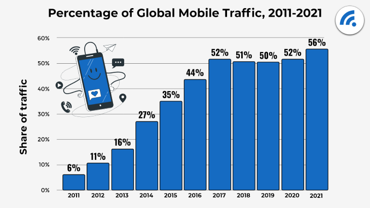
For over a decade, web traffic through mobile internet usage has skyrocketed from just 6% to an impressive 56% worldwide.
And it’s not just about browsing; mobile app downloads have also seen a huge increase, reaching 255 billion in 2022, up from 140 billion in 2016, representing a growth of more than 80%.
In 2021, mobile users spent an average of 4 hours every day on their devices, whether they were scrolling through social media, online shopping, or mobile banking.
These trends show the growing importance of mobile devices in our daily lives and the increasing need for businesses to have a mobile-friendly user experience.
In this article, we’re going to dive into the world of mobile UX design and explore some of the best practices, common challenges, and examples of apps that are doing it right.
Table of contents
- Responsive design
- Mobile vs. desktop design considerations
- iOS vs. Android design considerations
- Mobile gestures
- Mobile accessibility
- Example: Creating a post on Facebook
- Example: Order and pickup on Grab
Responsive design
Mobile devices, such as smartphones and tablets, come in a wide range of screen sizes and can orient themselves in portrait or landscape mode. Depending on their purpose, mobile apps may be optimized for one orientation over the other.
For example, some apps, like TikTok, are designed for portrait mode because the videos are viewed vertically. But other apps, like mobile games, are designed for landscape mode because it allows for dual hand controls.


Responsive designs adapt to different screen sizes and orientations, so whether you’re using an iPad in landscape mode or iPhone in portrait mode, the layout and content of the app will adjust to deliver the same level of user experience. Adopting responsive design ensures that apps are accessible and usable on a wide range of devices.
One way to approach responsive design is by considering how you handle navigation. On smaller screens, you might want to hide some menu items behind a hamburger icon to save space. That way, users can still access everything they need, but it won’t take up so much room on the screen.
Another approach is using a flexible column layout that can adjust the number of columns shown depending on the screen size. This way, your app can make the most of the available space and provide a seamless experience across different devices. It’s all about being thoughtful and strategic in how you design your app to make it as user-friendly as possible.
Mobile vs. desktop design considerations
Now let’s talk about the differences between mobile and desktop platforms so you can take them into consideration for user experience.
Screen space
The clearest difference is the amount of screen space available. Mobile screens are a lot smaller, which can make it tough to fit all the important information without it feeling cluttered. And when things are cluttered, it can lead to a poor user experience.
You don’t want to crowd everything together, because that can make it hard for people to use. You might miss the buttons you’re trying to tap or have a hard time finding the information you need.
User interactions
Another difference is how we interact with the device. With mobile, we’re mostly using our fingers for everything, like swiping and tapping. It’s not always as precise as using a mouse or keyboard. And for people with fine motor skills or visual impairments, using a keyboard can be a lot easier than trying to tap small buttons on a touchscreen.
Keeping things simple and accessible on mobile ensures that everyone can use it with ease.
iOS vs. Android design considerations
Mobile devices are mainly dominated by two main players: iOS and Android. Designing an app for both can be challenging and time-consuming. Here are some considerations when designing an app for both platforms.
Design guidelines
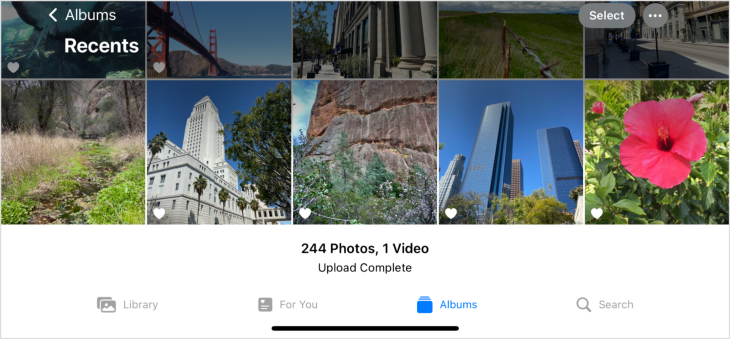
Both players have their own set of design guidelines that you need to follow, and they approach certain interactions differently. For example, Apple’s Human Interface Guidelines (HIG) for iOS recommend a navigation bar at the top of the screen and a tab bar at the bottom.
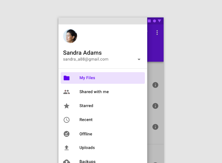
Meanwhile, Android’s Material Design guidelines suggest using a navigation drawer that slides out from the left side of the screen. There are several other examples of the differences between the two.
Range of screen sizes
Another thing to consider is that Android supports a wider range of screen sizes and resolutions compared to iOS, so designers need to take into account different aspect ratios and pixel densities when designing for Android.
Their developer guidelines include different window size classes, which are defined by width and height breakpoints. These can help determine when the layout of your app should be adjusted.
It’s more common to use width window size classes as opposed to height, as vertical scrolling allows users to easily access less important information that may be further down the screen. This approach allows your app to be easily used on a variety of screen sizes.

Mobile gestures
Gestures are fundamental to interacting with mobile devices. A gesture is a finger movement users make on a mobile device to interact with the interface.
Some of the most common gestures include tap, double tap, long-press, drag or pan, swipe or flick, pinch, and rotation.
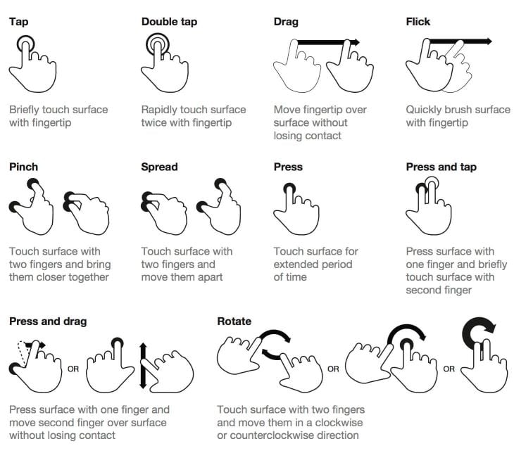
A tap is a quick and brief touch of the finger to the screen, typically used to select or activate items, such as buttons, links, or icons. It’s also used to open and close menus, initiate actions and navigate through content.
A double tap is two quick taps in succession, typically used to zoom in on images or maps. The double tap gesture has more recently been adopted by social media platforms, such as Instagram, to allow users to “like” a post.
A long-press is a press-and-hold gesture, typically used to bring up context menus, provide additional information, or initiate an action.
A drag or pan is a movement of the finger across the screen, typically used for navigation, scrolling, or moving items.
A swipe or flick is a quick movement of the finger across the screen, typically used for navigation, scrolling, or changing content.
A pinch is a movement of two fingers towards or away from each other, typically used to zoom in or out on images or maps.
A rotation is a movement of two fingers rotating around a central point, typically used to rotate images or 3D objects on the screen.
Design for external consistency
Users have grown accustomed to certain behaviors when using gestures to interact with mobile apps. So when an app behaves differently than they expect, it can throw them off and make the app feel confusing or frustrating.
To design for external consistency, follow established design patterns by using mobile gestures in the way users expect. That way, users can jump right into using the app without any obstacles.
When it comes time to hand off your designs to developers, make sure to document the behavior of each gesture so that they can implement it correctly. This ensures that the final product is consistent with the user’s expectations.
Mobile accessibility
Users come with all different types of abilities. Some people may have limited motor control or have impairments like vision or hearing loss. And even people without permanent disabilities may have temporary issues, like a broken hand or being in a loud environment.
Accessibility is an important best practice in mobile design as it ensures that apps are usable by as many people as possible, including those with disabilities. Here are some best practices for designing for mobile accessibility.
Focus on user goals
As mentioned earlier, mobile screens can become cluttered by trying to fit too much information into a small space. But, to avoid that, we must focus on the user’s goals.
Think about what the user wants to accomplish and what information they need to see to achieve their goal. And, if there are certain elements like navigation or menus that don’t need to be on the screen all the time, consider ways to hide them. That way, you’ll be able to present all the necessary information without overwhelming the user with a cluttered interface. Give the user what they need when they need it.
Consider context of use
People use their mobile devices in all sorts of different situations. Whether it’s on the go, in different environments, or even just using one hand. And when apps aren’t designed with these contexts in mind, it can lead to a frustrating experience for the user and they might just abandon the app.
By conducting research and usability testing, designers can understand how their users use their mobile devices in different environments and design apps with those situations in mind.
For example, a hiking app is probably going to be used outdoors, where bright sunlight or weather could affect the visibility of the screen. The user might also have gloves or other gear on, which could affect their touch accuracy.
These are just a few factors that we can keep in mind when designing for mobile. Empathy for our users can help us design with their context in mind.
Thumb zone
As mobile device screens have gotten larger over the years, it’s become more difficult to reach everything on the screen with our thumbs.
Based on an observational study by Steven Hoober, about half of the participants held their phones with one hand. This means that they’re relying solely on their thumb to interact with the screen, instead of using a two-handed approach.
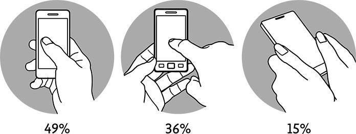
Based on this insight, we should design our apps with these one-handed use cases in mind.
One way to do this is by considering the “thumb zone” of a mobile screen. The thumb zone shows the easy-to-reach and hard-to-reach areas on a typical mobile screen, which can be used to design accessible mobile experiences.
In the diagram below, the zones of a screen are represented by what feels comfortable for a thumb to reach, what requires the thumb to stretch, and what feels hard to reach.
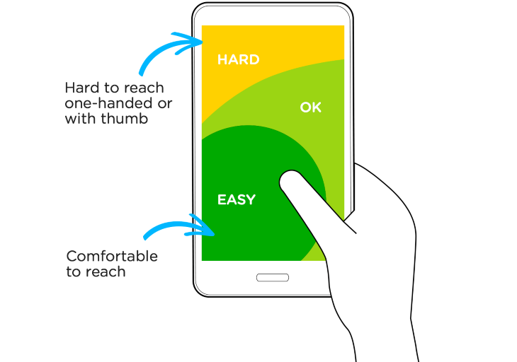
By keeping the main action elements, like buttons or navigation, closer to the bottom and middle of the screen, users will have an easier time reaching for them.
Touch target
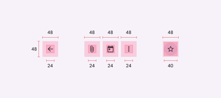
Another mobile accessibility best practice is following the minimum touch target size. This means that any element that a user might interact with, like an icon button, should be a minimum of 44pt for iOS and 48dp for Android.
Now, the icon on the button can be smaller, but make sure that the padding around it meets the minimum size. This helps to improve touch accuracy and reduces the number of missed targets.
Text size
Text can be hard to read on a mobile device, especially for people with visual impairments. Designers should follow the suggested text size of 16px for body text. In addition, users should be able to resize the text on the screen by 200 percent to improve readability.
Screen readers
For users with visual impairments, assistive technology like screen readers can be a big help. Both iOS and Android devices have built-in screen readers, like VoiceOver and Talkback.
To make sure your app is compatible with screen readers, work with your development team to ensure that all interactive elements have proper labeling and images have alt text. A screen reader will read out loud the label provided for each element, so it’s important that it is descriptive and indicates its purpose.
Also, make sure that elements are grouped in a way that allows for proper tab order that makes sense. Screen reader users swipe left and right to tab through a screen.
Lastly, conduct thorough user testing with people with disabilities to understand if your app is usable with a screen reader. Gather insights from real users rather than make assumptions about how you might think users would use your app.
Example: Creating a post on Facebook
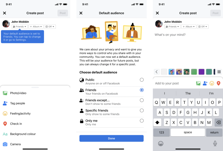
Facebook’s mobile app follows many mobile best practices that put the user first. When creating a new post on the Feed, the app alerts users to their default audience setting through a tooltip, making sure that the feature is not overlooked and users are aware of their privacy options.
The app also makes it easy to access post options by placing them in a bottom drawer that is located within the thumb zone, making it easy to navigate and select options.
The audience settings page features branded illustrations, easy-to-understand copy, and multiple audience options with descriptions to help the user make a well-informed choice.
Finally, the text area for creating a new post includes placeholder text to prompt the user to share what’s on their mind. The app leverages the native iOS keyboard, which slides in from the bottom of the screen, providing a familiar, intuitive typing experience.
Example: Order and pickup on Grab
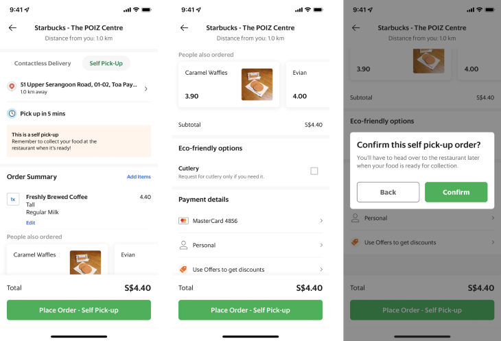
Grab’s mobile ordering system is designed with the user’s convenience in mind. The checkout screen displays all the important information needed to confirm an order, such as the name, location, and distance of the store and the estimated time for completion.
The order summary is clear and easy to understand, displaying the quantity and description of each item, including any custom options chosen. The item name is displayed in bold to indicate hierarchy, making it easy to identify items. Additionally, Grab’s People also ordered section provides an effective way to upsell additional items and mimic the in-person shopping experience.
Payment details are clearly presented, including helpful iconography to differentiate the payment options available. Lastly, the confirmation dialog serves as a final reminder for the user, in case they want to change their mind or have chosen pickup by accident.
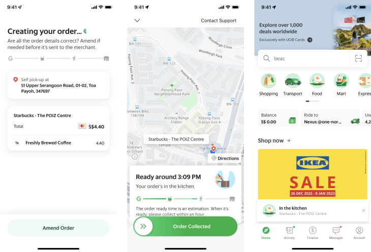
After the order is placed, Grab provides a thoughtful feature that allows users to amend their order before it is sent to the merchant. This gives users the last opportunity to alter or cancel their order in case they change their mind.
To keep users informed, while the order is being prepared, the app displays a progress stepper, which uses icons to indicate the stage of the order, providing a clear understanding of the order’s progress and reducing anxiety.
Moreover, the app allows users to continue exploring it while keeping track of their order’s progress by displaying it in a small message at the bottom of the screen, which creates trust with the user and does not interrupt their experience.
Conclusion
As more and more people are turning to their smartphones to access the internet, it’s essential to make sure your app is tailored to their needs. Responsive design is key to ensuring that your app adjusts seamlessly to different screen sizes, whether it’s on iOS or Android.
Great mobile experiences pay close attention to the details. Apps rely heavily on gestures, so it’s important to make sure those gestures are intuitive and easy to use. It’s not just about making your app look good, but also about creating an accessible and thoughtful experience for users.
Take inspiration from apps that are doing it right, such as Facebook, Grab, and other industry examples. By designing for the user first, you’ll be able to create apps that people love to use.
Featured image source: IconScout
The post An app designer’s guide to responsive mobile UX appeared first on LogRocket Blog.
from LogRocket Blog https://ift.tt/1oq63Sa
Gain $200 in a week
via Read more


