


CSS variables allow developers to create reusable CSS properties. Before the introduction of CSS variables, we couldn’t set the default variable type; in some cases, this little flaw could break an entire application. However, the CSS @propery addresses this flaw in particular.
In this tutorial, we’ll explore setting CSS variable configuration using the CSS @property feature. We’ll examine custom CSS properties’ pros and cons, learn how the @propery works, and review its different use cases. It’s important to keep in mind that the @propery is still experimental at the time of writing, so you should check your browser compatibility before getting started.
Jump ahead
- CSS custom properties
- How the
@propertyworks - Animation with the
@property - Manipulating the
@propertyCSS variable with JavaScript - Setting
@propertyCSS variable using JavaScript - Getting
@propertyCSS variable’s value using JavaScript - Theme switcher with the
@propertyvariable - Browser compatibility
CSS custom properties
Let’s consider the following CSS variable use case; we declare a variable foo and assign it a value of 10px, as follows:
--foo: 10px;
We can use the foo variable to set the width of an element as follows:
.element {
   width: var(--foo);
}
Let’s say we mistakenly misuse the --foo variable in another element, like in the code below:
.another-element {
    --foo:red;
    Text-shadow: var(--foo) 2px 5px red;
}
The Text-shadow property will break because the --foo variable is assigned a different value from its type. Although you could debug this type of error pretty quickly, with the new @property declaration, we can avoid this error altogether by setting a default type for our CSS variables, including color, length, percentage, etc.
How the @property works
With the @property, we can avoid the bug in our previous example by simply setting the variable type, initial value, and inherits properties. We can declare the @property variable as follows:
@property --x {
 syntax: '<color>';
 initial-value:blue;
 inherits: false;
}
In the code snippet above, we use the @property to declare and configure the values for the syntax, initial-value, and inherits variables. syntax specifies the type of value that we can assign to a CSS variable, while the @property syntax includes CSS types like length, color, percentage, etc.
When declaring @property variables, initial value is required. The @property will return the initial value if the value assigned to a variable differs from its type. Finally, inherits is a boolean value; setting it to true implies that the variable is inherited from the DOM tree.
After we create the --x variable for the @property, we can assign a value red to the --x variable, and then add it to the element property as follows:
 .element {
     --x: red;
     text-shadow: 4px 2px 5px var(--x);
   }
Below is the output:
Let’s say in the example above, we mistakenly assign 20px to the --x variable. The output will be as follows:
Animation with the @property
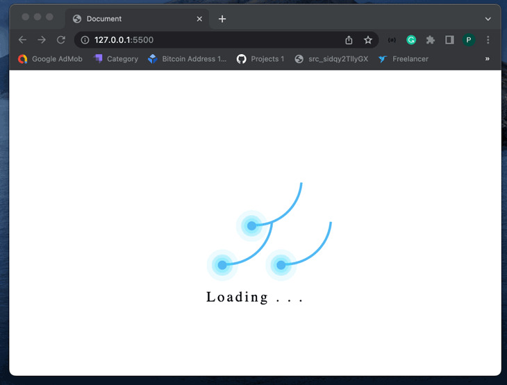
We can use the @property variable to add animations to websites. As an example, let’s create a simple page loader animation using the @property.
We’ll start with the HTML code. Create an index.html file and add the following HTML code:
<!DOCTYPE html>
<html lang="en">
 <head>
   <meta charset="UTF-8" />
   <meta http-equiv="X-UA-Compatible" content="IE=edge" />
   <meta name="viewport" content="width=device-width, initial-scale=1.0" />
   <link rel="stylesheet" href="style.css" />
   <title>Document</title>
 </head>
 <body>
   <div class="body">
     <div class="container">
       <div class="ring"></div>
       <div class="ring"></div>
       <div class="ring"></div>
       <p>Loading . . .</p>
     </div>
   </div>
 </body>
</html>
In the code above, we created a div with a container class. Inside the div, we defined three more children div with the class ring, which will act as our loader ring.
Now, create a style.css file and add the following code:
@property --main_color {
 syntax: "<color>";
 initial-value: #53b8f3;
 inherits: false;
}
@property --main_color2 {
 syntax: "<color>";
 initial-value: white;
 inherits: false;
}
@property --main_length {
 syntax: "<length>";
 initial-value: 150px;
 inherits: false;
}
@property --angle {
 syntax: "<angle>";
 initial-value: 0deg;
 inherits: false;
}
@property --percentage {
 syntax: "<length-percentage>";
 initial-value: 100%;
 inherits: false;
}
body {
 --main_color: white;
 background: var(--main_color);
}
.body {
 display: flex;
 justify-content: center;
 align-items: center;
 min-height: 100vh;
}
.container {
 position: relative;
 width: var(--percentage);
 display: flex;
 justify-content: center;
 align-items: center;
}
.container .ring {
 position: relative;
 width: var(--main_length);
 height: var(--main_length);
 margin: -30px;
 --percentage: 50%;
 border-radius: var(--percentage);
 border: 4px solid transparent;
 border-top: 4px solid var(--main_color);
 animation: animate 4s linear infinite;
}

@keyframes animate {
 0% {
   transform: rotate(var(--angle));
 }
 100% {
   --angle: 360deg;
   transform: rotate(var(--angle));
 }
}

.container .ring::before {
 --main_lenght: 15px;
 --main_color2: #24ecff33;
 content: "";
 position: absolute;
 top: 12px;
 right: 12px;
 --percentage: 50%;
 border-radius: var(--percentage);
 width: var(--main_lenght);
 height: var(--main_lenght);
 background: var(--main_color);
 box-shadow: 0 0 0 5px var(--main_color2), 0 0 0 10px var(--main_color2),
   0 0 0 20px #24ecff11, 0 0 20px var(--main_color), 0 0 20px var(--main_color);
}

.container .ring:nth-child(1) {
 position: absolute;
 top: -66.665%;
}
.container p {
 --main_lenght: -120px;
 position: absolute;
 --main_color2:black;
 color: var(--main_color2);
 font-size: 1.5em;
 font-family: consolas;
 bottom: var(--main_lenght);
 letter-spacing: 0.15em;
}
In the code above, we defined four properties, stating with two color properties, main-color and main-color2, indicating the color of the loader and the background of our webpage, respectively.
We also introduced an extra property angle to reflect the degree of ring rotation. Using the previously specified values, we then added some new CSS for page alignment and created the actual keyframes responsible for our loader animation.
Below is the result:
Manipulating the @property CSS variable with JavaScript
In JavaScript, we can declare the @property CSS variable using the registerProperty method by passing the variable’s name, syntax, initialValue, and inherits properties as an object:
window.CSS.registerProperty({
  name: '--foo',
  syntax: '<color>',
  initialValue: '#c0ffee',
  inherits: true,
});
Setting @property CSS variable using JavaScript
In JavaScript, we can update the value of the @property CSS variable using the setProperty method. If the inherits property of a CSS variable is true, we can change its initial value as follows:
document.documentElement.style.setProperty("--foo", "pink");
We can also update the value of a CSS variable inside the element property without changing the initial value of the variable:
document.querySelector(".element").style.setProperty("--foo", "red");
Getting @property CSS variable’s value using JavaScript
We can retrieve the value of the @property variable in JavaScript using the getPropertyValue method as follows:
document.querySelector(".element").style.getPropertyValue("--foo"))
Theme switcher with @property variable
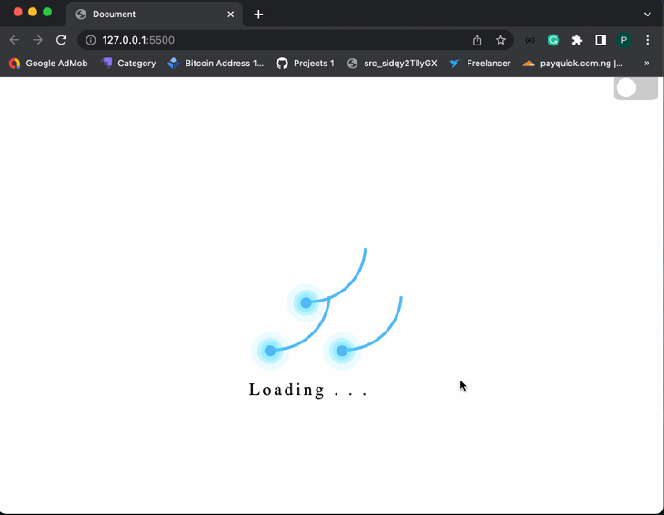
Let’s look at another example of using the @property variable; we’ll add a theme switcher between light and dark mode to our previous animation loader project. When the user toggles the button, the animation loader themes will change. Let’s start by adding the theme switcher to the index.html file, as shown below:
<!-- ... -->
<body>
<header>
<div class="toggle-button-container">
<label class="toggle-button-label" for="checkbox">
<input
type="checkbox"
class="toggle-button"
id="checkbox"
onchange="toggleTheme()"
/>
<div class="toggle-rounded"></div>
</label>
</div>
</header>
<!-- ... -->
Next, we’ll add the following CSS style to the style.css file:
/* ... */
.toggle-button-container {
 align-items: center;
 margin-top: 5px;
 width: 100%;
}

.toggle-button-label {
 display: inline-block;
 height: 34px;
 position: relative;
 width: 60px;
 float: right;
}

.toggle-rounded {
 --main_color: #ccc;
 background: var(--main_color);
 bottom: 0;
 cursor: pointer;
 left: 0;
 position: absolute;
 right: 0;
 top: 0;
 transition: 0.4s;
 border-radius: 15%;
}
.toggle-rounded:before {
 --main_color: #fff;
 background: var(--main_color);
 bottom: 4px;
 content: "";
 height: 26px;
 left: 4px;
 position: absolute;
 transition: 0.4s;
 width: 26px;
 border-radius: 100%;
}
input:checked + .toggle-rounded {
 --main_color: #9cafeb;
 background: var(--main_color);
}
input:checked + .toggle-rounded:before {
 transform: translateX(26px);
}
In the code snippet above, we use the @property variable to style the theme toggle button. Now, when the theme switcher button is toggled, the button’s color will change. Next, we’ll create a themes.js file and paste the following JavaScript code:
const toggleButton = document.querySelector(".toggle-button");
toggleButton.addEventListener("change", toggleTheme, false);
const theme = {
 dark: {
   "--main_color": "black",
   "--main_color2": "white",
 },
 light: {
   "--main_color": "white",
   "--main_color2": "black",
 },
};

function toggleTheme(e) {
 if (e.target.checked) {
   useTheme("dark");
   localSto,rage.setItem("theme", "dark");
 } else {
   useTheme("light");
   localStorage.setItem("theme", "light");
 }
}
function useTheme(themeChoice) {
 document
   .querySelector("body")
   .style.setProperty("--main_color", theme\[themeChoice\]["--main_color"]);
 document
   .querySelector("p")
   .style.setProperty("--main_color2", theme\[themeChoice\]["--main_color2"]);
}

const preferredTheme = localStorage.getItem("theme");
if (preferredTheme === "dark") {
 useTheme("dark");
 toggleButton.checked = true;
} else {
 useTheme("light");
 toggleButton.checked = false;
}
From the code above, the toggleTheme() function is called whenever the button is toggled. The useTheme function then updates the selected theme’s colors by passing in the selected theme as a parameter.
Finally, add the themes.js file to index.html. The output should look like the following gif:
Browser compatibility
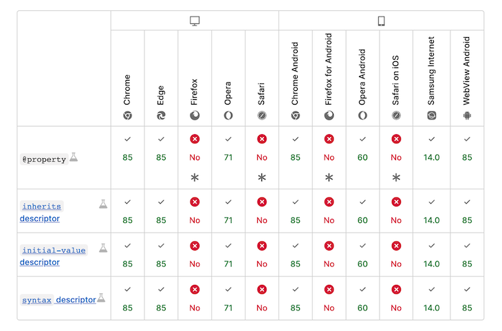
While the @property is a unique CSS-typed variable feature, the @property is only useful when compatible with your user’s browser. This CSS feature is still experimental and is yet to be supported by some browsers. Check the chart below for @property browser compatibility at the time of writing:
Conclusion
@property CSS variables help simplify how we build dynamic websites and complex animations while still preventing breaks in our CSS property. Like TypeScript, the @property aims to ensure that valid values are assigned to CSS variables.
In this tutorial, we learned how to use @property CSS variables like a pro by building a simple page loader animation and themes switcher. We also explored how @property works in JavaScript code.
The post Using @property for loosely typed CSS custom properties appeared first on LogRocket Blog.
from LogRocket Blog https://ift.tt/G5FkMR3
Gain $200 in a week
via Read more


