How do I get back to where I was before? We ask ourselves this a lot when browsing websites. Just like losing our car in a parking lot, users can easily get lost on a website. However, website designers have long had a trustworthy and inobtrusive solution to this navigation problem, and they are called breadcrumbs.
Breadcrumbs are often an underlooked design element in website UI, but they have stood the test of time. What is there not to love about the universally recognized element? They are just there — often tucked in the corner of the screen, ignored by users when not needed.
Nevertheless, when we do start asking the dreaded question, “How do I find my way back?” breadcrumbs are the unsung hero of the page; they help us with wayfinding through website hierarchies no matter how complex they get.
- What are breadcrumbs?
- Three types of breadcrumbs
- Why use breadcrumbs?
- When to use breadcrumbs
- When not to use breadcrumbs
- What about mobile breadcrumbs?
- Simple elements mean simple HTML
- How to style breadcrumbs
What are breadcrumbs?
Breadcrumbs are a secondary navigation that helps users get to related content nearby in the hierarchical structure of the website. Breadcrumbs can be found on the most popular sites in the world, especially ones with a myriad of pages.
This can only mean one thing: users genuinely use breadcrumbs, and designers find breadcrumbs as a solid option to help users navigate the hierarchy of sites. Amazon, Apple, and IBM all do it. Best practices and research don’t lie.
Breadcrumbs easily allow us to find our way back one or two — maybe even three or more pages in a website hierarchy. Navigation is essential for users to find their way through a website and has been universally important in life outside the internet ever since living organisms began existing.
When humans push forward into the unknown and explore, we want to know our way safely back home. Breadcrumbs help us with this and it is actually an ingenious name referencing back to The Brothers Grimm fairytale “Hansel and Gretel,” where the children drop breadcrumbs so that they can find their way back home through the forest. The characters acknowledge losing their way back home would be quite the mishap, as it does turn out to be.
There are so many examples of using trails to navigate, that when our websites seem like a scary forest or labyrinth of hierarchies where one could easily get lost. The solution is as simple as the fairytales and stories we are told as children: leaving a breadcrumb trail.
Three types of breadcrumbs
Trails in this context do not always mean showing us where we were before. There are several different breadcrumbs: two are commonly used, and one is not as common anymore.
The two main breadcrumbs used in designs today are:
- Location-based breadcrumbs: Shows the user’s current location in the website structure

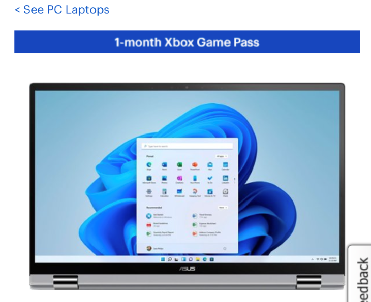
An example of a location-based breadcrumb, this ecommerce site shows the current location of the user as well as the hierarchy of pages the product is nested in.
- Attribute-based breadcrumbs: Shows the user an attribute of the current page

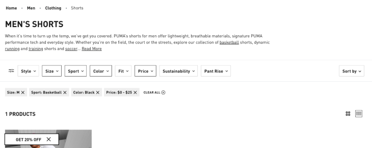
An example of an Attribute-based breadcrumb, notice how the retail site shows the selected style, color, and size that are included as crumbs. These are attributes that can be removed and show different pages or are content dependent.
The third not-as-used breadcrumb is what many people mistakenly think a breadcrumb is: the user’s session history. In best practice, breadcrumbs should not show a user’s session history! Imagine clicking through a hundred pages and you want to go back to where you were fifty pages ago…It would make the task so inconvenient when we could just use location or attribute crumb hierarchies to easily navigate back.
Although users may say they want to see their session history — they don’t. That should be a separate feature or be left to the browser as it is functionally a back button. This breadcrumb is a bad practice, and should seldom be used, but we’ll define it anyway.
- Path breadcrumbs: This shows users the unique steps they took to get to the current page
Why use breadcrumbs?
Breadcrumbs are an easy, widely accepted, and great user experience element that aid in wayfinding, save users time, and reduce frustration. Breadcrumbs are almost always a good solution for large or complex hierarchy sites because we can show users where they are on the site without adding a lot of noise or complication to each page. Let’s be honest: it is literally just normal size text links at the top of the page most of the time.
Designers since the beginning of the world wide web (to the present day) continue to apply this universally accepted concept. Breadcrumbs show us past pages in hierarchies and how many pages deep we have gone, making it easily accessible to click backward in our journey if we happen to wander astray (although maybe the user won’t face the threat of hunger or death as did Hansel and Grettel). If users can’t find their way home, they will no doubt have a terrible experience — and that is no good for a website.

When to use breadcrumbs
We learned that breadcrumbs are secondary navigation and are commonly used for sites with multiple page levels. They are especially important elements in retail or commerce sites.
Hierarchies themselves are a website’s structure that can show how a user navigates a site. It can also be understood as the layers of navigation (which pages a user can click to from a certain page and so on).
So when there are a couple pages and paths it is simple, and when there are a lot of paths it is complex. This is why we often see breadcrumbs on sites with a lot of products; there are often complex levels of product categorization and relations in multiproduct sites.

Say we are looking for camping items on a retail site. We will click camping lights, then we may get more specific in our ask and click solar lights, which is a subcategory. We can click on a product and see how we got there in the top left of the screen and then easily click back to solar lights if it is not the product we want.
Maybe we decide we want a kerosene lamp instead. No need to click the home button and navigate through the hierarchy (product layers) all again, resetting everything. We don’t even have to click the back button twice (although many users will opt to do this). All we have to do is look at the breadcrumb to see where we were before and click “camping lights.” Then we can redirect our search from there: the user can jump back two hierarchy levels in one simple click. It’s basically magic.
Let us visualize this hierarchy of a large ecommerce site with millions of items.
Sports & Outdoors > Outdoor Recreation > Camping & Hiking > Lights & Lanterns > Solar Lights > Solar Light X12

Or maybe we are on a financial website trying to learn more about their services. Our breadcrumbs might look like this:
Personal Finance > Retirement Plans > Roth IRA
Or in a modern example:
Learn > Crypto Basics

Notice most of the time we don’t need to start the hierarchy with Home as the beginning crumb. Sometimes we just want to display the last three hierarchies because otherwise there is information overload. If someone wants to go all the way home, they know they could just click the logo or Home in navigation in many cases. Breadcrumbs never replace primary navigation; it is only secondary.
Users also know how to strategically use breadcrumbs, so they could click back to the furthest hierarchy displayed, and then it will display even more of the hierarchies before it. This means we don’t need to display everything. We don’t want to overcomplicate crumbs by jamming too many links at once in the crumbs — as a matter of fact, the hierarchy itself should be consolidated whenever possible.
In order to declutter breadcrumbs, many designers opt to consolidate naming conventions. A common practice is to avoid long names for hierarchy pages and make them easy to understand. Instead of a blog breadcrumb that says “Notes from the Field,” maybe we could rename it “Field Notes” in our breadcrumbs to save some room without losing the context or meaning of where we are going back to.
When not to use breadcrumbs
Let’s not be complacent with the concept — breadcrumbs are not a one-size-fits-all solution. Many basic sites will not need breadcrumbs at all. For example, a portfolio website or a local small business that doesn’t have a lot of pages (and might only have one or two layers of a hierarchy) does not need breadcrumbs.
If we can just click the home button and get to the exact spot we were just in one or two pages ago, is it really necessary to additionally list the crumbs? Many times over the answer is no. Breadcrumbs do not need to be on a website that has a simple hierarchy.
Another common mistake is using breadcrumbs for forms where steps are showcased. In this case, the best practice is to use a stepper or progress bar to show steps, breadcrumbs are specific for location, attributes, or history. Breadcrumbs are not to be used everywhere, they should never replace the main navigation or on-page navigation of a website, such as that of a header or sidebar. Many basic sites will only need main navigation.
When our website starts to have complex architecture or will become complex in the future such as featuring the needs of filtering or categorization — maybe we just want to jump back a couple of levels — and breadcrumbs make for a much more convenient task. We can follow the crumbs as little or as far back as needed.
What about mobile breadcrumbs?
Now let’s talk about breadcrumbs on mobile. Are we really going to use valuable screen space for a supplementary element at the top of the page? Many designers will tell you, no, it is a waste of space. But users do in fact use breadcrumbs on mobile.
Breadcrumbs should be on mobile sites when it is in the original design (or desktop design). The same rules apply: we are not going to throw out the concept because the screen got smaller. That is lazy design. If users use breadcrumbs and it makes sense for the hierarchy, we will find a way, but our solution might be a little different. Imagine retail breadcrumbs showing four or five crumbs on mobile. This takes up way too much space.
So what is the solution? Use only one breadcrumb. A lot of people won’t realize it, but singular breadcrumbs are all over our phones — and often mistaken for a back button. In reality, we are jumping back a hierarchy, not in our session history like back buttons do. When we use one line with multiple crumbs or just one crumb, we aren’t pushing the prime real estate down the page. Using only one breadcrumb or one line is a common practice used by Apple, Meta, and other large companies. Multiple lines might push content to unwanted spaces.

For example, if I go to Files > Downloads > Folder and I am on the Folder page, the breadcrumb will only show one crumb back to Downloads. Or if I am on a retail website looking for laptops and click a product, only the last hierarchy breadcrumb will show, which was Laptops.

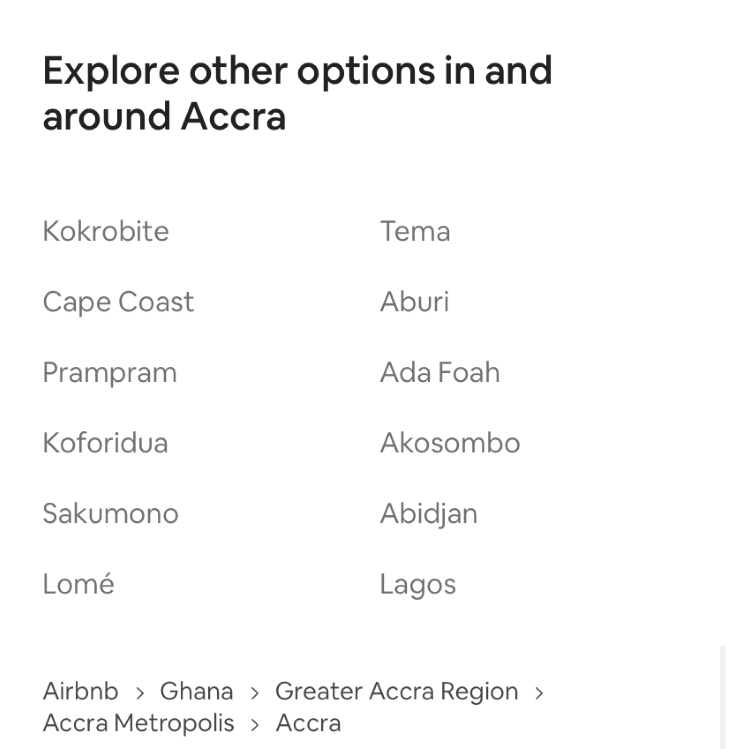
There is not a universal solution here; different sections of a webpage may need their own crumbs such as attribute hierarchies. If we want to get a rental home in Africa and we want to see which attributes we applied and jump back from specifying the city, Accra, to just specifying the country, Ghana, because we want to stay somewhere else, a multiline breadcrumb might be appropriate here, and maybe it is not at the top but instead at the bottom of the mobile site where the location is, like in Airbnb. This way, mobile users can find what they need and we are not wasting space at the top.

Simple element mean simple HTML
Earlier I mentioned the simplicity of breadcrumbs, and lucky enough for developers, this stays true. Sometimes the easiest way to find your way around a site is by using the simplest elements. Breadcrumbs are just nested links and text, often organized in a list when using HTML/CSS. The HTML list can look as flawless as this:
<ul class="breadcrumb">
  <li><a href="#">Home</a></li>
  <li><a href="#">Mens</a></li>
  <li><a href="#">Shoes</a></li>
  <li><a href="#">Athletic</a></li>
  <li>Running Shoe 12</li>
</ul>
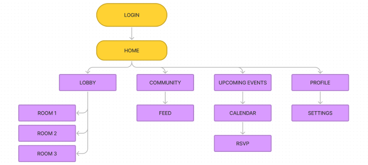
It is just a list of links. Breadcrumb links are often referred to as ancestor links showing hierarchy like a family tree, such as the father page and the grandfather. You don’t need to love genealogy in order to love the family trees of links. The sitemap will define the hierarchy of pages answering questions: What pages can go where? And what displays on breadcrumbs on this page?
How to style breadcrumbs
Although breadcrumbs are simple (they are just links), finding the correct design solution can take time. Would it surprise you that a group of senior designers could spend a week or more deciding best practices and implementation of breadcrumbs to their design?
When we get to designing the style, we have a lot of options for such a basic list. Let me throw a bunch of questions at you:
- What color are past links?
- Clicked links?
- Links you have not clicked?
- Is the current page a link?
- Is there a hover state?
- How do we separate each link, how long can this hierarchy be?
- Is it on the top left of every page?
- What pages need breadcrumbs?
- How does this design translate to the design style of the rest of the website?
Many elements of design are often underlooked. On a desktop, should you show the current page? Yes. The users should know where they are, but the best practice is to not make the current page a link! Past pages are links, and the current page displays the content; we are already on the page, so we don’t need to link to it!
Breadcrumb links should stay the same as how you style standard text links on the website. So say we have the default blue link with an underline, we’ll keep the breadcrumb the same. However, if the website has a design system or branding, we need to implement it to match how other links look and act on the site.

Finally, how do we show movement between pages? Arrows, lines, dots, or forward slashes?
Well, the answer here isn’t as transparent. A lot of breadcrumbs use a forward arrow showing movement forward through the hierarchy. Page A leads to B leads to C, etc. It makes sense and it is an acceptable use of arrows.
Accessibility practice and famous design systems such as the carbon design system tell us a forward slash / is also acceptable and shows forward motion without as many decorative elements. A | or dot is also seen around the web and is not quite as acceptable due to the fact there are no defined use cases for these elements. Although it is separation, it might not always make sense. It also shows no wayfinding movement and instead appears as a divider instead of a wayfinder. So when it comes to crumbs, try and stick to arrows or forward slashes.


W3School gives us a good start to a basic example of breadcrumbs, as well as a pretty generic styling of the elements using CSS.
Conclusion
Now that we talked about looks, function, and use cases, I think it is time we set our users up to succeed in navigating our websites. No matter how complicated or far we click down the rabbit hole of pages, breadcrumbs are the trusty North Star of our designs. Secondary navigation has never shined so brightly, as long as we just look up (to the top of the page).
Let’s make sure we navigate around safely by knowing where we are, and reduce frustration in complex sites by using breadcrumbs while implementing best design practices. Good luck navigating!
The post How to use breadcrumbs for clear website navigation appeared first on LogRocket Blog.
from LogRocket Blog https://ift.tt/VhcMK9w
Gain $200 in a week
via Read more


