


One product resulting from the work done by Interop 2022, the cross-browser initiative to find and address the most important interoperability pain points on the web, is the HTML inert attribute. Created to cater for interoperable behavior as part of improving the <dialog> specification, the inert property is a boolean value that causes the browser to ignore all of the events triggered on the elements it’s applied to. We’re mostly interested in its ability to ignore events from both users and assistive technologies.
In this article, we’ll explore the inert attribute, observe some of the pain points we faced before its introduction, and decide whether or not we can use it to alleviate or completely overcome these issues when programming for the web. We’ll cover the following:
- How was user focus managed before
inert? - Problems with the focus trapping method
- How
inertacts as a focus guard - Potential use cases for
inert - Browser compatibility
The full code for the examples covered in this article is available on GitHub. Let’s get started!
How was user focus managed before inert?
It’s good practice to remain in-keeping with the W3C specification of how interactive elements and the rest of the page ought to behave when active.
Before the creation of <dialog> and the inert property, implementing focus on elements that required more attention, like modals, required developers to limit focus inside of interactive spaces, listen to focus change events, and force the focus back in case it leaked outside the bounds of the target element. This all had to be done when the interactive element was still active.
Focus implementation also included ensuring that interaction with the page’s elements outside of the interactive element was impossible, trapping the user to only the interactive space. The JavaScript code below shows an example of implementing the focus loop within interactive elements:
// trap-focus.js

const FOCUSABLE_SELECTORS_LIST = 'a[href]:not([disabled]), input:not([disabled]), select:not([disabled]), textarea:not([disabled]), button:not([disabled]), area[href], [tabindex="0"], [contenteditable], object, iframe',
  TAB_KEY_CODE = 9
let firstFocusElement,
  lastFocusElement

function initiateFocusLooping(modal){
  let focusableModelElements = modal.querySelectorAll(FOCUSABLE_SELECTORS_LIST)
  firstFocusElement = focusableModelElements[0]
  lastFocusElement = focusableModelElements[focusableModelElements.length - 1]

  firstFocusElement.focus({focusVisible: true});
  modal.addEventListener("keydown", throttleFocus, false)
}

function endFocusLooping(modal){
  modal.removeEventListener("keydown", throttleFocus, false)
}

function throttleFocus(el){
  if(el.keyCode === TAB_KEY_CODE || el.key === "Tab"){
    if(el.shiftKey && document.activeElement === firstFocusElement) {
      el.preventDefault();
      lastFocusElement.focus();
    } else if(!el.shiftKey && document.activeElement === lastFocusElement) {
      el.preventDefault();
      firstFocusElement.focus()
    }
  }
}
In the code above, we first take care of keyboard navigation by getting to know all of the focusable elements within the interactive component. We then monitor keyboard navigation attempts, limit them to the locality of the interactive component, and actively implement the expected sequential navigation that’s automatically implemented within HTML documents.
So we don’t repeat the code unnecessarily, we’ll reference the trap-focus.js file throughout the following examples.
In respect to the interactive space, a developer has to be aware of all the possible actions that could occur within a page. For one, you have to work on handling keyboard navigation via Tab and Shift + Tab, forcing the looping of focus within the focusable elements within the interactive space. However, you also have to listen to the keyboard EscKeyDown event, which causes the closure of the interactive component:
// Listening to Esc key press and returning focus to element that triggered the interactive element
function listenToEscKeyDown(el) {
  if(!modal.classList.contains("hide") && (el.key === "Esc" || el.keyCode === 27)){
    toggleModal()
    ELEMENT_THAT_OPENED_INTERACTIVE_ELEMENT.focus()
  }
}
For the rest of the example code, we’ll reference the listenToEscKeyDown() function above so as not to repeat it.
When considering visual interaction for users with a mouse and touchscreen, we need to place a fixed positioned overlay block between the interactive component and the rest of the page’s elements, as is the case with modals. Alternately, you could place it on top of the page elements that should not be accessed, as is the case with full-screen and side-slide navigation menus, preventing users from accidentally interacting with them.
In the code below, we finalize the modal example that uses functions from the trap-focus.js example above. We also add an overlay container:
<style>
/* modal, modal-overlay, and hide styles */
</style>
<body>
<main>
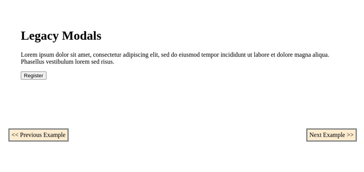
<h1>Legacy Modal</h1>
<div>
<p>
Lorem ipsum dolor sit amet, consectetur adipiscing elit, sed do eiusmod tempor incididunt ut labore et dolore magna aliqua. Phasellus vestibulum lorem sed risus.
</p>
<button class="open-modal">Register</button>
</div>
</main>
<div id="registration-modal" class="modal-overlay hide" role="dialog">
<div class="modal">
<h2 aria-label="Registration Modal">Registration</h2>
<p>Hello there, you can't focus outside my boundaries! :-)<p>
<form action="">
<div>
<input type="text" name="name" placeholder="Thunder Storm">
</div>
<div>
<input type="email" name="email" placeholder="example@mail.com">
</div>
<div>
<input type="password" name="password">
</div>
<div>
<legend>
Pet of choice:
</legend>
<label>
<input type="radio" value="cat" name="pet"> Cat
</label>
<label>
<input type="radio" value="dog" name="pet"> Dog
</label>
</div>
<div>
<label for="terms">
<input type="checkbox"> Agree to <a href="#terms">terms</a>
</label>
</div>
<div>
<button>Save</button>
<button type="button" class="close-modal">Discard</button>
</div>
</form>
</div>
</div>
<script src="/trap-focus.js"></script>
<script>
let modal = document.getElementById("registration-modal")
let closeModalButton = document.querySelector(".close-modal")
let openModalButton = document.querySelector(".open-modal")
function toggleModal() {
if(modal.classList.contains("hide")){
modal.classList.remove("hide")
initiateFocusLooping(modal)
document.addEventListener("keydown", listenToEscKeyDown, false)
} else {
modal.classList.add("hide")
endFocusLooping(modal)
document.removeEventListener("keydown", listenToEscKeyDown, false)
}
}
modal.addEventListener("keydown", throttleFocus, false)
openModalButton.addEventListener("click", toggleModal, false)
closeModalButton.addEventListener("click", toggleModal, false)
</script>
</body>
The toggleModal() function toggles the visibility of the modal by using classes and implements respective listeners to our modal component.
With the implementation above, we end up with the following modal component:
This focus strategy became known as focus trapping. As seen in the implementation above, we’ve performed all the required steps to place focus in an interactive space for all possible types of navigation until the intended task was accomplished within the space.
Problems with the focus trapping method
The focus trapping method faced a number of challenges; one major issue was dealing with web accessibility, especially on mobile devices.
The assistive technologies on these devices, like TalkBack and VoiceOver, provide assistance through double-tap and swipe events. At the time of writing, we don’t have a standard way to implement the logic for these events as we would otherwise with key-presses and clicks.
If we test the modal we implemented in the previous example with TalkBack on mobile, we end up with the following:
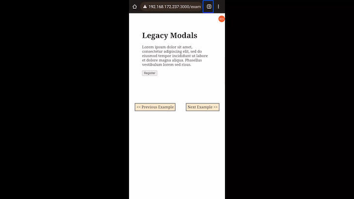
As we can observe in the demonstration above, the navigation focus goes beyond our trap to the underlying elements, which, in practice, are not supposed to be accessed while the modal is active.
To make this work, we could hide all the elements but the interactive element, the modal, from the assistive technologies.
We can do so by adding the aria-hidden property and setting it to true on all elements but the interactive component in focus. Doing so would inform screen readers that apart from our component, the other elements within the current document should be off limits:
<!-- ... page HTML ... -->
<script src="/trap-focus.js"></script>
<script>
  let modal = document.getElementById("registration-modal")
  let closeModalButton = document.querySelector(".close-modal")
  let openModalButton = document.querySelector(".open-modal")

  function toggleAriaHidden(allElements, exception, apply = true){
    for(const el of allElements){
      if(el.tagName !== "script" && el !== exception)
        if(apply){
          el.setAttribute("aria-hidden", "true")
        } else {
          el.removeAttribute("aria-hidden")
        }
    }
  }

  function toggleModal() {
    if(modal.classList.contains("hide")){
      modal.classList.remove("hide")
      initiateFocusLooping(modal)
      document.addEventListener("keydown", listenToEscKeyDown, false)
    } else {
      modal.classList.add("hide")
      endFocusLooping(modal)
      document.removeEventListener("keydown", listenToEscKeyDown, false)
    }
    toggleAriaHidden(document.querySelector("body").children, modal, false)
  }

  modal.addEventListener("keydown", throttleFocus, false)
  openModalButton.addEventListener("click", toggleModal, false)
  closeModalButton.addEventListener("click", toggleModal, false)
</script>
The toggleAriaHidden() function in the code above facilitates adding aria-hidden to all the elements that ought to be inaccessible:
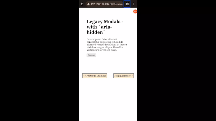
In the demonstration above, we can see that after having applied aria-hidden, the focus navigation does not leak into the underlying elements. However, the trouble with this fix is that in the presence of a large number of elements within a page, it becomes not only inefficient, but impractical.
To overcome that, we could leverage the aria-hidden characteristic, where all children elements under the container element where it’s applied are rendered inaccessible. However, this would require laying out the HTML documents so that elements higher up in the page’s hierarchy would be made inaccessible with aria-hidden while still maintaining the normal behavior within our pages.
In doing so, our interactive elements cannot be children of the elements that would be made inaccessible using aria-hidden. Therefore, we can reduce the number of manipulations that are applied to the DOM.
Another issue we face with focus trapping is in the case of modals. We need to add fixed positioned wrapping containers and overlays between the interactive components and the rest of the page. Otherwise, we can place these wrapping containers on top of the temporarily inaccessible parts of the page when the interactive components are in focus.
We need the wrappers to act as buffers or traps for all mouse events, which would otherwise end up in areas that should be inaccessible. You can see this implementation in practice by observing the .modal-overlay container in the previous example.
How inert acts as a focus guard
The inert attribute shifts the implementation of focus on interactive spaces from a trap to more of a guard like activity. By making the temporarily unneeded areas of a page inaccessible instead of trapping a user to specific areas, it leaves all focus related activities to the interactive spaces themselves.
Its implementation resembles what we see when using the JavaScript alert() function. When inert is added to an element, that part of the markup becomes frozen or guarded. Possible interactions like clicks and focus change attempts with both mice and keyboards become unavailable.
A developer’s work is made simple by implementing logic that’s centered on the interactive space rather than being mindful of the rest of the page’s markup and its behavior.
inert is also synonymous with accessibility, meaning, not only do the elements it’s applied to become inaccessible to visual interactions, but also to assistive technologies found in mobile devices.
In our example above, using inert would highly reduce the amount of code used to implement the modal.
When using the inert attribute, it’s good practice to implement a visual indication of the inert areas of the screen instead of the active ones. We need to implement this because the attribute itself does not handle it, as we would expect with elements like <dialog> and its ::backdrop pseudo-class. It’s important to make the inert areas obvious so that web app users are kept in the know of what is occurring on a webpage. Otherwise, they might be left frustrated.
We can style elements containing the inert attribute as follows:
[inert]{
  filter: grayscale(1);
  opacity: .2;
}
With inert, the previous example would look like the following:
<style>
  /* Remove .modal-overlay from styles, leaving .modal and .hide classes  */
</style>

<body>
  <main>
    <h1>Replacing Legacy Focus Trapping with `inert`</h1>
    <div>
      <p>
        Lorem ipsum dolor sit amet, consectetur adipiscing elit, sed do eiusmod tempor incididunt ut labore et dolore magna aliqua. Phasellus vestibulum lorem sed risus.
      </p>
      <button class="open-modal">Register</button>
    </div>
  </main>
  <!-- Removed modal overlay container -->
  <div class="modal hide">
    <h2>Registration</h2>
    <p>Hello there, you can't focus outside my boundaries! :-)<p>
    <form action="">
      <div>
        <input type="text" name="name" placeholder="Thunder Storm">
      </div>
      <div>
        <input type="email" name="email" placeholder="example@mail.com">
      </div>
      <div>
        <input type="password" name="password">
      </div>
      <div>
        <legend>
          Pet of choice:
        </legend>
        <label>
          <input type="radio" value="cat" name="pet"> Cat
        </label>
        <label>
          <input type="radio"  value="dog" name="pet"> Dog
        </label>
      </div>
      <div>
        <label for="terms">
          <input type="checkbox"> Agree to <a href="#terms">terms</a>
        </label>
      </div>
      <div>
        <button>Save</button>
        <button type="button" class="close-modal">Discard</button>
      </div>
    </form>
  </div>
  <script src="/trap-focus.js"></script>
  <script>
    let modal = document.querySelector("modal")
    let closeModalButton = document.querySelector(".close-modal")
    let openModalButton = document.querySelector(".open-modal")
    let otherPageElements = document.querySelector("main")

    // Remove toggleAriaHidden() function

    function toggleModal() {
      if(modal.classList.contains("hide")){
        modal.classList.remove("hide")
        initiateFocusLooping(modal)
        document.addEventListener("keydown", listenToEscKeyDown, false)
        otherPageElements.toggleAttribute("inert")
      } else {
        modal.classList.add("hide")
        endFocusLooping(modal)
        document.removeEventListener("keydown", listenToEscKeyDown, false)
        otherPageElements.toggleAttribute("inert")
      }
    }

    modal.addEventListener("keydown", throttleFocus, false)
    openModalButton.addEventListener("click", toggleModal, false)
    closeModalButton.addEventListener("click", toggleModal, false)
  </script>
</body>
Potential use cases for inert
inert can be useful when implementing a number of interactive space based components for websites and web apps. Let’s see a few examples of these components.
Custom confirm boxes
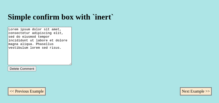
We could use inert to implement custom confirm boxes that adapt the schema of apps we build, doing away with the default browser specific custom boxes.
This type of implementation offers us not only the power to style our confirm boxes or modals, but also the ability to place any possible number of options, apart from the default two we get with JavaScript’s confirm().
Below is an example of a confirm box using inert:
<style>
  /* Custom styles */
</style>
<body>
  <main>
    <h1 tabindex="0">Simple confirm box with `inert`</h1>
    <div>
      <textarea name="" id="" cols="30" rows="10">Lorem ipsum dolor sit amet, consectetur adipiscing elit, sed do eiusmod tempor incididunt ut labore et dolore magna aliqua. Phasellus vestibulum lorem sed risus.</textarea>
    </div>
    <div>
      <button class="delete-prompt">Delete Comment</button>
    </div>
  </main>

  <div class="confirm hide" role="dialog">
    <p>Are you sure about deleting this text?<p>
    <button class="keep-text">Continue writing</button>
    <button class="delete-text">Yes</button>
  </div>
</body>
<script src="/js/trap-focus.js"></script>
<script>
  let confirmBox = document.querySelector(".confirm"),
    agreeBtn = document.querySelector(".delete-text"),
    disagreeBtn = document.querySelector(".keep-text"),
    deletionConfirmationBtn = document.querySelector(".delete-prompt"),
    mainElement = document.querySelector("main"),
    textArea = document.querySelector("textarea")

  deletionConfirmationBtn.addEventListener("click", toggleModal, false)
  disagreeBtn.addEventListener("click", toggleModal, false)
  agreeBtn.addEventListener("click", function(){
    toggleModal();
    textArea.innerText = ""
  }, false)

  function toggleModal() {
    mainElement.toggleAttribute("inert")
    if(confirmBox.classList.contains("hide")){
      confirmBox.classList.remove("hide")
      confirmBox.setAttribute("aria-modal", "true")
      initiateFocusLooping(confirmBox)
      document.addEventListener("keydown", listenToEscKeyDown, false)
    } else {
      confirmBox.classList.add("hide")
      confirmBox.removeAttribute("aria-modal")
      endFocusLooping(confirmBox)
      document.removeEventListener("keydown", listenToEscKeyDown, false)
    }
  }
</script>
Below is a demonstration of our confirm box in action:
Authentication forms
With modal components like prompts, important notifications, and obligatory authentication forms, it is appropriate to use inert. With inert, we can easily guide a user to the interactive element without worrying about accessibility; inert is also recognized and supported by assistive technologies.
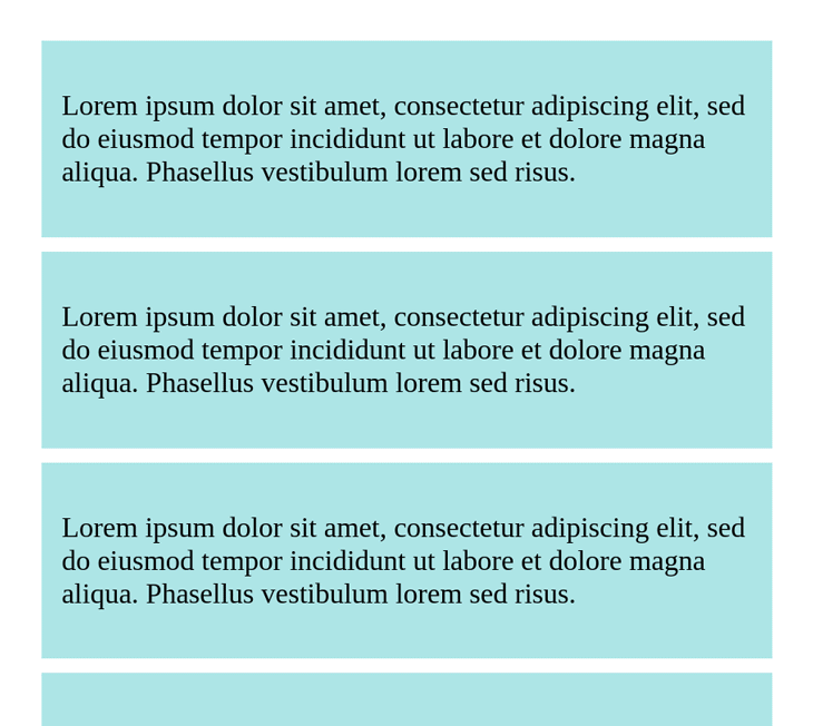
One of the popular trends in major social media web apps are conditional authentication forms. With these forms, a limit is set on the amount of feed that unauthenticated users can view. After a certain amount of content has been scrolled through, the unauthenticated visitors are prompted to sign up and sign in while being frozen from navigating on the active page.
Let’s see how we can implement such forms while using inert:
<style>
  /* [inert], main, form, .feed, .feed-item, main, .feed-item, .target-item, .authentication-form, .hide */
</style>
<body>
  <main>
    <div class="feed">
      <div class="feed-item">
        <p>
          Lorem ipsum dolor sit amet, consectetur adipiscing elit, sed do eiusmod tempor incididunt ut labore et dolore magna aliqua. Phasellus vestibulum lorem sed risus.
        </p>
      </div>
    </div>
  </main>
  <div class="authentication-form hide" role="dialog">
    <h2 aria-label="Authentication Form">Super Login</h2>
    <p>Hello there, to keep enjoying our feed, please sign in! :-)<p>
    <form action="">
      <input type="text" name="email" placeholder="email">
      <input type="password" name="password" placeholder="password">
      <div>
        <button class="close-modal">Sign In</button>
      </div>
    </form>
  </div>
</body>
<script src="/js/trap-focus.js">
</script>
<script>
  let loginModal = document.querySelector(".authentication-form"),
    feed = document.querySelector(".feed"),
    feedSample = document.querySelector(".feed-item"),
    targetElement, feedGuarded = false;

  // populate feed
  for(let i = 1; i < 20; i++){
    let newFeedNode = feedSample.cloneNode(true)
    newFeedNode.classList.add(i)
    if(i === 10) { // make the tenth post our target item
      newFeedNode.classList.add("target-item")
      targetElement = newFeedNode
    }
    feed.appendChild(newFeedNode)
  }

  function monitorFeed(){
    if(targetElement.getBoundingClientRect().top <= 100){
      guardFeed()
    }
  }
  document.addEventListener("scroll", monitorFeed, false)

  function guardFeed() {
    if(!feedGuarded){
      feed.toggleAttribute("inert")
      loginModal.classList.remove("hide")
      initiateFocusLooping(loginModal)
      feedGuarded = true
      // limit scrolling
      window.onscroll = function(){
        window.scrollTo(
          window.scrollY || document.documentElement.scrollTop,
          window.scrollX || document.documentElement.scrollLeft
        )
      }
      // stop scroll event listening
      document.removeEventListener("scroll", monitorFeed, false)
    }
  }
</script>
Below is the demonstration of the authentication form in action.
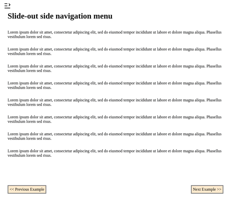
Slide-out navigation menu
With slide-out side navigation menus, we expect users’ attention to be on the navigation element, avoiding mouse clicks and keyboard navigation on the page behind it. In such a scenario, we can use inert to guide users.
Let’s see a working example:
<body>
  <input type="checkbox" class="nav-hum" id="nav-hum">
  <label for="nav-hum" tabindex="0"></label>

  <nav class="navigation" aria-label="Main">
    <h3>Slide-out Nav</h3>
    <ul>
      <li>
        <a class="side-nav" href="example-1.html">Example 1</a>
      </li>
      <!-- More links -->
      <li>
        <a class="side-nav" href="example-5.html">Example 7</a>
      </li>
    </ul>
  </nav>

  <main class="page-content">
    <h1>Slide-out side navigation menu</h1>
    <p tabindex="0">
      Lorem ipsum dolor sit amet, consectetur adipiscing elit, sed do eiusmod tempor incididunt ut labore et dolore magna aliqua. Phasellus vestibulum lorem sed risus.
    </p>

    <!-- more items -->
  </main>
</body>

<script>
  let navBtn = document.querySelector("#nav-hum")
  let pageContents = document.querySelector("main")

  navBtn.addEventListener("change", (el) => {
    pageContents.toggleAttribute("inert")
  })
</script>
Most of the logic that involves displaying and hiding the slide-out menu in this example is carried out inside the CSS stylesheets:
.page-content{
  position: absolute;
  left: 0;
  top: 0;
  right: 0;
  z-index: 1;
  margin: 0;
  display: flex;
  height: 100%;
  flex-direction: column;
  background-color: white;
}
.page-content > *{
  width: 100%;
}
nav.navigation{
  position: fixed;
  display: flex;
  flex-direction: column;
  justify-content: start;
  left: 0;
  right: 0;
  top: 0;
  bottom: 0;
  z-index: 0;
  margin: auto;
  padding: 1rem;
  padding-top: 1.5rem;
  background-color: bisque;
}
.navigation > ul{
  list-style: none;
}
.navigation > ul > li{
  margin-top: 1rem;
}
.nav-hum {
  position: absolute;
  clip: rect(0, 0, 0, 0);
}
label[for="nav-hum"] {
  position: fixed;
  top: 1rem;
  left: 1rem;
  z-index: 2;
  width: 30px;
  height: 30px;
  cursor: pointer;
  background-image: url("data:image/svg+xml;utf8,<svg xmlns='http://www.w3.org/2000/svg' viewBox='0 0 24 24' width='24' height='24'><path fill='none' d='M0 0H24V24H0z'/><path d='M21 18v2H3v-2h18zM17.404 3.904L22 8.5l-4.596 4.596-1.414-1.414L19.172 8.5 15.99 5.318l1.414-1.414zM12 11v2H3v-2h9zm0-7v2H3V4h9z'/></svg>");
  background-size: contain;
}
.nav-hum:checked + label {
  left: 215px;
  background-image: url("data:image/svg+xml;utf8,<svg xmlns='http://www.w3.org/2000/svg' viewBox='0 0 24 24' width='24' height='24'><path fill='none' d='M0 0H24V24H0z'/><path d='M21 18v2H3v-2h18zM6.596 3.904L8.01 5.318 4.828 8.5l3.182 3.182-1.414 1.414L2 8.5l4.596-4.596zM21 11v2h-9v-2h9zm0-7v2h-9V4h9z'/></svg>");
}
.nav-hum:checked ~ .page-content {
  box-shadow: inset -1px 0 3px 0px rgba(0,0,0,0.5);
  transform: translate(200px);
  overflow: hidden;
}
Placing the two together, we get the following output:
Browser compatibility
At the time of writing, the HTML inert feature has compatibility support for all the latest versions of major browsers, including mobile and desktop, except for Firefox. Feel free to check out the compatibility chart to learn more.
Using inert in incompatible browsers
It is good practice to think of the instances where new features might not be supported and work on making their support as broad as possible, especially when working on the web.
To make sure that our web apps don’t break or malfunction while using inert, as might be the case with incompatible browsers, we should use it’s polyfill.
Start by installing the npm module:
npm install --save wicg-inert
Import the polyfill into your project:
import "wicg-inert"
Add the script to the HTML page:
<html>
  ...
  <script src="/node_modules/wicg-inert/dist/inert.min.js"></script>
  </body>
</html>
For legacy browsers, you’ll have to include additional polyfills for Map, Set, Element.prototype.matches, and Node.prototype.contains. To avoid serving up unnecessary polyfills and remain in keeping with the W3C polyfill guideline, the inert polyfill does not bundle all these other polyfills.
Summary
In this article, we’ve learned about the inert HTML attribute, exploring how we can use it when implementing interactive space components, like modals, while managing user focus activities in a more guided manner than trapping.
We’ve seen practical examples of how to use inert and learned about its support in the current list of mainstream browsers. We’ve also reviewed some best practices while using inert, like adding visual indication of inert areas of the HTML page and adding its support for incompatible browsers.
For more information regarding the inert attribute, it’s inception, guidelines, and progress, you can check the following references:
The post Using HTML <code>inert</code> property to manage user focus appeared first on LogRocket Blog.
from LogRocket Blog https://ift.tt/HjmYzJw
Gain $200 in a week
via Read more


