


Mobile app developers use different strategies to notify users about both foreground and background app events. For foreground app event alerts, developers typically use flashbars, traditional alert boxes, toast messages, in-app notification systems, or some combination of these. Native, platform-dependent push notifications are often used for informing users about background app events.
A flashbar is a modern, animated GUI element that renders lightweight details about an app event. Flashbars typically appear in a corner of the screen (in most scenarios, they appear on the top or bottom corner) and disappear after a pre-defined timeout. From the UI/UX perspective, flashbars are suitable for most scenarios where we need to notify the user about the app events’ statuses. For example, you can display the specific action status after inserting a new record into a database.
React Native developers can use the popular react-native-flash-message library to display flashbars. In this article, I will explain how to build and customize flashbar components in React Native according to practical requirements.
Jump ahead:
- Highlighted features of
react-native-flash-message - Build a React Native flashbar
- Changing the flashbar type
- Using custom colors
- Applying custom styles to your flashbars
- Changing the flashbar position
- Attaching event handlers
- Customizing inbuilt animations and creating custom animations
- Embedding other components into flashbars
- Advanced flashbar configurations and features
react-native-flash-messagealternatives
Highlighted features of react-native-flash-message
The react-native-flash-message library lets you add Material Snackbar-like, low-priority alerting components, and allows you to create flashbars according to device orientation and status bar height, so it works well on devices with a notch (i.e., iPhone X).
I’ve highlighted some additional features below:
Cross-platform support
This library offers a JavaScript-based solution. In other words, it uses inbuilt React Native primitive components like View, Text, and Image without using custom native modules. So, you can expect a consistent flashbar look and feel across Android and iOS platforms. Also, this library offers a way to control operating-system-level UI elements, such as the status bar.
Customizability and extendability
This library offers various self-explanatory props to customize the flashbar colors, icons, styles, content, and transition animations. So, you can easily create a custom flashbar that matches your app theme in record time.
This package is also flexible enough to let you extend it for any advanced requirements, like creating your own flashbar component.
Adherence to UI/UX principles
You don’t need to set many props by yourself to create a flashbar for your app. The react-native-flash-message library lets you create a flashbar message with a message string by setting UX-friendly defaults. For example, this library renders a gray flashbar on top of the screen and hides it after about two seconds by default.
Build a React Native flashbar
We’ll create a new React Native app and add custom flashbars to understand the features of the react-native-flash-message library. If you need to add flashbars to your existing React Native app, you can also use the upcoming code examples without creating a new project.
Project setup and configuration
If you plan to create a new React Native project for this tutorial, create one with the official React Native CLI:
npx react-native init CustomFlashbars
cd CustomFlashbars
Once the above command completes, run the newly created project to make sure that everything works:
npx react-native run-android
# --- or ---
npx react-native run-ios
Next, install react-native-flash-message as follows:
npm install react-native-flash-message
# --- or ---
yarn add react-native-flash-message
Now, with a successful installation, we can start creating flashbars. Let’s show a basic flashbar first!
Creating a basic flashbar
Add the following code to your App.js to display a basic flashbar:
import React from 'react';
import {
  SafeAreaView,
  StyleSheet,
  View,
  Button,
} from 'react-native';
import FlashMessage, { showMessage } from 'react-native-flash-message';

function App() {
  function handlePress() {
    showMessage({
      message: 'Hello flashbars!'
    });
  }
  return (
    <SafeAreaView style={styles.container}>
      <Button
        title="Show alert"
        onPress={handlePress}/>
      <FlashMessage/>
    </SafeAreaView>
  );
}

const styles = StyleSheet.create({
  container: {
    flex: 1,
    justifyContent: 'center',
    padding: 12
  }
});

export default App;
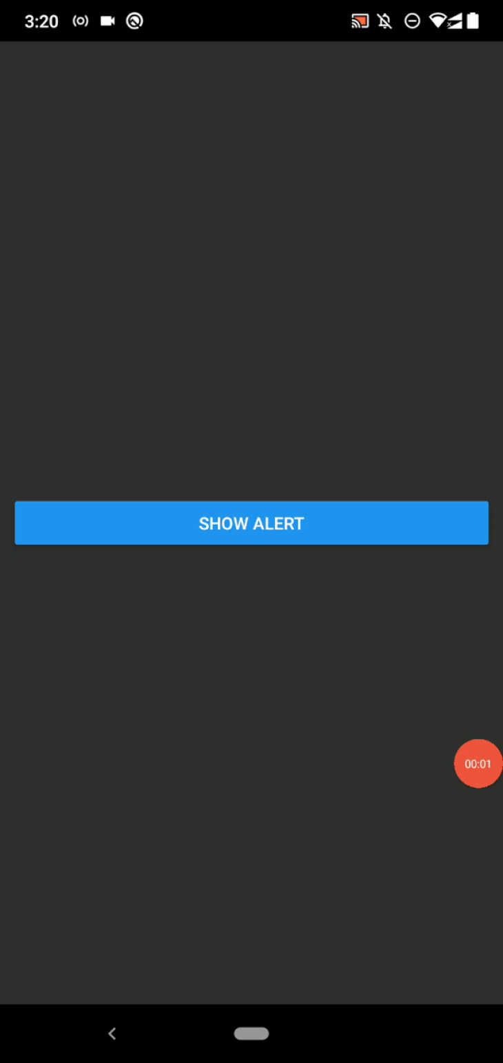
Here, we display a flashbar with the default configuration by sending only the message option. As shown in the above code, we need to add the FlashMessage component as a global component within the App component before using the showMessage function.
Once you add the global FlashMessage component, you can call the showMessage function from anywhere to show a flashbar message.
Run the above code and you should see a flashbar with a gray background, as shown in the following preview:
The flashbar will disappear after 1850 milliseconds by default, but you customize that time allotment via the duration option in the message object. For example, the following code hides the flashbar component after five seconds:
function handlePress() {
  showMessage({
    message: 'Hello flashbars!',
    duration: 5000
  });
}
You can use these message object options in the global FlashMessage component, too:
<FlashMessage duration={5000}/>
We typically show an alert title and description within UX-friendly boxes to create consistent, minimal, and flexible user interfaces. We can do the same with flashbar messages.
The following code snippet shows the flashbar title and description in the flashbar and renders a multi-line flashbar message:
function handlePress() {
  showMessage({
    message: 'react-native-flash-message',
    description: 'React Native flashbar and top notification alert utility' +
                  '\n' +
                  'Works on Android & iOS',
    duration: 2500
  });
}
As usual, you can use the newline character ( \n ) to create multi-line text for the flashbar message description. Once you run your app with the above code snippet, you will see a multi-line flashbar as follows:

The above FlashMessage component placement stays the same if your app renders multiple app screens with a library like react-navigation. Check this source file segment as a reference implementation.
If your app has only one app screen, the library documentation recommends avoiding global setup with React ref objects as follows:
import React, { useRef } from 'react';
import {
  SafeAreaView,
  StyleSheet,
  View,
  Button,
} from 'react-native';
import FlashMessage from 'react-native-flash-message';

function App() {
  const flashMessage = useRef();
  function handlePress() {
    flashMessage.current.showMessage({
      message: 'Hello flashbars!'
    });
  }
  return (
    <SafeAreaView style={styles.container}>
      <Button
        title="Show alert"
        onPress={handlePress}/>
      <FlashMessage ref={flashMessage}/>
    </SafeAreaView>
  );
}

const styles = StyleSheet.create({
  container: {
    flex: 1,
    justifyContent: 'center',
    padding: 12
  }
});

export default App;
The above code invokes the showMessage function via a ref object without importing the global function from the library. We’ll use the ref object-based approach in this tutorial, since our sample app has only one screen. But, you should use the first code snippet approach above if your app has multiple screens.
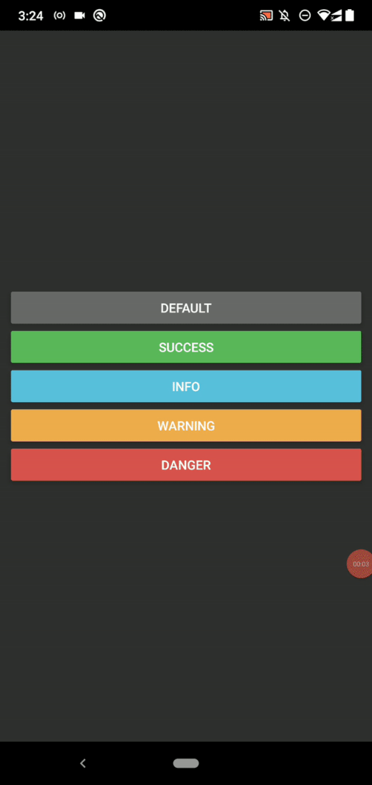
Changing the flashbar type
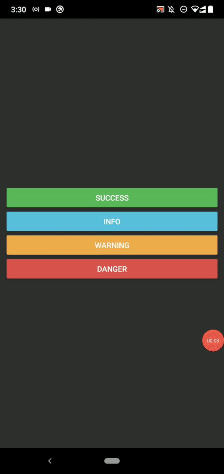
Earlier, we saw a gray flashbar message because we used a default configuration. This flashbar library offers you five pre-defined flashbar types, so you can choose one based on the flashbar message severity. Take a look at the following supported message types:
function Spacer() {
  return (
    <View style={styles.spacer}></View>
  );
}

function App() {
  const flashMessage = useRef();
  function handlePress(type) {
    flashMessage.current.showMessage({
      message: 'Type: ' + type,
      type
    });
  }
  return (
    <SafeAreaView style={styles.container}>
      <Button
        style={styles}
        title="Default"
        onPress={() => handlePress('default')}
        color="#696969"/>
      <Spacer/>
      <Button
        title="Success"
        onPress={() => handlePress('success')}
        color="#5cb85c"/>
      <Spacer/>
      <Button
        title="Info"
        onPress={() => handlePress('info')}
        color="#5bc0de"/>
      <Spacer/>
      <Button
        title="Warning"
        onPress={() => handlePress('warning')}
        color="#f0ad4e"/>
      <Spacer/>
      <Button
        title="Danger"
        onPress={() => handlePress('danger')}
        color="#d9534f"/>
      <FlashMessage ref={flashMessage}/>
    </SafeAreaView>
  );
}

const styles = StyleSheet.create({
  container: {
    flex: 1,
    justifyContent: 'center',
    padding: 12
  },
  spacer: {
    paddingBottom: 8
  }
});
Here, we created five buttons to show all of the pre-defined flashbar types that are supported. The handlePress function dynamically sets the message type. Add the above code to your App.js, then run it. You will see the following result:
Using custom colors
The type option sets the background color according to pre-defined types. For example, the default message type renders gray color for the background. These pre-defined color schemes are UX-friendly and solve almost all design requirements, but this library also lets you use custom colors for text and background.
For example, the following code snippet renders a flashbar with custom colors:
function App() {
  const flashMessage = useRef();
  function handlePress() {
    flashMessage.current.showMessage({
      message: 'Hello flashbars!',
      color: '#332222',
      backgroundColor: '#e09107'
    });
  }
  return (
    <SafeAreaView style={styles.container}>
      <Button
        title="Show alert"
        onPress={handlePress}
        color="#e09107"/>
      <FlashMessage ref={flashMessage}/>
    </SafeAreaView>
  );
}

const styles = StyleSheet.create({
  container: {
    flex: 1,
    justifyContent: 'center',
    padding: 12
  }
});
The above code snippet applies custom text and background colors with the color and backgroundColor options, respectively. You will see the following result when you run the app:
Applying custom styles to your flashbars
This library automatically applies suitable colors based on the flashbar message type while adhering to UI/UX principles. It also uses some text styles according to the given props, such as increasing the font weight of the message title if you create a multi-line flashbar with message and description options.
But in some scenarios, we need to make further customizations to accomplish our design needs. This library lets you change the message container, title, and description style definitions via the message object.
style: Changing the message container style
You can change the container style to use custom styling for the flashbar box, as shown in the following code snippet:
function App() {
  const flashMessage = useRef();
  function handlePress() {
    flashMessage.current.showMessage({
      message: 'Hello flashbars!',
      type: 'success',
      style: styles.flashMessage
    });
  }
  return (
    <SafeAreaView style={styles.container}>
      <Button
        title="Show alert"
        onPress={handlePress}/>
      <FlashMessage ref={flashMessage}/>
    </SafeAreaView>
  );
}

const styles = StyleSheet.create({
  container: {
    flex: 1,
    justifyContent: 'center',
    padding: 12,
  },
  flashMessage: {
    borderRadius: 12,
    opacity: 0.8,
    borderWidth: 2,
    borderColor: '#222',
    margin: 12
  }
});
The above code extends the inbuilt success message style and creates a custom flashbar with round edges. Look at the following preview:

Note: You can also set the floating message object option to true to make flashbar edges round. The above borderRadius prop was used for demonstration purposes.
titleStyle and textStyle: Changing text styles
You can use the titleStyle and textStyle options to pass custom styles for flashbar message titles and descriptions. For example, the following code snippet uses a bold font style for the title text and a small italic font style for the description text:
function App() {
  const flashMessage = useRef();
  function handlePress() {
    flashMessage.current.showMessage({
      message: 'Hello flashbars!',
      description: 'React Native flashbar and top notification alert utility',
      type: 'success',
      titleStyle: styles.flasdescriptionhTitle,
      textStyle: styles.flashText
    });
  }
  return (
    <SafeAreaView style={styles.container}>
      <Button
        title="Show alert"
        onPress={handlePress}/>
      <FlashMessage ref={flashMessage}/>
    </SafeAreaView>
  );
}

const styles = StyleSheet.create({
  container: {
    flex: 1,
    justifyContent: 'center',
    padding: 16,
  },
  flashTitle: {
    fontWeight: 'bold',
    fontSize: 18
  },
  flashText: {
    fontStyle: 'italic',
    fontSize: 15
  }
});
Run the above code. You will see custom text styles, as shown in the following preview:
Using inbuilt and custom icons
Most web developers often use icons with alert messages to improve user-friendliness. For example, if you use a suitable icon and color for an error popup, users know the particular popup’s severity without reading the entire text. Similarly, we can use icons in React Native flashbar messages for better user-friendliness.
By default, this library doesn’t show any icon with flashbars, but you can use one automatically based on the flashbar type as follows:
function Spacer() {
  return (
    <View style={styles.spacer}></View>
  );
}

function App() {
  const flashMessage = useRef();
  function handlePress(type) {
    flashMessage.current.showMessage({
      message: 'Type: ' + type,
      type,
      icon: 'auto'
    });
  }
  return (
    <SafeAreaView style={styles.container}>
      <Button
        title="Success"
        onPress={() => handlePress('success')}
        color="#5cb85c"/>
      <Spacer/>
      <Button
        title="Info"
        onPress={() => handlePress('info')}
        color="#5bc0de"/>
      <Spacer/>
      <Button
        title="Warning"
        onPress={() => handlePress('warning')}
        color="#f0ad4e"/>
      <Spacer/>
      <Button
        title="Danger"
        onPress={() => handlePress('danger')}
        color="#d9534f"/>
      <FlashMessage ref={flashMessage}/>
    </SafeAreaView>
  );
}

const styles = StyleSheet.create({
  container: {
    flex: 1,
    justifyContent: 'center',
    padding: 12
  },
  spacer: {
    paddingBottom: 8
  }
});
The above icon: 'auto' configuration asks the library to use a suitable icon based on the message type. Once you run the above code, you will see flashbar message icons as follows:
If you want more control over the inbuilt icon selection, you can manually set info, success, warning, and danger values for the icon option.
This library is so flexible, it’ll let you set any React component as the flashbar icon. Let’s add a vector icon with the react-native-vector-icons library.
Note: The following code requires an installation of the react-native-vector-icons library. Install it with the steps mentioned in the readme file of the library on GitHub.
Add the following code to your App.js file:
import Icon from 'react-native-vector-icons/FontAwesome';

function App() {
  const flashMessage = useRef();
  function handlePress() {
    flashMessage.current.showMessage({
      message: 'Hello flashbars!',
      description: 'React Native flashbar and top notification alert utility',
      type: 'warning',
      icon: () => <Icon
                    name="warning"
                    size={30}
                    color="#aa2020"
                    style=
                  />
    });
  }
  return (
    <SafeAreaView style={styles.container}>
      <Button
        title="Show alert"
        onPress={handlePress}
        color="#e09107"/>
      <FlashMessage ref={flashMessage}/>
    </SafeAreaView>
  );
}

const styles = StyleSheet.create({
  container: {
    flex: 1,
    justifyContent: 'center',
    padding: 12
  }
});
Here we use a warning sign vector icon from the Font Awesome icons pack. The above code will show a custom icon in the flashbar, as shown in the following preview:

Try to use a PNG icon with an Image component instance — you can use any JSX element in the icon callback.
Changing the flashbar position
Since we used the default position, all previous flashbars appeared on the top of the screen. We can change the flashbar position with the position option. The position option accepts top, right, bottom, and left string values.
Add the following option to the previous custom icon setup’s showMessage function:
position: 'bottom'
Once you open the flashbar, you will notice it on the bottom edge of the screen, the same as Android Toast or the default Snackbar setup.
Attaching event handlers
Flashbars are often used to display various alerts and in-app notifications. Alerts are typically short messages that don’t offer further interactivity, but if you use flashbars to display in-app notifications, you may need to direct the user to another app screen once the user presses a flashbar message. Or, you may need to show a detailed explanation about a particular flashbar-based error message when the user long-presses it.
In these scenarios, we need to attach event handlers to the flashbar. Look at the following code to understand all supported event callbacks:
function App() {
  const flashMessage = useRef();
  function handlePress() {
    flashMessage.current.showMessage({
      message: 'Hello flashbars!',
      description: 'React Native flashbar and top notification alert utility',
      type: 'info',
      position: 'bottom',
      hideOnPress: false,
      duration: 5000,
      onPress: () => console.log('event: onPress'),
      onLongPress: () => console.log('event: onLongPress'),
      onShow: () => console.log('event: onShow'),
      onHide: () => console.log('event: onHide'),
    });
  }
  return (
    <SafeAreaView style={styles.container}>
      <Button
        title="Show alert"
        onPress={handlePress}/>
      <FlashMessage ref={flashMessage}/>
    </SafeAreaView>
  );
}

const styles = StyleSheet.create({
  container: {
    flex: 1,
    justifyContent: 'center',
    padding: 12
  }
});
We set the hideOnPress prop to false and use a long duration to experiment with supported event handlers. Event handlers are executed on the following flashbar and user actions:
onPress: When the user presses the flashbaronLongPress: When the user long presses the flashbaronShow: When the flashbar appearsonHide: When the flashbar disappears
Run the code above. Tap or long-press the flashbar. You will see every event handler gets executed as follows:

Customizing inbuilt animations and creating custom animations
By default, the react-native-flash-message library plays a slide-in/slide-out transition animation when you display the flashbar on the top or bottom of the screen. Otherwise, it will play a fade-in/fade-out transition animation. If you don’t like transition animations, you can turn off transition animations as follows:
function handlePress() {
  flashMessage.current.showMessage({
    message: 'Hello flashbars!',
    animated: false,
    // -------
  });
}
You can further customize the inbuilt animation by changing the speed of the transition animation with the animationDuration option:
function handlePress() {
  flashMessage.current.showMessage({
    message: 'Hello flashbars!',
    animationDuration: 650,
    // -------
  });
}
This package lets you override the default transition animation with a custom animation as follows:
function handlePress() {
  flashMessage.current.showMessage({
    message: 'Hello flashbars!',
    animationDuration: 650,
    transitionConfig: (animValue, position) => {
      const opacity = animValue.interpolate({
        inputRange: [0, 1],
        outputRange: [0, 1]
      });
      const scaleY = animValue.interpolate({
        inputRange: [0, 1],
        outputRange: [0, 1]
      });
      return {
        opacity,
        transform: [{ scaleY }]
      };
    }
  });
}
The library uses the transitionConfig callback function to create animated styles for the flashbar container. The callback function sends two parameters:
Animated.Valuereference- Position of the flashbar
The callback function expects an animated styles object as the return value. Animated.Value goes from 0 to 1 when the flashbar appears, and goes from 1 to 0 when it disappears. So, it’s possible to animate the flashbar with any supported animation style prop within transitionConfig via the interpolate method.
For example, the above code snippet uses opacity and scaleY. Once you run the above code, you will see a custom transition animation, as shown in the following preview:

Try to make more custom animations for the sample flashbar with the React Native Animated .Value API.
Embedding other components into flashbars
Flashbars typically show a title and description with a suitable icon. In some scenarios, though, we need to embed other components into flashbars to improve UX and implement design requirements. For example, instead of letting users tap the flashbar to do a particular action, you can add a button for them to tap.
Look at the following sample code snippet:
function handlePress() {
  flashMessage.current.showMessage({
    message: 'Hello flashbars!',
    description: 'React Native flashbar and top notification alert utility',
    animationDuration: 550,
    position: 'bottom',
    renderAfterContent: () => (
      <View style=>
        <View style=>
          <Button title="Details" onPress={() => {}}/>
        </View>
      </View>
    )
  });
}
The above code snippet will embed a button element within the flashbar. Look at the following preview:

Similarly, you can use renderBeforeContent to embed a custom component before the flashbar content. The above code snippet uses an inline function for renderAfterContent with inline styles for demonstration purposes, but make sure to separate your components into functions and define component styles properly in stylesheets in your production apps.
Advanced flashbar configurations and features
We’ve discussed library features that you can use to create any custom flashbar according to your design requirements. You know how to add flashbars with custom colors, styles, animations, and embedded components. But the react-native-flash-message library offers even more options and features for advanced use cases.
Global access with the FlashMessageManager API
The FlashMessageManager utility class lets you manage flashbar instances. For example, the following code snippet disables all upcoming flashbars:
import { FlashMessageManager } from 'react-native-flash-message';
FlashMessageManager.setDisabled(true);
The following code snippet stores the current flashbar reference in ref:
const ref = FlashMessageManager.getCurrent();
Then, you can hide it programmatically:
ref.hideMessage();
Defining your own flashbar component with the MessageComponent prop
The inbuilt flashbar component lets you customize via props. If you can’t fulfill your design requirement with the existing, inbuilt options, you can implement and link your own flashbar component with the library via the MessageComponent prop.
Look at the following FlashMessage usage:
<SafeAreaView style={styles.container}>
  <Button
    title="Show alert"
    onPress={handlePress}/>
  <FlashMessage ref={flashMessage} MessageComponent=
    {({message}) => (
      <View style=>
        <Text style=>{message.message}</Text>
        <Text>{message.description}</Text>
      </View>
    )}
  />
</SafeAreaView>
The above code renders a minimal flashbar that supports the title and description only:
Similarly, you can make your own flashbar components based on your requirements. We override only the flashbar component — animations and global utility functions will work as expected, so you don’t need to re-implement them yourself. Linking a custom flashbar component is the only thing you need to do.
Check out all supported message object options and component props from the official library documentation. Library maintainers may add additional features based on feature requests on GitHub.
react-native-flash-message alternatives
Every popular React Native library typically has competitive alternatives. react-native-flash-message is a flexible and fully-featured library that you can use in any React Native app — and customizing react-native-flash-message-based flashbars is so easy.
But the following react-native-flash-message alternatives are also worth checking out because of their competitive features:
- react-native-toast-message: A lightweight, customizable, and modern toast messages
- react-native-simple-toast: Create native toast messages via ToastAndroid and Toast for iOS
- react-native-toast-notifications: A modern toast message library that lets you create stacked, customizable, and animated toast messages
Conclusion
In this tutorial, we learned how to create customized flashbars with the popular react-native-flash-message library. Some developers strive to make their apps look consistent among all supported operating systems with platform-agnostic GUI elements. Meanwhile, some developers tend to use platform-specific GUI elements. The react-native-flash-message library is a pure JavaScript package that lets you create consistent flashbars on all supported platforms.
We also briefly looked at alternatives like the react-native-simple-toast library, which renders platform-specific, native, flashbar-like toast messages. As compared to react-native-flash-message, though, react-native-simple-toast doesn’t support embedding JSX components because it’s a simple native toast library , not a fully-featured flashbar library.
The react-native-flash-message library supports embedding JSX components and offers extensive options/props for customization, and it offers more flexible features than other alternatives mentioned in this article.
So, overall, the react-native-flash-message library is a good library to add modern, customizable flashbars to your React Native apps. From the UI/UX perspective, the flashbar concept shows extended content than the traditional toast concept, so don’t hesitate to embed buttons or links into flashbars.
Flashbars typically display low-priority app events, so, for critical app events, a traditional alert box (a modal dialog) is suitable over the current app screen. Use flashbars to notify low-priority app events to users without blocking user interaction with the app screen. Check the Material Snackbar specification to learn more about the flashbar concept.
The post Build a custom flashbar in React Native appeared first on LogRocket Blog.
from LogRocket Blog https://ift.tt/0HehCY8
Gain $200 in a week
via Read more


