Overflow is one of the most infuriating issues you are likely to encounter as a frontend developer when building a website layout. Overflow occurs when the content within a web element doesn’t fit the constraints of its block formatting context and ends up spilling out:
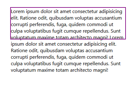
A parent element will expand to fit the content within it by default, unless fixed values are specified for its width and height. When a parent element’s width and height are specified with fixed values using pixels or any other fixed CSS values, an overflow is likely to occur when the content within the element increases.
For example, in the below code, as long as the container does not have a specified fixed width or height, the browser will fit the content within the container:
//HTML
<div class="container">
  <p class="content">
Lorem ipsum dolor sit amet...
  </p>
</div>

//CSS
.container{
  margin: auto;
  outline: solid purple 2px;
}
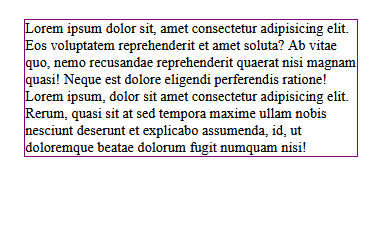
The CSS overflow property can be used to fix a broken layout caused by overflow issues that often occur when the content of a given element does not fit within the constraints of its parent element.
Rather than providing a general overview of CSS overflow, this guide will take a close look at each of the CSS overflow values and will demonstrate how they can be used to solve overflow problems that are often encountered when building website layouts.
Jump ahead:
- Prerequisites
- What are the CSS overflow property values?
- What are the overflow-x and overflow-y properties?
- What is the overflow-clip-margin property?
- What is the overflow-wrap property?
- Cross-browser compatibility
Prerequisites
To follow along with the examples and understand the terminologies used in the article, you’ll need to have a fundamental knowledge of CSS.
What are the CSS overflow property values?
The overflow property has a set of unique values it uses to fix overflow problems in CSS. These values are used to either hide or clip overflowing content using specific approaches.
These values include:
visiblehiddenclipscrollauto
overflow-x, overflow-y, overflow-clip-margin, and overflow-wrap are other properties that can be used to fix overflow problems in CSS, but in slightly different ways. We’ll learn more about these property later in this guide, but for now, let’s look at how the primary CSS overflow values work and how they’re used.
overflow-visible
overflow-visible is the default value of the overflow property, it doesn’t hide or clip the overflowing content of an element, instead, it leaves it as is.
Every element has this overflow value set by default. If you have an element with overflowing content, then the element’s overflow is visible.
Setting the visible value on the element is the same as not setting it at all; the overflow is visible regardless:
//HTML
<div class="container">
  <p class="content">
Lorem ipsum dolor sit amet...
  </p>
</div>

//CSS
.container{
  width: 370px;
  height: 100px;
  margin: auto;
  outline: solid purple 2px;
  overflow: visible;
}

overflow-hidden
overflow-hidden is used to hide the overflow of an element by clipping the content to fit the parent element’s box and making the overflowing content invisible. In this way, only the content that is within the boundaries of the parent’s borders is visible, as depicted in the below example:
<div class="container">
  <p class="content">
Lorem ipsum dolor sit amet...
  </p>
</div>

//CSS
.container{
  ...
  overflow: hidden;
}
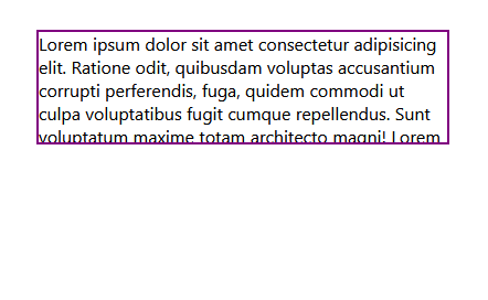
Here, the overflowing text of the paragraph element is hidden, but the text that is within the borders of the parent div element is still visible.
overflow-clip
At first glance, overflow-clip works similarly to the hidden value; it also clips the content to fit the parent’s box and hides the overflowing content.
One could argue that the clip value is redundant since the overflow property already has a value with the same use case. However, the clip value is actually very different from the hidden value.
The clip value does not only hide overflows, it also disables scrolling gestures on the containers to which it is applied. As a result, users are not able to use the mouse wheel to scroll the hidden content into view on such containers.
However, unlike the clip value, when the hidden value is applied to a container, content can be programmatically scrolled using JavaScript properties and methods such as scrollLeft and scrollTo().
In the below example, we see that overflow-clip does not permit us to scroll through the hidden content:
See the Pen
Overflow-clip by david omotayo (@david4473)
on CodePen.
Here, we see that the overflow-hidden property can be used with scrollLeft to allow us scroll through the hidden content:
See the Pen
Overflow-hidden by david omotayo (@david4473)
on CodePen.
As you can see, the scrollLeft property only works on the container with the overflow-hidden value.
overflow-scroll
overflow-scroll is also used to clip an element’s overflow, but, unlike hidden and clip, the scroll value adds a scrollbar to the container. Users can use the scrollbar to view the clipped content:
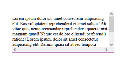
The scroll value may seem like an ideal solution for the overflow problem, but unfortunately, it has some issues.
When applied to a container, the scroll value displays a scrollbar on both the x-axis and y-axis of the container, regardless of whether there’s an overflow. The scroll value is best used with the overflow-x and overflow-y properties, as we’ll see later in this guide.
On another note, the browser tends to automatically add scrollbars to the viewport when an element floats beyond its parent’s boundaries, causing a layout shift.
This problem can be easily debugged by adding an outline to the HTML’s root element and highlighting every element in the markup. However, the problem can be much more extensive and may persist even after debugging.
Here’s a detailed tutorial on how to catch scroll-related bugs and suggestions for ways to fix them.
overflow-auto
overflow-auto is similar to the scroll value, except it only displays scrollbars when necessary, not by default. But, if the content of the container increases and overflows its boundaries, the auto value will cause a scrollbar to be automatically displayed on the axis on which the content is overflowing, instead of displaying it on both axes:
See the Pen
Overflow-auto by david omotayo (@david4473)
on CodePen.
If we try to decrease the width of the container element or add more content to the paragraph in the above CodePen example, a scrollbar will automatically be displayed on the container’s right border.
What are the overflow-x and overflow-y properties?
The overflow-x and overflow-y CSS properties are used to set overflow behaviors on the x-axis and y-axis of a container element.
These properties are much like the overflow property itself. The only difference is that their values are only applied to the horizontal or vertical borders of the container, as opposed to being applied to both axes at the same time.
In the example below, overflow-scroll has been applied to the container; as a result, scrollbars are displayed on both the x-axis and the y-axis:
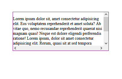
We can control where the scrollbar appears on the container by appending -x or -y to the overflow property (note that we are using the scroll value) to display it on either the x-axis or y-axis, respectively:
<div class="container">
  <p class="content">
Lorem ipsum dolor sit amet...
  </p>
</div>

//CSS
.container{
  ...
  Overflow-y: scroll;
  Or
  Overflow-x: scroll;
}
In the below example, we use overflow-y to display the scrollbar on the vertical axis:
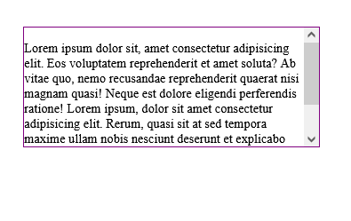
In this example, we use overflow-x to display the scrollbar on the horizontal axis:
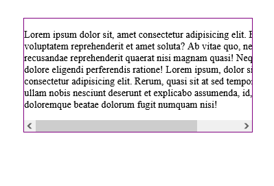
The purpose of values such as scroll, is not just to display the scrollbars, but rather to control how they are displayed.
N.B., if content is overflowing from both axes, (i.e., from the container’s right and bottom borders), scrollbars will be displayed on both axes regardless of the overflow property used
What is the overflow-clip-margin property?
overflow-clip-margin is a relatively new CSS property. It is used to control how the overflow-clip value snips the overflow of an element. This property determines how far the content of an element can overflow before it gets clipped:
   /*overflow-visible*/
  .container{
      width: 370px;
      height: 100px;
      margin-right: 90px;
      outline: solid purple 2px;
    }

     /*overflow-clip*/
    .container:nth-child(2){
      overflow: clip;
    }

    /*overflow-clip-margin*/
    .container:nth-child(3){
      overflow: clip;
      overflow-clip-margin: 45px;
    }
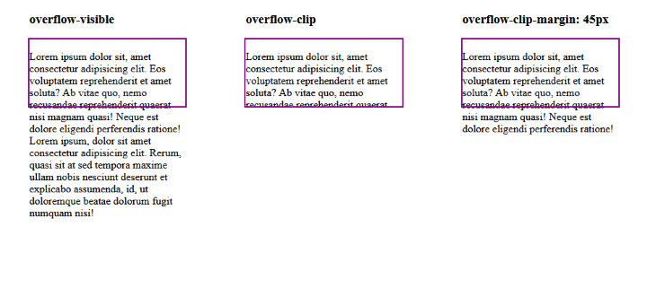
Notice how we added an overflow-clip value to the container, alongside the overflow-clip-margin. This is because it is required for the overflow-clip-margin property to work.
If the container does not have an overflow-clip value, CSS will ignore the overflow-clip-margin property. This is why the overflow-clip-margin property is only applied to the axis that is being clipped on the container. For example, if the clip value is applied to the container’s x-axis using the overflow-x property, the overflow-clip-margin will only be applied to the x-axis.
overflow-clip-margin does not have dedicated values like the overflow property. Instead, it accepts positive number values to specify how far the overflow will extend from the container. It does, however, have global values like every other CSS property:
inheritinitialrevertunset
What is the overflow-wrap property?
overflow-wrap is a CSS property that is used to break a long line of text if it overflows the boundaries of a targeted container element. But, unlike the overflow property, overflow-wrap can only be applied on inline elements, such as the paragraph and heading elements.
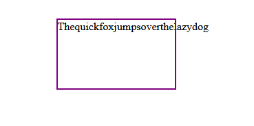
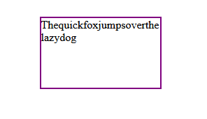
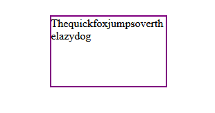
This property tells the browser that it can break a line of text into multiple lines if it overflows the container. Similarly to the overflow property, overflow-wrap also has a set of values that it uses to break texts:
normal: This is the default value of theoverflow-wrapproperty, it will not break text when it overflows its container; instead the text will break at normal word break pointsbreak-word: This value will break a long line of text into multiple lines from acceptable break points if the text overflows the containeranywhere: This value is similar to thebreak-wordvalue; however,anywhereallows long lines of text to be broken at an arbitrary point (even in the middle of a word) if it can’t be broken at an otherwise acceptable point
Here’s an example showing overflow-wrap with its the normal default value:
This example shows overflow-wrap with the break-word value:
Here is the same overflow-wrap example, but with the anywhere value:
Cross-browser compatibility
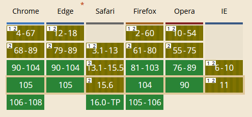
At the time of writing, the overflow and overflow-wrap properties and their values have hit full browser support, meaning that they are very well supported across modern browsers.
The overflow-clip-margin property, on the other hand, is indicated to only work with the Chrome, Edge, and Opera browsers, but I’ve used it with Firefox and have found that it works just fine.
You can try the property on your browser of choice and let us know if it works for you in the below comments.
Here’s a summary of browser support for the overflow property:
Here’s a summary of browser support for the overflow-wrap property:
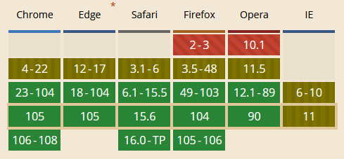
Here’s a summary of browser support for the overflow-clip-margin property:
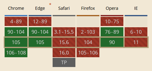
Conclusion
In this guide, we introduced the CSS overflow property, investigated its values, and considered how to use them to solve the overflow problem. We also looked at the overflow-x, overflow-y, overflow-clip-margin, and overflow-wrap properties and examined how they differ from the overflow property.
The post A new guide to CSS overflow appeared first on LogRocket Blog.
from LogRocket Blog https://ift.tt/obkrKIP
Gain $200 in a week
via Read more


