


Most of the time when developing, you might find yourself populating the ListView with some kind of predefined format. Instead of creating this layout by yourself using Rows, Columns, and Containers, you can use the ready-made widget in Flutter called the ListTile widget to help.
In this tutorial, I will show you how to add a ListTile widget in a Flutter app by walking through some practical examples.
Here’s what we’ll cover today:
- What is ListTile?
- ListTile variations
- Managing ListTile theme
- Adding a divider
- Adding swipe-to-dismiss behavior
- Changing ListTile height
- Customization
What is ListTile?
The ListTile widget in Flutter is a UI element that displays related information.
It follows the List specification from Material Design. A typical ListTile is divided into three sections; Start, Center, and End. The Start section contains the leading widget; the Center section includes the title and subtitle; and the End section contains the trailing widget.
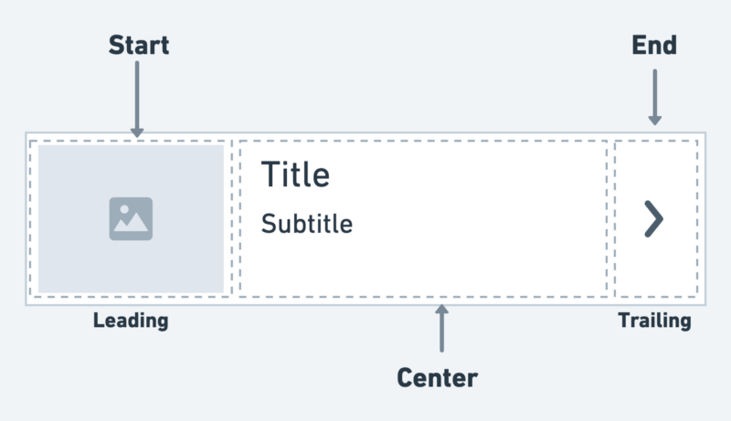
It is mainly used to populate the scrollable views such as ListView, Column, and Row. For example, you can use the ListTile to show a list of to-do items, emails, navigation options, and more. You can also receive the click event by tapping the ListTile.
If you’re a visual learner, check out this quick video tutorial:
Adding ListTile
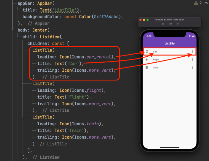
Here is the minimal code to display ListTile inside the ListView widget:
ListView(
  children: const [
    ListTile(
      leading: Icon(Icons.car_rental),
      title: Text('Car'),
      trailing: Icon(Icons.more_vert),
    ),
    ListTile(
      leading: Icon(Icons.flight),
      title: Text('Flight'),
      trailing: Icon(Icons.more_vert),
    ),
    ListTile(
      leading: Icon(Icons.train),
      title: Text('Train'),
      trailing: Icon(Icons.more_vert),
    )
  ],
)
Here’s how the code is translated into design:
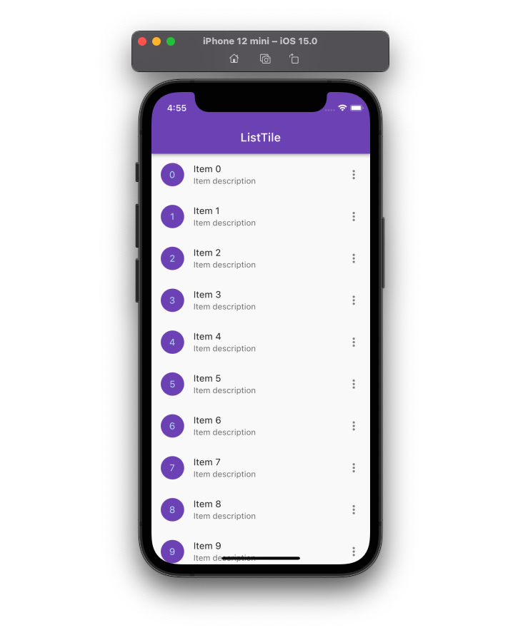
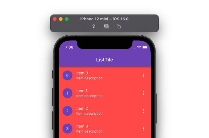
When you want to use the ListTile to populate the long list that might come from your backend, you can wrap the single ListTile widget inside the ListView.Builder and show the data inside the ListTile, as shown in the following code:
final List<String> items = List<String>.generate(10000, (i) => '$i');
ListView.builder(
  itemCount: items.length,
  itemBuilder: (context, index) {
    return ListTile(
      leading: CircleAvatar(
        backgroundColor: const Color(0xff764abc),
        child: Text(items[index]),
      ),
      title: Text('Item ${items[index]}'),
      subtitle: Text('Item description'),
      trailing: Icon(Icons.more_vert),
    );
  },
)
Output:
ListTile variations
There are also other types of ListTile which exist that allow you to perform a specific action on it.
These are:
- CheckboxListTile
- RadioListTile
- SwitchListTile
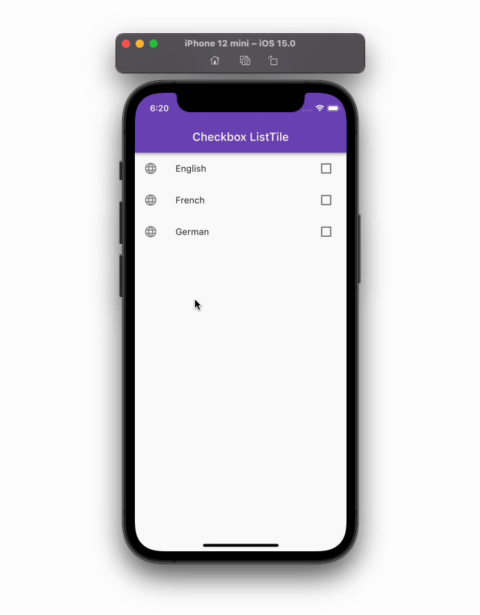
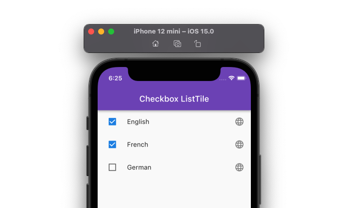
CheckboxListTile
The CheckboxListTile widget is a combination of ListTile and Checkbox widgets.
You can use this widget to mark any item as complete — for example; to-do items. By default, the checkbox is displayed on the right side of the ListTile (for left-to-right language).
Here’s how you can add the CheckboxListTile widget:
class Language {
  String name;
  bool isChecked;
  Language(this.name, {this.isChecked = false});
}
// 1.
final List<Language> languages = [Language('English'), Language('French'), Language('German')];
ListView.builder(
  itemCount: languages.length,
  itemBuilder: (context, index) {
    return CheckboxListTile(
      // 2.
      title: Text('${languages[index].name}'),
      // 3.
      value: languages[index].isChecked,
      // 4.
      onChanged: (bool? value) {
        setState(() {
          languages[index].isChecked = value!;
        });
      },
      // 5.
      secondary: const Icon(Icons.language),
    );
  },
)
Explanation of numbers in code block:
- A variable that holds a list of languages
- This shows the checkbox label
- This determines whether to check or uncheck the item
- This is called when you tap on the ListTile
- This acts as a leading icon
Output:
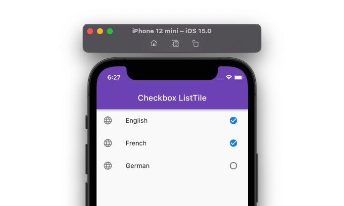
To swap the secondary (leading) widget and checkbox, you can use the controlAffinity property and set it to ListTileControlAffinity.leading.
You can also change the shape of the checkbox by adding the checkboxShape parameter and setting it to RoundedRectangleBorder(borderRadius: BorderRadius.circular(20)).
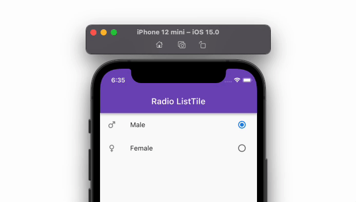
RadioListTile
The RadioListTile widget is a combination of ListTile and RadioButton widgets — this widget is used to select a single option from a list of items.
Here’s how you can add the RadioListTile widget:
// 1.
enum Gender { male, female }
// 2.
Gender? _gender = Gender.male;
ListView(
  children: [
    // 3.
    RadioListTile<Gender>(
      secondary: Icon(Icons.male),
      controlAffinity: ListTileControlAffinity.trailing,
      title: const Text('Male'),
      // 4.
      value: Gender.male,
      // 5.
      groupValue: _gender,
      // 6.
      onChanged: (Gender? value) {
        setState(() {
          _gender = value;
        });
      },
    ),
    RadioListTile<Gender>(
      secondary: Icon(Icons.female),
      controlAffinity: ListTileControlAffinity.trailing,
      title: const Text('Female'),
      value: Gender.female,
      groupValue: _gender,
      onChanged: (Gender? value) {
        setState(() {
          _gender = value;
        });
      },
    ),
  ],
)
Explanation of numbers in code block:
- An enum that holds all selection values for RadioListTile
- This saves default selection using enum
- Adding RadioListTile of type enum
- Assigning selection value to the current list tile. The ListTile represents this value
- This is used to display the currently selected value
- This gets called with the selection when you toggle the radio button
Output:
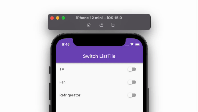
SwitchListTile
The SwitchListTile widget is a combination of the ListTile and Switch widgets.
You can use this widget to build the UI interaction that allows users to switch on or off app settings.
Here’s how you can add the SwitchListTile widget:
class Appliance {
  String name;
  bool isOn;
  Appliance(this.name, {this.isOn = false});
}
// 1.
final List<Appliance> appliances = [
  Appliance('TV'),
  Appliance('Fan'),
  Appliance('Refrigerator'),
];
ListView.builder(
  itemCount: appliances.length,
  itemBuilder: (context, index) {
    return SwitchListTile(
      // 2.
      title: Text('${appliances[index].name}'),
      // 3.
      value: appliances[index].isOn,
      // 4.
      onChanged: (bool value) {
        setState(() {
          appliances[index].isOn = value;
        });
      },
    );
  },
)
Explanation of numbers in code block:
- A variable that holds a list of appliances
- This shows the name or title of the ListTile
- This determines whether to turn the switch on or off
- This is called when you toggle the switch
Output:
Managing ListTile theme
The theme is an essential aspect of developing a front-end app. The theme conveys your brand, and — if not managed carefully — you may be wasting a lot of your time making all the UI elements follow the same rule.
Let’s say you want to change the look and feel of the ListTile to match your design. You really have the following two options:
- Changing theme at the widget level
- Changing theme at the app level
Changing theme at the widget level
You can change the ListTile’s appearance by directly modifying its properties such as color, shape, and size.
Here’s how you can change the ListTile’s background color, text color, and icon color:
return ListTile(
  // 1.
  tileColor: Colors.redAccent,
  // 2.
  textColor: Colors.white,
  // 3.
  iconColor: Colors.white,
);
Explanation of numbers in code block:
- This changes the background color of the ListTile
- This changes the color of all the text that appears on ListTile
- This changes the color of all the icons that appear on ListTile
Changing theme at the app level
You would probably want to change the visual aesthetic of the ListTile widget across all app pages. You can do so by defining the listTileTheme and then adding the ListTileThemeData widget.
Inside the ListTileThemeData widget, you can specify all the properties that you would like to change for all the ListTile widgets in your project.
Here is the code example:
return MaterialApp(
  title: 'Flutter Demo',
  debugShowCheckedModeBanner: false,
  theme: ThemeData(
    primarySwatch: Colors.blue,
    listTileTheme: ListTileThemeData(
      tileColor: Colors.redAccent,
      textColor: Colors.white,
      iconColor: Colors.white,
    ),
  ),
  home: MyHomePage(),
);
Both the first and second approach produce the same result as in the following:
Adding a divider
Adding a divider helps you clearly distinguish between the items, especially when items are displayed with three lines in the center section.
To add the divider between ListTile items, add the ListView widget. Inside ListView, add the ListTile.divideTiles with the tiles property and a list of ListTiles.
Code Example:
ListView(
  children: ListTile.divideTiles(context: context, tiles: [
    ListTile(
      leading: Icon(Icons.car_rental),
      title: Text('Car'),
    ),
    ListTile(
      leading: Icon(Icons.flight),
      title: Text('Flight'),
    ),
    ListTile(
      leading: Icon(Icons.train),
      title: Text('Train'),
    ),
  ]).toList(),
)
Output:
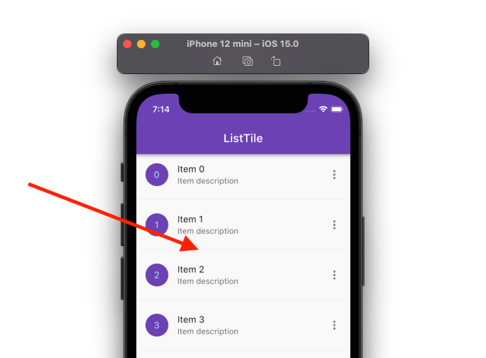
If you are using ListView.Builder, you can replace it with the ListView.separated and add the separatorBuilder parameter that returns the divider.
Code example:
ListView.separated( // <-- SEE HERE
  itemCount: items.length,
  itemBuilder: (context, index) {
    return ListTile(
      leading: CircleAvatar(
        backgroundColor: const Color(0xff764abc),
        child: Text(items[index]),
      ),
      title: Text('Item ${items[index]}'),
      subtitle: Text('Item description'),
      trailing: Icon(Icons.more_vert),
    );
  },
  separatorBuilder: (context, index) { // <-- SEE HERE
    return Divider();
  },
)
Output:
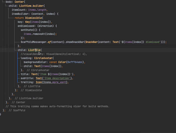
Adding swipe-to-dismiss behavior
The swipe-to-dismiss feature allows you to remove a particular ListTile from the list using a swipe gesture. For example, you could you this feature to remove an email from your list.
Here are the steps:
- Wrap your
ListTilewidget inside the Dismissible widget - Inside the Dismissible widget, add the
onDismissedparameter and register a callback. Here you can write the logic to remove the item from the list.
ListView.builder(
  itemCount: items.length,
  itemBuilder: (context, index) {
    return Dismissible( // Step 1
      key: Key(items[index]),
      onDismissed: (direction) { // Step 2
        setState(() {
          items.removeAt(index);
        });
        ScaffoldMessenger.of(context).showSnackBar(SnackBar(content: Text('${items[index]} dismissed')));
      },
      child: ListTile(
        //visualDensity: VisualDensity(vertical: 4),
        leading: CircleAvatar(
          backgroundColor: const Color(0xff764abc),
          child: Text(items[index]),
        ),
        title: Text('Item ${items[index]}'),
        subtitle: Text('Item description'),
        trailing: Icon(Icons.more_vert),
      ),
    );
  },
)
)
(Note: The above code only removes the ListTile from the UI, and you’ll have to write the business logic yourself to remove the item from your database)
Output:
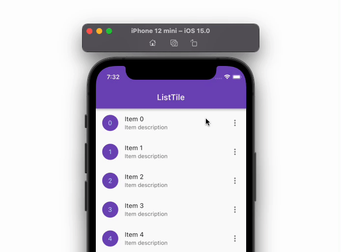
Changing ListTile height
Sometimes you might want to adjust the ListTile height up to some extent. The ListTile widget does not support the height property directly because its dimensions are constrained as per the Material design specification. So, in order to increase or decrease the ListTile height, you can use the visualDensityproperty.
Setting the visualDensity to a positive number will increase the ListTile height, whereas a negative number will decrease the height.
(Note: The maximum and minimum values you can set it to are 4 and -4)
Here is the code example:
ListTile(
  visualDensity: VisualDensity(vertical: 4), //<-- SEE HERE
  leading: CircleAvatar(
    backgroundColor: const Color(0xff764abc),
    child: Text(items[index]),
  ),
  title: Text('Item ${items[index]}'),
  subtitle: Text('Item description'),
  trailing: Icon(Icons.more_vert),
);
Output:
Customization
You can add various customizations to the ListTile by utilizing the available properties. For example, you can change its color (on different states such as hover, pressed, etc.), shape, add space between the title and other elements, and change its height, etc.
You can see all properties it supports by navigating to its definition. To see all properties, simply right-click and then Go to>Delcation or Usages.
Conclusion
Adding the ListTile widget helps you boost the app development speed. It follows the material specification and covers everything you need to present an item meaningfully.
In this tutorial, we first looked at how to add the ListTile, its types, and how to manage the theme, and covered some scenarios such as adding a divider and a swipe-to-dismiss feature and changing ListTile height, all of which I hope you will find helpful in building your next list.
The post How to add ListTile in Flutter: A tutorial with examples appeared first on LogRocket Blog.
from LogRocket Blog https://ift.tt/GaVW4PN
Gain $200 in a week
via Read more


