


Layouts can be described as containers that house the View objects — such as buttons, text fields, images, and more — that we see on an app UI. They define how views are arranged and displayed on an app UI.
Jetpack Compose, Android’s modern UI toolkit, provides some common layout types for developers to use. However, you can also use Jetpack Compose to create customized layouts based on your needs.
Let’s learn more about custom layouts for Android apps and how to create them using Jsatisetpack Compose. In this article:
- Why you should know how to create custom layouts
- Overview of layouts in Jetpack Compose
- Steps to build a custom layout in Jetpack Compose
Why you should know how to create custom layouts
Jetpack Compose offers many developer tools for building faster Android apps, including various layout options. Sometimes you can implement the design requirements for an app’s UI using these existing layouts in Jetpack Compose.
However, these existing layouts do not always satisfy project design requirements. In such cases, you should know how to create a custom layout to fit your project’s exact requirements.
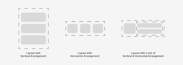
Overview of layouts in Jetpack Compose
Some common layouts in Jetpack Compose are:
Box: a layout that places its views on top of anotherColumn: a layout that places its views in a vertical sequenceRow: a layout that places its views in a horizontal sequenceConstraintLayout: a layout that places its views relative to others
Recently, LazyVerticalGrid and LazyHorizontalGrid, which were grid layouts under testing, were fully released.
Along with this update came an exciting new layout called LazyLayout. This is a layout that only composes and lays out currently needed items — in other words, items that can be visible on a device screen at a point in time.
You can use lazy layouts to build efficient scrollable layouts. LazyLayout variations include:
LazyList, which displays scrollable lists in:- A vertical sequence (
LazyColumn), or - A horizontal sequence (
LazyRow)
- A vertical sequence (
LazyGrid, which displays scrollable grids in:- Rows of a grid (
LazyVerticalGrid), or - Columns of a grid (
LazyHorizontalGrid)
- Rows of a grid (
I know you have seen the word “lazy” a lot, and no, it does not mean these layouts are unwilling to perform their functions (like some of us  ). Instead, it simply means a lazy layout will perform its function only when necessary. In other words, it is really efficient.
This efficiency is why lazy layouts are used for layouts that intend on displaying large number of views, allowing them to be easily organized and scrollable in the form of lists and grids.
Steps to build a custom layout in Jetpack Compose
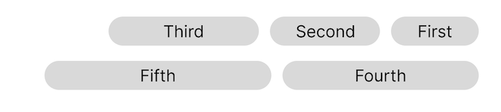
For you to effectively understand the process of building your own layout, I will use a simple example. We will build a layout I like to call a ReverseFlowRow.
This layout simply places its views next to each other, moving on to the next line when the current line is filled up. However, it starts arranging its views from the end position to the start position of the screen — in other words, from right to left:
Such a layout is what I feel should be used for Jetpack Compose’s AlertDialog buttons to satisfy Material Design guidelines.
Currently, a similar layout is being used, but it goes from the start position to the end position of the screen, which does not satisfy those guidelines. You can find the issue I filed on it with IssueTracker.
The theory behind Jetpack Compose layouts for Android apps
To display views on the screen, Jetpack Compose composes the UI tree of nodes (which represent views), lays out each view in the UI tree, and draws each of them to the screen.
For the purposes of this article, we are only interested in the laying out of views, since we can handle creating a custom layout during this process. The process of laying out the views within a layout happens in three steps:
- Measuring all views in the layout (i.e. the children)
- Deciding what size the layout should be
- Placing the children within the boundaries of the layout
Using the Layout composable
In Jetpack Compose, laying out views can be achieved using the Layout composable, which is defined as:
@Composable inline fun Layout(
    content: @Composable @UiComposable () -> Unit,
    modifier: Modifier = Modifier,
    measurePolicy: MeasurePolicy
)
The content parameter specifies the view or views (referred to as Composables) you want to be in this layout. The modifier parameter is used to define some modifications to the layout, which can be passed from the parent view or composable.
The most important part of the code above is MeasurePolicy, which defines the measurement of child views, the size of the layout, and the placing of the child views in the layout.
So our ReverseFlowRow will start off as this:
@Composable
fun ReverseFlowRow(
    content: @Composable () -> Unit
) = Layout(content) { measurables, constraints ->
    // measuring children, layout sizing, and placing children takes place here.
}
You may notice we represented MeasurePolicy as a lambda. This is possible because MeasurePolicy is a functional interface.
Also in the code above, measurables is the list of children that need to be measured, while constraints is the layout boundaries from the parent.
Measuring all views in the custom layout
We measure each child with constraints by calling measure(constraints) on each of them. This returns a Placeable, which corresponds to a child layout that can be positioned by its parent layout.
val placeables = measurables.map { measurable ->
    // Measure each child.
    measurable.measure(constraints)
}
Note that we used the parent’s constraints when measuring each child. This allows each child to be able to the entire space in the parent if possible.
Adding size constraints to the custom layout
Next, we define the size of the layout by calling the layout() method and specifying at least its width and height.
layout(constraints.maxWidth, constraints.maxHeight) {
   // Placement of children occurs here.
}
Here we used the maximum width and height of the parent’s constraint. Therefore, depending on the parent constraints, this layout may or may not take up the entire screen.
Placing views within the layout
Finally, we place the measured children, also called Placeable elements, in the layout by calling the placeRelative() method.
This method should be used if you want to automatically mirror your layout when the device’s layout direction changes — in other words, from left-to-right to right-to-left and vice versa.
Note that you can get the current LayoutDirection within the layout() receiver. This can be useful if you do not want to automatically mirror your layout when a layout direction changes, but rather, decide how you want to place your views in each layout direction.
If you do not want your layout to be automatically mirrored based on layout direction, use the place() method instead.
// Track the x and y co-ordinates we have placed children up to.
var yPosition = 0
var xPosition = constraints.maxWidth

// Place children in the parent layout.
placeables.forEach { placeable ->
    if (placeable.width < xPosition) {
        // There is still enough space in the current row to add the next child.
        xPosition -= placeable.width
    } else {
        // Space left in the current row is not enough for the child.
        // Move to the next row.
        yPosition += placeable.height
        xPosition = constraints.maxWidth - placeable.width
    }
    // Position child on the screen.
    placeable.placeRelative(xPosition, yPosition)
}
As you can see, we need to keep track of the x and y coordinates used to indicate where a placement should start for each child. This will enable us to place one child next to another as well as know when to move on to the next line or row.
Final Jetpack Compose project code for custom Android app layout
Our complete layout will look like this:
@Composable
fun ReverseFlowRow(
    mainAxisSpacing: Dp,
    crossAxisSpacing: Dp,
    content: @Composable () -> Unit
) = Layout(content) { measurables, constraints ->
    // 1. The measuring phase.
    val placeables = measurables.map { measurable ->
        measurable.measure(constraints)
    }

    // 2. The sizing phase.
    layout(constraints.maxWidth, constraints.maxHeight) {
        // 3. The placement phase.
        var yPosition = 0
        var xPosition = constraints.maxWidth

        placeables.forEach { placeable ->
            if (placeable.width < (xPosition + mainAxisSpacing.roundToPx())) {
                xPosition -= (placeable.width + mainAxisSpacing.roundToPx())
            } else {
                yPosition += (placeable.height + crossAxisSpacing.roundToPx())
                xPosition = constraints.maxWidth - placeable.width - mainAxisSpacing.roundToPx()
            }
            placeable.placeRelative(xPosition, yPosition)
        }
    }
}
Did you notice I added two new properties: mainAxisSpacing and crossAxisSpacing? These are used to add spacing between each child in the layout in the horizontal and vertical directions, respectively.
Testing our custom layout
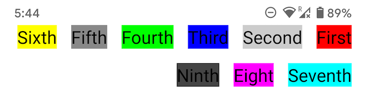
To preview our layout, we can wrap it within a composable function that is annotated with @Preview. This enables us to run a sample of the layout without the extra configuration required for an Android application. Also, let’s add some text views/composables within our layout to see how it displays them:
@Preview
@Composable
fun ReverseFlowRowPreview() {
    ReverseFlowRow(mainAxisSpacing = 16.dp, crossAxisSpacing = 16.dp) {
        Text("First", fontSize = 20.sp, style = TextStyle(background = Color.Red))
        Text("Second", fontSize = 20.sp, style = TextStyle(background = Color.LightGray))
        Text("Third", fontSize = 20.sp, style = TextStyle(background = Color.Blue))
        Text("Fourth", fontSize = 20.sp, style = TextStyle(background = Color.Green))
        Text("Fifth", fontSize = 20.sp, style = TextStyle(background = Color.Gray))
        Text("Sixth", fontSize = 20.sp, style = TextStyle(background = Color.Yellow))
        Text("Seventh", fontSize = 20.sp, style = TextStyle(background = Color.Cyan))
        Text("Eight", fontSize = 20.sp, style = TextStyle(background = Color.Magenta))
        Text("Ninth", fontSize = 20.sp, style = TextStyle(background = Color.DarkGray))
    }
}
Running the preview yields the following:
Although we used text views/composables in this example, this custom Jetpack Compose layout will work with other Jetpack Compose composables as well. You can also use the concepts and follow the steps we covered in this tutorial to create your own custom layout.
Conclusion
This is pretty much what creating your own layout entails. This example considers a regular case scenario, like the layout required for the buttons of an AlertDialog, but it can be improved to cater to more case scenarios, such as a situation where children have different sizes.
If you use the ReverseFlowRow layout we created as is with children of different sizes, there will be some overlap amongst them. Some additional code is needed to accommodate such a case. If you would like to tackle this mini-challenge, post the updated code in the comments below!
I am excited to see your solutions. In the meantime, you can learn more about Jetpack Compose topics such as theming to improve your Android app development skills.
The post Create custom layouts for Android apps with Jetpack Compose appeared first on LogRocket Blog.
from LogRocket Blog https://ift.tt/UL6fZHt
Gain $200 in a week
via Read more


