The UI of a Flutter application is made up of various widgets put together. Some of these widgets are visible, while others are not.
Visible widgets display elements to the user, such as text or images. Invisible widgets, or layout widgets, define how the visible ones are laid out on the screen.
Layout widgets are essential to your app’s success. The composition of your widgets determine how users will interact with your app. Flutter offers several widgets, like Container and Padding, for the purpose of laying out your UI.
In this tutorial, we’ll introduce Flutter’s box model, a concept used when discussing layouts. We’ll also learn how to implement margin and padding to lay out widgets in our Flutter app.
- The box model
- The
Containerwidget - The
EdgeInsetsclass - Setting the margin
- Setting the padding
- Dynamically setting the margin and padding
- Decorating the boxes
- The
Paddingwidget
The box model
The box model is a box containing the content, padding, border, and margin of a displayed widget. The goal is to ensure that the developer has a well-modeled UI.
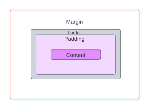
Within the box model, let’s break down the components.
The first is content. Content is the visible element that can be sized using width and height properties.
Next, we have padding. This is the empty space around the content. Its value is included in the width and height of the visible element.
Then, we have the border. A border wraps around the padding and content. Its value is included in the padding of the visible element as well.
Lastly, we have the margin. This is the empty space around the visible element. It’s completely invisible and clears the area outside the border.
The Container widget
Flutter offers a Container widget that can be used to implement the box model in our apps. Container is convenient because it can be used to manage multiple widgets’ widths, heights, margins, padding, colors, and more. It does this by combining common painting, positioning, and sizing widgets.
The margin and padding properties of Container are used to set the margin and padding (makes sense, right?) for the visible elements in our UI.
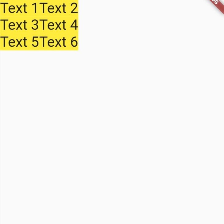
The app below renders two Text widgets inside the Container. The colors of each Container have been set to clearly demonstrate the effects of setting the margin and padding in the example below:
Row(
  mainAxisAlignment: MainAxisAlignment.start,
  crossAxisAlignment: CrossAxisAlignment.start,
  children: [
    Container(
      child: Text(
        "text 1",
        style: TextStyle(fontSize: 32),
      ),
      decoration: BoxDecoration(color: Colors.yellow),
    ),
    Container(
      child: Text(
        "text 2",
        style: TextStyle(fontSize: 32),
      ),
      decoration: BoxDecoration(color: Colors.green),
    ),
  ],
),

The code snippet above paints two Containers side by side without any whitespace. We’ll need to set the margin and padding for the visible Text widget. But before we do that, it’s important that we have an understanding of the EdgeInsets class.
The EdgeInsets class
The margin and padding properties of a Container widget expect a value of the type EdgeInsetsGeometry, an abstract class. This means that that EdgeInsetsGeometry can’t be used directly so we have to make use of its subclasses, EdgeInsets and EdgeInsetsDirectional, to set the margin and padding.
EdgeInsets sets margin and padding based on the left, top, right, and bottom direction parameters. EdgeInsetsDirectional, on the other hand, sets margin and padding based on the start, top, end, and bottom direction parameters.
The main difference between the two is that EdgeInsetsDirectional is a locale direction-aware widget, unlike EdgeInsets.
We can set the insets of theEdgeInsets class using the following properties:
EdgeInsets.zero: Sets a zero offset in all directionsEdgeInsets.all: Sets one common offset in all directionsEdgeInsets.only: Sets an offset only in the specified directions. The left, top, right, and bottom directions can be specified in any orderEdgeInsets.fromLTRB: Sets an offset in all directions based on the value passed for each. The directions have to be specified in the left, top, right, and bottom order.EdgeInsets.symmetric: Sets a vertical or horizontal offset
We can set the insets of the EdgeInsetsDirectional class using the following properties:
EdgeInsets.zero: Sets a zero offset in all directionsEdgeInsets.all: Sets one common offset in all directionsEdgeInsets.only: Sets an offset only in the specified directions. The start, top, end, and bottom directions can be specified in any orderEdgeInsets.fromSTEB: Sets an offset in all directions based on the value passed for each. The directions have to be specified in the start, top, end, and bottom order
In this tutorial, we’ll use the EdgeInsets class.
Setting the margin
The margin property of Container is used to set the margin. It adds an empty space around the Container.
First, we’ll add a margin around the first Container as shown below:
Container(
  margin: EdgeInsets.all(24),
  child: Text(
    "text 1",
    style: TextStyle(fontSize: 32),
  ),
  decoration: BoxDecoration(color: Colors.yellow),
)
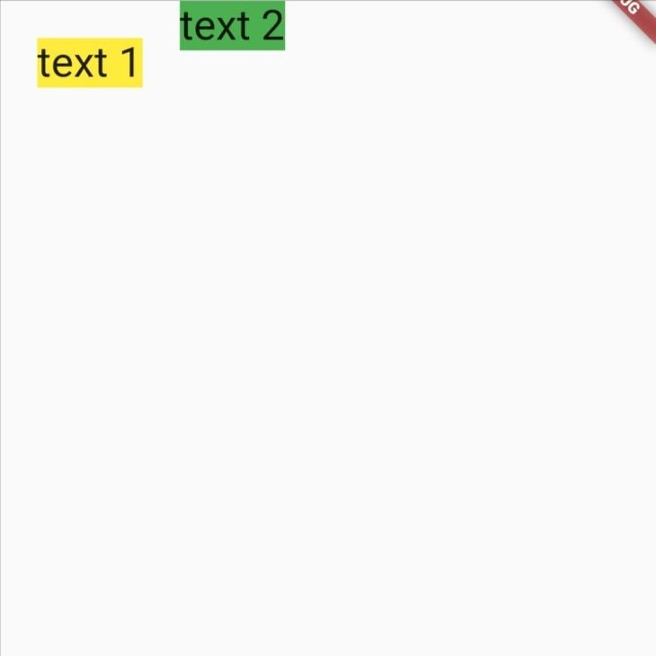
Next, we’ll add a top margin to the second Container only:
Container(
  margin: EdgeInsets.only(top: 24),
  child: Text(
    "text 2",
    style: TextStyle(fontSize: 32),
  ),
  decoration: BoxDecoration(color: Colors.green),
)
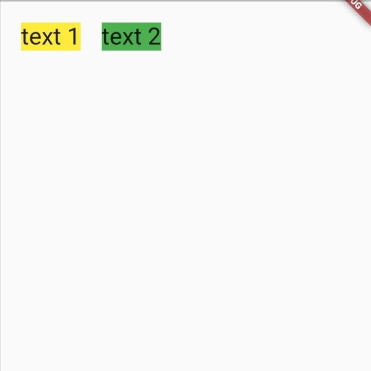
Our widgets are now separated with an empty space.
Setting the padding
The padding property of Container is used to add empty space inside the decorated Container. We’ll add horizontal and vertical padding to our widgets, as shown in the code below:
padding: EdgeInsets.symmetric(horizontal: 20, vertical: 12)
This code snippet adds horizontal and vertical padding to our widgets. It sets an offset of 20 to the left and right and an offset of 12 to the top and bottom.
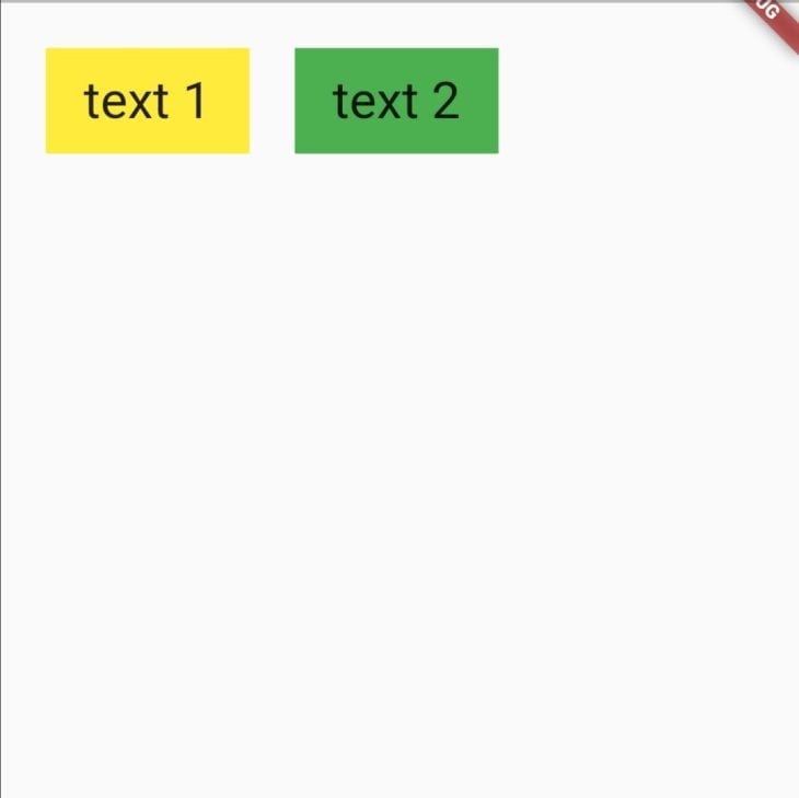
Our content is now padded and looks better!
Dynamically setting the margin and padding
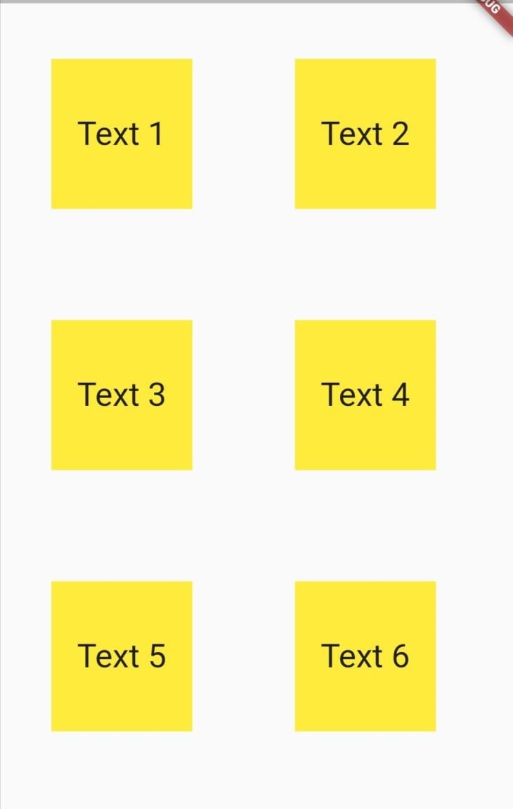
Setting a hardcoded value for our margin and padding will likely only look good on our testing device. On different screen sizes, the intended layout might not be what the user actually sees. Therefore, it is important to set the margin and padding dynamically based on screen size.
We’ll use the MediaQuery class to get the screen size of our app. Then, we’ll be able to dynamically set the margin and padding based on the size of the widgets.
First, we’ll store the device’s width and height values in variables like this:
Widget build(BuildContext context) {
  final height = MediaQuery.of(context).size.height;
  final width = MediaQuery.of(context).size.width;
  return ...
Next, we’ll set the margin and padding properties as a fraction of the device’s width and height:
margin: EdgeInsets.symmetric(horizontal: width *0.1, vertical: height *0.05),
padding: EdgeInsets.symmetric(horizontal: width *0.05,vertical: height*0.05),
This lays out our widgets with margin and padding that adapt to different sized screens.
Decorating the boxes
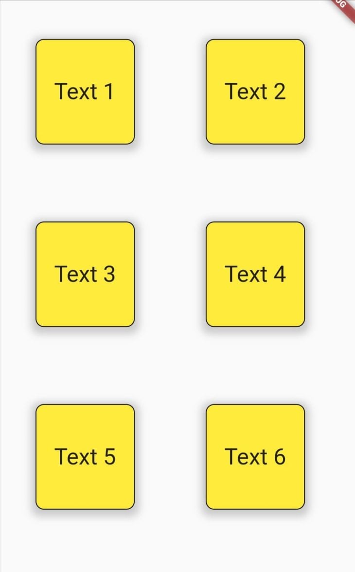
We can add some decorations to our container using the decoration property. This expects the abstract class for all decorations, called the Decoration class, and applies the styles to our widget.
The code snippet below uses the BoxDecoration class to add a color, border, border radius, and box shadow to the Container.
decoration: BoxDecoration(
  color: Colors.yellow,
  borderRadius: BorderRadius.circular(10),
  border: Border.all(),
  boxShadow: [
    BoxShadow(
      color: Colors.grey.withOpacity(0.5),
      spreadRadius: 5,
      blurRadius: 7,
      offset: const Offset(0, 3),
    ),
  ],
),
The Padding widget
We may need to add padding to a widget that does not implement the Padding class in its properties. For instance, the Card widget below draws a card with text in it.
Center(
  child: Card(
    color: Colors.yellow,
    child: Text(
      "Card text",
      style: TextStyle(fontSize: 32),
    ),
  ),
)
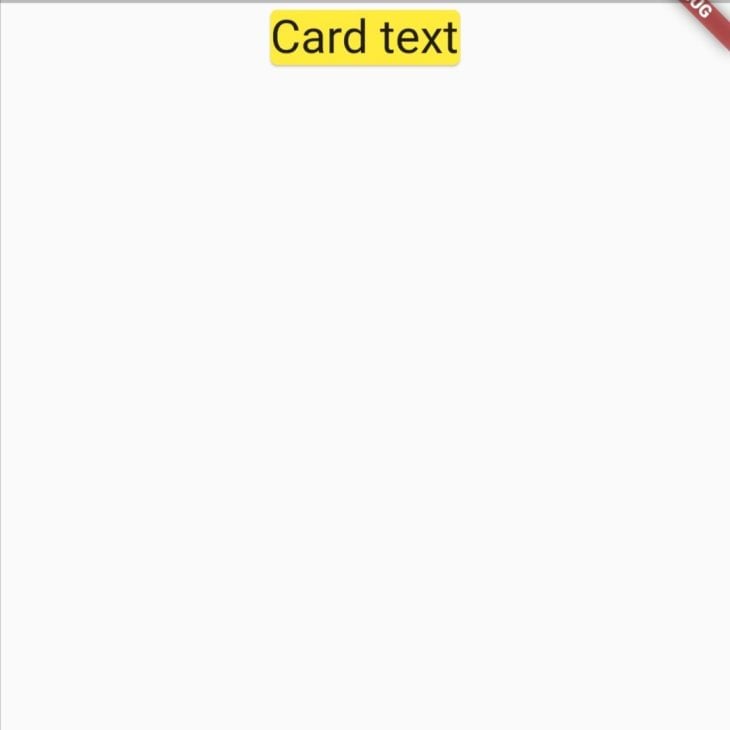
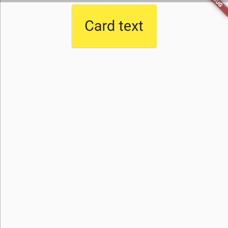
To add some space around the text, we can wrap the Text widget with a Padding widget. The Padding widget requires a padding property. The property is set to add empty space around the desired widget via the EdgeInsetsGeometry class.
child: Center(
  child: Card(
    color: Colors.yellow,
    child: Padding(
      padding: EdgeInsets.all(24.0),
      child: Text(
        "Card text",
        style: TextStyle(fontSize: 32),
      ),
    ),
  ),
)
Conclusion
In this tutorial, we discussed the box model and looked into how margins and paddings can be used to build layouts in Flutter. We also looked into the Container widget and how to set its margin, padding, and decorations. Finally, we used the Padding widget to add padding.
With that, you are now able to carefully lay out widgets in your UI to enhance your user interactions. All the code in this article is available on GitHub.
I hope you enjoyed this tutorial!
The post Flutter layouts guide: Margins and padding appeared first on LogRocket Blog.
from LogRocket Blog https://ift.tt/E9saIAy
via Read more


