Claymorphism is a design concept that revolves around clay-like UIs. Its user-friendly appeal is gaining popularity in the UI design world, especially in Web3.
An essential skill for a frontend developer is to be aware of popular UI design trends and be able to convert those designs into practical layouts.
This tutorial will help you learn the implementation of claymorphism UIs with CSS. By the end of the article, you will be able to create claymorphic design elements with Figma, CSS, and Tailwind CSS.
Contents
- Claymorphism examples
- Claymorphism properties
- Claymorphism with Figma
- Claymorphism with CSS
- Claymorphism with Tailwind CSS
- Claymorphism and glassmorphism
- Accessibility notes
Claymorphism examples
As the name already suggests, claymorphism incorporates artistic, clay-like aesthetics into the digital space to represent the UI.

Artistic 3D has become more popular thanks to NFTs and the metaverse, which often use these friendly graphics in their design.
NFT artworks that implement claymorphism sell for ridiculous amounts these days. The best example of the popularity of claymorphism in the world of Web3 is this NFT collection by Amrit Pal Singh.
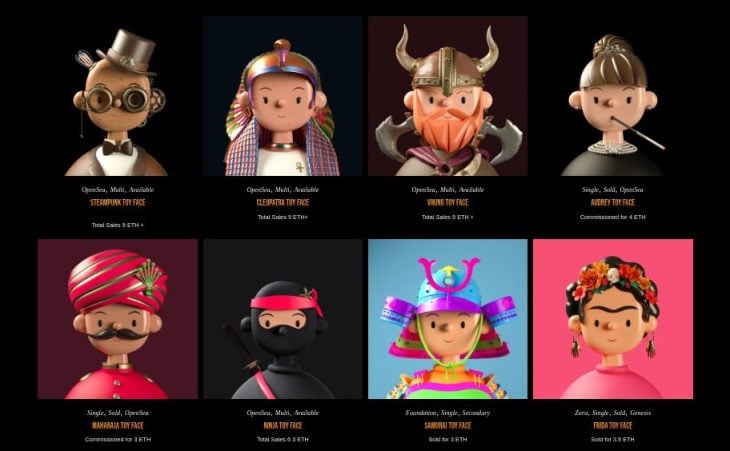
The child-like vibe of these avatars indicates a friendly, warm, and happy feeling overall.
Claymorphism is also about molding the layout elements according to the graphics. Here’s a better example that shows exactly that.

Claymorphism follows principles similar to neumorphism, but is more accessible and prettier. In contrast to concave elements in neumorphism, claymorphic UI elements are soft and easy on the eye, hence more appealing, accessible, and friendly.
Claymorphism properties
You can skip directly to the coding part, but it’s always a great idea to understand the core properties of any design concept before implementing it through code.
So before getting our hands dirty, let’s look at the key features and properties of claymorphism UIs.
Bright, pastel colors
The first step to implementing claymorphism is choosing the right colors. It is best to keep the background and foreground of claymorphic elements in brighter pastel colors, because the drop shadow tends to be ineffective on darker variations.
Smooth corners
Rounded corners give a claymorphic element the character it needs. Its softness is highly dependent on the radius of the corners and inner/outer shadows.
3D appearance
Claymorphic elements should appear like a 3D clay object, which is possible with inner shadows.
A claymorphic object has two inner shadows in general; one at the top-left and the other at the bottom right. The first shadow represents the glowing edges that show up when the object has an opaque background. The second shadow complements the first and adds a dark embossed effect to the object.
Inner shadows also contribute to the depth of the element and can be tinted the same color as the main background.
Depth
Along with inner shadows, the outer or drop shadow makes the object more accessible and identifiable on the main background. It controls the depth of the element and should be slightly darker than the background color.
Clay-like graphics
We have already seen some examples above that illustrate the use of fluffy, clay-like 3D graphics in claymorphism. It’s no surprise that graphics with a clay-like look and feel work well with claymorphism interfaces. Their addition makes UI elements look modern and more friendly and interactive.
Claymorphism with Figma
Let’s create a claymorphic card in Figma in six simple steps. We’ll be referring to this section later in our CSS implementation as well.
First, let’s add a 1366x768 desktop frame in our new Figma document that acts as the base for our claymorphic object. Now, add some color to our base desktop frame. I’m choosing two tints of green to add a gradient to the base frame.
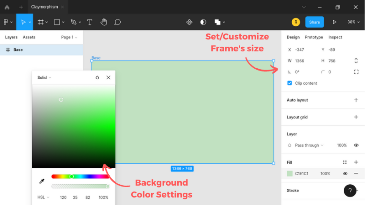
Then let’s draw a 550x350 frame in the middle of our base. This rectangular frame represents our claymorphic card in the UI.
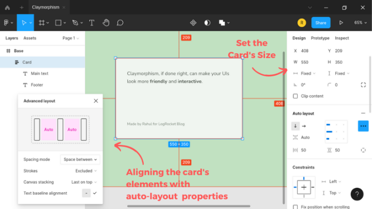
Next, add some roundness to the corners of this card element. A fifty pixel radius looks good enough. Also, add a 100% of corner smoothing to give it the soft edges of a rounded square.
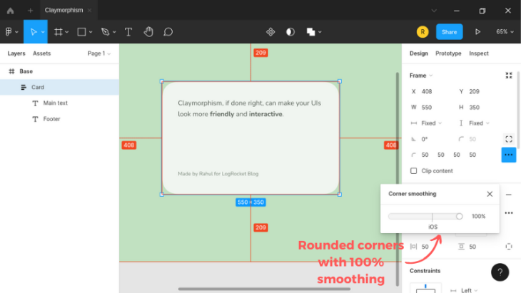
Next, provide a drop shadow and keep the shade a little darker than the main background color. The trick with the shadows here is to keep the x and y offset the same, and set the blur amount to twice this value.
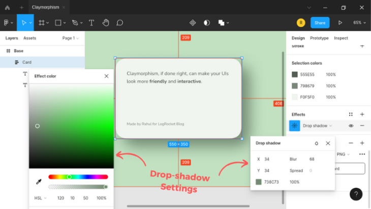
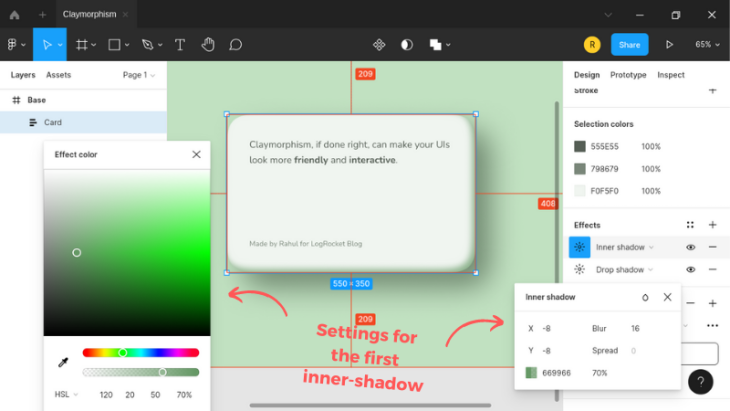
Adding an inner shadow to the card will bring out an embossed effect. This will add some shadow to the top left of the card.
Similarly, add an inner shadow to the top left side that acts more like an “inner glow” than a shadow.
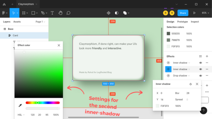
And there you have it, a general claymorphic element made in Figma that you can extend further by experimenting yourself. Check out the finished file here.
Claymorphism with CSS
It becomes easy to implement claymorphism in CSS if you know how to use box shadows intelligently.
As we noticed in Figma, our claymorphic object will take multiple (three) shadows overall, two inner, and one drop shadow.
Starting with the markup, let’s first add a layout container and a card element inside it with some paragraph tags:
<div class="container">
  <div class="card">
    <p>...</p>
    <p>...</p>
  </div>
As you can see, the markup is pretty simple.
Let’s jump into the CSS part and add some bare bone styling. I’m using the normalize CSS reset to keep things identical on all the browsers. I’m also using the traditional box-sizing reset to keep the spacing sensible and hassle-free.
The Nunito Google Font has a soft look that will look great on our UI. If you noticed, it is used in our Figma example as well:
/* Box sizing reset */
:root {
  box-sizing: border-box;
}

* {
  &,
  &:before,
  &:after {
    box-sizing: inherit;
  }
}

body {
  font: 1em/1.618 Nunito, sans-serif;
}
We are going to style the card element as a claymorphic object. Let’s apply the same colors to the elements that we used in the Figma tutorial.
I’m using the HSL color function for easy color modifications, which is not possible with RGB:
body {
  font: 1em/1.618 Nunito, sans-serif;

  color: hsl(120deg 5% 35%);
  background-color: hsl(120deg 35% 82%);
}
As you can see, modifying the saturation or lightness (or both) with HSL can give us a shade or tint of the same color without hassle.
Next, let’s define some alignment settings for our container element to align its child elements to the absolute center:
body { ... }

.container {
  display: flex;
  flex-direction: column;
  align-items: center;
  justify-content: center;

  min-height: 100vh;
  padding: 2em;
}
Next, let’s add some size, padding, corner-radius and alignment values to the card element:
body { ... }
.container { ... }

.card {
  display: flex;
  flex-direction: column;
  justify-content: space-between;

  max-width: 550px;
  min-height: 350px;
  padding: 50px;
  border-radius: 50px;
}
We should now add the inner and outer shadows to the card. It is possible with the multiple box-shadow values, as shown below:
body { ... }
.container { ... }

.card {
  ...

  background-color: hsl(120deg 20% 95%);
  box-shadow:
    34px 34px 68px hsl(120deg 10% 50%),
    inset -8px -8px 16px hsl(120deg 20% 50% / 70%),
    inset 0px 14px 28px hsl(120deg 20% 95%);
}
And we are done with the general CSS implementation of claymorphism!
Claymorphism Card UI / Regular Version
No Description
Keeping the outer shadow big will provide the element with more depth. You can change the direction of the shadows by modifying the x and y values. Check out these shadow variations for the bottom and left sides.
We’ve skipped the spread parameter of box-shadow in the code above, as it doesn’t apply to this use case. If you notice closely, the edges are not as soft as we made them in the Figma demo. We’ll address this issue in the next section.
Smoothing the corners
We can’t achieve a rounded square by smoothing corners with the CSS border-radius property. There are ways to get that done with SVG, but each implementation will require a different SVG, which isn’t flexible.
We can, however, use CSS Houdini APIs, which expose the CSS engine to create CSS extensions conveniently. These extensions can be polyfills to unavailable browser features or experiments like providing smooth, rounded corners to a given HTML element.
Let’s experiment with the CSS Paintworklet and a CSS Houdini extension and see what this combination fetches us.
The right way to begin with the CSS Paintworklet is by checking for its support and then loading the extension through the paintworklet module method:
<script>
if ("paintWorklet" in CSS) {
  CSS.paintWorklet.addModule(
    "https://www.unpkg.com/css-houdini-squircle@0.1.3/squircle.min.js"
  );
}
</script>
In the code above, we are loading a CSS Houdini extension that smooths the corners of any given element. Behind the scenes, this extension adds a mask-image property support for our web document to apply the effect, which we can configure further with some custom properties.
Next, add the mask-image property and provide some custom properties for corner smoothing. 1 denotes 100% of corner smoothing:
body { ... }
.container { ... }

.card {
  ...

  /* Squircle settings */
  --squircle-radius: 50px;
  --squircle-smooth: 1;
  -webkit-mask-image: paint(squircle);
  mask-image: paint(squircle);
}
As you can see in the demo, the drop shadow of our card gets cut due to masking. To fix this issue, we have to wrap our card element inside a division and then provide this wrapper division with the shadow:
<div class="container">
  <div class="card-wrapper">
    <div class="card">
      <p>...</p>
      <p>...</p>
    </div>
Let’s also add a drop shadow to this wrapper element with the filter CSS property. We are using the drop-shadow filter instead of the box-shadow property, as it draws the shadow as intended, regardless of the box-model irregularities:
.card-wrapper {
  border-radius: 50px;
  filter: drop-shadow(34px 34px 34px hsl(120deg 10% 50%));
}
The blur amount of the CSS drop-shadow filter doesn’t work exactly like that of the box-shadow property. It almost doubles the amount of blurring we see with the box-shadow property. I’ve adjusted the blur amount to counter that issue.
Claymorphism Card UI / Squircle Version
No Description
Caveats
Using the CSS Painting API to achieve a rounded square effect is expensive and time-consuming.
It is an experimental technology supported only on Chromium-based browsers for now. It also requires adding a wrapper element to take care of the drop-shadow, which also requires a bit of extra work.
Claymorphism with Tailwind CSS
Achieving the claymorphism effects with Tailwind is a bit tricky. Let’s quickly set up Tailwind in CodePen and see how to accomplish that.
Visit CodePen and create a new pen. Click on JS and then add cdn.tailwindcss.com as an external script.

Save your changes, and you’re good to go.
Let’s add some custom utilities to our Tailwind setup. Doing so will keep us from repeating many custom values for the inner and drop shadows:
tailwind.config = {
  theme: {
    extend: {
      fontFamily: {
        nunito: ["Nunito", "sans-serif"]
      },
      boxShadow: {
        "clay-card":
          "inset -10px -10px 20px hsl(302deg 25% 50% / 70%), inset 0 16px 32px hsl(302deg 25% 95%)",
        "clay-btn":
          "16px 16px 32px 0 hsl(277deg 50% 65% / 50%), inset -16px -16px 32px 0 hsl(277deg 50% 65%), inset 8px 8px 16px 0 hsl(227deg 65% 75% / 45%)"
      },
      dropShadow: {
        'clay': '35px 35px 35px hsl(302deg 25% 50%)',
      }
    }
  }
};
In the above configuration, we added a font utility to use the Nunito font, box-shadow utilities for our card and button elements, and a drop-shadow utility for the card wrapper.
We now have to add the CSS Houdini module as we did in the example above for the rounded square effect. We then have to add the CSS to load the web font and define settings and masking for the rounded square:
<div class="[ p-8 w-full h-screen ]
            [ flex justify-center items-center ]
            [ bg-gradient-to-b from-[hsl(302,33%,70%)] to-[hsl(302,33%,95%)] ]
            [ text-[hsl(302,20%,30%)] font-nunito ]">
  <div class="drop-shadow-clay">
    <div class="card
                [ p-[50px] max-w-lg rounded-[50px] ]
                [ bg-white shadow-clay-card ]
                [ flex items-center gap-5 flex-col md:flex-row lg:flex-row ]">
      <img
        class="object-scale-down max-w-[150px]"
        src="path/to/image.src" alt="..."><!-- Product image -->
      <div class="text-center md:text-left lg:text-left">
        <h3 class="text-xl font-bold mb-5">...</h3><!-- Product title -->
        <p class="text-sm mb-10">...</p><!-- Product description -->
        <a href="#" class="[ py-4 px-6 rounded-[50px] in-flex ]
                           [ font-bold text-white ]
                           [ bg-gradient-to-r from-[hsl(227,65%,75%)]
                             to-[hsl(277,50%,65%)]
                             hover:bg-gradient-to-r
                             hover:from-[hsl(277,50%,65%)]
                             hover:to-[hsl(227,65%,75%)] ]
                           [ shadow-clay-btn ]">...</a><!-- Order button -->
      </div><!-- Card content -->
    </div><!-- Card -->
  </div><!-- Card wrapper -->
</div><!-- The container -->
Claymorphism with Tailwind CSS / Squircle version
No Description
Did you notice how adding a fluffy 3D graphic enhanced the effect? You can modify images and alignment further to create more impactful variations. Here’s another example.
Claymorphism and glassmorphism
We can take claymorphism a step further by mixing it with glassmorphism. Before moving ahead, I’d like you to go through the basics of glassmorphism first and then come back here and observe the demo below.
Claymorphism x Glassmorphism
No Description
Accessibility notes
Making these effects accessible hinges on only one aspect: choosing the right colors. Ensure there is enough contrast between the object and the surface or main background.
The same applies to the darker variations of claymorphic objects. The object should always be lighter in color than the background, and the inner shadows should be visible for better noticeability and accessibility.
Claymorphism / Dark mode version
No Description
You should also check this colored implementation of the dark version.
On the same note, when mixing claymorphism with glassmorphism, make sure that the images used for the background are not cluttered, too dark, or too bright.
Conclusion
In this article, we explored the claymorphism design trend and its properties. We also looked at examples illustrating different applications of the concept.
We then created a claymorphism effect in Figma, which we later replicated in CSS. We discussed its implementation with Tailwind CSS with light and dark modes.
We also mixed glassmorphism and claymorphism and took notes on keeping claymorphic elements more accessible.
All the demos used in this tutorial are available in this CodePen collection. I hope you create fantastic UIs with all this new knowledge!
The post Implementing claymorphism with CSS appeared first on LogRocket Blog.
from LogRocket Blog https://ift.tt/h3K64BU
via Read more


