


Most frontend applications today require a search box of some sort, which sometimes is the first component a user interacts with on your page—take Airbnb, Uber, or Google Maps for instance. Creating a search component that not only works but is functional enough to guide your user in completing their desired task is vital for your application’s user experience.
Turnstone is a new library that enables React developers to do just that. This lightweight library (12.2kB Gzip) ships with autocomplete, automated caching, WAI-ARIA accessibility, and other features that let you build a functional and accessible search component.
Turnstone elements are easily customizable using various CSS methods like CSS modules or Tailwind CSS. In this article, we’ll use Turnstone and Tailwind to create an application that queries the Marvel Comics API to search for characters belonging to the Marvel Cinematic Universe.
View the live project and the source code on GitHub.
Prerequisites
To follow along with this tutorial, you’ll need:
- Basic understanding of the React framework
- An API key from the Marvel Comics API
Tailwind CSS knowledge is appreciated, but not required.
Getting your API key and adding referrer sites
Head to the Marvel Developers site and register a new account. Then navigate to My Developer Account where you’ll find your public and private API keys. Copy the public key for later.
Before your app can make a request to this API, its domain name has to be included in your list of referrer sites. On the same page, scroll down to the referrer sites section, and add the domain name of your app, i.e., localhost. You can also use an asterisk * to accept requests from all domains, although this is not entirely safe.
Now you’re all set to start developing!
Turnstone features
The Turnstone component accepts a variety of properties used to control different parts of the search box. Everything from the styling of the component, what data source the search box queries from, error messages, and more can be configured with the appropriate prop.
Let’s go over some of the important ones we will use in building this application.
typeahead
Type: boolean
typeahead — aka autocomplete — is a feature in which an application predicts the rest of a word a user is typing. This is set to true by default.
maxItems
Type: number
This property controls the maximum number of search results displayed in the listbox.
listbox
Type: object, array, or function
listbox specifies how results are rendered in response to a user’s query. This property controls the source of data as well as the search type — which could be either startsWith or contains.
As an object, listbox queries a single data source as such:
const listbox = {
    displayField: 'characters',
    data: (query) =>
      fetch(`/api/characters?q=${query}`)
        .then(response => response.json()),
    searchType: 'startsWith',
}

return (
  <Turnstone listbox={listbox} />
)
data above is a function whose return value should be a Promise that resolves to an array of items. This function takes the current query string as an argument, and reruns each time the string changes — which is why we need another prop called debounceWait, more on that momentarily.
If used as an array, listbox can collect data from multiple sources:
const listbox = [
  {
    id: 'cities',
    name: 'Cities',
    ratio: 8,
    displayField: 'name',
    data: (query) =>
      fetch(`/api/cities?q=${encodeURIComponent(query)}`)
        .then(response => response.json()),
    searchType: 'startswith'
  },
  {
    id: 'airports',
    name: 'Airports',
    ratio: 2,
    displayField: 'name',
    data: (query) =>
      fetch(`/api/airports?q=${encodeURIComponent(query)}`)
        .then(response => response.json()),
    searchType: 'contains'
  }
]

return (
  <Turnstone listbox={listbox} />
)
In this scenario, a ratio property can be used to specify the number of results that occupies listbox in relation to maxItems. This means, if maxItems is set to 10 for example, the ratio number from each data source should add up to 10.
styles
Type: object
An object whose keys represent elements rendered by Turnstone. Each corresponding value is a string representing the class attribute for the element
const styles = {
input: 'w-full h-12 border border-slate-300 py-2 pl-10',
  listbox: 'w-full bg-white sm:border sm:border-blue-300 sm:rounded text-left sm:mt-2 p-2 sm:drop-shadow-xl',
  groupHeading: 'cursor-default mt-2 mb-0.5 px-1.5 uppercase text-sm text-rose-300',
}

return (
  <Turnstone styles={styles} />
)
We can see how easily Tailwind fits in to make the styling process easier. View the list of available Turnstone elements in the docs.
debounceWait
Type: number
This property specifies the wait time — in milliseconds — after the user finishes typing before their query is sent to the fetch function.
defaultListbox
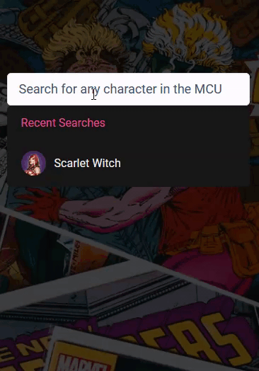
This property is identical to listbox but is displayed when the search box is in focus, without a query string. It is usually used to create a listbox for recent searches:
const defaultListBox = {
  displayField: 'Recent Searches',
  data: () => Promise.resolve(JSON.parse(localStorage.getItem('recentSearches')) || [])
}

return (
  <Turnstone defaultListBox={defaultListBox} />
)
Creating the Application
Open up your terminal and create a new React application with the following command:
npx create-react-app turnstone-demo
After the installation is complete, navigate into the project’s directory:
cd turnstone-demo
And install Turnstone and Tailwind CSS — alongside its peer dependencies, PostCSS and Autoprefixer:
npm install -D turnstone tailwindcss postcss autoprefixer
Let’s start out by creating an environment variable for the API key. In your project’s root, create a .env file and store the API key
// .env
REACT_APP_MARVEL_APIKEY = 'your_apikey_here'
Create React App provides support for environmental variables, which are created with the required REACT_APP_ prefix. This variable can then be accessed within the app as process.env.REACT_APP_MARVEL_APIKEY.
N.B., remember to add .env to your .gitignore file so you don’t expose your key in a public repository.
Image Backdrop
The underlying image backdrop as seen in the project demo is created with the following CSS class:
// App.css
.image-backdrop {
  background-image: linear-gradient(rgba(0, 0, 0, 0.7), rgba(0, 0, 0, 0.7)), url('../public/comic-backdrop.jpg');
  height: 100vh;
  width: 100%;
  background-size: cover;
  background-position: center;
  background-repeat: no-repeat;
}
Attach this class to the body tag in public/index.html and you should have an image backdrop for the search box to be placed over:
// public/index.html
<!DOCTYPE html>
<html lang="en">
  <head>
    <!-- markup -->
  </head>
  <body class="image-backdrop">
    <!-- more markup -->
    <div id="root"></div>
  </body>
</html>
Initializing Tailwind
To initialize Tailwind CSS, run the following command:
npx tailwindcss init -p
This generates the tailwind.config.js and postcss.config.js files, which are used to customize and extend Tailwind’s features.
We only need to configure the template paths for now. Update tailwind.config.js with the code below:
// tailwind.config.js
module.exports = {
  content: ['./src/**/*.{js,jsx,ts,tsx}'],
  theme: {
    extend: {},
  },
  plugins: [],
}
Next, add the Tailwind layers to index.css using the @tailwind directive:
// index.css
@tailwind base;
@tailwind components;
@tailwind utilities;
And now you can start styling your React app with Tailwind’s utility classes. Let’s begin by positioning the SearchBox component at the top center of the screen.
In src, create a components folder and store the SearchBox.js file. Next, import this component into App.js and apply the Tailwind classes below to the parent container:
// App.js
import SearchBox from './components/SearchBox'
import './App.css'

function App() {
  return (
    <div className='m-auto relative top-28 w-11/12 sm:w-6/12'>
      <SearchBox />
    </div>
  )
}
export default App
This positions the search box at the top center of the page.
Using the Turnstone component
Before we start to configure the dynamic parts of the search box, add the following properties to the Turnstone component:
// SearchBox.js
import Turnstone from 'turnstone'
const SearchBox = () => {
return (
<Turnstone
id='search'
name='search'
autoFocus={true}
typeahead={true}
clearButton={true}
debounceWait={250}
listboxIsImmutable={true}
maxItems={6}
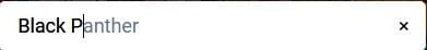
noItemsMessage="We couldn't find any character that matches your search"
placeholder='Search for any character in the MCU'
/>
)
}
export default SearchBox
clearButton renders a clear button whenever the user enters a character into the search box.
autoFocus set to true makes the search box automatically receive focus when the page loads.
maxItems sets the maximum number of search results to be displayed in the listbox to 6.
listboxIsImmutable set to true ensures that the contents of listbox doesn’t change between queries; i.e., the same query can’t return different results.
Now let’s move on to the listbox property.
listbox
In listbox’s data property, we make a request to the Comics API, attaching the current query string and your API key in the process:
// SearchBox.js
import Turnstone from 'turnstone'

const SearchBox = () => {
  const listbox = {
    displayField: 'characters',
    data: async (query) => {
      const res = await fetch(
        `https://gateway.marvel.com:443/v1/public/characters?nameStartsWith=${query}&apikey=${process.env.REACT_APP_MARVEL_APIKEY}`
      )
      const data = await res.json()
      return data.data.results
    },
    searchType: 'startsWith',
  }

  return (
    <Turnstone
      id='search'
      name='search'
      autoFocus={true}
      typeahead={true}
      clearButton={true}
      debounceWait={250}
      listboxIsImmutable={true}
      maxItems={6}
      noItemsMessage="We couldn't find any character that matches your search"
      placeholder='Search for any character in the MCU'
      listbox={listbox}
    />
  )
}
export default SearchBox
The Marvel API has an Interactive Documentation page where all available endpoints are listed. In our case, we’ve made a request to the characters endpoint: /v1/public/characters.
Extra parameters like stories, events, or nameStartsWith can be added to get different results. We also use the nameStartsWith parameter, setting its value to the query string.
The result of this function should be an object containing a results array of all Marvel characters whose name starts with the query string:
// JSON result from API call. query="Doctor Strange"
{
  "code": 200,
  "status": "Ok",
  "copyright": "© 2022 MARVEL",
  "attributionText": "Data provided by Marvel. © 2022 MARVEL",
  "attributionHTML": "<a href=\"http://marvel.com\">Data provided by Marvel. © 2022 MARVEL</a>",
  "etag": "07a3a76164eec745484f34562db7ca7166c196cc",
  "data": {
    "offset": 0,
    "limit": 20,
    "total": 2,
    "count": 2,
    "results": [
      {
        "id": 1009282,
        "name": "Doctor Strange",
        "description": "",
        // ...
The relevant data is located in data.results, which is the function’s return value.
At this point, the application functions properly. Now we can proceed to style Turnstone’s elements with Tailwind and the styles property.
Styling Turnstone elements with Tailwind
As explained earlier, keys in the styles object represent a certain element of the search component. We can style elements like the listbox, highlighted items in the listbox, and even the color of the autocomplete text to create a better looking search box:
// SearchBox.js
import Turnstone from 'turnstone'
import recentSearchesPlugin from 'turnstone-recent-searches'

const listbox = {
  // ...
}

const styles = {
  input: 'w-full border py-2 px-4 text-lg outline-none rounded-md',
  listbox: 'bg-neutral-900 w-full text-slate-50 rounded-md',
  highlightedItem: 'bg-neutral-800',
  query: 'text-oldsilver-800 placeholder:text-slate-600',
  typeahead: 'text-slate-500',
  clearButton:
    'absolute inset-y-0 text-lg right-0 w-10 inline-flex items-center justify-center bg-netural-700 hover:text-red-500',
  noItems: 'cursor-default text-center my-20',
  match: 'font-semibold',
  groupHeading: 'px-5 py-3 text-pink-500',
}

const SearchBox = () => {
  return (
    <Turnstone
      id='search'
      name='search'
      autoFocus={true}
      typeahead={true}
      clearButton={true}
      debounceWait={250}
      listboxIsImmutable={true}
      maxItems={6}
      noItemsMessage="We couldn't find any character that matches your search"
      placeholder='Search for any character in the MCU'
      listbox={listbox}
      styles={styles}
    />
  )
}

export default SearchBox
Item component prop
Although we can style items in listbox by referencing the item property in styles, Turnstone provides component properties that essentially allow extra customization and formatting of Turnstone elements.
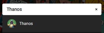
Here’s how we can use this to include an avatar beside the character’s name in a search result:
// SearchBox.js
import Turnstone from 'turnstone'

const listbox = {
    // ...
}

const styles = {
    // ...
}

const Item = ({ item }) => {
  /* thubmnails from the API are stored as partials therefore
    we have to concatenate the image path with its extension
  */
  const avatar = `${item.thumbnail.path}.${item.thumbnail.extension}`
  return (
    <div className='flex items-center cursor-pointer px-5 py-4'>
      <img
        width={35}
        height={35}
        src={avatar}
        alt={item.name}
        className='rounded-full object-cover mr-3'
      />
      <p>{item.name}</p>
    </div>
  )
}

const SearchBox = () => {
  return (
    <Turnstone
      id='search'
      name='search'
      autoFocus={true}
      typeahead={true}
      clearButton={true}
      debounceWait={250}
      listboxIsImmutable={true}
      maxItems={6}
      noItemsMessage="We couldn't find any character that matches your search"
      placeholder='Search for any character in the MCU'
      listbox={listbox}
      styles={styles}
      Item={Item}
    />
  )
}

export default SearchBox
Recent searches plugin
For an extra (1.7kB gzip), another package called turnstone-recent-searches can be added to Turnstone’s plugin prop to automatically record the user’s recent searches.
Install this package with the following command:
npm install turnstone-recent-searches
And include it in the plugins prop as such:
// SearchBox.js
import Turnstone from 'turnstone'
import recentSearchesPlugin from 'turnstone-recent-searches'

const styles = {
  input: 'w-full border py-2 px-4 text-lg outline-none rounded-md',
  listbox: 'bg-neutral-900 w-full text-slate-50 rounded-md',
  highlightedItem: 'bg-neutral-800',
  query: 'text-oldsilver-800 placeholder:text-slate-600',
  typeahead: 'text-slate-500',
  clearButton:
    'absolute inset-y-0 text-lg right-0 w-10 inline-flex items-center justify-center bg-netural-700 hover:text-red-500',
  noItems: 'cursor-default text-center my-20',
  match: 'font-semibold',
  groupHeading: 'px-5 py-3 text-pink-500',
}

const listbox = {
  displayField: 'characters',
  data: async (query) => {
    const res = await fetch(
      `https://gateway.marvel.com:443/v1/public/characters?nameStartsWith=${query}&apikey=${process.env.REACT_APP_MARVEL_APIKEY}`
    )
    const data = await res.json()
    return data.data.results
  },
  searchType: 'startsWith',
}

const Item = ({ item }) => {
  const avatar = `${item.thumbnail.path}.${item.thumbnail.extension}`
  return (
    <div className='flex items-center cursor-pointer px-5 py-4'>
      <img
        width={35}
        height={35}
        src={avatar}
        alt={item.name}
        className='rounded-full object-cover mr-3'
      />
      <p>{item.name}</p>
    </div>
  )
}

const SearchBox = () => {
  return (
    <Turnstone
      id='search'
      name='search'
      autoFocus={true}
      typeahead={true}
      clearButton={true}
      debounceWait={250}
      listboxIsImmutable={true}
      maxItems={6}
      noItemsMessage="We couldn't find any character that matches your search"
      placeholder='Search for any character in the MCU'
      listbox={listbox}
      styles={styles}
      Item={Item}
      plugins={[recentSearchesPlugin]}
    />
  )
}

export default SearchBox
This feature is equally important as it creates a better experience for your user.

Conclusion
Autocomplete search boxes are prevalent in modern UI design, and having a React library that helps us easily implement them is great.
Turnstone’s documentation does a good job at explaining its API design, giving it a gradual learning curve — which wasn’t the case when I tried other React autocomplete libraries. To see more examples of Turnstone in action, check out the examples on Turnstone’s website.
The post Create a customizable React search component with autocomplete appeared first on LogRocket Blog.
from LogRocket Blog https://ift.tt/zZ8JMjc
via Read more


