


You probably have been there before. How do we choose between showing a modal to users, and when do we navigate them to a separate, new page? And does it matter at all?
Actually, it does. The decision influences users’ flow, their context, their ability to look up details, and with it error frequency and task completion. Both options can be disruptive and frustrating — at the wrong time, and at the wrong place.
So we’d better get it right. Well, let’s see how to do just that.
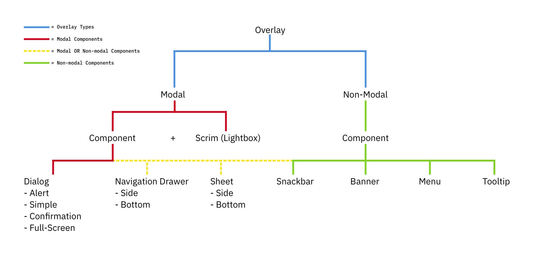
Modals vs. Dialogs vs. Overlays vs. LightboxesWhile we often speak about a single modal UI component, we often ignore fine, intricate nuances between all the different types of modals. In fact, not every modal is the same. Modals, dialogs, overlays, and lightboxes — all sound similar, but they are actually quite different:
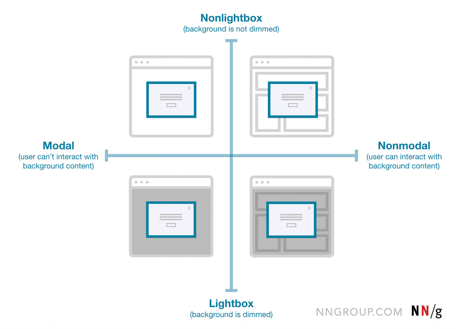
- Dialog
A generic term for “conversation” (user ↔ system). - Overlay
A small content panel displayed on top of a page. - Modal
User must interact with overlay + background disabled. - Nonmodal
User must interact with overlay + background enabled. - Lightbox
Dimmed background to focus attention on the modal.
As Anna Kaley highlights, most overlays appear at the wrong time, interrupt users during critical tasks, use poor language, and break users’ flow. They are interruptive by nature, and typically with a high level of severity without a strong need for that.
Surely users must be slowed down and interrupted if the consequences of their action have a high impact, but for most scenarios non-modals are much more subtle and a more friendly option to bring something to the user’s attention. If anything, I always suggest it to be a default.
Modals → For Single, Self-Contained TasksAs designers, we often dismiss modals as irrelevant and annoying — and often they are! — yet they have their value as well. They can be very helpful to warn users about potential mistakes or help them avoid data loss. They can also help perform related actions or drill down into details without interrupting the current state of the page.
But the biggest advantage of modals is that they help users keep the context of the current screen. It doesn’t mean just the UI, but also edited input, scrolling position, state of accordions, selection of filters, sorting, and so on.
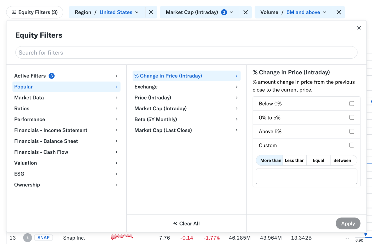
At times, users need to confirm a selection quickly (e.g., filters as shown above) and then proceed immediately from there. Auto-save can achieve the same, of course, but it’s not always needed or desired. And blocking the UI is often not a good idea.
However, modals aren’t used for any tasks. Typically, we use them for single, self-contained tasks where users should jump in, complete a task, and then return to where they were. Unsurprisingly, they do work well for high-priority, short interactions (e.g., alerts, destructive actions, quick confirmations).
When modals help:
🚫 Modals are often disruptive, invasive, and confusing.
🚫 They make it difficult to compare and copy-paste.
✅ Yet modals allow users to maintain multiple contexts.
✅ Useful to prevent irreversible errors and data loss.
✅ Useful if sending users to a new page would be disruptive.
✅ Show a modal only if users will value the disruption.
✅ By default, prefer non-blocking dialogs (“nonmodals”).
✅ Allow users to minimize, hide, or restore the dialog later.
✅ Use a modal to slow users down, e.g., verify complex input.
✅ Give a way out with “Close”, ESC key, or click outside the box.
Wizards or tabbed navigation within modals doesn’t work too well, even in complex enterprise products — there, side panels or drawers typically work better. Troubles start when users need to compare or reference data points — yet modals block this behavior, so they re-open the same page in multiple tabs instead.
For more complex flows and multi-step processes, standalone pages work best. Pages also work better when they demand the user’s full attention, and reference to the previous screen isn’t very helpful. And drawers work for sub-tasks that are too complex for a simple modal, but don't need a full page navigation.
When to avoid modals:
🚫 Avoid modals for error messages.
🚫 Avoid modals for feature notifications.
🚫 Avoid modals for onboarding experience.
🚫 Avoid modals for complex, lengthy multi-step-tasks.
🚫 Avoid multiple nested modals and use prev/next instead.
🚫 Avoid auto-triggered modals unless absolutely necessary.
In many complex, task-heavy products, users will find themselves performing the same tasks repeatedly, over and over again. There, both modals and new page navigations add friction because they interrupt the flow or force users to gather missing data between all the different tabs or views.
Too often, users end up with a broken experience, full of never-ending confirmations, exaggerated warnings, verbose instructions, or just missing reference points. As Saulius Stebulis mentioned, in these scenarios, expandable sections or in-place editing often work better — they keep the task anchored to the current screen.
In practice, in many scenarios, users don’t complete their tasks in isolation. They need to look up data, copy-paste values, refine entries in different places, or just review similar records as they work through their tasks.
Overlays and drawers are more helpful in maintaining access to background data during the task. As a result, the context always stays in its place, available for reference or copy-paste. Save modals and page navigation for moments where the interruption genuinely adds value — especially to prevent critical mistakes.
Modals vs. Pages: A Decision TreeA while back, Ryan Neufeld put together a very helpful guide to help designers choose between modals and pages. It comes with a handy PNG cheatsheet and a Google Doc template with questions broken down across 7 sections.
It’s lengthy, extremely thorough, but very easy to follow:
It might look daunting, but it's a quite simple 4-step process:
- Context of the screen.
First, we check if users need to maintain the context of the underlying screen. - Task complexity and duration.
Simpler, focused, non-distracting tasks could use a modal, but long, complex flows need a page. - Reference to underlying page.
Then, we check if users often need to refer to data in the background or if the task is a simple confirmation or selection. - Choosing the right overlay.
Finally, if an overlay is indeed a good option, it guides us to choose between modal or nonmodal (leaning towards a nonmodal).
Whenever possible, avoid blocking the entire UI. Have a dialog floating, partially covering the UI, but allowing navigation, scrolling, and copy-pasting. Or show the contents of the modal as a side drawer. Or use a vertical accordion instead. Or bring users to a separate page if you need to show a lot of detail.
But if you want to boost users’ efficiency and speed, avoid modals at all costs. Use them to slow users down, to bundle their attention, to prevent mistakes. As Therese Fessenden noted, no one likes to be interrupted, but if you must, make sure it’s absolutely worth the cost.
Meet “Smart Interface Design Patterns”You can find a whole section about modals and alternatives in Smart Interface Design Patterns, our 15h-video course with 100s of practical examples from real-life projects — with a live UX training later this year. Everything from mega-dropdowns to complex enterprise tables — with 5 new segments added every year. Jump to a free preview. Use code BIRDIE to save 15% off.
 Meet Smart Interface Design Patterns, our video course on interface design & UX.
Video + UX Training
$ 495.00 $ 699.00 Get Video + UX Training25 video lessons (15h) + Live UX Training.
100 days money-back-guarantee.
Video only
40 video lessons (15h). Updated yearly.
Also available as a UX Bundle with 2 video courses.
- Different Types of Popups, by Anna Kaley
- Best Practices for Designing UI Modals, by Uxcel
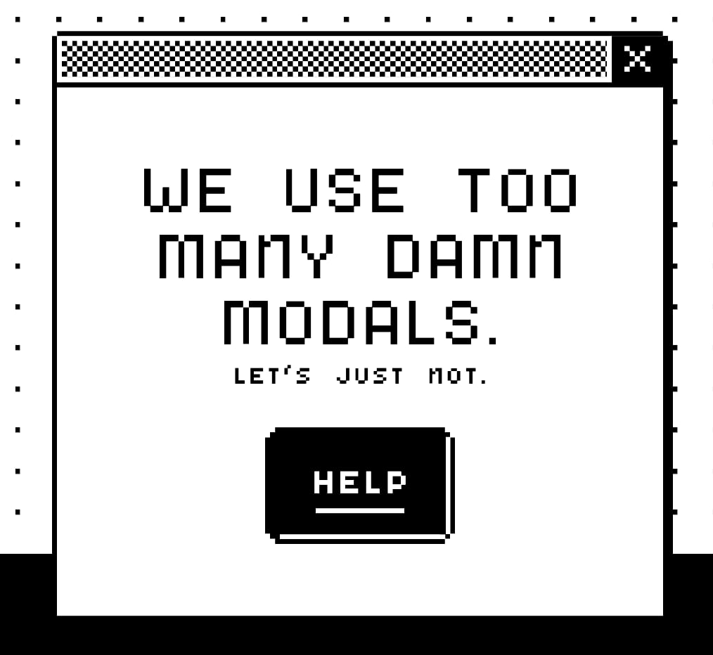
- We Use Too Many Damn Modals: UX Guidelines, by Adrian Egger
- Modal & Nonmodal Dialogs, by Therese Fessenden
- Modern Enterprise UI Design: Modal Dialogs, by James Jacobs
- Modals in Design Systems
Gain $200 in a week
from Articles on Smashing Magazine — For Web Designers And Developers https://ift.tt/oXxqQO2


