Login screen design is not the sexiest of topics. It doesn’t get as much loving attention as “landing page patterns” or “dashboard UI,” yet without attention, the login screen can literally make or break a product experience. How many moments have you had, panicking over a misremembered password or username, while walking the tightrope of your daily existence?
Then there is the trust issue. Would you board a plane if you noticed the door was rusty and slightly crooked? This is the one clue you get as you interact with a product that something might be off. The first impression is all we need to make a judgment.
- The login experience of the past
- The essential elements of a login screen design
- Spacing and the law of proximity
- The marketing version of a login screen
- Some do’s for login screens
- The big don’t
The login experience of the past
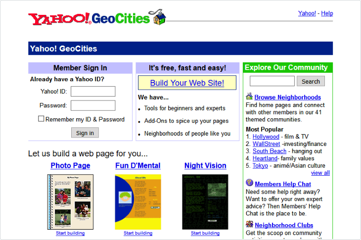
It really was a simpler time back in 1999. The only way to log in was with an ID and password and not much has changed in this design pattern. The nostalgia is powerful with this one.
It’s interesting to see how many ways users can log in now:
- Username and password: the most common login pattern and the one we will start with
- Social login: a user can log in using social media accounts such as Facebook, Google, and Twitter
- Two-factor authentication (2FA): this is becoming more common. A user provides two forms of identification to access a system, such as a password and a one time code sent to their phone
- Single sign-on (SSO): this is more common in company settings. A user can log in to multiple applications with one set of credentials.
- The magic link: this pattern sends a unique link to the user’s email, which they can click to log in without a password
- Biometric login: this uses physical characteristics, such as fingerprints or facial recognition, to authenticate users. Being used more and more on mobile and some laptops
- One-time password (OTP): this pattern sends a unique password to the user’s email or phone number, which they then enter to access a system
- Certificate-based authentication: this pattern requires users to have a digital certificate that is validated by the system before granting access. More commonly used for governmental services
The essential elements of a login screen design
Before we use some of these more advanced methods, such as 2FA and magic links, we should build a straightforward login form with a few essential design elements.
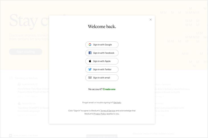
Here is an example of a login screen that could use an upgrade. Not that I think it is bad, but it’s not the most appealing screen. It’s trying to cover too many bases, too many options.
The questions that hit me every time I land on this screen are, which way have I signed in before? What happens if I sign in with Twitter, but signed in with Google previously? Do I sign in to a different account? It never gives me a feeling of calm:
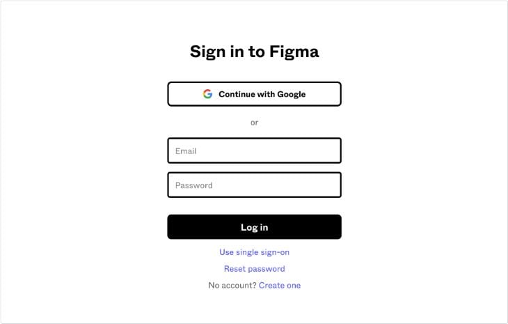
Here is the login screen from Figma; one I land on frequently. It’s clean and easy to understand, and I never feel anxious:
Login screens do not need to be over designed. Users do not want to linger here. A clean and clear experience is the best option for most products and websites. A login experience should get you in the door quickly and not have some burly bouncer pushing you away.
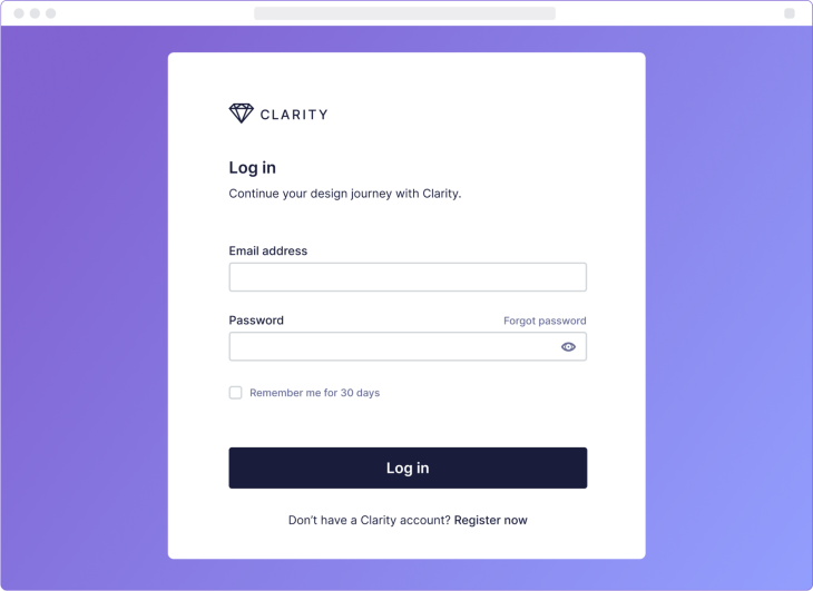
Our example login screen
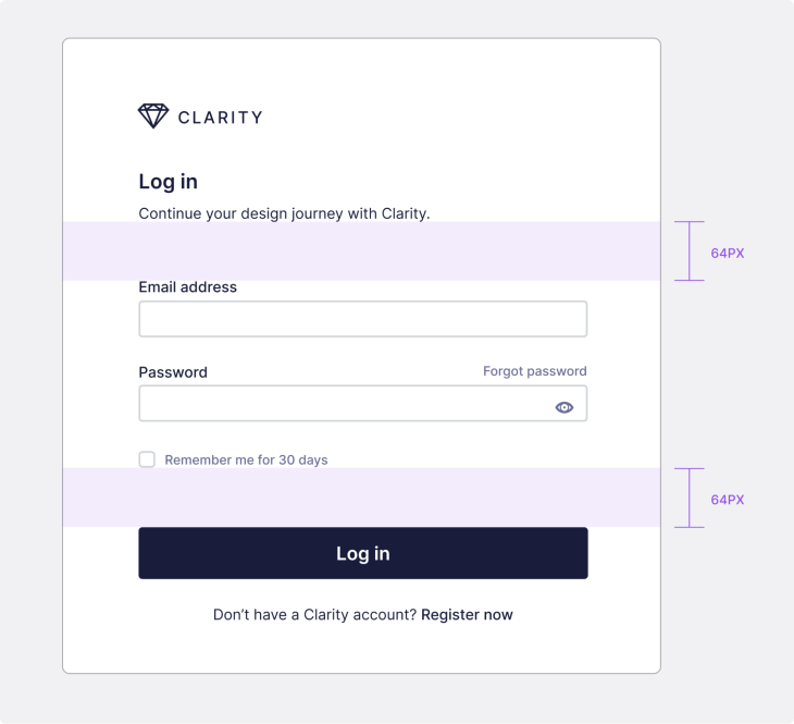
Let’s begin by building our login screen with the most essential visual elements, and I’ll break down what we’re doing for success here:
Branding
It sounds so obvious to include the organization’s logo, but I have seen screens with no branding, name, or single clue to what I was logging into. Include the logo at the very least, company name, title, and introduction text. All this information gives the user context to what they are entering, especially if it’s the first visit.
Email or username field
This field allows users to enter their username or email address. My recommendation here is to allow for an email address as the primary option. Who remembers their username? I have verified these issues over years while creating login experiences.
Password field
This field allows users to enter their password. We have seen above that certain login flows just use a magic link, bypassing the need for a password, but that’s for another day. Always include a show/hide password toggle.
Forgot password link
This link provides users with the option to reset their password if they forget it. It is important to associate this closely with the password field. This will be one of the most used elements in your login screen, believe me.
Login button
The login or submit button is our main call to action. There are many labels we can apply to this, but it is recommended to use a verb such as “log in” or “continue.”
“Remember me” checkbox
This checkbox allows users to remain logged in even after they close the website or application.
Under GDPR regulations, websites and apps are required to get explicit consent from users before storing or processing login information, such as usernames and passwords. So by default, the checkbox should not be selected, but if the user opts in and activates it, this preference can be saved, and the checkbox will automatically be selected as the default choice on their next login. My recommendation is to remember the user’s details for 30 days.
Registration link
This link provides users with a way to create a new account if they don’t already have one, yet this can cause a big issue. Have you ever gone to a login page only to find out after you have input your details that you are on the register page? I have seen many examples where both screens look similar. These two links need to be clearly differentiated with a prominent title telling you what the screen is.
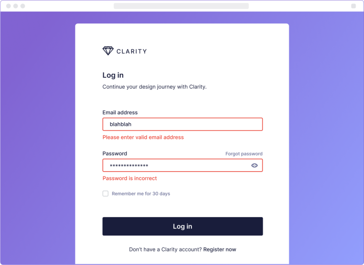
Validation
These are so important to remember. If your platform has very strict validation rules around the formatting of the password, then you need to show these clearly, especially when the user is filling:
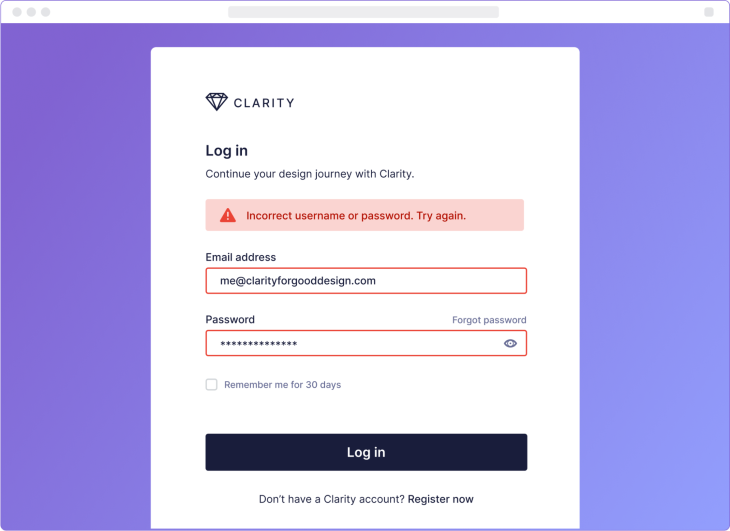
Error messages
The messages to alert users about incorrect login details or other errors logging. These come in the form of:
- Incorrect username or password
- Issues with the system
This message should be clear and concise:
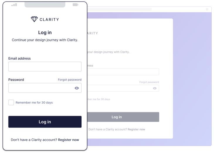
Responsive
Another element of this login screen we can’t overlook is making it responsive. Obviously, if your product does not work on smaller screens, then offering a responsive login makes little sense. But if you do, making it responsive is just a matter of resizing elements and text to be more readable on smaller screens:
Spacing and the law of proximity
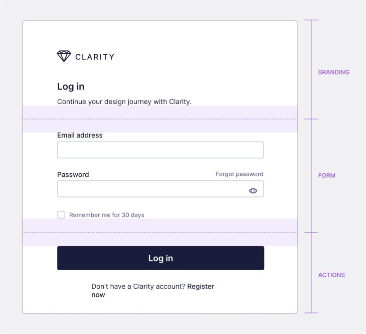
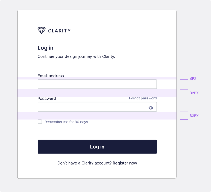
Taking a cue from gestalt theory, we will use our favorite gestalt principle of the law of proximity to make sure that the screen is as clear as possible. I am using an 8px grid for the spacing of this design.
Grouping elements
We naturally group our elements into branding, form, and actions when building our login screen:
Spacing between elements
We can give generous spacing between the different groupings:
It is important to space input fields so that the label is tied visually to its text field.
The marketing version of a login screen
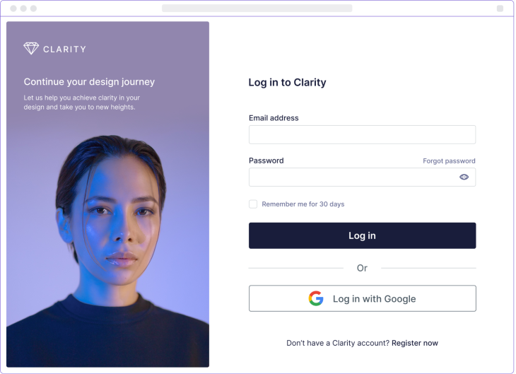
We have created a more refined and marketing-led version, including imagery and a social login. You might need to push the brand harder, so the login screen and its counterpart on the register page are natural homes for this:
This should give you an example of ways you can push a login screen further, and we’ll discuss some less visually apparent best practices below.
Some do’s for login screens
HTTPS security
Use the HTTPS protocol to secure the login process and definitely use two-factor authentication for added security.
Use an appropriate input type
It is essential to consider how the form should be properly implemented. Define the email field with the HTML input type <input type="email"> and the password field with <input type="password"> when the design goes into development. Including the correct input type in your email field prevents the frustrating issue of it being automatically capitalized.
Give feedback
Using visual indicators that provide feedback to users during the login process, such as a loading spinner or progress bar, is a good thing.
Be accessible
Please, don’t forget about accessibility. Ensure that the login UI design is accessible to users with disabilities. This means designing with clear contrast, avoiding small font sizes, and providing an alternative text for images. Use ARIA (Accessible Rich Internet Applications) attributes to make the form accessible for users with disabilities.
Clearly label the fields and provide helpful hints or placeholders to guide the user and give visual cues like highlighting the active input the user is filling out.
The big don’t
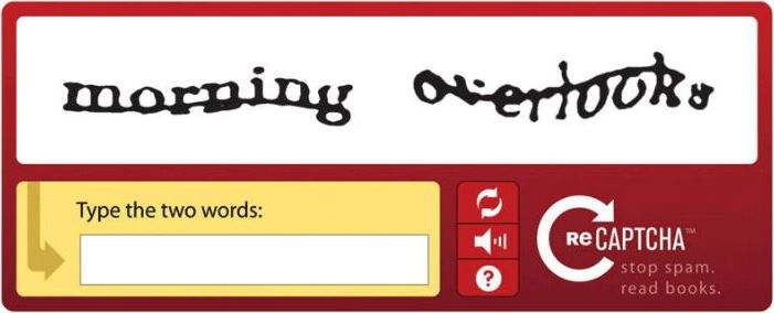
There is a place reserved in hell for CAPTCHA. You know it. The ugly input that makes you type in incomprehensible words. Or the tiled version that makes you pick similar images.
It’s got me stuck many times over the years. Users should never have to jump through hoops because of our technological limitations, especially on log in.
Striking a balance between security and usability is important. The addition of excessive security precautions, like CAPTCHA, can lead to users feeling frustrated and consequently reduce the number of form submissions.
There are other user-friendly ways to tackle the issue of spam bots. So, please look at other ways to keep your user’s data safe.
A good first impression
We have explored the design of a simple login screen, put together the most essential components, and created some alternatives. While login screen design may not be as exciting as other UI elements, it plays a crucial role in creating a positive user experience and building trust with users.
A clean, straightforward login screen with clear branding, essential elements, and user-friendly features can make all the difference in creating a good first impression and keeping users engaged. By paying attention to the details and putting in the effort to create a well-designed login screen, your users will unconsciously applaud you for it!
Header image source: IconScout
The post The essential elements of login screen UI design appeared first on LogRocket Blog.
from LogRocket Blog https://ift.tt/CyfkwDs
Gain $200 in a week
via Read more


