


A tooltip is a short contextual message contained in a small box that appears when hovering on a user interface element such as a button or icon. A tooltip provides the user with useful additional information about that element.
Tooltips are best suited for desktop and laptop devices because of the availability of a cursor to perform the hover interaction that triggers the tooltip. On mobile devices, tooltips can appear by long tapping an interface element, as per the Material Design guidelines.
The type of information a tooltip typically contains can be how-to instructions or relevant shortcuts:
The importance of tooltips
Tooltips are useful (and sometimes a necessity) in user experience design because they can help guide users through a UI pattern; the tooltip assists them in performing the desired action.
The user might need this guidance either because they are a beginner with technology products, or because the interface itself is too innovative to match all the pre-existing mental models of the user. A tooltip can create affordance to help users learn the new behavior and get accustomed to the new interface pattern.
Tooltips are also essential in use cases where a user might have doubts about certain interface elements, and they help clarify any misconceptions. In situations where tooltips communicate shortcuts, they help the user to get accustomed to the user interface and perform the desired actions more efficiently on repeat use.
In addition, tooltips help with accessibility for screen readers. They can also help users understand what to expect from similar interface elements.
Common issues with tooltip design
Placement
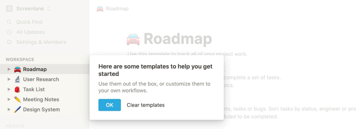
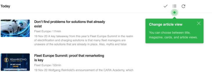
The primary issue with the tooltip design is its placement. We have to be mindful of the tooltip placement so that it does not block other essential elements on the screen.
When using tooltips for multiple interface elements that are side by side, we should use arrows to indicate which element the tooltip is for.

The above image is an example of a tooltip with bad placement. It blocks an essential part of the screen. The user experience is still manageable because there is enough tap area, but if this tooltip was over a smaller input box, then the input box would have been untappable.
Tooltip overload
Another common issue is the overuse of tooltips. We have to think of tooltips as friction that slow the user down, and too many tooltips cause user frustration.
Unclear information
Tooltip content should be helpful and clear. If a tooltip just repeats what the main interface element states, then it is redundant.
Tooltip design should be consistent throughout the interface, there should be enough contrast, and you shouldn’t use transparency.
We should also be mindful of the tooltip timing. Too fast or too slow to display the tooltip can cause user frustration.
Principles for effective tooltip design
We have already discussed some common issues with tooltips, and to comprehensively discern what constitutes a good tooltip, we can detail some principles for effective tooltip design.
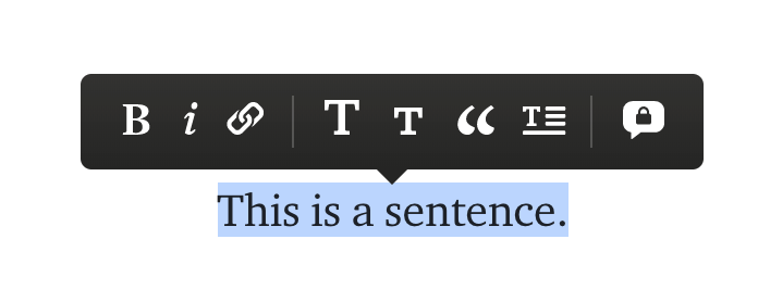
The visual design aspect
Good tooltip design should contain a high contrast box color to make it distinct from the underlying elements. Tooltips should ideally contain an arrow to point to the element it pertains to. This is particularly important when there are lots of elements with tooltips next to each other.
The position of the tooltip can be flexible. It can be on the top, bottom, or the left or right side. If it cannot appear in one position, we can have it appear in another position dynamically.
The width of the tooltip should ideally be short since we should only be using a single short sentence at best inside a tooltip. It is best to avoid opacity for tooltips since it hampers readability.
The proper usage of tooltips
Tooltips are best suited for additional and contextual information:
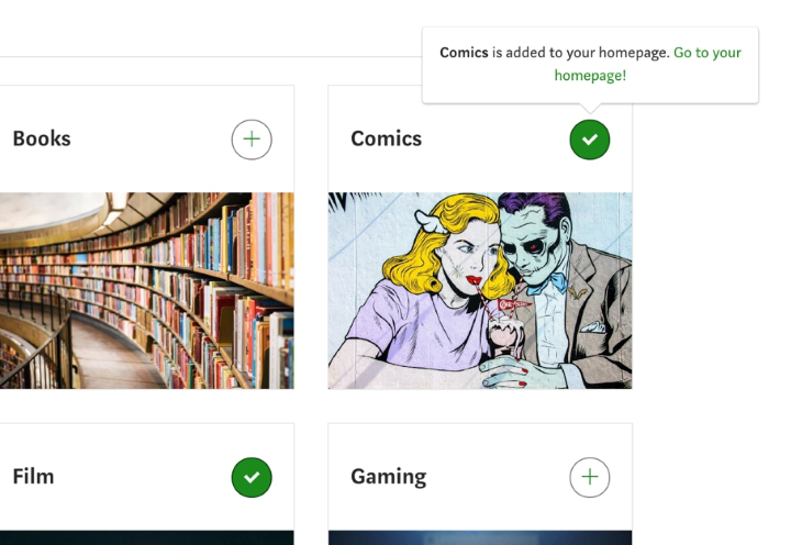
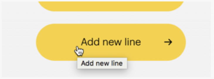
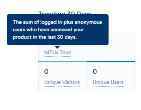
In the example above, the tooltip informs the user about an action you performed. The tooltip is noncritical in nature, but it is helpful in reassuring the user about their performed action. The tooltip is contextual and nonblocking; it does not interrupt the user’s task (which is to select some topics).
So, the key principles to be noted from here:
- Good tooltips contain noncritical but helpful contextual information
- Good tooltips are nonblocking in nature and do not interrupt the user
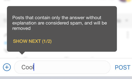
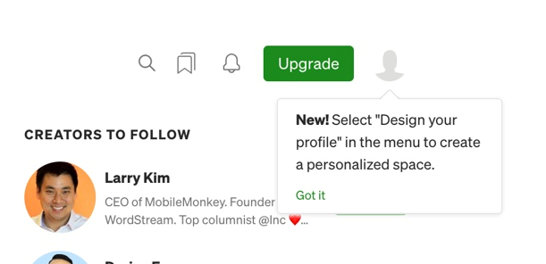
Designers commonly use tooltips to guide users in an onboarding process or announce new features, but it is best to refrain from thinking of tooltips as a way to get users to perform the desired action, like in this screenshot:
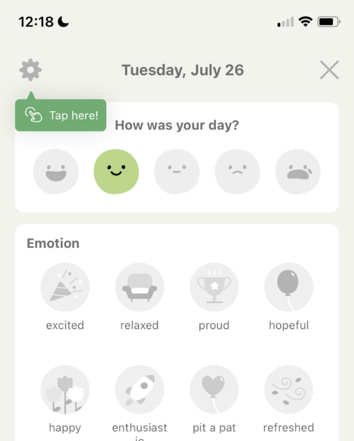
The user interface itself should be self-explanatory. We should not be reliant on tooltips to take users down a certain path. The tooltip demonstrated above does not add any contextual value. Better copy, such as, “Review your journal settings” would have made more sense.
Some designers even consider the use of tooltips quite undesirable altogether, as detailed in this opinion piece that argues for the occasional use of the tooltip.
The biggest failure in tooltip design is using them to convey critical information. Information such as password requirements should be right below the input field as instructive text, and should not require any user interaction to make it visible”
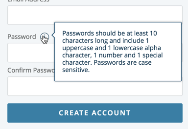
This example is to convey the noncritical nature of tooltips because putting critical information inside a tooltip can make it easily get missed by the user since they are not always easily discoverable.
Interacting with tooltips
It may not be wrong to state that a user generally does not expect a tooltip, since it is a nonessential item. Therefore, we have to be mindful of how the interaction with the tooltip occurs so that it is not annoying to our users.
- We already mentioned the aspect of timing in the common issues with tooltips. A tooltip should appear neither too fast nor too slow or it will frustrate the user.
- Good tooltips should have the option to press confirm or close them if the user wants to make them disappear. This allows users freedom and control, and the tooltip becomes less intrusive in nature.
- Tooltips should not repeat the copy of the parent element. It adds no value and has the opposite effect of being a distraction.
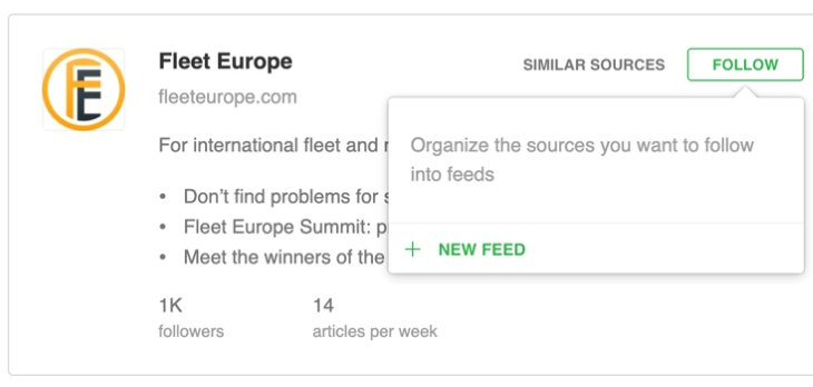
- If tooltips are used in a sequence, where a series of tooltips appear after each other (as part of a guided tour, for example), we should include a progress indicator and the user should have the option to skip the tour.
In the example above, they didn’t include a skip button but since it’s only two steps, the user experience is not bad. If there were more than two steps, the absence of a skip button would have been felt more prominently.
- In addition to tooltips being displayed on hover, tooltips should also display when it is focused on, with a keyboard. This is particularly necessary for accessibility reasons for users who navigate the user interface with a keyboard for special needs (such as Braille) and hear the options out loud.
Designing for mobile
There is no hover interaction on mobile due to the lack of a cursor, therefore we have to design tooltips for the touch (tap) interaction. In such a scenario, we have to decide whether we want the tooltip to trigger either on a long press or by tapping an icon. The long press interaction can be advanced and less discoverable, so the icon-based visual cue is usually the best choice.
No matter what interaction we choose, it’s important to stay consistent. Nielsen Norman Group classifies a tooltip that triggers upon touching or clicking on a “?” or “i” icon as a popup tip. Beyond designing for the touch or tap interaction, all the same principles that applied to desktop tooltips apply to mobile design as well.
Different types of tooltips
To further understand good tooltip design, we can analyze existing tooltip patterns in user interface design. Users have pre-existing mental models on tooltips and mimicking them will result in greater success.
- The most common tooltip is the information tooltip, which triggers on hovering over an interface element
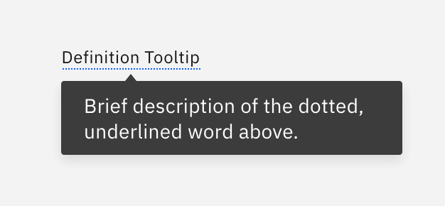
- The contextual tooltip is one that is specific to a certain context; for instance, it could be an underlined text that requires hovering to display the tooltip
- Instead of guiding users using a comprehensive series of tooltips, some applications only show tooltips when the user reaches a certain step in the user flow (to avoid information fatigue)
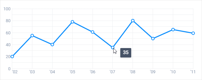
- Most applications will use tooltips to show additional data upon hovering a data point in a graph. Doing so makes the graph less overwhelming; the graph then feels interactive and the usefulness of the data is also preserved
(Image source: Webix) - Tooltips are often used for inline editing tools. They afford the user a quick and easy way to access tools, and as a result, improve the user experience
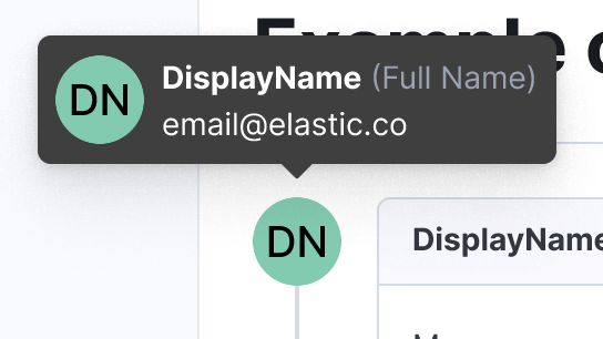
- Some tooltips display by hovering over user images and avatars. Theuser details are not necessary for every screen, but in situations where they might be needed for additional context, a tooltip is really handy to make that content available without leaving the screen
- Tooltips are often used for feature announcements and discovery. This helps with feature adoption and allows a gentle nudge to the user to explore a relevant functionality that they are not accustomed to
- Tooltips can explain terminology. They are most prominent in technical dashboards
- In interface design, sometimes we break rules for the greater good. In complex applications, normal modals can take shape in a large format as a super modal, and similarly, tooltips can take shape in a large format known as a super tooltip. A super tooltip can contain detailed context with sections and GIFs to explain complex contextual content (in an onboarding flow, for instance). These are less common but still quite prevalent
Testing tooltips for user engagement
Before testing our tooltip design, we have to identify our goals and objectives; i.e., what is the primary purpose of our tooltips? In an onboarding scenario, we might want to understand whether users understand the contents of our UI. We may want to determine whether the tooltips are sufficiently engaging or whether users tend to skip through the steps, which could make us want to revisit the tooltips and make them more concise and short.
To test the effectiveness of our tooltip design, we have to test it with real users in a realistic scenario. For instance, we can post paid surveys on platforms like UserCrowd where we ask qualified users to go through a user flow such as sign-up or onboarding and then ask them a series of questions to collect feedback about their experience. Since these are paid surveys, we have to account for bias and supplement our feedback collection with real-time observations as well, using platforms such as LogRocket to observe user interaction with our tooltips.
We might find insights such as how the tooltip might be a distraction from the user engaging in a more meaningful task. In the event of such a discovery, we can improve the timing and placement of our tooltip to be less intrusive. For instance, moving the tooltip to lower in the eye scan pattern and using a more gentle fade-in animation would make it less distracting.
A/B testing is a great way to understand which tooltip design works best. The most notable aspects of the tooltip design that can be tested are the placement and the contents of the tooltip. One tooltip copy may be is clear to some internal stakeholders and unclear to others, but only real users can tell us what resonates with them.
If we follow these basic principles, tooltips can be a blessing for any application by reducing the time a user takes to adapt to an interface. As our application gets more complex, we have to be mindful of the different tooltips we employ and ensure we’re being consistent throughout the application in how we trigger tooltips and the visual treatment we use to display them.
The post Designing better tooltips for improved UX appeared first on LogRocket Blog.
from LogRocket Blog https://ift.tt/ErBbZUz
Gain $200 in a week
via Read more


