In the UI/UX field, adding icons helps create a visual indicator for a particular element (i.e., a button, or a tab header) to express the context/action without so much text. Moreover, adding icons makes the app eye-catching and friendly for users.
We can add icons to our Vue.js apps with various icon libraries that come with either font- or SVG-based icon sets. Some icon libraries come as a part of a popular Vue.js UI component library; other libraries were developed based on popular, library-agnostic icon collections.
In this article, I will help you choose an icon library for your Vue.js project by listing popular Vue.js icon libraries with features and demos. Also, I will mention some niche and lesser-known icon libraries for designing unique app screens.
Here’s a list of libraries we’ll cover:
- @heroicons/vue
- @fortawesome/vue-fontawesome
- PrimeIcons
- @coreui/icons-vue
- vue-material-design-icons
- vue-feather
- vue-unicons
- oh-vue-icons
- Libraries for niche icons
You can create a new Vue 3 app with the following command to test the upcoming code examples on your computer:
npx create-vue@3
Or, you can copy-paste the following code into a CodeSandbox Vue.js 3 project.
Let’s get into it!
@heroicons/vue

The heroicons library offers over 290 high-quality, MIT-licensed SVG icons for web development. It was developed by the Tailwind CSS team and offers an official component package for Vue.js. You can also copy-paste the library-agnostic SVG code from the official website.
Highlighted features
- Offers three icon types: outline, solid, and mini
- Supports Vue 3
- A dedicated Vue.js component for each icon
- Styling options with Tailwind CSS classes (i.e.,
text-gray-500)
Installation
You can install this icon library with the following command:
npm install @heroicons/vue
# --- or ---
yarn add @heroicons/vue
Usage example
You can import, use, and customize icons as shown in the following example:
<script>
import { BeakerIcon, Cog6ToothIcon } from '@heroicons/vue/24/solid';
export default {
    components: { BeakerIcon, Cog6ToothIcon }
}
</script>

<template>
    <div>
        <beaker-icon class="icon"/>
        <cog-6-tooth-icon class="icon"/>
    </div>
</template>

<style>
.icon {
    width: 36px;
    height: 36px;
    color: #222;
    margin-left: 12px;
}
</style>
Preview
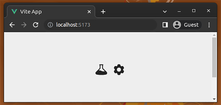
Browse all icons on the Heroicons website.
@fortawesome/vue-fontawesome
The @fortawesome/vue-fontawesome package lets you use the well-known FontAwesome icon collection’s free and open-source icons. This library lets you use inbuilt animations for icons and also lets you customize icons with pre-developed component props.
Highlighted features
- Offers 2,000 free, open source, CC BY 4.0-licensed SVG icons
- Three free FontAwesome icon packs: regular, solid, and brand
- Support for Vue 3
- One Vue component to use all supported icons (the bundle size can be reduced by importing only required icons)
- Many inbuilt animations: beat, fade, bounce, spin, etc.
- Props for customization (i.e., changing icon scale)
Installation
You can install this icon library and its dependencies with the following command:
npm install @fortawesome/vue-fontawesome @fortawesome/fontawesome-svg-core @fortawesome/free-solid-svg-icons
# --- or ---
yarn add @fortawesome/vue-fontawesome @fortawesome/fontawesome-svg-core @fortawesome/free-solid-svg-icons
This icon library recommends using a global setup with your required icons in the main app entry point, as shown in the following main.js source:
import { createApp } from 'vue';
import App from './App.vue';

import { FontAwesomeIcon } from '@fortawesome/vue-fontawesome';
import { library } from '@fortawesome/fontawesome-svg-core';
import { faUser, faClock } from '@fortawesome/free-solid-svg-icons';

import './assets/main.css';

library.add(faUser, faClock);


const app = createApp(App);
app.component('font-awesome-icon', FontAwesomeIcon)
app.mount('#app');
Next, you can display any pre-imported icon in your App.vue:
<template>
    <div>
        <font-awesome-icon icon="fa-solid fa-user" class="icon"/>
        <font-awesome-icon icon="fa-solid fa-clock" class="icon"/>
    </div>
</template>

<style>
.icon {
    margin-left: 12px;
    font-size: 36px;
    color: #222;
}
</style>
Preview
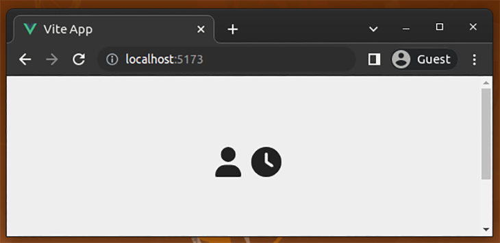
Browse all available icons on the FontAwesome website.
PrimeIcons
PrimeIcons is the default icon library for all Prime-based UI component libraries. PrimeIcons is a library-agnostic icon library because it recommends you import font-based icons from a stylesheet. In Vue.js apps, you can either import icons from the primeicons.css stylesheets or copy-paste the SVG icon sources from the GitHub repository.
Highlighted features
- Offers over 250 free, open-source, MIT-licensed font icons (and their SVG sources)
- FontAwesome-like, developer-friendly icon definitions
- Icons for Vue.js via a library-agnostic stylesheet (supports Vue.js 3)
- Inbuilt spin animation via the
pl-spinCSS class - CSS fonts-based customizations for icons (i.e., changing text size to re-size the icon)
Installation
You can install this icon library with the following command:
npm install primeicons
# --- or ---
yarn add primeicons
Usage example
You can import, use, and customize icons as shown in the following example:
<script>
import 'primeicons/primeicons.css';
</script>

<template>
    <div>
        <i class="icon pi pi-clock"></i>
        <i class="icon pi pi-car"></i>
    </div>
</template>

<style>
.icon {
    color: #222;
    margin-left: 12px;
    font-size: 36px;
}
</style>
Preview
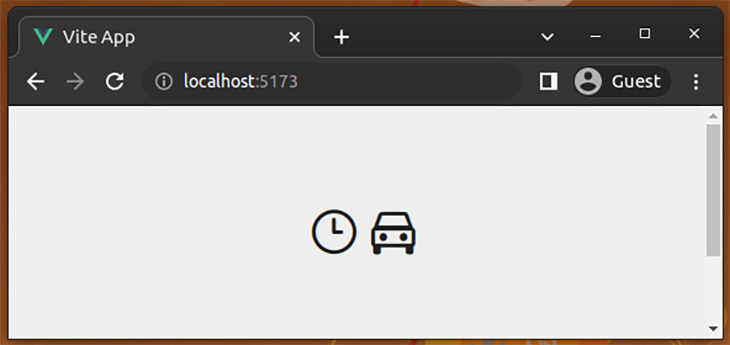
Browse all icons on the PrimeVue website.
@coreui/icons-vue
CoreUI is a popular UI component library for vanilla JavaScript, Vue, Angular, and React. The CoreUI library offers over 1,500 free and open-source icons via the @coreui/icons package that offers both SVGs and an icon font. We can use all supported CoreUI SVG icons in Vue.js via the @coreui/icons-vue package.
Highlighted features
- Offers over 1,500 free, open-source, CC BY 4.0-licensed SVG icons
- One Vue.js component to add all supported icons (the bundle size can be reduced by importing only required icons)
- Supports Vue.js 3
- Customizations via component props (i.e., changing the size)
Installation
You can install this icon library with the following command:
npm install @coreui/icons @coreui/icons-vue
# --- or ---
yarn add @coreui/icons @coreui/icons-vue
Usage example
You can import, use, and customize icons as shown in the following example:
<script>
import { CIcon } from '@coreui/icons-vue';
import { cilCalendar, cilBell } from '@coreui/icons';

export default {
    components: { CIcon },
    setup() {
        return { cilCalendar, cilBell }
    }
}
</script>

<template>
    <div>
        <CIcon :icon="cilCalendar" width="36" customClassName="icon"/>
        <CIcon :icon="cilBell" width="36" customClassName="icon"/>
    </div>
</template>

<style>
.icon {
    color: #222;
    margin-left: 12px;
}
</style>
Preview
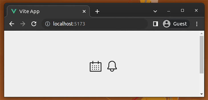
Browse all icons on the CoreUI website.
vue-material-design-icons
The Material Design concept offers a UI/UX specification for a component-based, fully-featured design system. It has several official implementations (i.e., Flutter widgets and Android UI) as well as third-party implementations. The @mdi/js package offers SVG data for icons in the Material design concept. The vue-material-design-icons library is a wrapper library that lets Vue.js developers use Material icons via @mdi/js.
Highlighted features
- Offers over 7,000 free, open-source, Apache 2.0-licensed SVG icons
- A dedicated Vue component for each icon
- Support for Vue.js 3
- Customizations via component props (i.e., changing the size and color)
Installation
You can install this icon library with the following command:
npm install vue-material-design-icons
# --- or ---
yarn add vue-material-design-icons
Usage example
You can import, use, and customize icons as shown in the following example:
<script>
import AlarmIcon from 'vue-material-design-icons/Alarm.vue';
import BasketIcon from 'vue-material-design-icons/Basket.vue';

export default {
    components: { AlarmIcon, BasketIcon },
}
</script>

<template>
    <div>
        <alarm-icon :size="36" class="icon"/>
        <basket-icon :size="36" class="icon"/>
    </div>
</template>

<style>
.icon {
    color: #222;
    margin-left: 12px;
}
</style>
Preview
Browse all icons on the Pictogrammers website.
vue-feather
The vue-feather package offers free, open-source, MIT-licensed, SVG-based icons from the popular feature-icons package for Vue.js projects.
Highlighted features
- Offers over 280 free, open-source, MIT-licensed SVG icons
- One Vue.js component to add all supported icons
- Support for Vue.js 3
- Spin and pulse inbuilt animations
- Customizations via component props (i.e., changing the size, changing animation speed)
Installation
You can install this icon library with the following command:
npm install vue-feather
# --- or ---
yarn add vue-feather
Usage example
You can import, use, and customize icons as shown in the following example:
<script>
import VueFeather from 'vue-feather';

export default {
    components: {
        'vue-feather': VueFeather
    }
}
</script>

<template>
    <div>
        <vue-feather type="star" size="36" class="icon"/>
        <vue-feather type="sun" size="36" class="icon"/>
    </div>
</template>

<style>
.icon {
    margin-left: 12px;
    color: #222;
}
</style>
Preview
Browse all icons on the library’s website.
vue-unicons
The @iconscout/unicons package offers over 1,000 icons in the SVG format and via an icon font. The vue-unicons package lets you use all supported SVG Unicons via a pre-developed Vue.js component.
Highlighted features
- Offers over 1,000 free and open-source SVG icons
- One Vue.js component to add all supported icons (the bundle size can be reduced by importing only required icons)
- Support for Vue 3
- Customizations via component props (i.e., changing the size, icon color, and hover icon color)
- Attaching click event handler via a prop
- An inbuilt API to add custom icons
Installation
You can install this icon library with the following command:
npm install vue-unicons
# --- or ---
yarn add vue-unicons
Usage example
This library offers an inbuilt API to register required icons from the main entry point of the Vue.js app without using local component imports. Look at the following main.js source:
import { createApp } from 'vue';
import App from './App.vue';
import Unicon from 'vue-unicons';
import { uniMusic, uniCarWash } from 'vue-unicons/dist/icons';

import './assets/main.css';

Unicon.add([uniMusic, uniCarWash]);
createApp(App).use(Unicon).mount('#app');
You can display any pre-imported icon in App.vue:
<template>
    <div>
        <unicon
            name="car-wash"
            width="36"
            height="36"
            class="icon"
            fill="#222">
        </unicon>
        <unicon
            name="music"
            width="36"
            height="36"
            class="icon"
            fill="#222">
        </unicon>
    </div>
</template>

<style>
.icon {
    margin-left: 12px;
}
</style>
Preview
Browse all icons on the library’s website.
oh-vue-icons
We can use various icon packs from different Vue.js icon libraries, but in some scenarios, we need to use several icon packs in one app. In this case, we’d have to install multiple icon libraries in our Vue.js projects.
What if you can access every popular icon library by installing one library, but only bundle the icons that you use? The oh-vue-icons package provides a single Vue.js component to access over 30,000 SVG icons from multiple icon collections.
Highlighted features
- Over 30,000+ icons from 20 popular icon packs
- One Vue.js component to add all supported icons (but, SVG content imported separately)
- Supports Vue 3
- Many inbuilt animations (i.e., wrench, ring, pulse, spin, etc.,)
- Customizations via component props (i.e., changing the size, icon color, and label)
Installation
You can install this icon library with the following command:
npm install oh-vue-icons
# --- or ---
yarn add oh-vue-icons
Usage example
This icon library requires a global setup with required icons in the main app entry point, as shown in the following main.js source:
import { createApp } from 'vue';
import App from './App.vue';

import { OhVueIcon, addIcons } from 'oh-vue-icons';
import { BiBagFill, FaClock } from 'oh-vue-icons/icons';

import './assets/main.css';

addIcons(BiBagFill, FaClock);

const app = createApp(App);
app.component('v-icon', OhVueIcon);
app.mount('#app');
Next, you can display any pre-imported icon in your App.vue:
<template>
    <div>
        <v-icon
            name="bi-bag-fill"
            class="icon"
            fill="#222"
            scale="2"/>
        <v-icon
            name="fa-clock"
            class="icon"
            fill="#222"
            scale="2"/>
    </div>
</template>

<style>
.icon {
    margin-left: 12px;
}
</style>
Browse all icons on the library’s website.
Preview
The above preview has two icons from two different icon packs, Bootstrap and FontAwesome.
Libraries for niche icons
Above, we’ve covered some of the primary icon libraries available based on popularity and icon offerings. In other scenarios, though, we may need niche icons to build special apps, such as cryptocurrency systems, games, etc., The following Vue.js icon libraries offer niche icons for special use cases:
vue-cryptoicon: Cryptocurrency iconsvue-country-flag: Country flag icons
There are also some less-popular (compared to the downloads and GitHub stargazer counts for each of this article’s icon libraries), but highly usable icon packs for Vue.js:
vue-ionicons: Icons from the Ionicons projectvue-icons: An alternative foroh-vue-iconswith over 60,000 icons@iconscout/vue-unicons: Official Unicons Vue.js package (an alternative forvue-unicons), but this is still growing and is less popular compared to the unofficial package at the time of writingvue-tabler-icons: Over 1,200 Tabler iconsvue-eva-icons: Over 480 Eva icons
Conclusion
In this article, we discussed the features and given usage examples of popular Vue.js icon libraries. We imported icon components locally in the App.vue source file for most examples, but you can also register icon components globally with app.component method, as shown in other examples above (i.e., FontAwesome).
These popular icon libraries offer some generic icon packs that every web application will need at some point. For example, we can find icons for add, remove, and edit actions in a grid section from any popular icon library.
You can also create your own icon library for Vue.js by either re-using SVG files from an existing icon pack or creating your own SVG icons from scratch. Most of the above libraries offer high-quality non-antialiasing SVGs. Meanwhile, others offer library-agnostic, developer-friendly, high-quality icon fonts.
The post Best icon libraries for Vue.js appeared first on LogRocket Blog.
from LogRocket Blog https://ift.tt/58MfxIh
Gain $200 in a week
via Read more


