Plotly is a powerful data visualization tool that you can use to create stunning graphs, charts, and other visualizations for your Rust projects. Plotly is an open source package built on the popular Plotly.js library that provides a high-level interface for creating interactive plots.
Plotly is handy for working on data-intensive projects, helping you create beautiful and informative visualizations for easier communication. The library is easy to use with its high-level interface that eases the process of creating complex visualizations with just a few lines of code. With zero to no knowledge, you can use Plotly easily in your Rust projects. In this article, we’ll cover how to start plotting using the Plotly package.
Jump ahead:
- Getting started with Plotly
- Creating basic plots with Plotly
- Customizing Plotly plots
- Plotly vs. Vegalite
Getting started with Plotly
You’ll need to set up a Rust project to use Plotly. You can use Cargo to create a new Rust project with the new command:
cargo new plotly-tutorial
The command creates a new Rust project in the specified directory containing the necessary files to run your project.
After creating your Rust project, you’ll need to install Plotly as a dependency. Run this command to install it:
cargo install plotly
You’ll also need to add Plotly to your project’s dependencies in your Cargo.toml file. The latest version at the time of writing is 0.6.0:
[dependencies]
plotly = "0.6.0"
After installing and adding Plotly to your app’s dependencies, import it with the use directive. Here’s how you can import Plotly functions in your Rust files:
use plotly::common::{Mode, Title};
use plotly::layout::{Axis, Layout};
use plotly::{Plot, Scatter};
The code imports functions from the common, layout, Plot, and Plotly modules in the Plotly package.
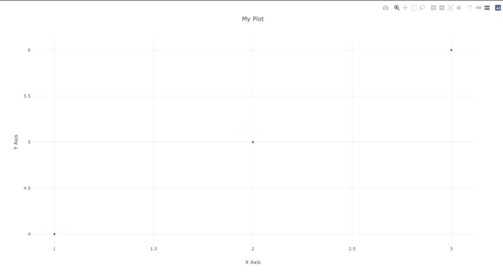
Here’s how you can create a simple scatter plot with Plotly:
fn main() {
    let trace = Scatter::new(vec![1,  2, 3], vec![4, 5, 6]).mode(Mode::Markers);

    let layout = Layout::new().x_axis(Axis::new().title(Title::from("X Axis")))
        .y_axis(Axis::new().title(Title::from("Y Axis")))
        .title(Title::from("My Plot"));

    let mut plot = Plot::new();
    plot.add_trace(trace);
    plot.set_layout(layout);
    plot.show();

}
In the main function, the trace variable creates a new Scatter object with two vectors of data points for the X and Y axes. The mode function calls on the scatter object to display the data points as markers on the plot.
The Layout::new function creates a new Layout object with the x_axis and y_axis functions that specify the axis and labels. The title function gives the plot a name.
Finally, the program creates a plot with the objects and adds them with the add_trace and set_layout functions. The show function displays the plot in a new window of your browser.
Here’s the resulting graph when you run the program:
Creating basic plots with Plotly
With Plotly, you can create a variety of plot types, from line charts to scatter plots and bar charts.
Plotting line charts with Plotly
You’ll need the Plot, Scatter, and Title modules to plot a line chart with Plotly. Here’s how to plot a line chart with two vectors holding the X and Y values:
use plotly::{Plot, Scatter};
use plotly::common::Title;

fn main() {
    // Create data for the line chart
    let x_values = vec![1, 2, 3, 4, 5];
    let y_values = vec![2, 4, 6, 8, 10];

    // Create a scatter plot with the data
    let scatter = Scatter::new(x_values, y_values).name("Line Chart");

    // Create a plot and add the scatter plot
    let mut plot = Plot::new();
    plot.add_trace(scatter);

    // Customize the plot layout
    plot.set_layout(plotly::Layout::new().title(Title::from("My Line Chart")));

    // Show the plot in a browser window
    plot.show();
}
The x_values and y_values are vectors for the line chart data, and the scatter variable creates a scatter plot with the data. The plot variable is an instance of the new plot; the add_trace method adds the trace to a plot.
The set_layout method customizes the plot layout, and the show method renders the plot to the browser:
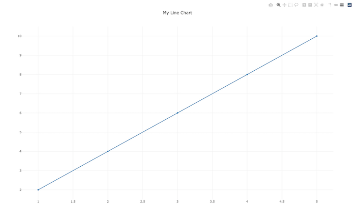
![]()
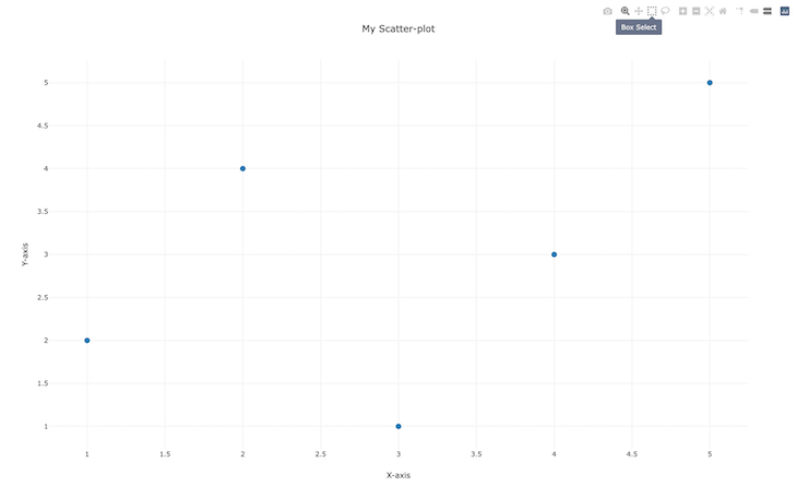
Plotting scatter plots with Plotly
Creating a scatter plot with Plotly is similar to creating a line chart. You’ll need to define the data, create a scatter trace, create a plot layout, and add the trace to the plot layout:
use plotly::{Plot, Scatter};
use plotly::common::{Marker, Mode, Title};
use plotly::layout::{Axis, Layout};

fn main() {
    // Define the data for the scatterplot
    let x_data = vec![1, 2, 3, 4, 5];
    let y_data = vec![2, 4, 1, 3, 5];

    // Create a Scatter trace
    let trace = Scatter::new(x_data, y_data)
        .mode(Mode::Markers)  // Set the marker mode
        .marker(Marker::new().size(10));  // Set the marker size

    // Create the plot layout
    let layout = Layout::new()
        .title(Title::new("My Scatter-plot"))
        .x_axis(Axis::new().title(Title::new("X-axis")))
        .y_axis(Axis::new().title(Title::new("Y-axis")));

    // Create the plot and add the trace and layout
    let mut plot = Plot::new();
    plot.add_trace(trace);
    plot.set_layout(layout);

    // Show the plot in the default browser
    plot.show();
}
The x_values and y_values are vectors for the line chart data, and the scatter variable creates a scatter plot with the data. The mode function sets the marker mode, and the maker function sets the marker size.
The layout variable is an instance of the plot layout, and the title, x_axis, and y_axis functions set the titles for the plot and the x and y axis, respectively:
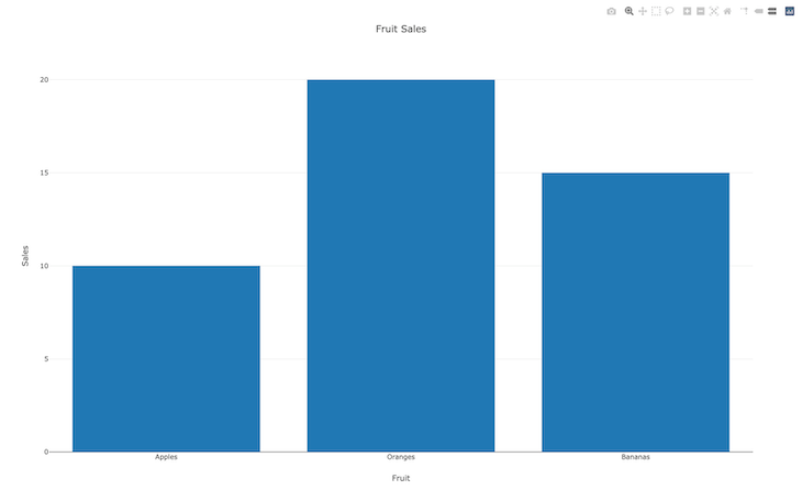
Plotting bar charts with Plotly
You’ll need the Bar module to plot bar charts with Plotly. You’ll start by defining data for the bar chart and creating a bar trace before creating the plot layout and adding the trace layout:
use plotly::{Plot, Bar};
use plotly::common::{Title};
use plotly::layout::{Axis, Layout};

fn main() {
    // Define the data for the bar chart
    let x_data = vec!["Apples", "Oranges", "Bananas"];
    let y_data = vec![10, 20, 15];

    // Create a Bar trace
    let trace = Bar::new(x_data, y_data)
        .name("Fruit sales");

    // Create the plot layout
    let layout = Layout::new()
        .title(Title::new("Fruit Sales"))
        .x_axis(Axis::new().title(Title::new("Fruit")))
        .y_axis(Axis::new().title(Title::new("Sales")));

    // Create the plot and add the trace and layout
    let mut plot = Plot::new();
    plot.add_trace(trace);
    plot.set_layout(layout);

    // Show the plot in the default browser
    plot.show()
}
The code plots a bar chart on the browser for fruit sales with the x_data and y_data variables. The trace variable is the bar trace instance, and the name method takes in the name of the bar chart:
Customizing Plotly plots
Customizing plots allows you to create visualizations that effectively communicate your data insights.
In the follow sections, we’ll cover a few of the many customizations you can make to your Plotly plots.
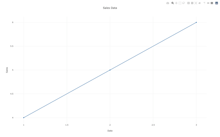
Adjusting plot titles, axis labels, and legends
The titles, axis labels, and legends of your plot are essential to propagating information in your visualizations.
Here’s how you can add plot titles, axis labels, and legends to a line chart with Plotly:
use plotly::{Plot, Scatter};
use plotly::layout::{Layout, Legend, Axis};
use plotly::common::Title;

fn main() {
    // Create a layout with a custom plot title, an x-axis title, y-axis title, and a legend.
    let layout = Layout::new()
        .title(Title::new("Sales Data"))
        .x_axis(Axis::new().title(Title::new("Date")))
        .y_axis(Axis::new().title(Title::new("Sales")))
        .legend(Legend::new());

    // Create a scatter plot trace with data and a custom name.
    let trace = Scatter::new(vec![1, 2, 3], vec![4, 5, 6])
        .name("Q1 Sales");

    // Create a new plot and add the trace and layout to it.
    let mut plot = Plot::new();
    plot.add_trace(trace);
    plot.set_layout(layout);

    // Display the plot in the default browser.
    plot.show();
}
The layout variable is a new layout instance. The title method takes in the title of the plot. The title function of the y-axis instances takes in the title of the X and Y axis. The legend function takes in an instance of a legend.
When running the function, you’ll see the axis, legend, and plot all labeled as intended:
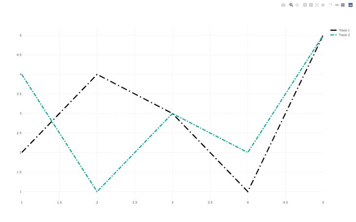
Changing colors and line styles
Colors add variance and spice to plots. Plotly provides many colors and line styles for customizing your plots. You’ll need the NamedColor module to work with colors in Plotly.
Here’s how to create a scatter plot with two traces and specify colors with Plotly:
use plotly::common::Mode;
use plotly::{NamedColor, Plot, Scatter};

fn main() {
    // Define some sample data
    let x_values: Vec<f64> = vec![1.0, 2.0, 3.0, 4.0, 5.0];
    let y_values_1: Vec<f64> = vec![2.0, 4.0, 3.0, 1.0, 5.0];
    let y_values_2: Vec<f64> = vec![4.0, 1.0, 3.0, 2.0, 5.0];

    // Create a scatter plot with two traces
    let trace1 = Scatter::new(x_values.clone(), y_values_1.clone())
        .mode(Mode::Lines)
        .name("Trace 1")
        .line(plotly::common::Line::new().color(NamedColor::Black).width(5 as f64).dash(plotly::common::DashType::LongDashDot));
    let trace2 = Scatter::new(x_values, y_values_2)
        .mode(Mode::Lines)
        .name("Trace 2")
        .line(plotly::common::Line::new().color(NamedColor::LightSeaGreen).width(5 as f64).dash(plotly::common::DashType::DashDot));

    let mut plot = Plot::new();
    plot.add_trace(trace1);
    plot.add_trace(trace2);
    // Show the plot
    plot.show();
}
The program creates a scatter plot with two traces. The color function changes the color of a plot. The first trace has the color Black and the second has LightSeaGreen.
You can use DashType to specify a dash type line style for your plot. The first trace has the LongDashDot line style, and the second has the DashDot line style:
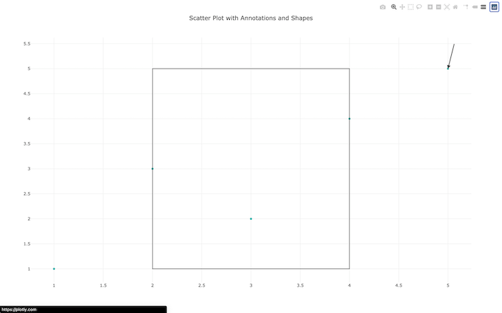
Adding annotations and shapes
You can create shapes with Plotly for extra customization on your plots. The process of adding annotations and shapes is similar; you just need to specify the coordinates.
Here’s how you can add annotations to your plots:
// Create some annotations
    let annotations = vec![
        Annotation::new()
            .x(5.0)
            .y(5.0)
            .show_arrow(true)
            .arrow_head(2)
            .ax(20)
            .ay(-80),
    ];
The annotations variable is a vector with a field for the annotations. The x and y functions are for the coordinates of the annotation. The show_arrow option shows arrows on the coordinates, and the arrow_head function specifies the arrowhead size. The ax and ay functions set the components of the arrow, respectively.
To declare a shape, you’ll specify the coordinates and other options, such as opacity. Here’s how you can add a square to your plot:
   // Create a shape
    let shape = Shape::new()
        .opacity(0.5)
        .x0(2.0)
        .x1(4.0)
        .y0(1.0)
        .y1(5.0);
The x0, x1, y0, and y1 variables are coordinates for the shape, and the opacity function sets the shape’s opacity.
You can add annotations and shapes with the annotations and shapes functions:
let layout = Layout::new()
        .title(Title::new("Scatter Plot with Annotations and Shapes"))
        .annotations(annotations)
        .shapes(vec![shape]);
Here’s the result of adding an annotation and shapes to the plot:
Plotly vs. Vegalite
Although Plotly is undoubtedly one of the most popular plotting libraries in the Plotly ecosystem, many other libraries are rising through the ranks, one of them being Vegalite.
Vegalite allows you to create interactive visualizations declaratively. It is built on the Vega-Lite visualization grammar and offers a high-level API for creating charts.
One primary benefit of using Vegalite is that it is designed to be highly customizable. You can fine-tune the visual properties of your charts with a wide range of options, from color schemes to axis labels.
Like Plotly, Vegalite also offers built-in support for interactive features such as hover tooltips, zooming, and panning, all of which allow you to create highly engaging visualizations.
While Vegalite may be more customizable and faster, Plotly offers a broader range of specialized chart types and a more moderate learning curve.
Both libraries have their strengths and weaknesses. Vegalite is highly customizable, fast, and easy to use, but it has a steeper learning curve.
Plotly, on the other hand, is also customizable and fast, but offers a broader range of specialized chart types and has a more moderate learning curve than Vegalite. Ultimately, your choice should depend on your project’s specific needs.
Conclusion
Plotly is a helpful tool when building interact web applications in Rust. In this article, you learned how to use Plotly for plotting a variety of charts, as well as how to customize those plots. You also got an overview of the differences between Plotly and the Vegalite plotting library.
The post Plotting Rust projects using Plotly appeared first on LogRocket Blog.
from LogRocket Blog https://ift.tt/qb6xUWB
Gain $200 in a week
via Read more