What is empathy in a UX context?
UX design is all about solving the problems that users actually have — not about solving the problems we assume users want to be solved. That’s why we need to understand users’ feelings and thoughts in a specific situation by using our own experiences to relate theirs. That’s when empathy comes into play: the ability to understand and share the feelings of another.
Empathy is a critical part of human-centered design, and it starts at the research stage. If you are the one who is conducting interviews, here are a couple of tips to help you empathize better with your participant:
- Ask lots of questions
- Become more observant
- Be an active listener
- Have an open mind
- Leave biases behind
All of these elements can influence our ability to empathize with our users and therefore solve problems they actually have. If we don’t practice empathy, we’ll be left with sympathy, assuming the problems our users want solved rather than identifying their real concerns.
A good method for developing empathy for users is creating empathy maps. We’ll cover how you can make your own empathy map step by step and demonstrate what they’re useful for.
- What is an empathy map?
- How do we make empathy maps?
- How to get the most out of your empathy map
- Best practices for empathy maps
What is an empathy map?
An empathy map is a design tool that represents a collaborative visualization of what we know about the user. It breaks down each user interview into digestible pieces of information.
Empathy maps shed light on which problems to solve and how. They are widely used throughout the Agile design process, and they are most useful at the beginning of the design process, after user research but before concepting.
Empathy maps:
- provide a glance into a user as a whole
- create a shared understanding of user needs and pain points
- remove bias from design explorations
- align the team on a single vision
- can be used as an aid when communicating design decisions
- discover gaps in user research
- are fast and inexpensive
Empathy maps vs. journey maps
You’ve probably heard a lot about mapping in the UX space, so let’s clarify some terms.
Empathy maps are not replacements for journey maps. Journey maps provide a visualization of the end-to-end user experience, whereas empathy maps offer a focused view based on the specific problem statement.
Let’s take a closer look at how these maps are different from one other:
| Journey maps | Empathy maps |
| Showcase a detailed footprint of user interactions | Abstract visualizations about the user’s mental model |
| Represent movement from point A to B to C in order to complete a designated task | Paint a picture about the task itself from a broader point of view |
| The product (or the experience) has to be already designed in order to have a journey map | An empathy map is used for informing the potential design concepts (aka “before” the experience is designed) |
| Helpful artifacts for the entire cross-functional team (especially stakeholders in marketing) | Powerful tools for designers and researchers |
How do we make empathy maps?
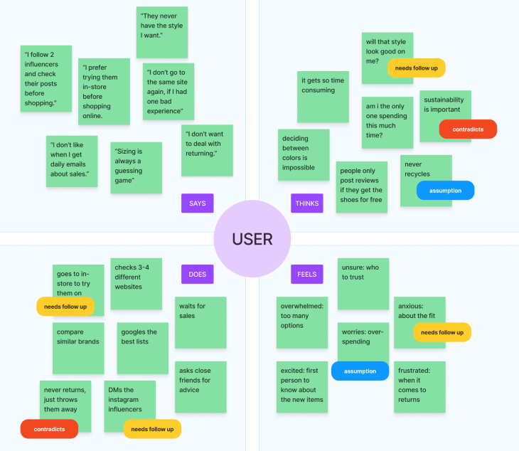
Traditional empathy maps are created as a 2×2 grid (four quadrants), each quadrant representing what the user:
- Says
- Thinks
- Does
- Feels
Once the user interviews have been conducted, the designer (and/or the team) come together to reflect and add sticky notes (with quotes and observations) into each specific quadrant.
Empathy maps can either be made for an individual user or a group of users in order to begin identifying patterns.
Let’s walk through the steps to create one, and then we’ll explain how to use an empathy map.
Step 1: Prep
While empathy maps vary in format, they all have common elements. A whiteboard (or a large piece of paper, or FigJam in the world of remote working) is divided into sections with the user at the center. We label each quadrant with a category that explores both the user’s external and internal world: what the user is saying, thinking, doing, and feeling.
Before the actual mapping, make sure to have an agreement on the goals and the scope. Is this map for a predetermined persona (from marketing research) or an individual user from the specific user interview? Will the team work together in a workshop environment to fill out the quadrants? Is the end goal to validate the problem statement or figuring out the research gaps?
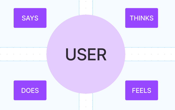
Let’s go over an example to demonstrate the process. The objective was to improve the shopping experience for an ecommerce website, and we conducted user interviews about the overall experience when it comes to buying shoes online.
Step 2: What does the user say?
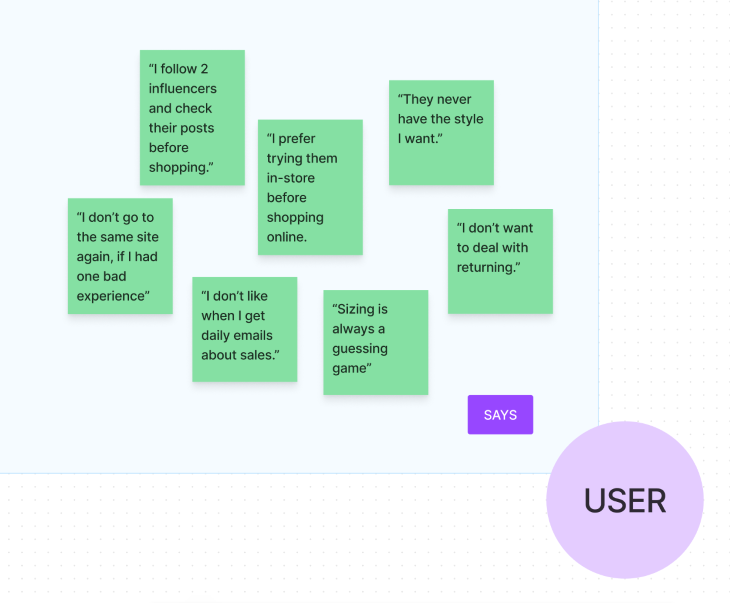
The Says quadrant contains direct quotes from the research. I recommend keeping it verbatim so that nothing gets lost in translation or paraphrased by mistake.
For example:
- The user says, “I don’t want to deal with returning.”
- The user says, “Sizing is always a guessing game.”
- The user says, “They never have the style I want.”
We take these and put them as individual sticky notes in the Says quadrant.
Step 3: What does the user think?
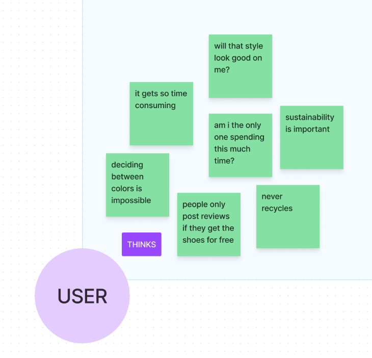
The Thinks quadrant represents the user’s thoughts on the given topic. Since us humans are not yet capable of mind reading, these “thoughts” will be our interpretation of what the user might think during the research/interviews.
That’s why the Thinks quadrant also represents “implications”; the things that they didn’t actually say out loud but we think they might mean it. Be aware of their body language as well. It might reveal hints about their true intentions, especially if they are hesitating or afraid of being judged or maybe they are just simply being nice and hiding their true feelings. (If your sticky note is based on assumptions, make sure to note that in the map as well.)
It is possible to have the same content in both Says and Thinks quadrants as well as contradicting information since what the user says out loud that might not match what they actually think, and that’s totally normal.
Examples:
- The user thinks checking out gets too time consuming
- The user never thinks about recycling
- The user thinks deciding on a color is really difficult
We take these and put them in individual sticky notes in The Says quadrant.
Step 4: What does the user do?
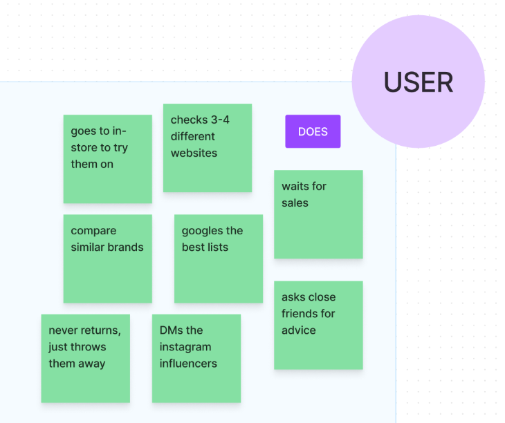
The Does quadrant showcases the particular actions that the user takes regarding the topic or the particular things that they do during the interview.
It can be both the physical actions while interacting with the product (refreshing, tapping, closing, adding an item to a cart…), or the steps they would take throughout the process (asking a friend, reading comments, calling a representative…).
Examples:
- The user waits for the sale season
- The user searches for the best shoes listicles online
- The user goes to the actual store to try them on
We take these and put them in individual sticky notes in the Does quadrant.
Step 5: How does the user feel?
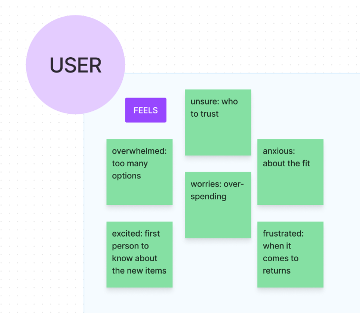
The Feels quadrant represents the user’s feeling and what is causing this. It is often written as “an adjective + the reason.”
Pay attention to the positive and negative sides of thoughts. What makes the user feel good or bad? Frightened? Excited? Anxious? Worried? Think about the root cause that’s related to the feeling.
Examples:
- The user feels overwhelmed because there are too many different options
- The user feels worried about overspending online
- The user feels excited when they get an email about the new seasonal items
We take these and put them in individual sticky notes in the Feels quadrant.
Step 6: Synthesize
When all the quadrants are filled with sticky notes, take a moment to reflect. The purpose of the mapping is to put the user at the center and put you in their shoes.
Within each quadrant, look for similar themes, move them closer together, label them. Mark the stickies if they are based on assumptions, indicate if any followups needed, or label if they are contradicting with each other. Bring them back to the team and talk about:
- What do you all agree on?
- What surprised you?
- What’s missing?
How to get the most out of your empathy map
Just because the workshop is over, that doesn’t mean the empathy map can be thrown away. Even though empathy maps shine the brightest during the early stages of the product development cycle (e.g., ideation and research), they can still be used as a powerful aid throughout the rest of the process (prototyping, sourcing, costing, and commercialization).
Since they provide a deep dive into the users as a whole, empathy maps can be leveraged as a design artifact that can be used to fact check throughout the development. If a user assumption needs to be validated, reference your empathy map’s related quadrant. Or if the team needs alignment on metric definitions such as OKRs, KPIs, or leading and lagging indicators, use your empathy map as a starting point.
Keep in mind that iteration is the key when it comes to developing successful products, and with every new version of the experience, we also learn more about user behaviors. Make sure to update your empathy maps whenever there’s a new input, research, study, or interview that’s related to that map’s specific user.
Best practices for empathy maps
Here are a couple of tips and tricks to help you get started making effective empathy maps.
- Identify the output: Do you aim to investigate a specific behavior, or do you hope to have a better understanding of a mental model? Are we at a 1,000-foot view or 100,000-foot view? Making sure everyone is looking at the same problem is a crucial first step before solving the problem. It is important to have your team align on the goal and the outcomes, including how generic or specific you all want the map to be
- Be inclusive: Having different points of view in the same room will help you discover different angles and identify your own unconscious biases. The more eyes on it, the more inclusive you get, and the better the end product will be. Since each cross functional partner will bring their own expertise, it will also be a great melting pot for business goals, user needs, and tech feasibility. It’s also a great team bonding exercise, especially in the world of remote work
- Think about the logistics: Set up a workshop environment and create empathy maps as a team. Make sure everyone gets enough time to work on the map and don’t forget to include “Intro to Empathy Maps 101” since some stakeholders might not be too familiar with empathy maps. Some parts can be done in async, but always have a followup session to go over the findings and talk about the synthesis as a team.
Keep in mind
- Users are humans and humans are complex: They have feelings, their own biases, and they might not tell the truth at all times
- It is the UX professional’s job to investigate: Make the best possible educated guess, build the hypothesis, and connect the dots
- Treat empathy maps as treasure maps: Uncover gems like unmet user needs or gaps in the user research
- Contradiction and ambiguity are expected between quadrants: Lines can get blurry, especially between the Thinks and Feels quadrants
- Do not focus too much on being 100% accurate: If a post-it feels like it can belong to multiple quadrants, place it on the quadrant that comes to your mind first
Empathizing is the number one superpower for designers to spot user problems, and solving user problems is the ultimate goal of UX design. Take advantage of empathy mapping and use it as a powerful tool in the product development cycle.
Header image source: Flaticon
The post Empathy mapping in UX: How to put yourself in users’ shoes appeared first on LogRocket Blog.
from LogRocket Blog https://ift.tt/KmlpCH5
Gain $200 in a week
via Read more


