


Design systems are essential tools for product design teams. They ensure consistency and efficiency throughout the entire design process, from concept to finished product.
Designers, developers, and stakeholders depend on a design system to guarantee their creation is visually appealing, accessible, and user friendly.
Figma provides an ideal platform for design teams to create and maintain their systems; in this article, we’ll look at how to create a headless design system using Figma.
- What is a headless design system?
- How are design tokens used in headless design systems?
- Creating a headless design system in Figma using the Tokens Studio plugin
- Design handoff and communication
- Scaling headless a design system with Figma
- Benefits of a headless design system
- Best practices for UI Components in a headless design system
What is a headless design system?
A headless design system is one that prioritizes core design elements and their relationships over specific visual implementations. As the name implies, this separation delineates design from visual representation.
With this approach, designers define the elements and their relationships while developers use these definitions to implement the design in code, providing greater flexibility and scalability within design systems.
When designing a website or app, designers often create button components. In traditional design systems, these buttons would include specific visual attributes like color, size, and shape. However, in headless systems, the button component only includes core design elements like typography, spacing and layout — these being what the developer would use to implement with specific visual attributes as needed.
How is headless design system different from traditional design system?
Headless design systems differ from traditional designs in that there is no central user interface or frontend. Instead, the system consists of multiple components which can be tailored according to the project needs, allowing developers to craft customized user experiences without needing to build out an entire UI from scratch.
Furthermore, headless designs offer more control over data storage and access, making them safer than traditional designs. With greater flexibility comes greater responsibility for developers, making headless design an appealing option for those seeking unique user experiences.
How are design tokens used in headless design systems?
What are design tokens?

Design tokens are a set of variables that define the design elements of a product, such as typography, color, spacing and layout. These variables are defined once and can be reused across various platforms and design tools.
Design tokens provide one source of truth for design elements so designers and developers can collaborate more easily while ensuring consistency throughout their system.
The tokens enable us to differentiate the visual representation of a design element from its underlying definition. This means we can define core attributes like size, weight, and spacing for an element and then apply them across different visual representations such as buttons, text, or images.
Design tokens in headless design systems
Headless design systems define design tokens in a manner that separates them from their visual representation. This means the design tokens represent core attributes of an element such as font size, weight, and line height but do not dictate how it should appear visually; the visual representation is defined separately and can be modified without affecting the underlying design tokens.
Take for instance a button component in our headless design system. Instead of specifying its visual attributes such as color, shape, and size, we define its core design elements such as font size, line height and padding. With these design tokens we can generate different visual representations of the button such as primary button, secondary button or disabled button.
By employing design tokens in this manner, we can guarantee consistency across different platforms and design tools. Furthermore, updating a design element’s visual representation without impacting its underlying design tokens makes maintaining the design system simpler.
Creating a headless design system in Figma using Tokens Studio plugin
The Tokens Studio plugin for Figma is an efficient tool for creating and managing design tokens across various projects.
Tokens are discrete units in a design system that represent visual properties like colors, typography, spacing, and borders. With Tokens Studi,o designers can create a centralized repository of tokens which are easy to access and update as needed — providing consistency and scalability when working on design initiatives.
Let’s look at how you can use your own tokens to manage a headless design system.
1. Installing Tokens Studio

Install the Tokens Studio plugin from the Figma plugin library. This plugin is essential for creating and managing design tokens in Figma.
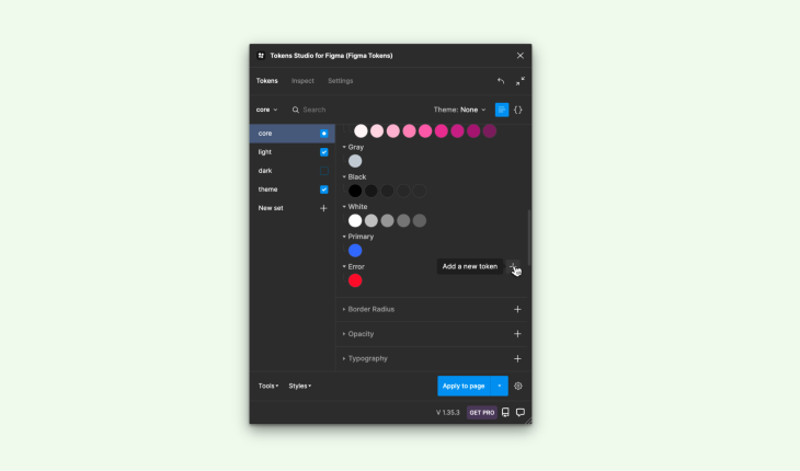
2. Creating tokens
Tokens Studio provides a wealth of customizable properties for customization. Colors, spacing, sizing, border radius, opacity, and typography are just a few of its many options.
To create a new token, navigate to the relevant section and click on the + symbol next to its name. This will open a modal window where you can assign a unique name and value for the token. For better organization, use dot notation to nest tokens within each other.
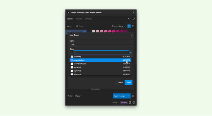
3. Referencing tokens
To simplify the creation of new tokens, you can refer to existing ones and create aliases. Aliases are identified by having their property name enclosed in curly braces.
To create an alias, type { into the value field, and a dropdown list with all available tokens will appear. Select your desired token from this range and press Confirm, linking it to its selected counterpart — making managing and organizing your token library much simpler!
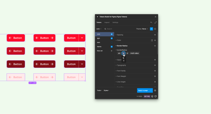
4. Applying tokens
To apply a token’s default behavior to an object on the canvas, begin by selecting it. Left-click on the desired token to apply; spacing attributes would have automatic layout gap and border radii would apply across all corners.
For more control, use the right mouse button and select. This will enable you to adjust padding or alter individual corners of the border radii. By employing these techniques, you can quickly and easily customize objects on the canvas according to your desired specifications.
Design handoff and communication
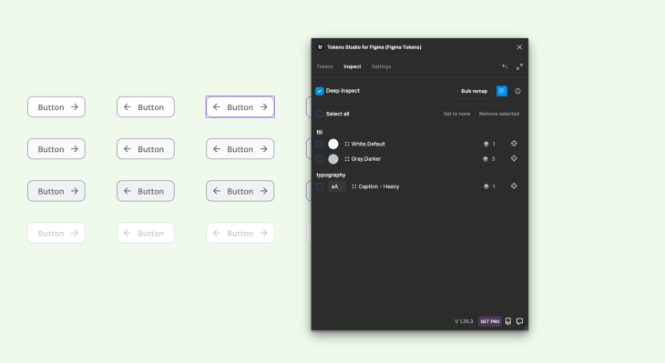
1. Inspecting designs
In Tokens Studio, it’s easy for others to examine your designs and identify which tokens were used. All tokens associated with the active layer can be found in the Inspect panel.
For a more detailed view of nested elements, select the Deep Inspect option. This will reveal additional properties and attributes that can be modified or remapped to further customize your designs. By providing this level of transparency, Tokens Studio enables easy collaboration and efficient management of design assets.
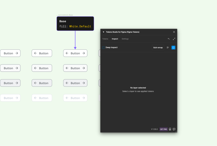
2. Annotating design
Utilizing a plugin can make data inspection difficult as a viewer. To circumvent this issue, development teams must either utilize the plugin or rely on redlining as an alternative approach.
Tokens Studio offers an annotation feature to assist with creating design specifications. To utilize it, first click on the Inspect panel tab and uncheck Deep Inspect. Select any layer to view all applicable tokens. Finally, switch to the Debug & Annotate view and place your annotation as desired.
It’s essential to note that documentation does not automatically update, so any modifications must be manually adjusted. Using annotations, development teams can more effectively communicate design specifications and collaborate more efficiently.
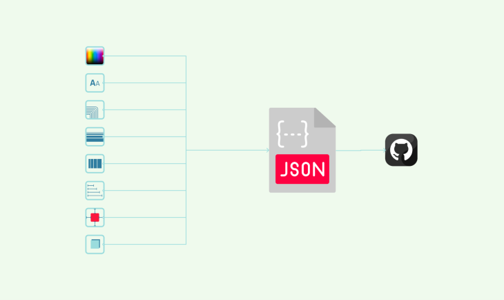
3. Tokens repository
Design systems are essential in enabling multidisciplinary teams to collaborate around one source of truth. With Tokens Studio, there are multiple methods for synchronizing your tokens; by default they’re stored locally on your device; however, this may not be sufficient if working with multiple Figma files simultaneously.
If your token library needs updating, Tokens Studio provides several sync providers in the Settings panel. These options range from GitHub and Gitlab to Azure, JSONBin, and other storage and allow for seamless integration across different files while guaranteeing all team members have access to the most up-to-date versions of your tokens.
Scaling headless a design system
Headless design systems provide several advantages, such as providing teams with a single source of truth, improved collaboration, and speedy design iterations.
Unfortunately, as the system grows in size and complexity it becomes harder to manage and scale effectively. For that reason, I’ll share the industry best practices for making headless design systems scalable.
1. Establishing a consistent naming convention
In order to make your design system scalable, it’s essential that you establish an intuitive naming convention for tokens. This should be simple enough that all team members can follow it easily. When naming your tokens, ensure they are descriptive and follow a logical hierarchy; this will make organizing and searching specific tokens easier as your system expands in size.
2. Using version control
Version control is essential when working with a headless design system. It helps teams keep track of changes made to the system and rollvback to previous versions if needed.
Using version control, you can guarantee all team members are working with the most up-to-date versions of the system and prevent conflicts due to using outdated ones.
3. Documenting your system
Documenting is essential for the scalability of your headless design system. It helps new team members comprehend its structure, how to use it, and underlying principles.
Documentation should include guidelines on token usage, naming conventions, and design principles so everyone is on the same page and the system is used consistently across various projects.
4. Embracing automation
Automation is an invaluable asset that can make your headless design system more scalable. By automating tasks such as token creation, syncing, and documentation you save time and reduce the chance of errors. Furthermore, automation enables design rules and guideline consistency across various projects.
5. Fostering collaboration
Collaboration is essential for making your headless design system scalable. Encourage collaboration among designers, developers, and other stakeholders to ensure everyone is on the same page. Use tools like Slack, Trello or Asana to facilitate communication and teamwork between members.
Benefits of a headless design system
Design systems are essential tools for product designers, and creating a headless design system can offer several advantages.
Increased flexibility
A headless design system separates design from visual representation, offering designers greater freedom. They can focus on core design elements and their relationships without worrying about specific visual attributes.
Designers create one element such as a button, then developers customize its appearance with various attributes like color, size, and shape.
Improved scalability
A headless design system enhances scalability by defining core design elements and their relationships once. Designers can then create visual representations of those elements without having to redefine them, making it simpler for the system to scale as it grows.
Furthermore, designers can quickly produce new components without starting from zero each time; updates to visual representations don’t affect underlying elements, making it simpler for iterate and make changes within the design system more efficiently.
Increased consistency
A headless design system helps maintain consistency in design elements. By concentrating on core elements and relationships, designers can create an easy-to-update system. Styles for these elements ensure consistency across platforms and tools while eliminating manual updates that cause inconsistencies.
Best practices for UI components in a headless design system
Maintain modularity in UI components
Modularity is key when designing for headless design systems. Each UI component should exist independently from others and be self-contained, allowing modification to individual parts without impacting other parts of the system.
Take a modular approach when crafting components by breaking them up into smaller, reusable elements.
Utilize a consistent design language
A consistent design language is essential for creating an intuitive user interface. Keep all components unified in style, color scheme, typography and layout by applying the same style across all components.
This creates a unified look and feel that makes navigating the interface simpler for users. Utilize a design system to guarantee consistency across all UI elements.
Focus on accessibility
Accessibility is paramount when it comes to user interface components. Make sure all elements are accessible for those with disabilities, including those using assistive technologies.
Use accessible color schemes, provide alternative text for images and make interactive elements easy to navigate using a keyboard. Moreover, ensure your components meet WCAG 2.1 guidelines.
Optimize for performance
Performance is paramount when creating a fast and responsive user interface. Optimize your UI components’ performance by keeping them lightweight, minimizing the number of requests needed to load them, and using techniques such as lazy loading or code splitting to enhance speed and responsiveness.
Final words
In conclusion, creating a headless design system with Figma can be an invaluable asset for designers and design teams. With the capability of delineating design principles, creating design tokens, designing scalable components with variable dimensions, and documenting your system — you create the basis of an integrated user experience.
Figma’s features enable designers to collaborate more easily and share their work across different platforms and channels with ease. With careful planning and execution in place, a headless design system helps teams craft products that cater specifically to their users’ requirements.
The post Creating a headless design system using Figma appeared first on LogRocket Blog.
from LogRocket Blog https://ift.tt/vWzPAeD
Gain $200 in a week
via Read more


