Design concepts are an incredibly important part of the product workflow. They’re critical for ideating, iterating, testing, and essentially mocking up designs before moving on to development, where it’s then too late or too expensive to fix any problems that come up.
In this article, you’ll learn about the different types of design concepts and how product teams can use them to iron out problems early.
Table of contents
- What are design concepts?
- What are design concepts useful for?
- Tips for conducting user and UX research
- How product managers can create good practices for design concepts
- Writing design statements
- Useful tools for building design concepts
What are design concepts?
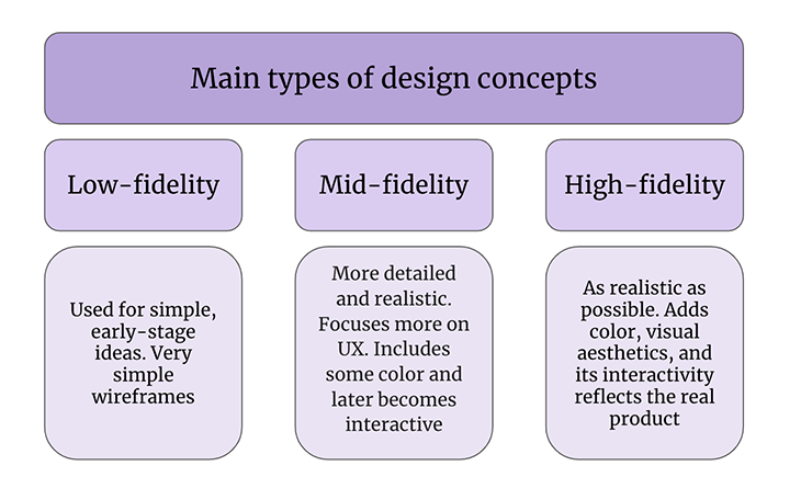
There are three main types of design concepts, sometimes referred to as “mockups,” — low-fidelity, mid-fidelity, and high-fidelity. In this case, fidelity means the level of realism:

Low-fidelity design concepts are the simplest, used for visualizing early-stage ideas. Typically, these come in the form of simple wireframes (i.e. low-detail, low-color, low-interactivity blueprints).
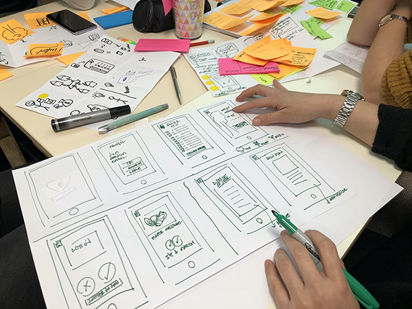
They’re usually digital, but product teams might prefer to ideate by sketching (or “paper prototyping”) to start. At this point, the objective is to understand core user needs through ideation, iteration, and user testing. No idea is too bad or too crazy; in fact, teams are encouraged to go wild!
Mid-fidelity design concepts are more detailed and realistic. At this point, you’ve likely chosen a concept to move forward with, and now it’s time to focus more on UX (user experience) rather than user needs. You’ll use color where it concerns usability, and in later stages, you’ll start to make it interactive. At that point, you’d begin to refer to it as a prototype. You’ll be UX testing rather than user testing.
High-fidelity design is about making the prototype as realistic as it can be. This includes using color to help express a visual aesthetic for the first time and ensuring that its interactivity reflects how the final product should act.
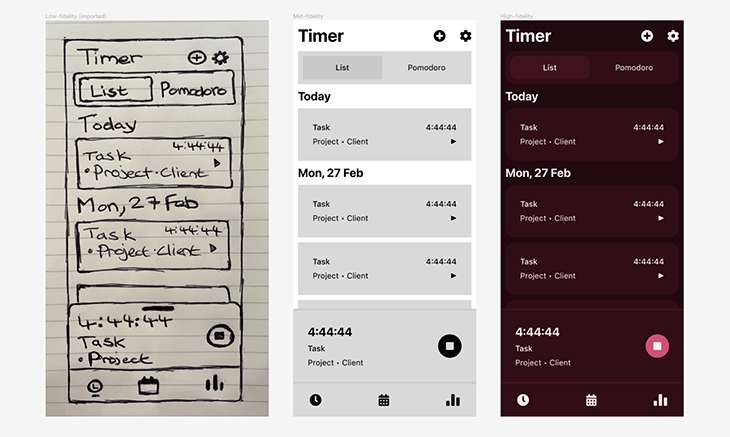
Here’s a quick visual to get an idea of what the different three types of design concepts look like:

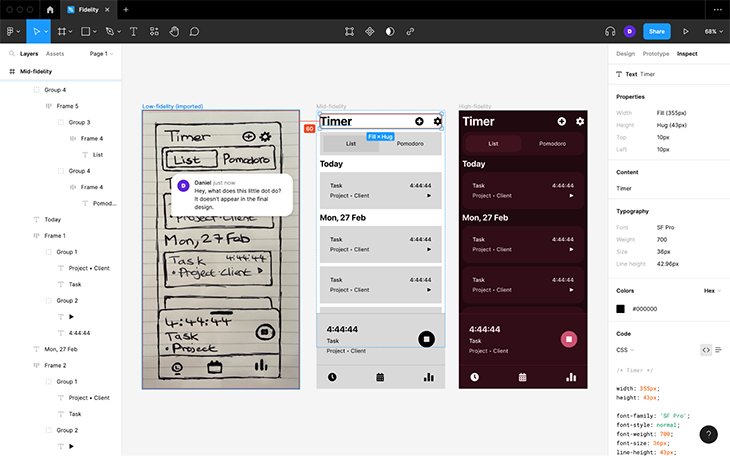
Designers will typically use design handoff tools to annotate the design, compensating for the limitations that UI design tools have. At the same time, this enables developers to enter the chat and enquire about any concerns they have about how the design would be developed. This is, of course, before doing even more UX testing:

What are design concepts useful for?
During the product process, obstacles and setbacks are inevitable. However, fixing problems post-design phase is 2–15x more expensive. Design concepts are the first step in creating a great product because they enable product teams to discover and fix problems long before the development phase.
In the low-fidelity phase, design concepts are useful for generating, refining, and user-testing a high quantity of ideas. The goal is to end up with the one concept that best meets user needs.
In the mid-fidelity phase, design concepts are useful for crafting a good user experience and using UX testing to test and refine it. This includes usability (how well users can use it), accessibility (ensuring that everybody can access it regardless of their abilities), and a little bit of interactivity. Without great usability and accessibility, users are far less likely to want to engage with your product.
In the high-fidelity phase, it’s just more usability, accessibility, and interactivity, plus the addition of a visual aesthetic (sometimes referred to as the surface layer). While it is more of the same in terms of designing and UX testing, it’s less about the basic structure and more about the tiny details. In fact, this is the mockup that developers will use as a guide to actually build the product. Without high-fidelity prototypes (or without any design concepts, in fact), developers will have almost nothing to go on.
Tips for conducting user and UX research
Using design concepts internally is a great way to design products by applying what we call “design heuristics,” which are essentially repeatable solutions (or safe bets, if you will).
Generally speaking, these safe bets are likely or certain to improve the design regardless of the context. For example, additional color contrast will improve readability in 100 percent of scenarios — we wouldn’t need to do any testing to find this out.
However, product teams must utilize user and UX testing to uncover and solve most problems, as well as confirm that any design heuristics used were, in fact, the right choice.
Building a research participant database
You’ll want to build up and maintain what’s essentially a database of research participants. You’ll only reuse participants in the mid-fidelity and high-fidelity stages that you used in the low-fidelity stage. Additionally, you’ll go through all of these stages multiple times before finally developing the product, and then several more times as your product gets new features, targets new markets, readjusts its business goals, or gets rebranded.
The goal is to have a healthy amount of research participants at hand since some participants might not be available when you need them to be. Some might not fit a particular demographic (like age group) or criteria (having used a similar product). For this reason, simply getting 5–10 participants won’t do.
Note their demographics, attributes, contact details, how reliable they are, and how forward they are with feedback. Product teams should be able to easily segment and contact participants based on this information. There are useful tools that can help with this, but we’ll go into that in a moment.
Building a research repository
Product teams should also get in the habit of contributing to what’s called a research repository. In a nutshell, every time a study or test is carried out, the objectives, design concepts, step-by-step process, insights, and outcomes are documented so that product teams can easily repeat successful processes or reuse insights, therefore saving time.
Utilizing a research repository can also help to build a more democratic, more information-sharing-based culture where anybody can contribute to the product’s design. This brings a wide range of perspectives to the team, lessens the burdens of research by spreading responsibility, and boosts team morale by allowing for more creative freedom.
Remember, literally anybody can use design concepts — product managers, developers, marketers, etc. At the very least, an idea can be explored with some paper prototyping and a research participant database.
What I’m describing here sounds like a bottom-up approach to product management. If you’d rather take a top-down approach where work is more methodic, organized, and synchronous (although perhaps more limiting), it’s best to adopt a product methodology.
How product managers can create good practices for design concepts
There are many different product methodologies. They all have their own processes, benefits, and drawbacks, but fundamentally they’re the same — helping teams streamline their processes and spend just the right amount of time on things. Generally speaking, they all involve ideation, iteration, testing, and rapid incremental improvement, utilizing design concepts rather than wasting heavy resources on development.

Some popular methodologies include:
- Agile sprints
- Design sprints
- Design thinking
Product managers can own design concepts by choosing an appropriate product methodology. Martin Backes’ article goes into much more detail about the pros and cons of each product methodology. I recommend this read, as Martin also gives advice to ensure that the team makes the most of the techniques and time constraints enforced by the chosen methodology (or methodologies if you prefer to switch between different styles).
With that in mind, utilizing a product methodology doesn’t necessarily have to mean utilizing a top-down approach to product management. For example, rather than doing back-to-back design sprints, taking a break in-between sprints enables team members to take on side quests where they can use their creative freedom to explore ideas using design concepts.
As an example, a developer might want to test a particular design pattern against an alternative, knowing that the performance of its implementation would be slow — something that a designer wouldn’t typically know. Given what we know about fixing problems post-design phase, this could be a very costly mistake if ignored.
Again, this is why it’s so important for product teams to have a diverse range of expertise plus the creative freedom and ability (or collaborative bandwidth) to explore ideas using design concepts, even if it’s just on paper.
Writing design statements
A design statement is essentially a piece of documentation that documents an entire design process. As an example, the kind of write-ups that you’d put in a research repository would be classified as design statements.
But those aren’t the only types of design statements. You’ll also want to document how your users respond to certain design patterns — which ones they find easy to use, which ones they don’t find easy to use, how it was tested, and any relevant context.
If any design heuristics were used that seemed unproblematic during testing, cite which heuristic was used and why.
It’s useful to document these things so that product teams have access to valuable insights when using design concepts in the future. Plus, this information will become your product’s design system later on.
Useful tools for building design concepts
The following tools are great for creating wireframes and prototypes of any fidelity:
For sketching, you’ll want to look into:
And finally, for creating a research repository (including having a place to store research participant information):
Wrapping up
Design concepts should accompany product teams through every step of the product process, helping them to ideate, iterate, test, surface problems, and eventually hand them off to developers to build.
It’s definitely worth learning how to build and test them efficiently (perhaps using a product methodology), how to include everybody that works on the product (not just the designers), and how to document the insights to give them recycled value.
If you’ve got anything to share, your tips and tools are welcome. Either way, thanks for reading!
Featured image source: IconScout
The post A guide to design concepts: Mockups, wireframes, and more appeared first on LogRocket Blog.
from LogRocket Blog https://ift.tt/zhSJROE
Gain $200 in a week
via Read more


