


Vuetify is one of the most widely recognized user interface frameworks for Vue.js. It provides a set of reusable and customizable components that allow us to quickly and effectively build modern and user-friendly interfaces.
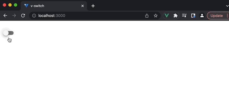
Among many of the components available to us from the Vuetify library, Vuetify provides the v-switch component (i.e the switch component) — a toggle switch that allows users to turn options on or off:
v-switch is commonly used to enable or disable features in an app, change themes, and switch between values in a form. In this article, we’ll investigate how we can use the v-switch component in addition to understanding some of the customizations it offers out of the box.
Jump ahead:
- Getting started with Vuetify
- Creating our project using create-vuetify
- The
v-switchcomponent v-switchcustomizations
Getting started with Vuetify
All code samples shared in this article involve the use of Single-File Components and the Composition API that Vue 3 provides. In particular, we’ll follow the recommended <script setup> syntax.
All running code examples we share through Codepen will follow the more traditional Options API.
If you’d like to follow along with this article in your local development environment, follow the steps below to create a Vue/Vuetify 3 project with the help of the create-vuetify tool (as shown in the Installation section of the Vuetify docs).
Creating our project using create-vuetify
First, we’ll run the following command in our terminal:
yarn create vuetify
Then, we’ll provide the following options to create a Vue/Vuetify 3 project named vue-switch-project:
Project name: vue-switch-project
Next, we’ll navigate into the newly created vue-switch-project/ directory and run the yarn dev command. This will run our newly scaffolded Vue application at http://localhost:3000/:
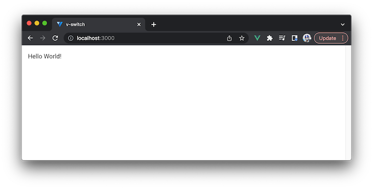
Next, we’ll remove the autogenerated src/assets/ and src/components/ directories from our project because we’ll only be working within the src/App.vue file. As a starting point, we’ll have the App.vue file simply render a “Hello World!” text:
<template>
  <v-app>
    <v-main>
      <v-container fluid> Hello World! </v-container>
    </v-main>
  </v-app>
</template>

<script setup></script>
In the template above, we’re using some base Vuetify components. They include:
v-app: The foundation of a Vuetify application. It should be positioned at the top level of an app and is responsible for applying the app’s theme and layout to the entire applicationv-main: Is used to specify a page’s primary contents. It should often be used as the container for the application’s main contents and can also be used to apply certain styles or layout settings to that contentv-container: A flexible container that may be used to encapsulate and center the contents of an application. It has a responsive design and may be used to apply different styles or layout options to its contents
Our app currently look like this:
The v-switch component
Data binding
In its most basic form, v-switch toggles between two values. To see this in action, we’ll render the v-switch component in <template>:
<template>
  <v-app>
    <v-main>
      <v-container fluid>
        <v-switch />
      </v-container>
    </v-main>
  </v-app>
</template>

<script setup></script>
When saving the above change, we’ll be presented with the switch toggle in our app:

See the above example in this Codepen.
Using the v-model directive, we’ll create two-way data binding between the switch value and a data property in our component. Then, we’ll bind the switch toggle to a data property labeled isEnabled:
<template>
  <v-app>
    <v-main>
      <v-container fluid>
        <v-switch v-model="isEnabled" />
      </v-container>
    </v-main>
  </v-app>
</template>
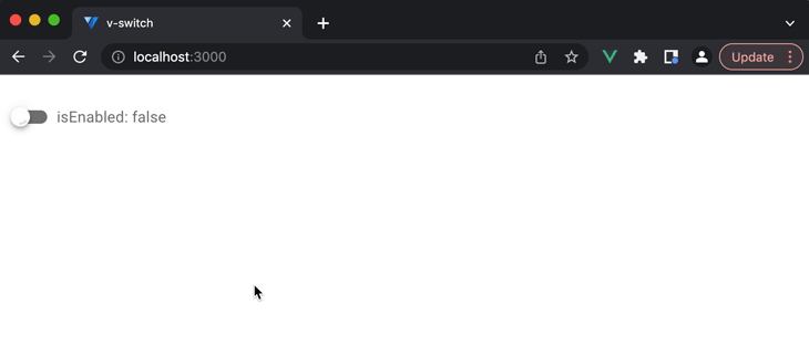
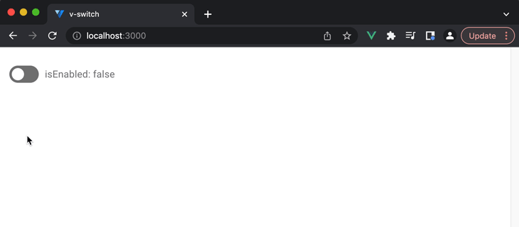
Now, let’s define isEnabled in the <script> of our component. We’ll use the ref() function to create a reactive reference to the value and initialize that value with false:
<template>
  <v-app>
    <v-main>
      <v-container fluid>
        <v-switch v-model="isEnabled" />
      </v-container>
    </v-main>
  </v-app>
</template>

<script setup>
import { ref } from "vue";
const isEnabled = ref(false);
</script>
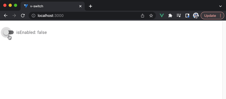
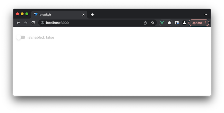
The v-switch component contains a label prop that accepts a string value and is used to display a label beside the switch input. We’ll use this prop to visualize the change in the isEnabled property when the switch is toggled. We’ll bind the label prop with the v-bind directive (i.e., the : shorthand) to a value of isEnabled: ${isEnabled.toString()}":
<template>
  <v-app>
    <v-main>
      <v-container fluid>
        <v-switch
          v-model="isEnabled"
         :label="`isEnabled: ${isEnabled.toString()}`"
        />
      </v-container>
    </v-main>
  </v-app>
</template>

<script setup>
import { ref } from "vue";
const isEnabled = ref(false);
</script>
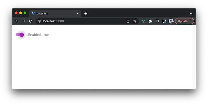
When the switch is toggled, we’ll notice the value of the switch input label toggle between isEnabled: false and isEnabled: true:
See the above example in this Codepen.
The example above represents the base capability of v-switch. With that said, v-switch also provides many different customizations that we can apply right out of the box. We’ll use the next section to dive into a number of customizations.
v-switch customizations
Color
v-switch provides a color prop that allows us to change the color of our switch toggle when the switch is in the “toggled on” state.
For example, if we were to add a value of purple to the color prop as follows:
<template>
  <v-app>
    <v-main>
      <v-container fluid>
        <v-switch
          v-model="isEnabled"
          :label="`isEnabled: ${isEnabled.toString()}`"
          color="purple"
        />
      </v-container>
    </v-main>
  </v-app>
</template>
Notice that our switch color will change to purple when toggled on:
See the above example in this Codepen.
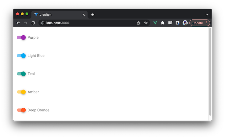
We can use any of the built-in colors available to us from the Vuetify library. The Vuetify documentation shows us the entire Material design color palette supported by the library.
Here’s an example of using a variety of colors available to us from the library:
<template>
  <v-app>
    <v-main>
      <v-container fluid>
        <v-switch v-model="isEnabled" label="Purple" color="purple" />
        <v-switch v-model="isEnabled" label="Light Blue" color="light-blue" />
        <v-switch v-model="isEnabled" label="Teal" color="teal" />
        <v-switch v-model="isEnabled" label="Amber" color="amber" />
        <v-switch v-model="isEnabled" label="Deep Orange" color="deep-orange" />
      </v-container>
    </v-main>
  </v-app>
</template>

<script setup>
import { ref } from "vue";
const isEnabled = ref(false);
</script>
This will make our app present a list of different colored switch inputs:
See the above example in this Codepen.
Loading and disabled states
v-switch supports a loading prop that displays a circular loading bar when given a value of true:
<template>
  <v-app>
    <v-main>
      <v-container fluid>
        <v-switch
          v-model="isEnabled"
          :label="`isEnabled: ${isEnabled.toString()}`"
          loading
        />
      </v-container>
    </v-main>
  </v-app>
</template>
See the above example in this Codepen.
The loading prop can also be given a string value to represent the color of the circular loading bar. Here’s an example of displaying the loading state in the color pink:
<template>
  <v-app>
    <v-main>
      <v-container fluid>
        <v-switch
          v-model="isEnabled"
          :label="`isEnabled: ${isEnabled.toString()}`"
          loading="pink"
        />
      </v-container>
    </v-main>
  </v-app>
</template>
In our app, it would look like this:
See the above example in this Codepen.
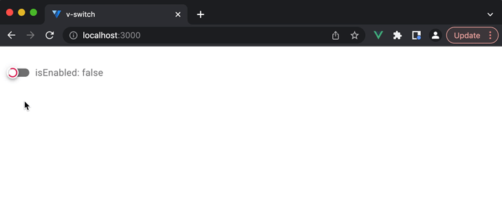
The v-switch component also supports a disabled prop, which has the component displayed in a disabled state when given the value of true:
<template>
  <v-app>
    <v-main>
      <v-container fluid>
        <v-switch
          v-model="isEnabled"
          :label="`isEnabled: ${isEnabled.toString()}`"
          disabled
        />
      </v-container>
    </v-main>
  </v-app>
</template>
When the switch is in the disabled state, we’re unable to toggle the switch:
See the above example in this Codepen.
Custom switch values
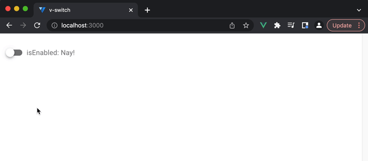
The v-switch component allows us to specify different custom values using the false-value and true-value props.
For example, we can apply the values for the false-value and true-value props as "Nay!" and "Yay!". We’ll also initialize our isEnabled reactive property with a value of "Nay!":
<template>
  <v-app>
    <v-main>
      <v-container fluid>
        <v-switch
          v-model="isEnabled"
          :label="`isEnabled: ${isEnabled.toString()}`"
          color="purple"
          false-value="Nay!"
          true-value="Yay!"
        />
      </v-container>
    </v-main>
  </v-app>
</template>

<script setup>
import { ref } from "vue";
const isEnabled = ref("Nay!");
</script>
Our v-switch component will behave as follows:
- When the component is rendered for the first time, the
isEnableddata property to which the switch is bound will have a value of"Nay!". This is because we initialized theisEnabledreactive property with a value of"Nay!" - When the switch is toggled on, the
isEnableddata property will be given a value of"Yay!". This is because thetrue-valueprop is being given a value of"Yay!" - When the switch is toggled back to off, the
isEnableddata property will be given a value of"Nay!". This is because thefalse-valueprop is being given a value of"Nay!":
See the above example in this Codepen.
Custom switch label
The v-switch component displays a label depending on what string value we provide the label prop. However, we may want to customize this label to better fit the context of our application by rendering a label with a more complex markup. We can achieve this with the capability that Vue provides us known as slots.
In the template of our Vue component, we’ll add a <template> element with a v-slot attribute to specify the location where we want to insert our custom contents:
<template>
  <v-app>
    <v-main>
      <v-container fluid>
        <v-switch v-model="isEnabled">
          <template v-slot:label>
            <!-- custom label markup goes here -->
          </template>
        </v-switch>
      </v-container>
    </v-main>
  </v-app>
</template>
We want to display a loading bar as the custom label markup for our switch so we’ll place the v-progress-linear component in our slot template.
Next, we’ll provide a value of pink to the color prop of v-progress-linear and bind the isEnabled reactive data property as the value of the indeterminate prop:
<template>
  <v-app>
    <v-main>
      <v-container fluid>
        <v-switch v-model="isEnabled">
          <template v-slot:label>
            <v-progress-linear :indeterminate="isEnabled" color="pink" />
          </template>
        </v-switch>
      </v-container>
    </v-main>
  </v-app>
</template>

<script setup>
import { ref } from "vue";
const isEnabled = ref(false);
</script>
When true, the indeterminate prop continuously animates the progress bar. In our code example above:
- When the switch is toggled off, the loading bar is visible but no animation is present
- When the switch is toggled on, the loading bar is visible with a continuous animation
When saving our changes, our app looks like this:
See the above example in this Codepen.
Inset effect
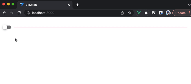
We can customize the appearance of the switch to create an inset effect by using the inset prop:
<template>
  <v-app>
    <v-main>
      <v-container fluid>
        <v-switch
          v-model="isEnabled"
          :label="`isEnabled: ${isEnabled.toString()}`"
          color="purple"
          inset
        />
      </v-container>
    </v-main>
  </v-app>
</template>
See the above example in this Codepen.
Errors and error messages
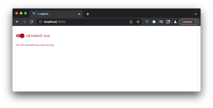
The v-switch component contains an error prop that accepts a Boolean and, when given a value of true, has the switch element be rendered in a red error color.
There also exists an error-messages prop that places an error message below the switch toggle that allows us to provide additional information as to why the switch input is in an error state:
<template>
  <v-app>
    <v-main>
      <v-container fluid>
        <v-switch
          v-model="isEnabled"
          :label="`isEnabled: ${isEnabled.toString()}`"
          color="purple"
          error
          error-messages="Uh oh! Something went wrong."
        />
      </v-container>
    </v-main>
  </v-app>
</template>
See the above example in this Codepen.
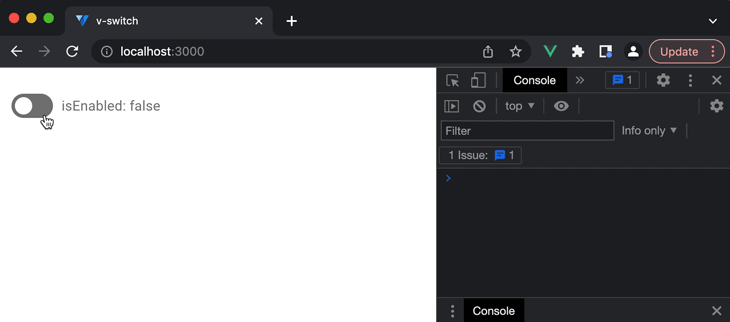
Listening to events
When the switch component is toggled, it emits a variety of events that we can listen to and respond to in our application. These include all the events that are triggered from an HTML <input> element like:
onchangeoninputonmousedownonmouseup- etc.
Let’s see a visual example of this with the onchange (i.e. change) HTML event. When the switch is toggled, it emits a change event when the switch value has successfully changed.
We can use the v-on directive (i.e. the @ shorthand) to listen for the change event and trigger an onChange() function in our component. This onChange() function will emit a console.log message that states whether the switch is on or off depending on the value of the isEnabled reactive property:
<template>
  <v-app>
    <v-main>
      <v-container fluid>
        <v-switch
          v-model="isEnabled"
          :label="`isEnabled: ${isEnabled.toString()}`"
          color="purple"
          @change="onChange"
          inset
        />
      </v-container>
    </v-main>
  </v-app>
</template>

<script setup>
import { ref } from "vue";

const isEnabled = ref(false);

const onChange = () => {
  console.log(`Switch is now ${isEnabled.value ? "on" : "off"}`);
};
</script>
The console.log message is emitted every time the switch is toggled on or off:
See the above example in this Codepen.
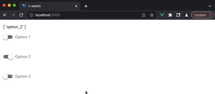
Binding multiple values in an array
v-switch also supports binding multiple values in an array. To do this, we can have multiple v-switch components use the v-model directive to bind to the same array property.
Here’s an example of rendering three different v-switch components where each v-switch component will have a unique value associated to it:
<template>
  <v-app>
    <v-main>
      <v-container fluid>
        <v-switch
          label="Option 1"
          value="option_1"
        />
        <v-switch
          label="Option 2"
          value="option_2"
        />
        <v-switch
          label="Option 3"
          value="option_3"
        />
      </v-container>
    </v-main>
  </v-app>
</template>
The value prop is used to specify the value that the switch should represent when it is toggled on. This is helpful within the context of storing multiple values in an array because we most likely want to store multiple unique values as opposed to storing multiple true/false values.
We’ll use the reactive() function to establish reactivity for an object that has a values array. We’ll initialize this values array with the value of the second toggle: option_2:
<template>
  <v-app>
    <v-main>
      <v-container fluid>
        <v-switch
          label="Option 1"
          value="option_1"
        />
        <v-switch
          label="Option 2"
          value="option_2"
        />
        <v-switch
          label="Option 3"
          value="option_3"
        />
      </v-container>
    </v-main>
  </v-app>
</template>

<script setup>
import { reactive } from "vue";

const selectedOptions = reactive({ values: ["option_2"] });
</script>
Lastly, we’ll bind the selectedOptions.values array to each of the v-switch components. We’ll also display the value of this array above our rendered list of v-switch components:
<template>
  <v-app>
    <v-main>
      <v-container fluid>

        <v-switch
          v-model="selectedOptions.values"
          label="Option 1"
          value="option_1"
        />
        <v-switch
          v-model="selectedOptions.values"
          label="Option 2"
          value="option_2"
        />
        <v-switch
          v-model="selectedOptions.values"
          label="Option 3"
          value="option_3"
        />
      </v-container>
    </v-main>
  </v-app>
</template>

<script setup>
import { reactive } from "vue";
const selectedOptions = reactive({ values: ["option_2"] });
</script>
Because we’ve initialized our array with the value of ["option_2"], the second switch in our rendered list will be in the toggled-on state when the page renders for the first time. If we were to toggle any of the switches on or off, our selectedOptions.values array changes:
See the above example in this Codepen.
Conclusion
Vuetify’s v-switch component is a useful tool for adding toggle functionality to a Vue.js app. It can be easily bound to a component data property and can also be used to bind multiple values in an array. We’ve also seen how the component offers a range of customization options, such as color, loading and disabled states, custom values and labels, inset styling, and error handling.
You can refer to the Vuetify API documentation as a useful resource to recognize all the different props that v-switch accepts.
The post Using the <code>v-switch</code> Vuetify component appeared first on LogRocket Blog.
from LogRocket Blog https://ift.tt/WTYXUcJ
Gain $200 in a week
via Read more


