Scannability provides a clear path for users. People don’t treat websites like a book that they would carefully read; they treat them as quick sources of information. With an abundance of websites available, if a user doesn’t find what they need they will move to the other source, and that decision time is in milliseconds.
That’s where scannability comes in. It lets the user quickly get the lay of the land. For an interface to be scannable, users should be able to draw correct conclusions about the website’s purpose and quickly find the information they need. While it sounds simple, there is a lot of thought that goes into making a website scannable.
Scanning patterns
To improve scannability, the first thing we should understand is how people scan the webpage. Eye-tracking studies show that people have a few scanning patterns they usually use. NN Group defines these patterns as the most common:
- F-pattern
- Spotted pattern
- Layer-cake pattern
- Commitment pattern
F-pattern
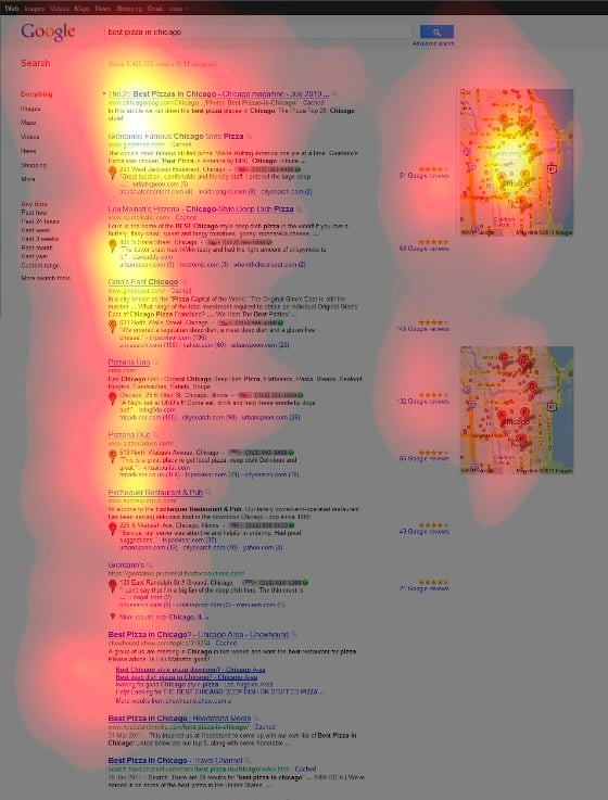
Probably the most known pattern is when people fixate on the start of the line at the left side of the page and most scanning happens on the left top side of the page, similar to the letter F (for left-to-right languages; for right-to-left languages, the pattern is reversed).
Spotted pattern
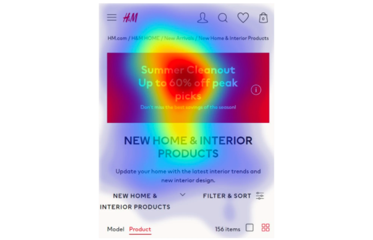
The spotted pattern appears when the user picks up visual clues on the webpage. Those clues could be highlighted information, like a heading or bold text, or it could be the format of the text. For example, if a user searches for an email, they would fixate on a text that looks like an email.
Layer-cake pattern
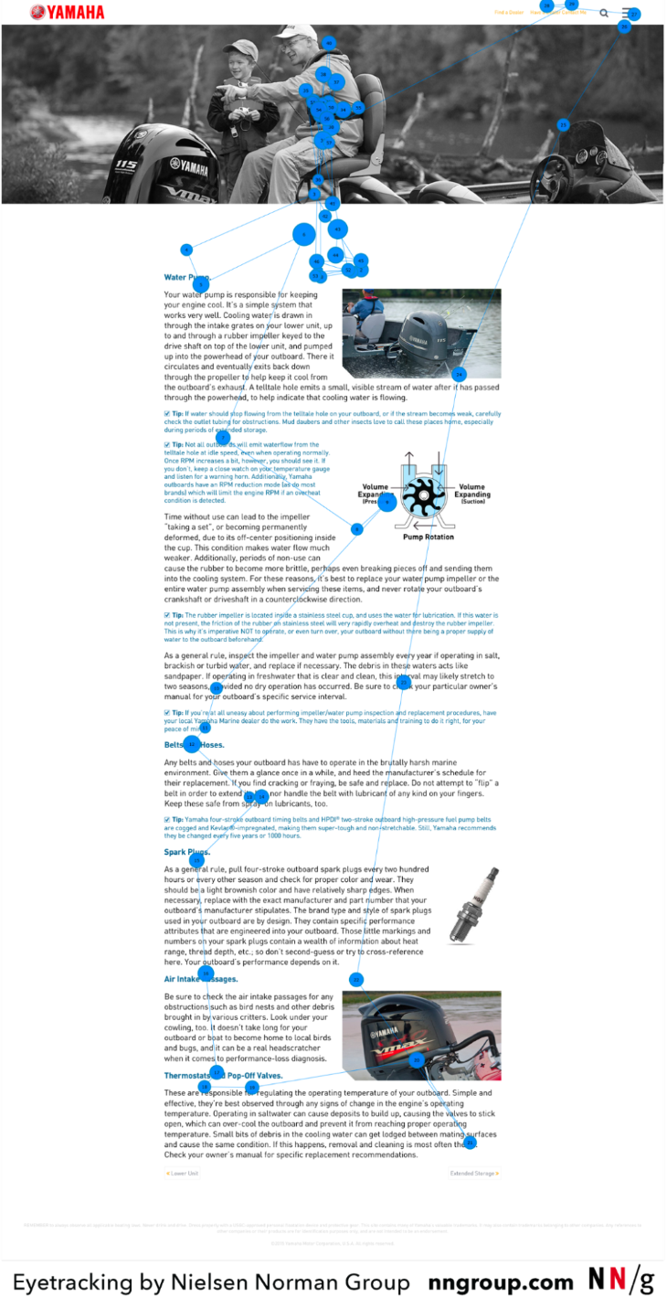
In the layer-cake pattern, headings and subheadings are most in focus. A user uses headings to identify if the text below would be something of interest to them and when a relevant heading is found proceed to read the text.
Commitment pattern
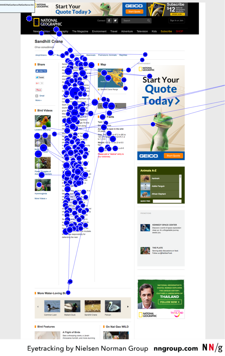
This pattern appears when users are highly motivated to carefully read the website. This pattern is not a scanning one but a careful reading of the website. The pattern could be seen with sources that are highly trusted and that are used for the consumption of information.
Knowing patterns that people use to scan a webpage is an important step to improving scannability in UX.
Based on this information, we should pay attention to the visual clues we leave on the website and what those clues tell people. However, never forget to consider the cultural difference of users and always pay attention to your user needs since that’s also something that decides their scanning pattern.
Steps to scannability
Know your user
Every project should start with understanding the user. As we talked about previously, you should know how users scan the text, what they are searching for, and what is important to them. That also should correspond to our goals: what we want the user to see and how we want them to perceive our page.
User interviews, building personas, and creating journey maps are just some of the ways that can help us learn more about the user and what their goals are.
Information Architecture
Information architecture (IA) is a large discipline about grouping, combining, and using information. Don’t confuse it with sitemaps! Good IA improves comprehension, which leads to better scannability.
When on the IA step, we should start with defining a language that will be better suited for our users. For example, if our users are people of a specific profession, we should learn more about the jargon of that profession. On the other hand, if you are designing an ecommerce website for all ages, your best bet is simple wording that everyone will understand.
The other step in perfecting IA is to combine related information. Grouping information makes it easier for people to search for what they need. Card sorting and user interviews are something that can help with studying information and aid in providing better IA.
Google has researched find how to improve forms and defined twenty rules. We can see some rules are clearly talking about information architecture:
- Match the size of the input fields to the expected length of the answer
- Order options in an intuitive sequence (e.g., weekdays in the sequence Monday, Tuesday, etc.). If no meaningful sequence is possible, order them alphabetically
- For date entries, use a dropdown menu when it is crucial to avoid format errors. Use only one input field and place the format requirements with symbols (MM, YYYY) left or inside the text box to achieve faster completion time
- If answers are required in a specific format, state this in advance, communicating the imposed rule (format specification) without an additional example
With those and other rules, they were able to drop the comprehension time of the online form drastically. These rules can translate to many other contexts for greater scannability.
Visual hierarchy
From scanning patterns, we can see that people pay attention to visual clues when we give them. Visual hierarchy is a strong tool that we use to guide a user through information.
Visual hierarchy is where we use our IA and our knowledge of users since every step here is connected. Having clear headings, groupings of information, and highlights where needed is a key to better scannability. What is important here is following NN Group’s rule for usability heuristics: If everything is highlighted, then nothing is. We should have a clear understanding of what is most important and highlight it, and unnecessary information should be removed or hidden for specific user needs. That’s how we’ll get a good visual hierarchy.
Let’s look at the example:
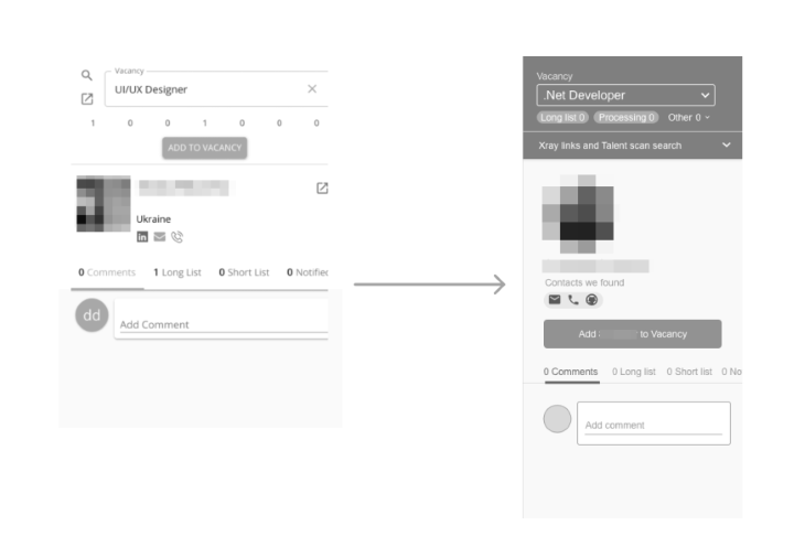
Visual hierarchy example
In the sample above of adding a candidate to the vacancy, we can see how with small changes in the visual hierarchy, we can improve our comprehension. By highlighting the top part of the panel, we showed the parent/child relationship of the element Vacancy and the candidate that we want to add to it.
We also moved the button to show that it’s related to the candidate. While scanning without reading, people could assume that button is for adding the vacancy in the first version.
Additionally, we emphasize the button because it is the most important action. This way, while scanning, it’s clearly visible and not skipped. Even small changes to the visual hierarchy can improve scannability drastically.
Visualization of information
Scanning is all about quickly getting the main idea. If a user needs more information, they will stop and read that information.
The visualization of information is a powerful tool that can be used to improve scannability. It is done by providing nontextual information. We know that people fixate on images and understand them way quicker than plain text. We can use that information to provide a visual overview of the information where possible. Let’s take this flight ticket search concept as an example.
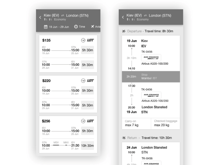
Visualizing information example
Just by scanning we can tell that the 3rd option has two stops and make an assumption that one of them is a long one. That’s information that would be enough for us while we scan to decide if we want to learn more and drill down. So that’s how information visualization could help us improve scannability.
Conclusion
Information about the user should guide our tactic to improve scannability. We should learn about their cultural differences, the jargon they use, and the information that is important to them. This will help us focus on what is important and use visual techniques to guide the user. Ultimately, scannability from the designer’s side is about showing the user the way based on their needs. Usability and scannability are intrinsically linked, and understanding the user is the key to unlocking both. By knowing the user’s needs, the designer can create an interface that is both user-friendly and visually appealing. This leads to a more enjoyable and productive experience for the user.
Featured image source: IconScout
The post Making your website scannable for better UX appeared first on LogRocket Blog.
from LogRocket Blog https://ift.tt/5q7LbaM
Gain $200 in a week
via Read more


