


What exactly are design tokens?
Design tokens are the fundamental design values used to build and maintain a design system. These include spacing, typography, color, object styles, and more. Let’s look at an example to understand this better.
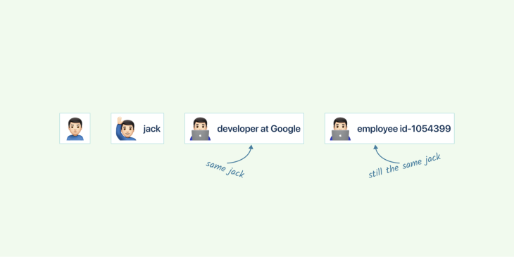
Imagine you have a friend. His name is Jack. Jack is working as a developer at Google and also has been given an employee identification number 1054399. Jack here is a single individual and can be identified using different ways. The following snapshot illustrates the example in detail.
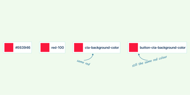
It’s the same with the design tokens: instead of using hex or RGB or HSB values, we assign these values names called tokens. These can later be mapped to other styles and elements to create a highly scalable system.
Why do we need design tokens?
Organizations need design systems and design tokens to create a consistent, scalable brand. By using a design system, organizations can define their branding standards and ensure that they are consistently applied across all touchpoints. Design tokens provide the building blocks for creating a consistent, scalable brand identity by allowing organizations to control the look and feel of their products and communications.
Design tokens are a powerful tool for creating and maintaining design systems. They provide a single source of truth for designers, developers, and product teams to refer to when creating user interfaces. Design tokens help ensure that all components in the system are consistent and adhere to the same design principles.
Design tokens also make it easier to communicate design decisions across teams. By having one source of truth, everyone is on the same page when it comes to how components should look and behave. This makes it easier for designers and developers to collaborate on projects without having to constantly refer back to each other’s work.
Finally, design tokens provide a solid foundation for future development. By using them as the basis for your design system, you can easily maintain consistency across all components while making changes or adding new features over time.
How can you set up design tokens?
Design tokens are a powerful tool for designers to create consistent and reusable design systems. They allow designers to define a set of values that can be used across different platforms, devices, and applications.
Jan Six’s Tokens Studio (Formerly Figma Tokens) Plugin is the most powerful and extensively used plugin for Figma at present. This plugin makes it simple to create, manage, and use design tokens in your projects. It also provides an easy way to share tokens in a JSON file with other team members or clients. With this plugin, you can quickly set up design tokens and use them in your designs with just a few clicks.
Design tokens come in three types: global tokens, alias tokens, and component-specific tokens;
- Global tokens are the most basic type of design token and they provide a single source of truth for all components in an application

- Alias tokens are used to create aliases for global tokens so that they can be reused across multiple components
- Component-specific tokens are used to define specific values for individual components, such as colors or font sizes
Naming design tokens
Naming conventions for design tokens are important for creating a consistent and modular design system. It helps developers and designers quickly identify the purpose of each token, making it easier to use them in their projects.
An ideal token name must be simple, understandable, scalable, and consistent. To name design tokens, there is no go-to standard set to follow. We’ll use color in the example that follows since it’s a design element that’s employed in a broad range of ways.
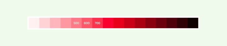
It is easy to name your palette with simple and straightforward names like “red-default,” “purple-pink,” or “yellow”. However, as the system becomes more sophisticated, naming tokens that meet all the requirements becomes increasingly difficult.
Using abstract names based on tonal values and then arranging them in component-specific token order is one of the most common solutions.
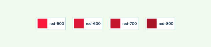
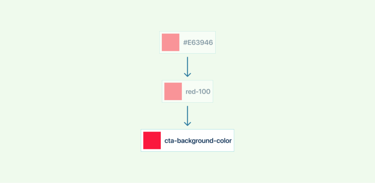
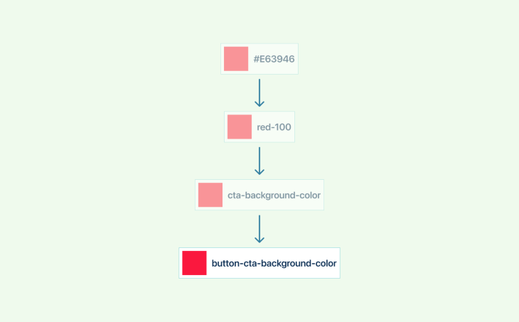
Naming colors with values from 100–900 (100 to 900 represents the light present in the color), 100 being the lightest and 900 being the darkest.
Please remember not to add all the colors in the color spectrum. But the goal is to create a minimal and meaningful palette. These are called global tokens. In short, global tokens have generic names with no context.
An alias token, however, is more specific and is used to create aliases for global tokens so that they can be reused across multiple components.
For example:
primaryBackgroundColor: $red-500
primaryTextColor: $red-600
Here, we are being descriptive with context.
Component-specific tokens are used to define specific values for individual components, such as colors or font sizes.
For example:
$button-cta-bg-color: neutral-500 (Using alias token)
$link-button_bg_color: neutral-500 (Using alias token)
$color-text-link: #FCFCFC (Using specific color)
As the complexity of the design system increases, it gets more difficult to name the tokens. In this scenario, a definitive pattern could be used as a name.
- Level 2 naming: CATEGORY-CONCEPT
Ex: size-xl - Level 3 naming: CATEGORY-COMPONENT-VARIANT
Ex: background-link-secondary - Level 4 naming: CATEGORY-COMPONENT-VARIANT-STATE
Ex: background-link-secondary-idle - Level 5 naming: SYSTEM-CATEGORY-COMPONENT-VARIANT-STATE
Ex: sys-background-link-secondary-idle
Preparing the design handoff
Design handoff is an important process for any user interface design project. It involves transferring the design from the designer to the development team in a way that is clear and organized. This process helps ensure that the development team understands all of the details of the design so they can accurately create it.
The first step in a successful design handoff process is to create a user interface design in Figma. This will allow you to easily share your work with the development team and provide them with all of the necessary information they need to start building your product.
Once you have created your designs, you should also include detailed handoff notes which explain how each element works and what it should look like when completed.
Finally, you should share your files with the development team and start inspecting them to make sure everything looks as expected before handing it off for final production.
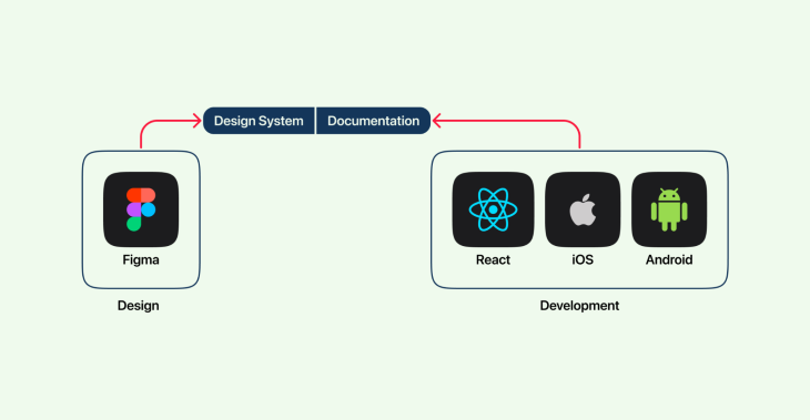
As the brand evolves, the designer will need to make changes and communicate the same with the developers so that the developer can make the same changes in code. And, the same process will be followed when the developer makes the changes to the styles. When multiple designers and developers are involved in the process, the chances for human error are high.
In order to have smooth communication, we would need a standard handoff methodology like below.
Benefits of having design tokens
Design tokens are a great way to manage design at scale. They help ensure that your designs are always up-to-date and consistent across different platforms.
Design tokens are essentially variables that store information about your design system. This could include colors, fonts, spacing, and other design properties. By storing this information in variables, you can easily update your designs in real time. This is especially helpful when working with large teams or managing multiple projects.
Design tokens also make it easy to port your designs to different platforms. If you ever need to create a new design for a different platform, you can simply update the variable values. This ensures that your designs will be consistent across all platforms.
Overall, design tokens are a powerful tool that can help you manage complex designs at scale. They provide an easy way to keep your designs up-to-date and consistent while also making it easy to port them to different platforms.
How to create design tokens in Figma
At the time of writing, Figma does not have an inbuilt feature to create design tokens. However, there are other external third-party plugins like Tokens Studio (formerly Figma tokens), Specify App, Style Dictionary, and many more.
Among these, Tokens Studio is the most advanced and widely used plugin, and we’ll look at how to install and use Tokens Studio in the following steps.
1. Installing the plugin

- Open the Figma app
- Search for Tokens Studio in the Plugins panel
- Install the Tokens Studio plugin
2. Create or import styles
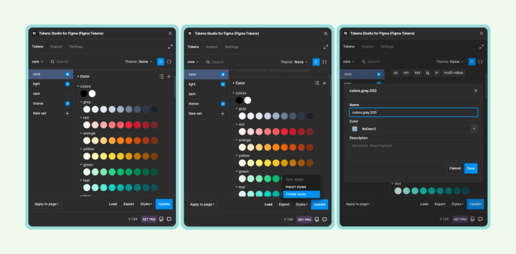
- Create styles by selecting Create Styles
- You could also import existing styles using
.jsonfiles
3. Export styles
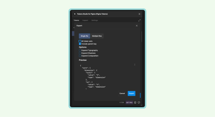
4. Make design tokens platform agnostic
To make design tokens compatible with all the platforms, we would need the Style Dictionary token transformer to transform token values.
Using design tokens in Figma
The Figma app has some limitations when it comes to creating design tokens. One such limitation is the lack of support for opacity tokens, border radius tokens, and spacing tokens. This means that if you want to use these types of tokens in your design, you will need to use Tokens Studio.
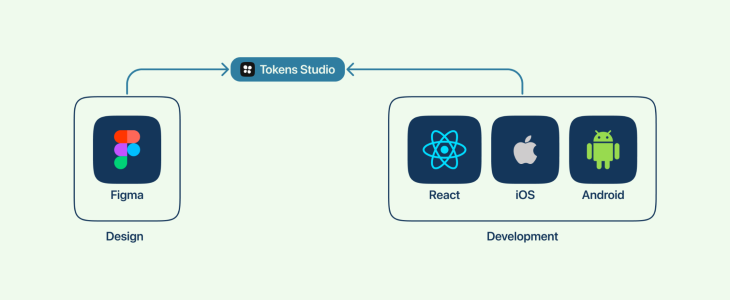
In a normal design workflow, the designer updates the style in Figma, documents the changes, and then transfers the project to the developers. Developers then update the properties of their component. The problem with this workflow is that it takes a lot of focus and attention to detail and is more prone to errors.
With design tokens, the designer updates the styles in Figma and Tokens Studio updates the centralized repository, creating a platform-specific .json file. Developers get the .json from the repo and update and the changes are applied automatically.
This revolutionary technique in its own merit saves a ton of time on both the designer’s and engineer’s end by eliminating the need for documentation and by streamlining the handoff process.
Conclusion
Design tokens are a great way to make sure that design consistency is maintained across multiple platforms and devices. With Tokens Studio, designers and developers can easily create, manage, and optimize design tokens to ensure their product looks the same regardless of platform or device. By utilizing this tool, designers and engineers can increase productivity by streamlining the workflow while ensuring designs stay consistent throughout all stages of development.
The post Making a complex design system with Tokens Studio for Figma appeared first on LogRocket Blog.
from LogRocket Blog https://ift.tt/gJT1oNn
Gain $200 in a week
via Read more


