We must be able to design high-frustration user flows in a way that enables users to navigate them as easily as possible, especially since users today are more anxious and impatient than ever before.
In this article we’ll take a look at cancel buttons, the sometimes destructive ramifications of interacting with them, and what we can do as UX designers to ensure that users have an easy time and remain in full control while canceling, deleting, clearing, returning to a previous state, and so on.
- What are cancel buttons?
- What should a cancel button look like?
- Cancel button design is all about friction
- How to surface problems with cancellation flows
What are cancel buttons?
Cancel buttons are those that are used to trigger cancel actions. For example, the cancellation of a subscription, the deletion of data, or the clearing of input. Naturally, these actions are destructive, so if they’re not designed well, users will report having had a negative experience. In most cases, these negative experiences are caused by accidental loss of data, which in the worst of cases can’t be undone.
As you can imagine, these negative experiences can be so bad that they not only hurt business objectives but cause users to rage quit instantly. If there was ever a way to make users feel outrageously angry, completely wasting their time by “letting” them cancel/delete all of their data would be the way to do it.
Let’s see what we can do to make sure that doesn’t happen.
N.B., cancel buttons shouldn’t be confused with close buttons. Closed buttons hide things (e.g. they dismiss modals, toggle tabs, and so on), whereas cancel buttons delete things (i.e. data, input, etc.). Things that have been hidden can usually be retrieved pretty easily, whereas things that have been canceled, deleted, or cleared might be gone forever.
What should a cancel button look like?
Cancel button vs. cancel link
First, we need to clarify: cancel button or cancel link?
Users expect buttons to perform an action (i.e., cancel) and links to navigate them to a new page or screen (i.e., where they can cancel from there), so the correct choice is whichever one indicates your chosen approach, thus meeting user expectations.
The worst possible outcome is that users click on a cancel link thinking that their decision isn’t set in stone only to find that it’s actually a destructive, finalized action.
As for why you’d want or wouldn’t want to take users to another page/screen to cancel, well, we’ll dive into that a bit later.
Cancel buttons are just like other buttons (almost)
Great buttons are:
- Affordant: it’s clear what they are, what they’ll do, and what they’ve done at every point of the interaction flow
- Accessible: anybody can find and engage with them easily due to their size, spacing, contrast, and UI copy
- Aesthetical: they just look nice, like you want to click them really bad
The “three A’s,” as I like to call them.
I went into what makes a great button design in a lot more detail in my previous article, so to summarize:
- Large-enough target size (minimum: 44px)
- Enough spacing between targets (minimum: 8px)
- Enough color contrast (check using Stark)
- Padding (my recommendation: 0.5× the height)
- Rounded corners (my recommendation: 0.3× the height)
- Subtle hover state (my recommendation: 110% brightness)
- Realistic drop shadow (see the article)
- Discernible UI copy (applies to links and buttons)
- Underline placed under the descenders (applies to links)
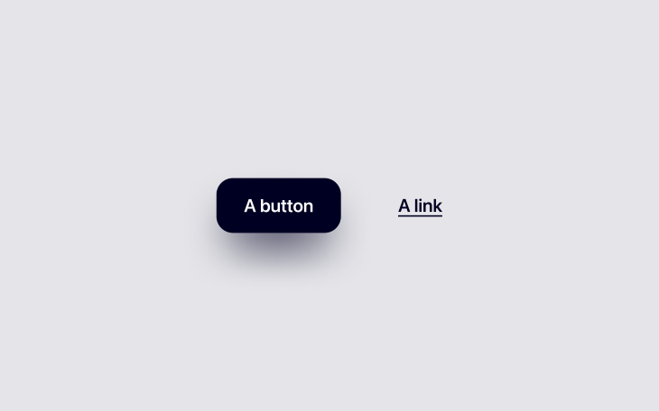
Cancel button color
Standard button design tips aside, what do cancel buttons need specifically? The answer might surprise you: not much. Cancel buttons just need to be a specific color.
Cancel buttons should be orange or red if interacting with them results in a somewhat significant destructive action (orange for an initial warning, red for the final warning).
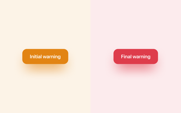
However, the majority of cancel buttons are only mildly destructive — you’ll want to keep these ones fairly neutral (i.e., on the gray spectrum). If you take a look at HTML’s native search element (<input type="search">), you’ll see when hovering over them that an “×” icon appears that helps users cancel/clear their input — it’s gray because it’s only mildly destructive (users only lose 1–3 words). It’s a small icon rather than a large button for the same reason.
See the Pen
Search input example by Daniel Schwarz (@mrdanielschwarz)
on CodePen.
Your brand color is (hopefully) a positive color, so it’ll have the complete opposite effect of making users stop and think about their actions. You’ll definitely want to avoid using that color.
Cancel button design is all about friction
Great design sometimes requires friction. Less friction means that users can accomplish their tasks quicker, but more friction can reduce the likeliness of them making mistakes. We have to sacrifice a little of one to get more of the other, so as you might’ve guessed, it’s all about finding the optimal balance.
In many scenarios, the possibility of a mistake is nil, in which case we can focus 100 percent of our efforts on speed and convenience. However, when it comes to cancel buttons, we must find the optimal balance between speed and friction based on the severity of any potential mistakes.
Clearing input
Going back to the search input example — assuming that you’ve cleared a search input before, you would have noticed that there wasn’t any friction at all. This is because it’s hardly a destructive action (you’re only losing a few words that can be retyped easily).
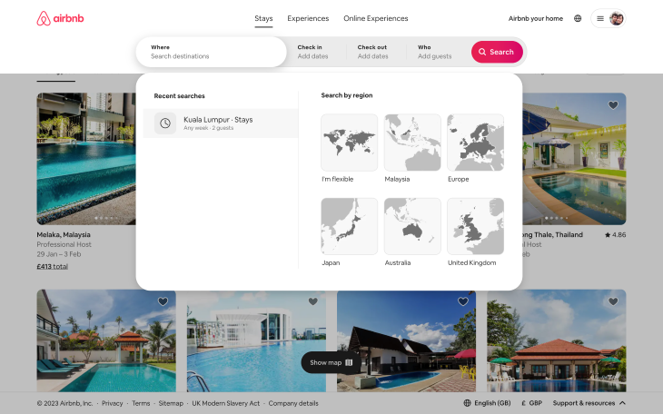
However, if it were a long-form input or a form made up of multiple inputs, you’d want a cancel button to be accompanied by friction. Now, it’s difficult to recommend specific dos and don’ts because they depend on many factors, but consider any combination of the following approaches:
- A warning dialog upon canceling or leaving the page/screen/modal in some way
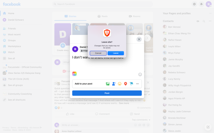
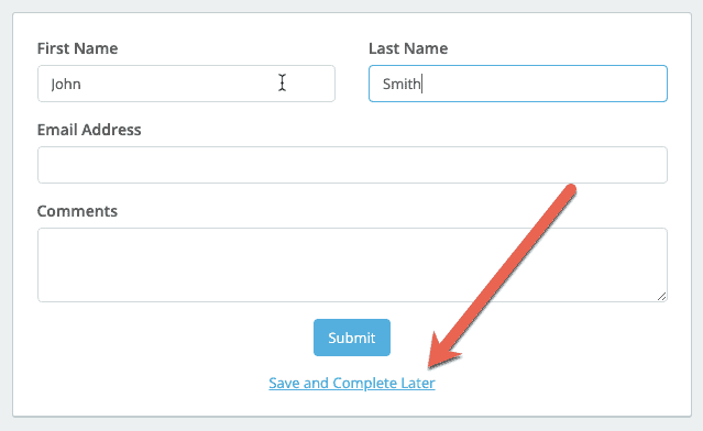
- The option to save progress so that users can return and complete the form later
- Automatic saving of nonsensitive input and filters (a common UX pattern for search interfaces)
Deleting data and canceling subscriptions
When it comes to deleting data and canceling subscriptions (which can include data deletion too), we need to tread a little more carefully.
Let’s start with data. Here are a few examples that you might be familiar with:
- A document (e.g., a Figma or Google document)
- A project, team, or organization (anything that takes time to organize)
- Large portions of personal data (e.g., profile or history/algorithm data)
There are many interesting ways to deal with these scenarios, with pros and cons to each one.
Firstly, consider asking users to confirm their action via email. This is probably my favorite approach because it adds a layer of security too, and although it’s also the slowest approach, users don’t necessarily need to confirm their action right away. If the deletion is time-sensitive, asking users to confirm their password is a better approach.
If security isn’t really an issue, consider asking users to recall something such as their email address or the name of what they’re trying to delete.
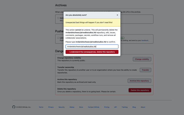
The bare minimum is having a simple “Are you sure?” question.
All of these approaches create friction, giving users an opportunity to reconsider their action before taking it. The approaches have varying degrees of security and convenience — it’s simply about choosing the one that feels most suitable.
Subscription cancellation comes with potential data loss, so the approaches are pretty much the same. However, subscription cancellation can also come with loss of payment authorization, a minor inconvenience for B2C products but a major inconvenience for B2B products where approval from somebody that’s “higher up” is usually required in order to reauthorize payments. So in addition to leveraging the UX design tips mentioned already, make sure to cancel the payment authorization without deleting the payment information to make it easier for users to recover from accidental cancellation.
Also, don’t insist that users call or email in order to cancel (but I’m sure you know that already!).
Offering contingency plans for deactivating or canceling
As a contingency (or alternative?), consider offering deactivation or implementing a grace period, where the data is locked rather than lost. Choosing one of these approaches should depend on how costly it is for you to house the data (with a grace period, the data is only stored for a limited amount of time).
Additional pages/screens
If you’d like to shoot your shot at trying to retain customers or if more information is required regarding the ramifications of deleting/canceling, then you might want to direct users to another page/screen. As mentioned earlier, this is probably the only scenario where the (initial) cancel button is better off as a link (an orange warning link, specifically).
How to surface problems with cancellation flows
Cancellation flows are frustrating right off the bat because their outcomes aren’t and can never be rewarding. At best, users go from being in a predicament to neutral ground. On the upside, people love to complain about high-frustration scenarios like these ones, which makes our job as designers easier. Users will waste no time complaining to us in great detail if we make it easy for them to do so (and probably even if we don’t, thanks to social media).
It’s good practice to get user feedback as often as possible. Your best bet is prompting users to complete feedback surveys. However, being accessible and available on live chat and social media is important too (especially if one of your goals is to run damage control).
Users are less likely to rave about smaller inconveniences such as lost input or the inability to cancel an action and return to a previous state, making them harder for us to detect and improve. The trick is to use analytics to identify pages/screens with an abnormal number of refreshes. After that, use session replays to see if those refreshes are happening because users weren’t able to find stable ground (i.e., starting over by refreshing).
To summarize, collect feedback in a variety of ways and whenever you have the opportunity to do so. For minor gripes (including those that are so small that users might forget or feel too embarrassed to mention), quietly dig through your analytics and take peeks at your session replays to see what users are actually doing, play-by-play.
Conclusion
As designers, we tend to focus on ways to get users to do things we want them to do rather than ways to help them cancel those things (and rightfully so, it’s important to prioritize certain conversion flows/business objectives). However, making it difficult for users to cancel, delete, clear, unsubscribe, go back, and so on can be extremely frustrating to them and a lightning-quick way to ensure that they won’t want to stick around.
It’s important to not get lost in the primary business objectives and remember that all of the little things (including cancel actions) combined can actually wind up having a huge impact on business objectives in the grand scheme of things. To that end, cancel buttons should be clear despite leading to friction to prevent users from taking action accidentally, and not obscure or unpredictable in any way.
If there’s anything that you’d like to add, please drop a comment in the comment section below.
And as always, thanks for reading!
Featured image source: IconScout
The post How to design nondestructive cancel buttons appeared first on LogRocket Blog.
from LogRocket Blog https://ift.tt/QBUq0V8
Gain $200 in a week
via Read more


