Not so long ago, these beautiful posters showed up in an advertisement on one of my social feeds:
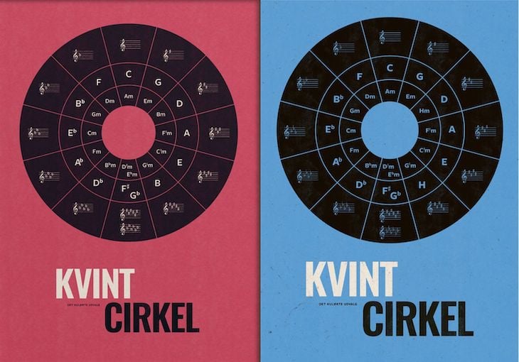
I typically ignore all ads, but these appealed to me right away. Maybe because I used to study music in high school and play in a band, or maybe because I used to work in graphic design and these are just beautiful!
Right away, I wanted to re-create them in <svg>. I often re-create art in <svg> as an exercise to improve my skills. But then it struck me: What if I could make the posters come alive by making them interactive, flexible, and responsive?
In this tutorial, we’ll be re-creating the posters above using SVG, CSS, and a bit of math.
To jump ahead:
- Arcs and circles
- Placing elements around a circle
- Styling the circle with
fills andstrokes - Customizing our circle’s aesthetic
Arcs and circles
In music theory, and in the words of Wikipedia, the Circle of fifths is a way of organizing the 12 chromatic pitches as a sequence of perfect fifths.
The circle has three rings. The outer ring contains the staff with either flats (b) or sharps (#). The middle ring contains the major chords, and the inner ring contains the minor chords.
A full circle is 360 degrees, so each “chromatic pitch” will be 30 (360/12) degrees.
Norwegian developer Håken Lid has developed some useful JavaScript functions for creating <svg> circle segments. For our purposes, we will be using the polarToCartesian and segmentPath methods:
function polarToCartesian(x, y, r, degrees) {
  const radians = degrees * Math.PI / 180.0;
  return [x + (r * Math.cos(radians)), y + (r * Math.sin(radians))]
}
function segmentPath(x, y, r0, r1, d0, d1) {
  const arc = Math.abs(d0 - d1) > 180 ? 1 : 0
  const point = (radius, degree) =>
    polarToCartesian(x, y, radius, degree)
      .map(n => n.toPrecision(5))
      .join(',')
  return [
    `M${point(r0, d0)}`,
    `A${r0},${r0},0,${arc},1,${point(r0, d1)}`,
    `L${point(r1, d1)}`,
    `A${r1},${r1},0,${arc},0,${point(r1, d0)}`,
    'Z',
  ].join('')
}
The first method is used to convert polar coordinates into Cartesian coordinates, and the second is to create paths with arcs in SVG.
Next, we’ll create our own segment method that will call Håken’s segmentPath method for each “chunk”:
function segment(index, segments, size, radius, width) {
  const center = size / 2
  const degrees = 360 / segments
  const start = degrees * index
  const end = (degrees * (index + 1) + 1)
  const path = segmentPath(center, center, radius, radius-width, start, end)
  return `<path d="${path}" />`
}
index is the current “segment” (one of 12, in our case) and segments represents the total amount of segments (again, 12 in our case). size is the diameter of the circle (and the viewBox of our SVG). radius is normally half the diameter, but because we need three “rings,” we need to be able to change it for each “ring.” Finally, width is the height of the arc.
Let’s call this method 12 times, using a loop, updating index for each iteration:
segment(index, 12, size = 300, radius = 150, width = 150)
If width is set to the same value as radius, the arc will fill out the circle:
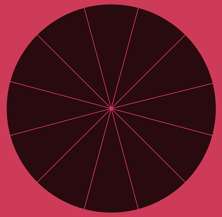
However, if we change width to 50, it will only fill up one third of the circle (because 50 is one third of 150):
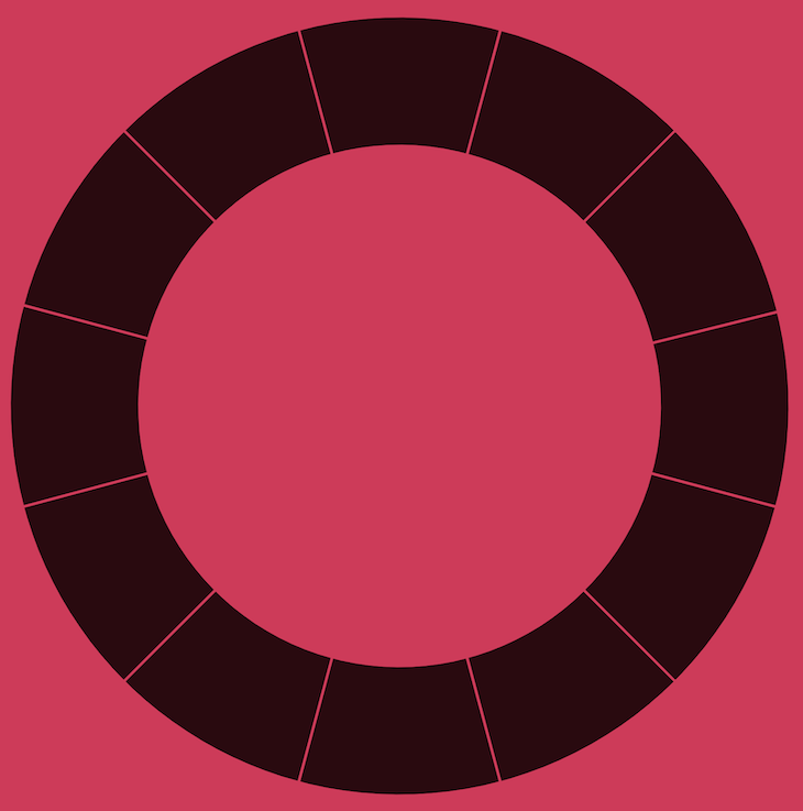
Let’s add the other circles by calling our segment method multiple times within our loop:
segment(index, 12, 300, 100, 30) /* radius = 100, width = 30)
segment(index, 12, 300, 70, 30) /* radius = 70, width = 30)
Now we have this — which almost looks like Spider-Man  :
:
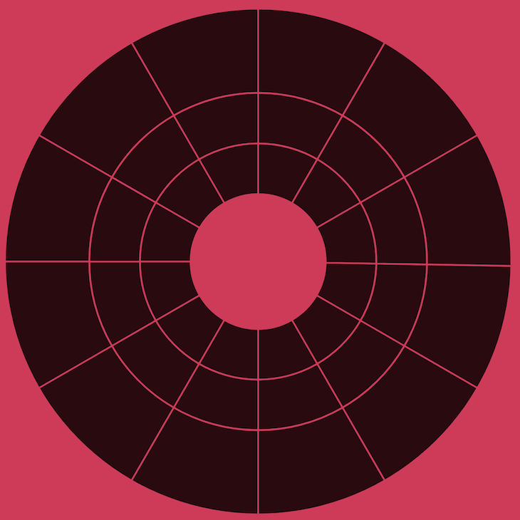
In our circle of fifths, the text should be placed exactly on the lines as we see above. However, the arcs themselves should not.
Let’s use a CSS transform function to rotate the arcs. As each “chunk” is 30 degrees, we need to rotate them half of that, 15 degrees:
transform: rotate(-15deg);
transform-origin: 50% 50%;
This gives us:
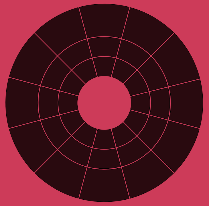
Getting closer!
Now, let’s add the staff, flats, and sharps. I grabbed the elements I needed from Wikimedia Commons, cleaned them up with Jake Archibald’s SVGOMG, and then I converted them into <symbol>s so I can <use> them multiple times.
But before we add these elements and fill out our circles, we should organize our data.
Let’s create an array of 12 objects, containing the labels and amount of flats or sharps:
{
  outer: {
    amount: 4,
    use: 'flat'
  },
  middle: {
    label: 'A<tspan baseline-shift="super">b</tspan>'
  },
  inner: {
    label: 'Fm'
  }
}, /* etc */
What’s up with <tspan baseline-shift="super">?
Because we’re in <svg> land, we can’t use <sup>, so for chords like A flat, we replace <sup> with baseline-shift.
Placing elements around a circle
To place an element in a circle, we need the center point of the circle, the radius of the circle, the angle, and some math:
function posXY(center, radius, angle) {
  return [
    center + radius * Math.cos(angle * Math.PI / 180.0),
    center + radius * Math.sin(angle * Math.PI / 180.0)
  ]
}
Now, let’s combine all the examples into one big “render” chunk. data is the array of objects we created earlier:
const size = 300; /* diameter / viewBox */
const radius = size/2;
const svg =  data.map((obj, index) => {
  const angle = index * (360 / data.length);
  const [x0, y0] = posXY(radius, 125, angle);
  const [x1, y1] = posXY(radius, 85, angle);
  const [x2, y2] = posXY(radius, 55, angle);
  return `
  <g class="cf-arcs">
    ${segment(index, data.length, size, radius, 0, 50)}
    ${segment(index, data.length, size, 100, 0, 30, obj.middle.notes)}
    ${segment(index, data.length, size, 70, 0, 30, obj.inner.notes)}
  </g>
  <g transform="translate(${x0-15}, ${y0-radius})">
    <use width="30" xlink:href="#staff"></use>
    ${Array.from(Array(obj.outer.amount).keys()).map(i => `
      <use width="2" xlink:href="#${obj.outer.use}" class="cf-${obj.outer.use}-${i+1}"></use>`
    ).join('')}
  </g>
  <text x="${x1}" y="${y1+3}" class="cf-text-middle">${obj.middle.label}</text>
  <text x="${x2}" y="${y2+2}" class="cf-text-inner">${obj.inner.label}</text>
  `
  }).join('')
Styling the circle with fills and strokes
It’s trivial to set the background-color of the page and place the circle centrally. The most important parts are the <path>s we created earlier.
Without fill or stroke, our circle looks like this:

Let’s add some simple styling, with a stroke that matches the background-color:
path {
  fill: hsl(348, 60%, 10%);
  stroke: hsl(348, 60%, 52%);
}
… and while we’re at it, why not add a hover effect:
path:hover {
  fill: hsl(348, 60%, 25%);
}
We finally have our circle of fifths! Isn’t it beautiful?
See the Pen
Circle of Fifths by Mads Stoumann (@stoumann)
on CodePen.
Customizing our circle’s aesthetic
Now, let’s create the dusty blue version — and while we’re at it — let’s add some subtle noise to make it look vintage:
See the Pen
Circle of Fifths – Blue Vintage by Mads Stoumann (@stoumann)
on CodePen.
The grainy, noise filter is an SVG filter, used as a CSS background.
Conclusion
In this tutorial, we learned how to code SVG from scratch, using a bit of math. Placing data in a circle does not have to be difficult, and with trigonometric functions coming soon to CSS, it’s going to be even easier.
I hope you had fun reading — hopefully this article inspired you to do some creative coding with SVG! Check out these other articles if you are interested in using CSS filters with SVGs or animating SVGs with CSS.
Here’s the original poster that inspired this tutorial.
The post Creating an interactive SVG: The circle of fifths appeared first on LogRocket Blog.
from LogRocket Blog https://ift.tt/t475Sox
Gain $200 in a week
via Read more


