For many teams, both big and small, team members may struggle to estimate the amount of work that needs to be completed, what has already been completed, and how much work is left.
This is where creating a burndown chart comes in handy. To put it simply, a burndown chart is a useful tool to facilitate discussions with your team on the estimated amount of work to complete an initiative or ship a new feature. Once an estimated amount of work is agreed upon, it can be used to manage and organize the work completed in a week. It also helps team members keep track of if work is being completed late or on time.
This article will explain what a burndown chart is and what it does. It will also demonstrate a simple, replicable template on Excel/Google Sheets that anyone can use to start creating their very own burndown chart for any future initiatives or features.
Table of contents
- What is a burndown chart?
- Why should you use a burndown chart?
- Steps required to create your own burndown chart
- Burndown chart Excel/Google Sheets template
What is a burndown chart?
A burndown chart is a simple method to visualize the amount of work completed throughout a sprint or multiple sprints. It tracks whether the actual amount of work completed is pacing well or not against the amount of work that was initially planned for each successive sprint.
This is a very common tool for many agile teams. It helps team members keep track of completed work and what else needs to be done. It’s an effective way to communicate to other internal stakeholders within the company — such as the head of product or CEO of the company — the amount of work your team has completed and how much more time is needed to complete the project.
Why should you use a burndown chart?
As a product manager, tracking and managing work via a burndown chart is a shared responsibility with the engineering manager and scrum master of the team. Using such an intuitive visual aid not only helps you organize and plan future work for the team but helps you have a better understanding of the work. In turn, you also gain the ability to communicate that understanding with other stakeholders in the organization who have interest in the progress your team is making.
The main advantages of using a burndown chart are:
- A starting point for discussions with your engineering manager and scrum master on the amount of work estimated for a particular feature or initiative
- A way to track the progress of your team on a sprint-by-sprint basis without being a micromanager
- A visual aid in communicating with stakeholders outside of your team, with respect to the progress that your team is making on delivering the feature
Steps required to create your own burndown chart
Creating a Google Sheets or Excel burndown chart is very easy! We will go through the steps of replicating your own very simple (but useful) Excel burndown chart and you can download a free example on Google Sheets.
Step 1: Initial discussions with your product trio (and scrum master)
Before you even begin putting down anything on a piece of paper, let alone create a burndown chart, you’ll need to have a discussion with the engineering manager and scrum master on the initiative. Where a burndown chart is required, the discussion should focus on fleshing or estimating the following information:
- The total amount of effort required by the team to complete the initiative and ship the feature
- How that effort is going to be allocated and divided into the next few sprints
- Based on the above, how many sprints it will take to complete the initiative or ship the feature
In terms of providing an estimate, different product managers will provide different methods, depending on where and how they work. Personally, I like to keep it simple and utilize story points via Fibonacci sequencing. This is a way of estimating the amount of work that needs to be done to complete a user story. In a Fibonacci sequence, each number is the sum of the previous two in the sequence, e.g. 0,1,1, 2, 3, 5, 8,13, 21, etc.
In my day-to-day, I use the scale up to 13, with 1 being very simple and 13 being very difficult, to estimate the effort required in completing user stories for a sprint. As a product manager, it is important that you have a universal and generally accepted method as a central discussion point.
Having these discussions with the engineering manager and scrum master helps focus engineering leadership on providing realistic timelines on when initiatives will be complete. They also provide you with some degree of confidence that your estimations are, on some level, accurate.
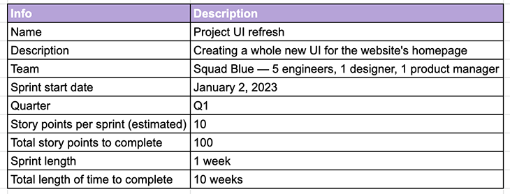
Other than estimating the amount of effort required, other information that might be useful can include:
- The name of the initiative
- A description of the initiative
- The team or number of team members dedicated to this initiative
- The sprint start date
- The quarter that this initiative is expected to be completed in
You can see an example below:
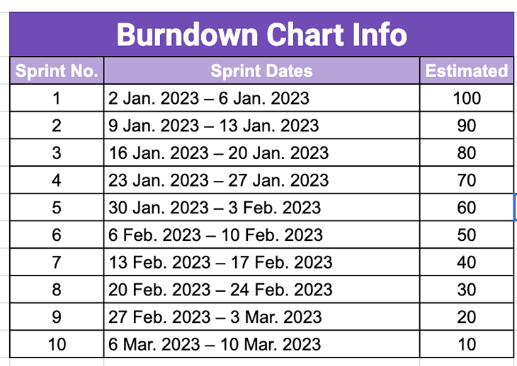
Step 2: Plot your sprint dates and estimated completion per sprint
Once a discussion around effort has been held and agreed upon, it’s time to plot out the amount of effort required per sprint. Using the above example table, let’s say it was agreed upon that it would take about 10 weeks (or 10 sprints, if you are using a weekly sprint schedule) to complete the initiative. In total, you’re estimating to take about 100 story points or 10 story points of effort per sprint.
You can then create a table that includes the following information:
- The date spans between each sprint (e.g. 2 January 2023 – 6 January 2023 = Sprint 1)
- The remaining story points at the start of that sprint (e.g. 100 points)
- Repeat the first two bullet points until you reach the end (e.g. 10 points for the 10th sprint or week)
See an example below:
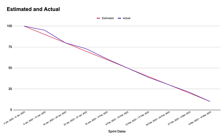
Step 3: Keep track of your completed vs. estimated work and make adjustments
Once you’ve plotted out the estimated amount of effort on a per-week basis, it’s time to kick off the initiative. Every week (or every sprint) as work gets completed, keep track of the amount of finished story points. At the end of every sprint, record the balance of the remaining story points.
Here’s an example of what this looks like:
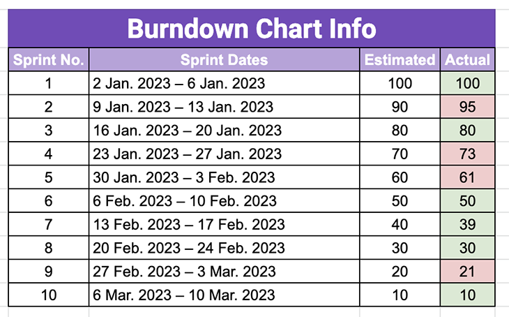
As seen above, keeping track of story points in the format of a burndown chart helps provide an overview of where the team is either lacking efficiency or is going above and beyond to finish work. This can potentially either move your release date earlier or later than planned.
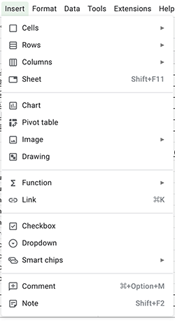
Using the above table, it’s easy to create a chart on Excel or Google Sheets. Start by selecting all of the above data before heading to the top toolbar and selecting Insert > Chart:
When done correctly, you can select the option for Line Chart, which should then create a burndown chart similar to this:
During sprints where the number of user stories or points exhausted is less than budgeted/estimated, it helps you consider if the team is sufficiently staffed or experienced enough to complete the work at hand. It also helps you figure out whether any bottlenecks stopped them from completing the work, or if they require any assistance from you, as the product manager, to help unblock them from their work.
During sprints where the number of user stories or points exhausted is more than budgeted or estimated, it is good to take stock and review to see whether there was something that helped the team achieve greater efficiencies in their work. Can you implement these methods in the following sprints to further achieve greater velocity for the team? Great things to consider!
Burndown chart Excel/Google Sheets template
Please click this link here for a FREE Google Sheets burndown chart template to use for your own teams. It’s pretty self-explanatory, but feel free to reread the article and follow along with the spreadsheet to give you a better understanding!
Conclusion
Use the above instructions and you’ll be able to create your own burndown chart in no time!
If you would like to see other templates that I’ve created for product managers, please feel free to visit this link as well.
Featured image source: IconScout
The post What is a burndown chart and how to use it like a product manager appeared first on LogRocket Blog.
from LogRocket Blog https://ift.tt/lxjsQgK
Gain $200 in a week
via Read more