


It is impossible to use any modern digital product and not come across a modal. If we try to save a file on our desktop or laptop, we’re quite likely to encounter a modal that will ask us to define the file name and location. In certain situations where a mobile application is asking for audio or video permission, we’re prompted to grant or deny this access request via a modal.
With modals being nearly ubiquitous, you’ll likely be tasked with implementing them at some point. Let’s explore why modals are so prevalent and whether they’re the best option to achieve your goals so you’re better equipped to create modals that won’t harm users’ experiences.
- What is a modal?
- Types of modals
- What’s the UX problem with modals?
- So, how do you use modals correctly?
What is a modal?
Let’s first define a modal as simply as possible: a modal is a window that sits on top of the main application. UX designers use modals to display additional actionable content, to assist the user to accomplish their desired task.
On a desktop or laptop, clicking on the number of reactions on a social media post opens up a list of users who reacted to that post in a modal. The user can then use this information to perform additional tasks beyond the scope of the initial content. For instance, the user can discover new users or conversations to follow.
An even more common use of modals is the settings page of various desktop applications. If we try to print a file, we’re bound to be faced with a modal because simply clicking Print is not always enough instruction to make the print happen.
There are many variables that have to be defined to print: paper size, color, orientation, number of copies, and so on. To speed things up, most print settings modals have a Default setting, and usually, we can just click print without tinkering too much.
Types of modals
Nielsen Norman Group aggregated the different types of modals into classifiable groups, as follows:
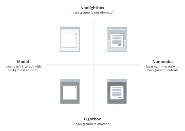
Even though Nielsen Norman Group helps us understand the different types of modals, we need to explore a little more of their use case–specific implementation and how they vary.
Dialog modals
A dialog is a system message, and a dialog box is a type of modal that conveys this message to the user, such as an alert or confirmation. In some cases, this can also be a fullscreen message to grab the user’s attention. Furthermore, dialog boxes can be classified into two types. They are as follows:
Modal dialogs
A modal dialog box is a blocking object. We must close this dialog box to proceed to any other tasks.
An example of this is a confirmation dialog box. For instance, if we try to close an application with unsaved work, it prompts us to either save or not save before exiting. The modal blocks us from exiting the application, but it also reduces user frustration in case the unsaved work was because of user error.
Modeless dialogs
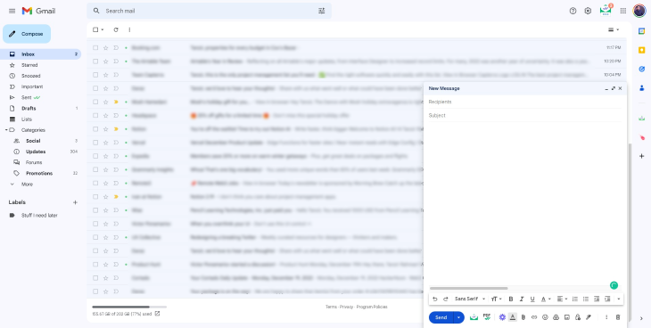
A modeless dialog box is a nonblocking object. We can interact with other user interface elements that are not part of the dialog box without closing the dialog box. An example of this is a search box, which we can keep open on the side and perform queries when needed.
We can find examples of modeless dialogs in older versions of Microsoft Office products; the latest versions have moved these to the sidebar instead of modeless dialog boxes. Another example of a modeless dialog box is the New Message prompt that opens when we press the Compose button in Gmail.
Overlay modals
Overlays are modals that usually contain noncritical information. Overlays can be of several types: pop-up, lightbox, or fullscreen.
Pop-up modals
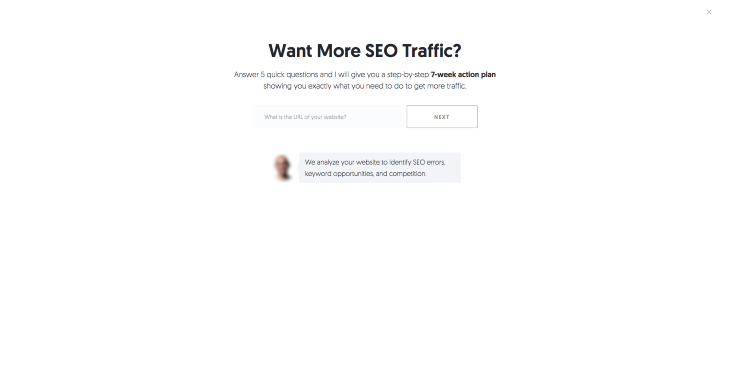
These usually appear automatically without any user action, such as an opt-in form on a website. They tend to be skippable but keep appearing repeatedly. They either disappear on their own or require some user action to close the popup. In order to prevent bad UX, we have to keep the following points in mind when implementing pop-ups:
- We shouldn’t show pop-ups right after a user enters a screen
- Pop-ups shouldn’t interfere with critical user interactions
- Pop-ups have to be properly timed so that they don’t create user frustration
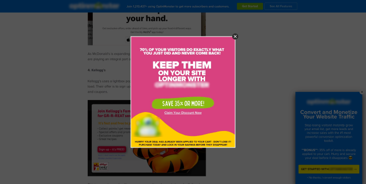
Lightboxes
Lightboxes make the content of the background less prominent such that the overlay content is the primary focus. We discovered this in the Nielsen Norman Group classification. You often see the lightbox effect with pop-ups like the one above to focus your attention on one area of the screen.
Fullscreen modals
A fullscreen modal is one in which the content occupies the entire screen and the content beneath the modal is completely hidden. These types of modals are particularly useful when we want the user’s undivided attention and we don’t want them to be distracted by the content lying beneath.
Where would a fullscreen modal make sense? For instance, we might implement a fullscreen modal when we want the user to select their location on a map. This ensures good accuracy because the user is solely focused on the map.
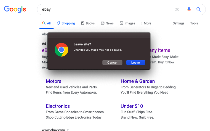
The following is an example of a fullscreen pop-up that shows when a user moves the cursor outside the body area of the website (i.e., the user is trying to exit the website).
What’s the UX problem with modals?
From a user perspective, modals are frustrating when they disrupt the task at hand. Modals by their inherent nature are disruptive because they sit on top of the main application. However, modals are most annoying in the following scenarios:
- Lack of organization: The user can feel lost if the content within the modal is not well organized and the user cannot find what they’re looking for. For instance, wherever a user tries to report a post on a social media platform, the website opens a modal to take some additional input. If the collection of the input is not simple and intuitive, the user might feel frustrated while seeking help
- Difficulty to close: Users can feel agitated if there is no easy way to exit out of a modal. For instance, some modals might not have the close button on top. Instead, they might require some action to close the modal, such as clicking outside the pop-up. The modern practice for many applications is to reduce double confirmation modals. For instance, applications now auto-save work instead of asking the user to save manually before exiting
- Persistency: Users get frustrated if a modal keeps reappearing and there is no way to hide it for a prolonged period of time. An example of a persistent modal would be a dialog box in a trial software reminding the user that this is a trial and it will expire. The good practice would be to limit these modals, and show them near the end of the trial period so that it doesn’t seem to the user that we are forcing them to purchase. In some applications, there’s usually a Snooze button for such scenarios where the user can opt to turn off these reminders
- Unclear microcopy: If the modal copy is not concise and clear, navigating it is confusing. The best practice is to follow common language used in other websites and applications to match the user’s mental model (i.e., what they’re used to from previous experience). A great website for good samples of microcopy is Microcopy.me.
So, how do you use modals correctly?
The main consideration when implementing a modal becomes: do we want the modal to be blocking or nonblocking?
If the modal presents something that is optional and the user can skip it, then it makes sense to have it be nonblocking, such as an opt-in form for a newsletter. If the modal presents some critical information such as account verification, then it makes sense to be a blocking modal with the background dimmed.
Let’s look at some examples of modal types, their pitfalls, and how and when to use them well.
Avoid nested modals
One crucial dilemma we faced when implementing modals is the concept of nested modals in web and desktop applications. In general, we should avoid using a modal within another modal at all costs; otherwise, our application gets confusing and complicated like a house of mirrors.
The only outlier where a modal within a modal can be acceptable is when we’re implementing a double confirmation for critical actions such as deletion or anything that requires password confirmation.
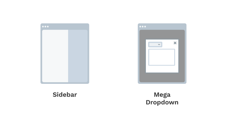
So then, what can we do when we need to show additional contextual information? There are three options.
- Instead of a modal, we can move the modal content to its own dedicated page
- We can use an expandable sidebar. Modern applications can have sidebars on both sides — one on the left for primary navigation and a secondary one on the right for contextual components
- Instead of showing a modal within a modal, we can have a mega dropdown. This is our regular dropdown box but expanded to a much larger size that would be needed to fit our modal content
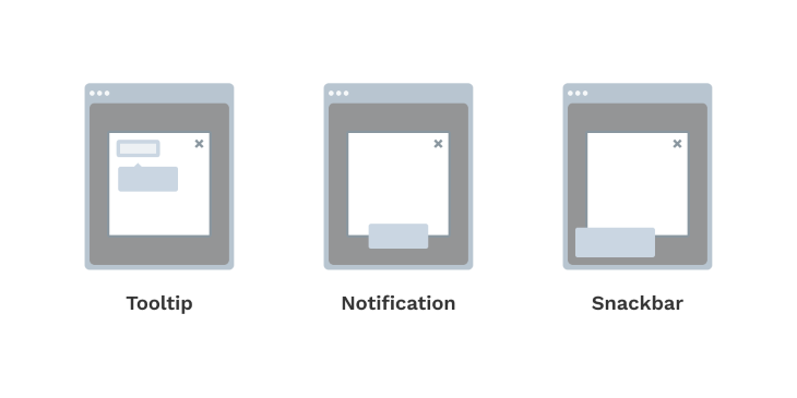
- In situations where the modal content doesn’t require too much space, we can also utilize tooltips, notification bars, or snack bars.
Consider how you position modals
Something that’s not given too much thought is the sizing and placement of modals. Good modals will have ample whitespace and will be a delight to look at due to their excellent proportions and the way they’re presented using visual hierarchy and spacing.
However, the most important aspect is making sure that the modal is in the user’s focus. If it’s a lightbox modal where the background is dimmed, then focus is quite easily achieved.
If we implement modals where the background is still visible, then we have to be mindful of the placement so that the modal does not create visual clutter. It is also generally a good idea to add motion to small modals that appear in the UI without the background dimming, to ensure that it catches the user’s attention.
Remember accessibility
A further step to make a modal design even more inclusive is to make them accessible to keyboard users and screen readers. You can achieve this by making the modal objects switchable as the selected item using the tab key.
Screen readers should also be able to hear out loud the appropriate labels for each object. When designing components, we already define an intermediate state known as a hover or select state. This intermediate state is an important cue for our users to understand where they are performing their actions.
It is also a good idea to save the user’s last active state so that the user can pick up where they left off when reaccessing a modal.
Modals must be scalable
Another thing to consider is the scalability of modals. A modal cannot contain an infinite amount of content. Therefore, similar to UI screens and pages, modals themselves can have pagination or steps where we can click Next to move on to the next step.
In such cases, it’s vital that we show a progress bar so the user expectations are properly managed and they have the context of where they are in the process. The user’s last entered data should be autosaved to avoid frustration.
Since we know modals are disruptive and they divert the user’s attention, we should try to use more subtle UI for use cases such as user onboarding and feature announcements. Tooltips are more appropriate for drawing attention to features and guiding users, instead of modals.
Other best practices for modals
And lastly, I have several miscellaneous tips for getting your modals on the right track. We have to be attentive when implementing modals, or we’ll lose users permanently:
- Some other good practices to remember are that a modal should be easy to get out of, whether that’s in the form of a cancel button, a close button on top, an escape key on the keyboard, or clicking outside the window
- The modals we implement have to have a descriptive but concise title. It is also good practice to include a subtitle that is instructional to the user
- There are certain scenarios where using a modal is not a good idea. For instance, when showing error, load, or success states. Using modals in such cases can be bad UX because of the frequency of the state changes and the fact that they block the parent screen. Instead, we can embed them in the existing screen, which requires no additional action from the user. Embedding these messages also allows the user to understand the message in the context of the main component triggering the change
- Modals should not be used to show loading states. Instead, we can place them in the body. For instance, if the loading is triggered by a button, then the button itself can have a loading state. The best use for a modal is to show irreversible actions, to further draw attention to the action, and reduce unwanted errors
- The messaging inside modals should ideally be direct and conversational. For instance, a delete action should ask, “Are you sure you want to delete?” and not, “Free up storage?” The latter is a byproduct of the user’s intended action and asking that as the primary question creates confusion
- Good modal design should follow the same UX principles as designing other UI elements. For instance, we should look to minimize the number of options in a modal. A primary and secondary button is the most common but in some cases, we can have a third button such as a “learn more” or “get help” but these can deviate the users away from the modal’s main purpose.
Summary
To implement modals that don’t hurt UX, we must maintain good modal anatomy. A modal must not interrupt key user interactions and should be properly timed. The most important aspect of the modal design is deciding when a modal is appropriate to use, so be sure to keep this advice in mind.
The post Implementing modal windows that don’t hurt UX appeared first on LogRocket Blog.
from LogRocket Blog https://ift.tt/VSA54u1
Gain $200 in a week
via Read more


