The rule of thirds is a somewhat hidden rule in design but is everywhere you look. Name any website, and you can easily spot the rule of thirds. See any billboard ad, and most likely the rule of thirds is present. Browse any marketing poster, and it’s probably there.
The rule of thirds is an old rule from artists dating back to the 1700s. And yet, its simple application holds preeminence in modern day marketing designs and is used by graphic artists everywhere you look.
All humans are drawn to the center of a composition, such as a webpage or an image. But that doesn’t mean just putting an image in the center of everything. In this article, I’ll take a deep dive into the rule of thirds. We’ll see where this design theory came from, how it’s used, and how brands such as Nike, Amazon, and Apple use this rule.
It’s more than a handy-dandy trick on your phone. Ready? Let’s dive in.
- What is the rule of thirds?
- 3 rules for designing a landing page with the rule of thirds
- Examples of the rule of thirds from famous brands
- When not to use the rule of thirds
What is the rule of thirds?
The rule of thirds is used in web design to create balance within the images or other elements of the landing page. Its main principle is that if elements on the page reside within a third of the page, then it is more aesthetically pleasing to viewers than if it was zoomed-in and centered, for example.
The rule of thirds is a way to break the landing page into two lines both horizontally and vertically, forming a grid-like pattern of intersections. The grid cuts the landing page into thirds, with three even horizontal columns and three even vertical rows. The grid is then made up of nine even boxes, made from the horizontal columns and the vertical rows.
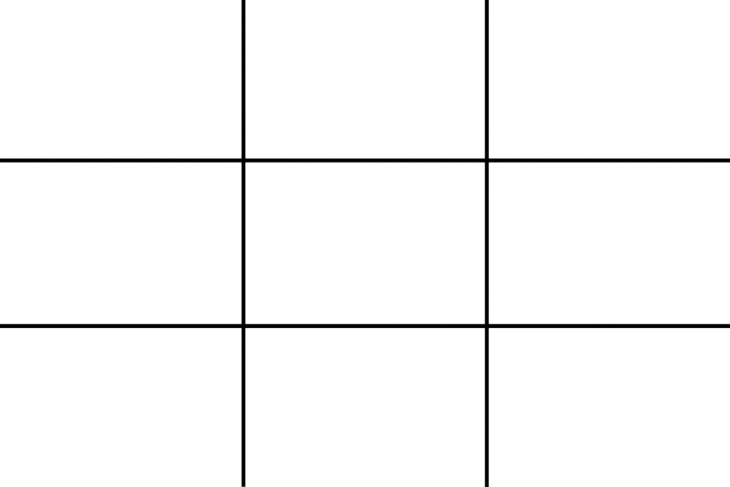
You can then place your relevant image or relevant text at every intersection of these columns and rows. Or, alternatively, you can also use each of the nine boxes to place your image or your text.
For example, if your landing page has an image, a call-to-action button, and contact information, you’d want to place the image over two horizontal columns, the call-to-action button on the bottom right intersection, and the contact information on the bottom left intersection.
We’ll talk more about this as we go along.
The history of the rule of thirds
We can’t talk about the rule of thirds without first talking about proportions. Proportions, generally speaking, is the theory that objects have a relationship to each other (micro) and to the whole (macro).
For example, your images, buttons, and text in your landing page all interact with each other, which is the micro view of proportionality, and each contribute to the wholeness of the landing page, which is the macro view of proportionality.
The rule of thirds is a vital part of art and design theory. The first person to theorize fully the rule of thirds was John Thomas Smith in the eighteenth century. In his book published in 1797, Remarks on Rural Scenery, he says:
“In short, in applying this invention, generally speaking, or to any other case, whether of light, shade, form, or color, I have found the ratio of about two thirds to one third, or of one to two, a much better and more harmonizing proportion, than the precise formal half, the too-far-extending four-fifths — and, in short, than any other proportion whatever.”
Some say the Rule of Thirds have existed since antiquity, but John Thomas Smith was the first to ever record in written language, making his work a foundational one for artists.
As you can see in the previous quote, the rule of thirds is primarily about proportion, and making sure your creation, something as vital as a landing page, is aesthetically pleasing and harmonizing to the naked eye.
The Rule of Thirds has gone on long after John Thomas Smith to become one of the most important “Fundamental Principles of Design”–along with The Golden Ratio, and The Rule of Proportions.
Where you find the rule of thirds
Although the theory of the rule of thirds dates back to the 18th century, you can find recent applications of the rule of thirds everywhere you look.
First, take a look at your iPhone. Open the Camera Options, and under Composition, turn on the grid option. The grid that overlays the image on your camera’s screen is based on the rule of thirds theory.
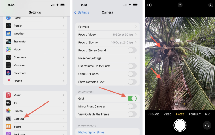
In all types of design — be it graphic design, UI design, or other fields such as architecture and film, the rule of thirds abounds. All you need is a grid that breaks the selected image into nine little boxes. You check out this post that will give you an idea of how the rule of thirds works in film. For how it works in architecture, check out this post on grids in architecture.
3 rules for designing a landing page with the rule of thirds
If you’re here, you’ve learned about the rule of thirds already. So how to actually apply it to your landing page? Here’s how to convert viewers into leads with this design rule.
Use a basic grid layout
In order to apply the rule of thirds to a landing page, you must use a grid design. Remember that the grid design is overlaid on top of both the entire landing page, and each element or each image. Where the eye lands first is, naturally, at the intersections. But, not each intersection has the same effect on the viewer.
The top left intersection is where the eye scans first, which gets 41 percent of the scan, while the button left intersection gets 25 percent. The top right intersection gets 20 percent in the eye scan, while the bottom right gets 14 percent. Thus, your viewer will most likely look at the top left corner first, while they will look at the bottom right corner last.
Knowing this information about the rule of thirds will significantly get you ahead of the game when it comes to gridding the most important information on your page first, middle, and last.
Here’s a guide from Design Web Kit:
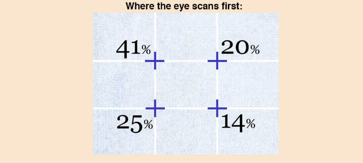
You must use the grid for the whole landing page. Then, for each element: each image, each CTA, each marketing message, each product description, and so on.
Use intersections of the grid layout for important information
To really get your landing page synonymous with the rule of thirds, all of the elements in your landing page that you want to draw attention to must be on the intersections of the grid layout.
If you have a catchy headline/slogan and you want that seen first, put it directly at the top left intersection. If you want to overlay an image, put the center of the image directly on the 20 percent intersection.
Then you have a call-to-action; make sure to put it at the 25 percent mark. And your description in the 14 percent mark. You now have a headline, an image, a description, and a call-to-action directly where visitors to your site will scan. You can drag around the elements as much as you can.
Divide your landing page into nine sections
You can also not use the intersections and create your landing page into nine sections. One way that I’ve seen most websites do this is
- Cut their images into six images on the first two horizontal rows and use the bottom horizontal row as a centered headline with description and CTA
- The other way around: use the top horizontal row for a centered headline with description and CTA, and use the last two horizontal rows for six images
Examples of the rule of thirds from famous brands
Nike
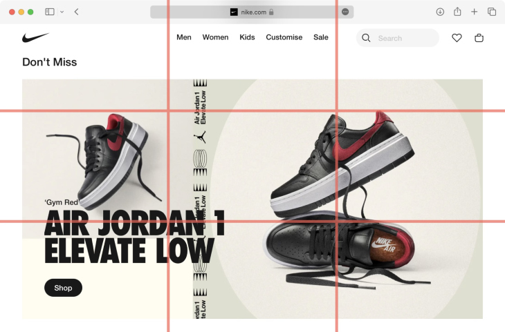
All of Nike’s images use the rule of thirds. On their localized homepages, they use a combination of product photos, CTAs and headlines to show their most coveted footwear designs. One of their images uses a photo of people on two vertical rows, with a product photo of a sneaker in closeup on the right vertical row. The sneaker resides on the 20 percent intersection, while a headline with the brand name is overlaid on the photo of users on the 41 percent intersection.
Their homepage is cut into thirds as well, not just their images. At every thirds’ intersection, you can see how Nike uses the rule of thirds to showcase their branding messages, their product photos, their varying descriptions, and their CTAs, in their order of priorities.
Amazon
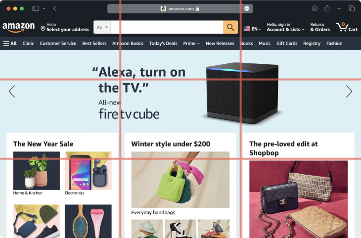
Amazon’s homepage uses the rule of thirds to a T. At the top of their homepage to the middle of the page, they use nine even boxes with text and content. Towards the middle of the page, they have a horizontal wide box for rotating, smaller images. Then towards the end of the page, they rotate one line of three even boxes with one line of the horizontal wide box. Another three boxes, one line of the horizontal box, and you reach the end of their webpage.
Amazon uses the rule of thirds strictly on their homepage. This is because, as a mass marketplace, they want their consumers to be able to empathize with their brand. By being able to show their consumers all the hottest products they offer in an organized and visually-appealing design, Amazon can grow their authority as a mass marketplace that caters to all. And, by being able to click in detail on each offering as it zooms by on the page, consumers can more conveniently personalize their experience.
Apple
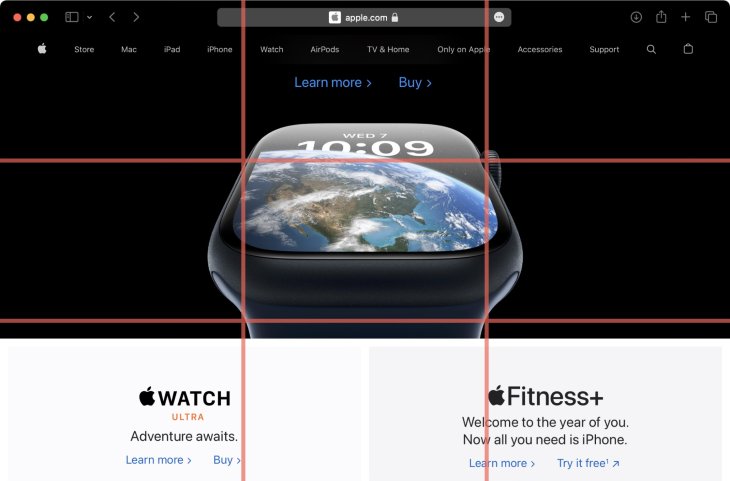
Apple’s ingeniousness shows in their UX design, making them a force to be reckoned with in marketing. And yet, Apple uses the rule of thirds on their landing page, too.
On their iPad landing page, they have 21 horizontal rows in the whole landing page, which they’ve cut into two columns. But these two columns consistently have their products side by side, with the center of their images residing on the intersections of three columns. It’s not as obvious as Amazon, for example, but it’s still the rule of thirds.
In one image, they have a rainbow of iPads residing on the 41 percent intersection, while on the 20 percent intersection, they have their product name, product descriptions, and product CTAs.
When not to use the rule of thirds
As you can see, the rule of thirds is very reliable. It’s a tried-and-true way to create readability for a webpage and visibility for brands. And because of its predominance on the net, how often it’s been used, and for how long, it’s already trained visitors to expect different elements in the same place on a visual level. As we scroll, we expect things to be in more or less the same places with every page we scan.
If the landing page itself has elements that are incompatible with the rule of thirds, you can let go of it. For example, if you want to showcase your film, it might be better if you use two horizontal rows only. For your photography website, maybe you want a centered image. Maybe you just want to experiment and have enough knowledge for it.
So, if you have a good grasp of design, go ahead and do what you feel fits the medium. Just make sure to use the other principles of design, such as proportions or even the Golden Ratio.
Wrapping things up
Here are three takeaways I hope you’ve learned by browsing through this:
- The rule of thirds is a pre-existing principle of design that can help your brand be more visible by harmonizing your landing page to the naked eye.
- The rule of thirds works in every image, in every landing page, and in every UX element. Most big brands use it to their advantage
- The rule of thirds is not really a rule, it’s more like a preference of the natural eye for harmony. If you can, use it, but if you’re foregoing it, make sure to use other principal elements of design
The post Designing a landing page with the UX rule of thirds appeared first on LogRocket Blog.
from LogRocket Blog https://ift.tt/Bgz8dCK
Gain $200 in a week
via Read more


