


Creating a typewriter effect is easier than you think. While the most common way to achieve this effect is by using JavaScript, we could also use plain CSS to create our typewriter animation.
In this article, we’ll look at how to create a typewriter animation effect with only CSS. It’s simple, nice, and easy. We’ll also take a look at the pros and cons of creating this effect with CSS versus JavaScript.
To follow this article and animate the final typewriter effect, you will need a basic understanding of CSS and CSS animation. If you have this baseline knowledge, then you’re good to go. We will cover the following:
- Pros and cons of using JavaScript vs. CSS for typewriter animation
- Overview of our typewriter CSS animation project
- Setting up the project
- Styling the webpage
- Creating the typewriter animation with CSS
@keyframesandsteps()
Let’s jump right in.
Pros and cons of using JavaScript vs. CSS for typewriter animation
Ultimately, the choice between CSS and JavaScript will depend on your specific needs and resources. Let’s go over some benefits and drawbacks of each approach to help you decide.
Using CSS only is simpler and easier to implement than using JavaScript. This approach also uses fewer resources than JavaScript, which can be important for performance on low-end devices.
However, when using CSS only, the typewriter animation may not be as dynamic as it could be with JavaScript. Additionally, you may not be able to handle more complex scenarios, such as changing the content of the animation on the fly.
In comparison, using JavaScript offers more control over the animation. You can fine-tune the timing of the effect and make it more dynamic. JavaScript can be more flexible and adaptable than CSS, especially if you need to change the content of the animation quickly.
On the other hand, JavaScript can be more complex to implement than CSS, especially for developers who are not familiar with it.
If you just need a simple, static typewriter effect, CSS might be the way to go. But if you need more control or dynamic content, JavaScript might be the better choice.
Now let’s move on to building our typewriter effect!
Overview of our typewriter CSS animation project
To achieve the typewriter effect, we will animate our text so that it displays text gradually. We will also have a cursor that types out the text and then continues to blink once it is done typing.
Before we dive in, let’s review some of the CSS properties we’ll be using.
We will use @keyframes for animations, as this at-rule gives us more control over the animation we want to perform. Using the overflow property on our content will ensure that each word displays in accordance with the animation rather than being shown all at once.
The white-space property will trim the animation down to a single line. Meanwhile, the border-right-color property will help animate our cursor from light grey to transparent, giving the animation a realistic touch of a blinking cursor.
Finally, the width property is animated from 0% to 100% to achieve the effect of each letter appearing one at a time.
Setting up the project
First, let’s define the HTML structure for the text that we’ll animate with the typewriter effect using CSS. Inside the folder for this project, create an index.html file, which will act as our webpage for this project demo, and paste this:
<!DOCTYPE html>
<html lang="en">
  <head>
    <meta charset="UTF-8" />
    <meta http-equiv="X-UA-Compatible" content="IE=edge" />
    <meta name="viewport" content="width=device-width, initial-scale=1.0" />
    <link rel="stylesheet" href="new.css" />
    <title>Document</title>
  </head>
  <body>
    <div class="container">
      <p class="first_line">Hello. My name is Temitope</p>
      <p class="second_line">and this is a typewriter effect</p>
    </div>
  </body>
</html>
We included a div container inside this file with two paragraphs of text. Each paragraph has its own class — first_line and second_line, respectively — as we are trying to achieve a multiline typewriter effect.
That’s all we need to do inside our index.html page. Let’s move on to styling our webpage and creating our animation.
Styling the webpage
Create another file inside the project folder called style.css and paste this:
@import url("https://fonts.googleapis.com/css2?family=Major+Mono+Display&display=swap");
body {
  height: 100%;
  width: 100%;
  background: #111;
  color: #d8e0db;
  font-family: "Major Mono Display", monospace;
}
.container {
  margin-top: 5%;
  width: 100%;
  height: 100%;
  padding: 70px;
}
.first_line,
.second_line {
  white-space: nowrap; /* keep text in one line */
  overflow: hidden; /* hide text behind the cursor */
  margin: 0.5rem auto;
  font-family: "Major Mono Display", monospace;
  font-size: 2rem;
  font-weight: bold;
}
.first_line {
  border-right: 2px solid rgba(17, 17, 17, 0.9);
}
.second_line {
  border-right: 2px solid rgba(17, 17, 17, 0.9);
}
In our style.css file, we are trying to style both lines of our text. We used some CSS properties we discussed earlier for our animation to work.
We set the overflow property as hidden to prevent unwanted horizontal scrolling and extra whitespace in the project. The white-space: nowrap setting will get our animation into a single line.
Finally, the border-right property will act as our cursor, which we want to blink as the text is displayed. We added two of these — one for each line — but the black color we assigned makes them invisible for now.
You may have noticed that we set the background color to black using the hex color code #111 while our text color of #d8e0db translates to a very light tan. You can choose whatever colors you like for your own text, but ensure the colors contrast each other sufficiently to comply with accessibility standards.
Additionally, we are using the Major Mono Display font family. Just like the background and text color, you can also choose whatever font you’d like. However, some fonts work better than others with the typewriter effect.
You may want to choose a clean sans-serif or monospaced font for the best result. Also, you will see that we are setting a width in our @keyframes below. You may need to change the width to accommodate any font you choose to use and ensure the cursor blink animation works correctly.
Creating the typewriter animation with CSS @keyframes and steps()
We’ll use CSS @keyframes to create an effect for both our lines of text. We want all of the text to be typed out in a letter-by-letter fashion, just like a typewriter does:
@keyframes typewriter_1 {
  from {
    width: 0;
  }
  to {
    width: 38rem;
  }
}
@keyframes typewriter_2 {
  from {
    width: 0;
  }
  to {
    width: 40rem;
  }
}
The @keyframes rules are named typewriter_1 and typewriter_2 respectively. Each rule has two keyframes — from and to. The to keyframe uses rem , a scalable CSS unit that makes our design flexible, responsive, and accessible.
In the typewriter_1 keyframe, we set the from width to 0 while to is set to 38rem. This ensures that when the text is shown letter by letter, our cursor will blink alongside it from width 0 at the start to width 38 at the end of our text. Our typewriter_2 also has from and to widths set to 0 and 40rem, respectively.
Our @keyframes will create an animation where the element gradually appears from left to right, just like a typewriter printing text.
To apply this animation, include it in the subtitle class selector using the animation property. In our case, we would update our div subtitle to the following:
.first_line {
  border-right: 2px solid rgba(17, 17, 17, 0.9);
  /* define animation types for firstline  */
  animation: typewriter_1 6s
}
.second_line {
  border-right: 2px solid rgba(17, 17, 17, 0.9);
  /* define animation types for econd_line  */
  animation: typewriter_2 5s
}
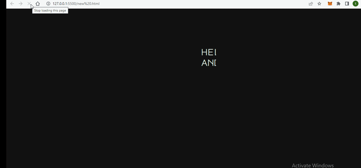
The animation is added alongside the animation speed to reveal our text smoothly. Here’s the result:
It does not look like the way we want, right? Remember, our goal is to make it look the way a typewriter works — that is, typing it out in a letter-by-letter fashion. To achieve this, we’ll be making use of steps() CSS function.
The steps() function in CSS is used to specify the number of intervals or steps in a timing function. In our case, we’ll be using it inside our animation property to allow our text to be displayed letter-by-letter:
.first_line {
  border-right: 2px solid rgba(17, 17, 17, 0.9);
  /* define animation types for text + cursor */
  animation: typewriter_1 6s steps(33) 1s 1 normal both;

}
.second_line {
  border-right: 2px solid rgba(17, 17, 17, 0.9);
  /* define animation types for text + cursor */
  animation: typewriter_2 5s steps(31) 1s 1 normal both;

}
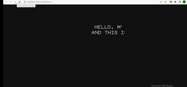
In the code above, you’ll notice the steps are 33 and 31 respectively. We got these numbers by counting the number of characters that we have in our text ourselves. checking the result in our browser:
Now it’s all coming together. However, notice in our result that the cursor isn’t showing or blinking. We want the cursor to blink to make our typewriter animation look more realistic. Additionally, both lines of text appear simultaneously, which is not the way a typewriter looks.
To fix this, we’ll also use @keyframes to create animations for each line’s cursor:
@keyframes first_cursor {
  from {
    border-right-color: rgba(17, 17, 17, 0.9);
  }
  to {
    border-right-color: rgba(255, 255, 255, 0.8);
  }
}
@keyframes second_cursor{
  from {
    border-right-color: rgba(17, 17, 17, 0.9);
  }
  to {
    border-right-color: rgba(255, 255, 255, 0.8);
  }
}
In the code above, the border-right-color property settings of both our cursors will change from black to white as they move. This will give each of our cursors a blinking effect.
We’ll include this inside the animation properties for our text classes, setting each animation direction property to infinite. This will make the cursor disappear and reappear every 780ms forever:
.first_line {
  border-right: 2px solid rgba(17, 17, 17, 0.9);
  /* define animation types for text + cursor */
  animation: typewriter_1 6s steps(33) 1s 1 normal both,
    first_cursor 900ms steps(33) 8;
}
.second_line {
  border-right: 2px solid rgba(17, 17, 17, 0.9);
  /* define animation types for text + cursor */
  animation: typewriter_2 5s steps(31) 1s 1 normal both,
    second_cursor 900ms steps(31) infinite;
  -webkit-animation-delay: 7s;
  animation-delay: 7s;
}
In the code above, we added infinite to our second cursor animation since our text ends on the second line. This will make the cursor disappear and reappear every 900ms forever.
We also added a seven-second delay to the second_line so it does not run at the same time as our first line types and displays.
All done! When checking out the result in the browser, we should now see the following:
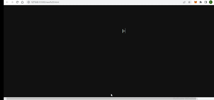
Congrats! We just made a typewriter animation effect using only CSS.
Note that you can follow these same steps if you only want one line of text. The only difference would be adding infinite to the first line’s animation, since there would be no second line. This will ensure the cursor blinks continuously at the end of your single line. You also would not need to add a delay property as we did in the second line.
Conclusion
In this article, we looked at how we can use CSS to create a typewriter animation effect with no JavaScript at all. It’s easy to do this with just basic HTML code and non-complex CSS syntax. Plus, it has no browser support issues!
A typewriter animation effect on our website will add interest and delight to our web pages. Please share if you found this helpful.
The post Creating a typewriter animation effect with only CSS appeared first on LogRocket Blog.
from LogRocket Blog https://ift.tt/9Llr5kE
Gain $200 in a week
via Read more


