


Oftentimes, you might come across web pages that have a background spanning the whole page. These kinds of full-page backgrounds can be used to create a cohesive look and feel for a website, or to add visual interest and context to specific pages or sections.
When used effectively, a full-page background can enhance the user experience and make a website stand out. In this tutorial, you will learn how to set a full-page background image and create a visually striking and immersive experience for users. We’ll explore different techniques for setting a full page background using CSS, including using the background-image property, the image-set() function, and advanced techniques such as using multiple background images and adjusting the background-repeat, background-position, and background-size properties.
Jump ahead:
- Setting a background image
- Understanding the
background-sizeproperty - Using the
image-set()function - Advanced techniques for full-page backgrounds
Setting a background image
The most basic way to set a full-page background is to use the background-image property in your CSS. This property accepts a value that is the URL of the image you want to use as the background.
Here’s an example of how to use the background-image property to set a full-page background:
body {
  background-image: url('/path/to/image.jpg');
}
This will set the body element as the container for the background image, which will cover the entire webpage.
When choosing a background image, it’s important to consider the dimensions of the image in relation to the size of the screen it will be displayed on. If the image is too small, it may appear pixelated or stretched when it’s displayed on larger screens. On the other hand, using an image that is too large can negatively impact performance, as it will take longer to load.
One way to optimize the size and resolution of your background image is to use an image editing tool to resize and crop the image to fit the dimensions of your webpage. You can also use the background-size property to specify how the image should be scaled to fit the webpage:
body {
  background-image: url('/path/to/image.jpg');
  background-size: cover;
}
The cover value tells the browser to scale the image up or down as needed to fit the entire webpage, maintaining the aspect ratio of the image. This can be a good choice if you want the image to fill the entire webpage, but don’t want it to be stretched or distorted.
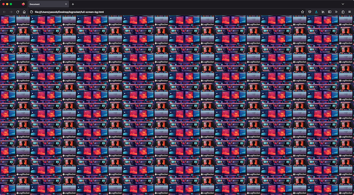
Here is a CSS sample that sets the body tag to be the size of the visible width and height and sets the background to be of size cover:
body {
  width: 100vw;
  height: 100vh;
  background: url('https://i.imgur.com/vHHl8Xk.jpg');
  background-size: cover;
}
This is what the output will look like:

It looks fine, but if we resize the page, the image will perfectly scale while maintaining its aspect-ratio to cover the whole page:

Notice how there are no scroll-bars. The image is simply covering the whole background of the body.
Understanding the background-size property
The background-size property has the following values:
auto: This is the default value. The background image’s size is determined by the actual size of the image filelength: You can specify the size of the background image using length values, such as `20px` or `10em`. This will set the width and height of the image to the specified valuespercentage: You can specify the size of the background image using percentages, such as `50%` or `75%.` This will set the width and height of the image to a percentage of the size of the elementcover: This value scales the background image to be as large as possible so that the background image covers the entire element while preserving its aspect ratiocontain: This value scales the background image to the largest size, such that both its width and height fit inside the elementinitial: This sets the property to its default valueinherit: This inherits the value from its parent element
The image-set() function
The image-set() function allows you to provide different versions of an image for different device resolutions. This can be useful if you want to use a higher resolution image for devices with high pixel densities, such as smartphones and tablets, while using a lower resolution image for devices with lower pixel densities.
Here’s an example of how to use the image-set() function in a background-image declaration:
body {
  background-image: image-set(
    '/path/to/image-lowres.jpg' 1x,
    '/path/to/image-highres.jpg' 2x
  );
}
The image-set() function takes a series of image URLs and resolutions as arguments.
In this example, we’re providing two versions of the same image: a low-resolution version for devices with a pixel density of 1x, and a high-resolution version for devices with a pixel density of 2x. The browser will choose the appropriate version of the image based on the device’s pixel density.
Advanced techniques for full-page backgrounds
In addition to the background-image and background-size properties, there are several other CSS properties that you can use to fine-tune the appearance of your full-page background.
One useful property is background-repeat, which determines how the background image is repeated if it’s smaller than the container element. The default value is repeat, which means that the image will be tiled horizontally and vertically to fill the container. You can also set the value to repeat-x, repeat-y, or no-repeat to specify how the image should be repeated.
Let’s take a look at the same demo as before, but this time I have manually defined the size of the background and made it repeat across both axes:
body {
  font-weight: bold;
  width: 100vw;
  height: 100vh;
  background: url('https://i.imgur.com/vHHl8Xk.jpg');
  background-size: 250px;
  background-repeat: repeat-x repeat-y;
}
N.B., If you have set background-size to cover, then repeat won’t have any effect.
The background-position property allows you to specify the position of the background image within the container element. You can use this property to center the image or to adjust its position to the left, right, top, or bottom of the container.
In addition to these properties, you can also use the background-blend-mode property to overlay multiple background images and create more complex effects. This property allows you to specify how the colors of the background images should be combined, using options such as multiply, screen, and overlay.
Let’s look at an example of how you might use these properties to create a full-page background with multiple images and an overlay effect. Here are two images that we will be using in the demo:


This is the relevant CSS:
body {
    background-image: url('https://imgur.com/Fn9FQwT.jpg'), url('https://imgur.com/VfcgZZ9.jpg');
  background-size: cover;
  background-blend-mode: difference;
}
And here is the output:
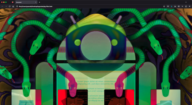
In this example, we’re using two images as the background for the body element, with the first image positioned in the center and the second image positioned at the bottom of the container. We’re also using the difference blend mode to overlay the two images, creating a more complex and visually interesting effect.
You can look at a slightly different example on JSFiddle. Feel free to play around and experiment with it.
Conclusion
In this article, we covered different techniques for creating a full-page background using CSS. We looked at the background-image property and the image-set() function, and advanced techniques such as using multiple background images and adjusting the background-repeat, background-position, and background-size properties.
It’s important to consider the impact that background images can have on a website’s performance and to choose and optimize images appropriately to ensure a fast and smooth user experience. By using these techniques and considering the user’s device and connection speed, you can create visually striking and immersive full-page backgrounds that enhance the user experience on your website.
The post Create a full-page background with CSS appeared first on LogRocket Blog.
from LogRocket Blog https://ift.tt/5aOrHtC
Gain $200 in a week
via Read more


