


In this article, we’ll look at how to work with Vuetify color themes. We will cover how to add Vuetify to a Vue.js application, how to create custom themes, and how to dynamically switch between them.
Jump ahead:
- Why use Vuetify themes for Vue.js apps?
- Adding Vuetify to a Vue.js app
- Vuetify theme configuration
- Dynamically switching between themes with Vuetify
- Switching between Vuetify themes in your markup
Why use Vuetify themes for Vue.js apps?
Vuetify is one of the most widely used CSS libraries and currently the most popular material design component library for Vue.js. As of the writing of this article, this Vue component framework has over 36k stars on GitHub.
Along with its extensive component and icon library, Vuetify provides a plethora of other features. One of these features is the ability to dynamically switch app color themes with minimal effort. This makes Vuetify an excellent choice for developers designing responsive, flexible, and extensible apps.
Adding Vuetify to a Vue.js app
Let’s get started by creating a new Vue application and configuring Vuetify. We’ll explore two different ways to do so below: the recommended approach using Vite, and an alternate option using Vue CLI.
Creating the project with Vite (recommended)
The easiest way to get started with creating a new Vue and Vuetify project is via the command below. This command uses Vite to scaffold a new Vue 3 application, as well as to install the latest version of Vuetify on the app:
npx create-vuetify my-app
# OR
yarn create vuetify my-app
Running this command will prompt you with a few questions, such as whether you want to add TypeScript support to your app, your preferred package manager, and so on.
Make the appropriate selections according to your preferences. Once done, you can now run your application with the following command:
npm run dev
# OR
yarn dev
Creating the project with Vue CLI
Another option is to use the traditional Vue CLI tooling. However, this is not recommended because Vue CLI is currently in maintenance mode.
To begin, ensure that Vue CLI is installed globally. Then, run the following command to create a new application:
vue create my-app
Similar to the Vite command, running this command will prompt you to make some selections according to your preferences. After, you can add Vuetify with this command:
vue add vuetify
When you run this command, you will also be prompted to select a preferred version of Vuetify to install. You can then run your application with the following command:
npm run serve
# OR
yarn serve
Using either of the two methods mentioned above will generate the necessary scaffold for your application — specifically, a new plugin/vuetify.js file in the /src folder. This file contains the code for initializing Vuetify with Vue, as well as any future theme configuration we will be doing.
For even more options, the official installation page includes instructions on how to configure Vuetify manually as well as via CDN.
Vuetify theme configuration
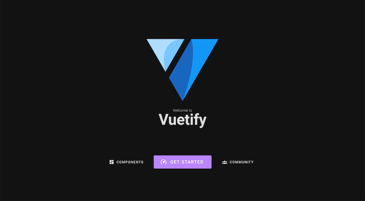
Vuetify comes with two themes pre-installed — a light theme and a dark theme. By default, when you run your application, it will be rendered in the light theme. However, you can change this setting by editing the defaultTheme option in the Vuetify plugin configuration file.
For example, to set a default dark theme, we can modify the defaultTheme option like so:
// src/plugins/vuetify.js

import "@mdi/font/css/materialdesignicons.css";
import "vuetify/styles";

import { createVuetify } from "vuetify";

export default createVuetify({
  theme: {
    defaultTheme: "dark",
  },
});
Our application should now be rendered with the dark theme, as shown below:
Creating custom themes
In Vuetify, it is also possible to create custom themes that are based on either the default light or dark themes. We can do this by passing an object containing our new theme options — such as if it’s extending the light or dark theme, as well as color preferences — during Vuetify’s initialization.
For example, suppose you want to create a custom theme that is based on the dark theme, but with a few changes to the colors used. You could do this by defining the custom theme as follows:
// src/plugins/vuetify.js

import "@mdi/font/css/materialdesignicons.css";
import "vuetify/styles";

import { createVuetify } from "vuetify";
// Custom theme properties
const customDarkTheme = {
  dark: true,
  colors: {
    background: "#15202b",
    surface: "#15202b",
    primary: "#3f51b5",
    secondary: "#03dac6",
    error: "#f44336",
    info: "#2196F3",
    success: "#4caf50",
    warning: "#fb8c00",
  },
};

export default createVuetify({
  theme: {
    defaultTheme: "customDarkTheme",
    themes: {
      customDarkTheme,
    },
  },
});
To verify these changes, let’s open the default src/App.vue file and paste the code below into it:
<template>
  <v-container class="fill-height">
    <v-responsive class="d-flex align-center text-center fill-height">
      <div class="text-body-2 font-weight-light mb-n1">Welcome to</div>

      <h1 class="text-h2 font-weight-bold">Vuetify</h1>

      <div class="py-5" />

      <v-row class="d-flex align-center justify-center">
        <v-col cols="auto"> <v-btn color="primary"> Primary </v-btn> </v-col>
        <v-col cols="auto">
          <v-btn color="secondary"> Secondary </v-btn>
        </v-col>
        <v-col cols="auto"> <v-btn color="error"> Error </v-btn> </v-col>
      </v-row>

      <v-row class="d-flex align-center justify-center">
        <v-col cols="auto">
          <v-btn color="info"> Info </v-btn>
        </v-col>
        <v-col cols="auto">
          <v-btn color="success"> Success </v-btn>
        </v-col>
        <v-col cols="auto">
          <v-btn color="warning"> Warning </v-btn>
        </v-col>
      </v-row>
    </v-responsive>
  </v-container>
</template>
To demonstrate how our Vuetify theme colors will look, the default component in the code above has been modified to display buttons of different variants. If we run our application now, we should get the following results:

Dynamically switching between themes with Vuetify
Vuetify includes a useTheme method that allows us to easily get and set the value of our app’s current theme. Using this method, we can access the current theme value at theme.global.current.value.dark. This will return a boolean (true or false) value indicating whether the current theme is dark or light.
Furthermore, to change the current app theme, we can simply modify theme.global.name.value, setting its value to light, dark, or a custom theme name we’ve created.
For example, we can use the following code to create a dynamic light/dark mode switcher based on this principle:
<!-- src/App.vue -->
<template>
  <v-container class="fill-height">
    <v-responsive class="d-flex align-center text-center fill-height">
      <div class="text-body-2 font-weight-light mb-n1">Welcome to</div>

      <h1 class="text-h2 font-weight-bold">Vuetify</h1>

      <div class="py-4" />
      <v-row class="d-flex align-center justify-center">
        <v-col cols="auto">
          <v-switch
            inset
            color="info"
            v-model="darkMode"
            @change="toggleTheme()"
            :label="`It's ${darkMode ? 'Dark' : 'Light'}!`"
          ></v-switch>
        </v-col>
      </v-row>
    </v-responsive>
  </v-container>
</template>

<script setup>
import { ref } from "vue";
import { useTheme } from "vuetify";

const theme = useTheme();
const darkMode = ref(false);

const toggleTheme = () => {
  theme.global.name.value = darkMode.value ? "dark" : "light";
  // Optional: Get value of current theme
  console.log(`Current theme is dark? ${theme.global.current.value.dark}`);
};
</script>
The code above imports Vuetify’s useTheme hook and uses it to get the current theme object. We also created a reactive darkMode state and bound it to a switch component. The darkMode variable is set to false, indicating that the theme is light by default.
Following that, we defined a toggleTheme function to toggle between light and dark themes. When you toggle the switch, the function updates the darkMode variable and uses it to set the current theme name.
When we run our application in the browser, we should see the following output:
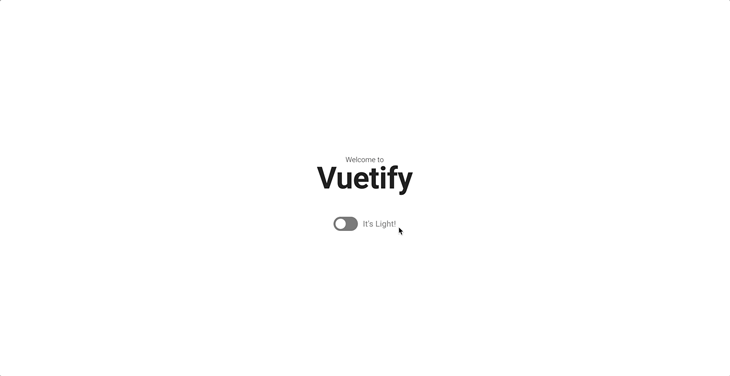
It’s also worth noting that the defaultTheme option in the Vuetify plugin file was set to light to demonstrate this example.
Dynamically switching between custom themes
We can also use the previously described concept to switch between custom themes. Assume we have a couple of custom themes defined in our plugin file, as shown below:
// src/plugins/vuetify.js

import "@mdi/font/css/materialdesignicons.css";
import "vuetify/styles";

import { createVuetify } from "vuetify";

const customDarkTheme = {
  dark: true,
  colors: {
    background: "#15202b",
    surface: "#15202b",
    primary: "#3f51b5",
    secondary: "#03dac6",
    error: "#ff5722",
  },
};

const customLightTheme = {
  dark: false,
  colors: {
    background: "#eee",
    surface: "#15202b",
    primary: "#3f51b5",
    secondary: "#00ccff",
    error: "#ffcc00",
  },
};

export default createVuetify({
  theme: {
    defaultTheme: "light",
    themes: {
      customDarkTheme,
      customLightTheme,
    },
  },
});
We can switch between them as expressed in the code below:
<!-- src/App.vue -->
<template>
  <v-container class="fill-height">
    <v-responsive class="d-flex align-center text-center fill-height">
      <div class="text-body-2 font-weight-light mb-n1">Welcome to</div>

      <h1 class="text-h2 font-weight-bold">Vuetify</h1>

      <div class="py-5" />

      <v-row class="d-flex align-center justify-center">
        <v-col cols="auto"> <v-btn color="primary"> Primary </v-btn> </v-col>
        <v-col cols="auto">
          <v-btn color="secondary"> Secondary </v-btn>
        </v-col>
        <v-col cols="auto"> <v-btn color="error"> Error </v-btn> </v-col>
      </v-row>

      <div class="py-5" />

      <v-row class="d-flex align-center justify-center">
        <v-col cols="4">
          <v-select
            label="Select Theme"
            v-model="selectedTheme"
            :items="myThemes"
            @update:modelValue="setTheme()"
          ></v-select>
        </v-col>
      </v-row>
    </v-responsive>
  </v-container>
</template>

<script setup>
import { ref } from "vue";
import { useTheme } from "vuetify";

const theme = useTheme();
const myThemes = ["light", "dark", "customLightTheme", "customDarkTheme"];
const selectedTheme = ref(myThemes[0]);

const setTheme = () => {
  theme.global.name.value = selectedTheme.value;
  console.log(selectedTheme.value);
};
</script>
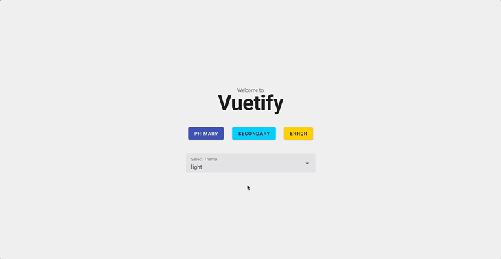
In the code above, we defined an array that contains Vuetify’s default light and dark themes, as well as our own customDarkTheme and customLightTheme.
We then used this array to populate a select component, allowing the user to select from various theme options. When a user chooses a different theme from the select component, our application updates to use that theme.
When you run your application at this point, you should see something like this:
Switching between Vuetify themes in your markup
Vuetify provides additional methods for you to easily apply preferred themes directly in your markup.
One method is to use the theme prop, which is supported by all Vuetify components and allows you to easily set a preferred theme for different sections of your application. Here’s an example of how this could be used in a card component:
<v-card width="400" theme="dark">
  <v-card-item>
    <v-card-title>Card title</v-card-title>
  </v-card-item>

  <v-card-text> Lorem ipsum dolor sit amet. </v-card-text>
</v-card>
In the example above, regardless of the theme you specify in the Vuetify configuration, the card component and its children will be rendered in the dark theme. Of course, the value specified in the theme prop could also be a custom theme name that you had previously created.
Another method to directly apply themes in your markup is by using the <v-theme-provider> component. This component is mostly useful for applying different themes to larger sections of your application, eliminating the need to set the theme prop on each individual component:
<v-theme-provider theme="customLightTheme">
  <v-container>
    <v-row>
      . . .
    </v-row>
  </v-container>
</v-theme-provider>
In the preceding example, we used the <v-theme-provider> component to apply the customLightTheme to a large section of our application.
Conclusion
Throughout this article, we’ve covered how to create custom themes in Vuetify, as well as how to dynamically switch between these themes. All the examples used in this article have also been created as separate components and uploaded to Github for your convenience.
The post Building dynamic Vuetify themes for Vue.js applications appeared first on LogRocket Blog.
from LogRocket Blog https://ift.tt/Xml5V8G
Gain $200 in a week
via Read more


