


What is Fitt’s law all about?
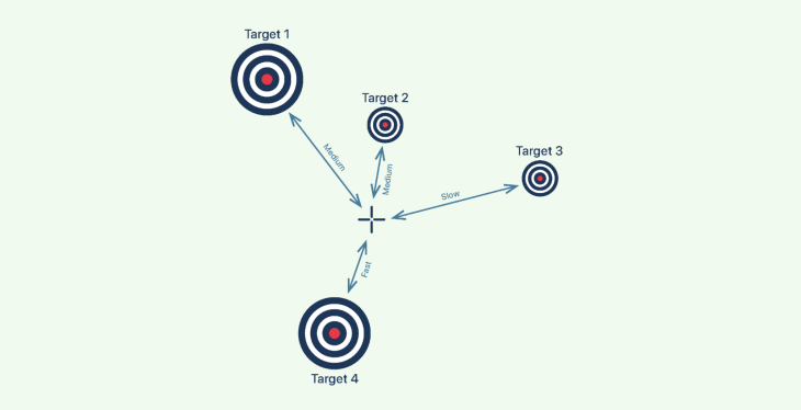
In 1954, psychologist Paul Fitts discovered that the greater the distance between the pointer and the target, the longer it takes for the pointer to reach the target; in other words, a closer target is faster and easier to approach. However, the size of the target has a direct impact on the time required, and thus larger targets are faster and easier to reach.
His law states that the mistake rate increases when the goal is small and distant and decreases when the target is large and close.
The diagram below depicts the relationship between the target and pointer in terms of speed, time, and distance.
Let us understand Fitt’s law even better with the help of the following examples, then cover these topics in depth for better implementing Fitt’s law:
- Prime pixels and magic pixels
- The three rules for Fitt’s law in UI design
- Applying Fitt’s Law in desktop interfaces
- Applying Fitt’s Law in mobile interfaces
- Good and bad examples of Fitt’s law
Example 1

To help you understand Fitt’s law, look at the image above and tell me which is easiest to hit with a small piece of rock from where you are.
If you’re not an expert marksman, I’m guessing your answer is the bigger one in front.
Example 2

Let us look at another example. Look at the above image and use your mouse (or your thumb if you’re reading this on your smartphone) to point to the center of the two circles.
If I’m correct, it took you milliseconds to point at the larger circle and was the most difficult to point at the smaller circle.
Prime pixels and magic pixels
A point where the mouse pointer first appears when the user lands on a page is called the prime pixel. In order for designers to make best use of Fitt’s law, it’s necessary to know the prime pixel’s location.
Operating systems such as MacOS and Windows effectively use the prime pixels since the cursor always appears in the prime pixel region upon booting.
In contrast, this is not the case for web apps, websites, and other software programs running on these operating systems, as the pointer location would be altered. On the bright side, you can figure out the likely prime pixel when a user does something, even if you can’t find the prime pixel on a site.
Let’s take a look at a small example that best demonstrates the prime pixel:
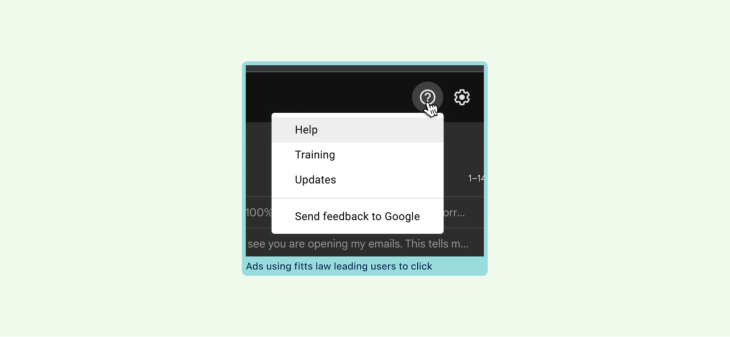
The dropdown menu that appears when a user clicks on the Help button is adjacent to the icon. This informs the user of the resultant possibilities for the action performed.
Similar to prime pixels, the edges of the screen include four additional essential pixels known as magic pixels. These are the farthest from the prime pixels, and a designer must deliberate while placing any UI elements here.
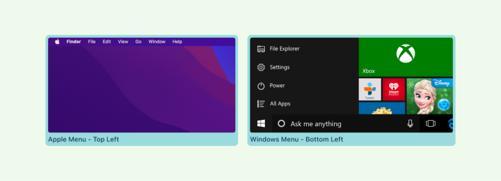
The below snapshot shows the magic pixels in the Windows 11 operating system.
As a consequence of their distance from the prime pixels, these four pixels are regarded as the least useful location for anything important or any interactive elements in a design.
Generally speaking, from the perspective of a designer, the prime pixel is the one in the middle of the screen, until such time as it is acted upon and it shifts. This pattern may be observed in Google’s search box. When you visit Google for information, the search box is located in the center, allowing you to conveniently type and search for the desired information.
The three rules for Fitt’s law in UI design
Fitt’s law is frequently employed in user interface design, as seen in most digital products with strong usability, where all interactive components related to a user’s task are large, close, and quickly accessible.
This law is especially essential in visual interface design or any interface design discipline that involves pointing and selecting with the mouse pointer or thumb.
In general, Fitt’s law can be applied to UI design in three simple parts:
- Size: UI components need to be distinct, clickable, and clear
- Effort: Use prime and magic pixels to your advantage, and make your user interface elements easy to locate and interact with
- Distance: Consider the distance between elements, and use size and effort in conjunction with distance to produce a visually appealing and functional experience
Applying Fitt’s law in desktop interfaces
Mind the size and distance of your important buttons
When developing a user interface, it is essential to consider the element’s size and distance to the nearest and most often used interaction. The size and distance of a button to its nearest interactive element are among the most prominent design guidelines for buttons.
It is also important to consider high-risk interactive elements such as the delete action that you don’t want the user to activate by accident. These should usually be placed away from most frequently used interactive elements.
In the image below, the Delete button is located with both Download and Edit. Since Delete is inherently destructive, it must always be placed away from the most frequently used buttons.

Use accessible edges to your advantage
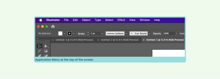
The mouse pointer comes to an end at the edges (top, bottom, left, right and corners). The user needs significantly less precision because they can simply hurl the mouse toward the corners and the pointer will be restricted by the screen boundaries. This is one of the reasons why you have Windows and Apple menus in the corners.
Similarly, the top and bottom margins are more accessible. The top and bottom are not as easily reached, but they still provide quicker access than a single point in the middle of the screen. This is also why Apple’s application menu is located at the top of the screen.
Provide helpful pop-up menus
Pop-up menus are a terrific way to reduce the time and distance between the pointer and the menu items. Right-click dropdown menus are the most frequent type of pop-up menu that spares the user time searching for their settings.

Applying Fitt’s law in mobile interfaces
In mobile UI, the cursors are your fingers. As opposed to pointers, fingers are thicker and less accurate than the mouse pointer. Therefore, it is essential for mobile interface touch targets to be larger.
For example, consider a CTA button that occupies the majority of the horizontal screen width on a mobile device.

Because of its size and location, the button at the bottom of the screen is easily accessible when a person interacts with a mobile device using only their thumb.
In contrast, it becomes challenging when the most interacted elements are positioned beyond our natural thumb range and the user must use both hands to reach them.
Place buttons in locations that are natural for one-handed reach
Keeping this in mind, designers must always position desired targets within this range.
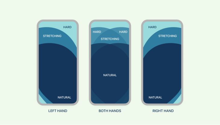
When applying Fitt’s law, it is important to understand the primary goal of the screen, what it was intended to accomplish, and how we can make that goal easy for the user to achieve.
Good and bad examples of Fitt’s law
Fitt’s law cannot be considered a solution to every problem; there will be situations in which it makes sense to apply it and others in which alternative principles are more appropriate.
There are instances where Fitt’s law could be used as a dark pattern, which happens with ads that pop up suddenly on search engine pages.
In the following example, the advertisement appeared in the prime pixel location immediately after I opened the page. After closing the first ad, a second ad appears on the top edge with big text and a CTA. This is just one of the numerous ways websites make use of Fitt’s law in ads.
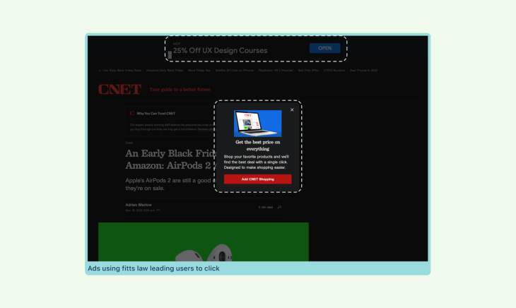
While there are many examples of websites displaying relevant ads next to search results, there are competitors who use this to misdirect users.
To better illustrate examples of Fitt’s law, I’ve prepared more examples. These apps are my personal favorites and I use them on a daily basis; I have made them intentionally bad for the educational purpose of this article.
Example 1: Finding a purchase button
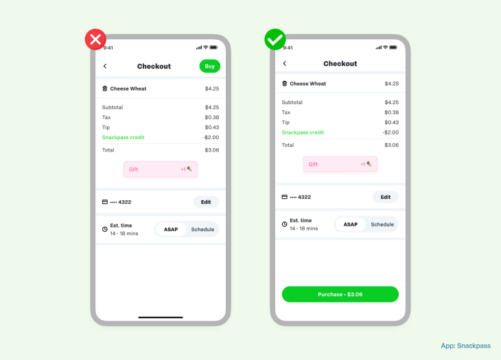
In the above snapshot, the user’s primary action is to finalize their cart and complete the purchase by paying.
In the bad example, the Buy option is located at the top-right area of the screen, making it difficult for the user to tap with only one hand.
In the good example, however, the Purchase button is at the bottom of the screen, with all of the relevant information spanning from left to right, making it simple to tap and complete the task at hand.
Example 2: Larger form options
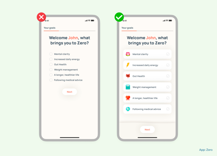
In the above screenshot, the user is in the middle of an onboarding process for a fitness app and must select his major goals for using the application.
In the bad example, the goals are simply a checklist with radio buttons that are too close together, making it difficult for the user to tap. This list also requires more cognitive effort to digest all of the information on the screen. In addition, the action button Next is located far away from the user’s thumb range.
However, in the good example, all of the goals are set properly, with supporting graphics at the perfect distance between them. The call to action button is also conveniently accessible with the thumb.
Example 3: Simplified tab bars
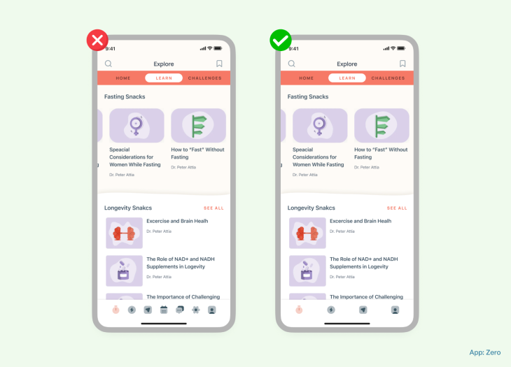
In the example, you can see the application’s homepage. The homepage is the most important part of any digital product since it determines the next step the user will take. Do it right, and you may have a loyal, paying customer; do it wrong, and it just takes seconds to uninstall.
In the bad example, the tab bar is cluttered with too many functions placed closely together, making it susceptible to errors.
In contrast, the good example uses only the necessary functions and places them at a safe distance from one another. As per Apple’s accessibility guidelines, all touchscreen controls and interactive elements have a hit target that measures at least 44 pt.
Example 4: Throw the discard button far away
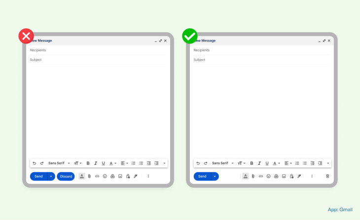
This is application is probably the most used email service on the planet. In the screenshot, you can see two discrete examples of the email composer window, and the primary objective here is to compose an email and send it to recipients.
And, in the example on the left, you can see a Discard button next to a Send button. This is incorrect on several levels, and here’s why:
- Send and Discard do not hold the same significance, and it’s counterintuitive to place them next to each other
- The Discard button color is attracting too much attention to it when it is not even the primary function here
- The Send and Discard buttons have the same colors, and the user may accidentally click on Discard instead of Send
In the example on the right, however, the trash button is situated far away from the send button, reducing the possibility of human error. It’s located on the edge of the screen, which is another point of accessibility.
Final thoughts
Although Fitt’s law was developed in the late 1950s, long before the advent of the Internet, it remains an important principle in the field of digital product design to boost engagement and profitability.
While Fitt’s law is a good starting point for good usability, it’s not the only or even the most important design principle to consider. Data tells us more than what a principle can theorize, and the best option to understand if the design solution is user-centered is to conduct usability tests on your users.
Theories are a good place to start, but asking questions, taking inspiration from the real world, iterating on solutions, getting a deeper understanding of why and how things are working, and then ultimately applying them back to the real world will be most effective.
The post Using Fitt’s law to effectively guide users through your app appeared first on LogRocket Blog.
from LogRocket Blog https://ift.tt/cw8p9kY
Gain $200 in a week
via Read more


