


What are CTAs, and what happens when they’re ineffective?
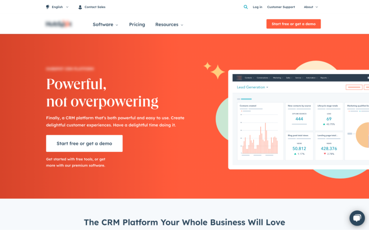
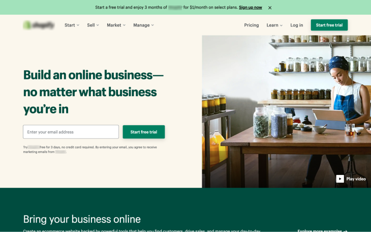
CTAs (calls to action) are links or buttons that push users to do something on an app or website. On ecommerce websites, for example, visitors are pushed to “Buy” products or at least “Add [them] to cart,” and on SaaS marketing websites, visitors are pushed to “Subscribcalle” to products or at least “Sign up for free.”
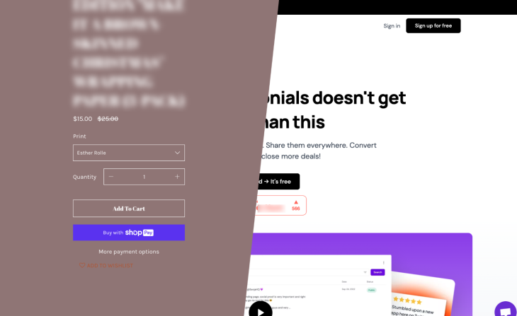
When CTAs are ineffective, as indicated by their CTR (click-through rate), visitors end up not taking action and the app or website fails to live out its purpose. In this article, you’ll learn what you can do as a UX designer to ensure that that doesn’t happen.
- The three different types of CTAs and what they do
- Things to consider when designing CTAs
- Interactivity for CTA links
- Build up to the CTA with a value proposition
- How to improve your CTA’s click-through rate
The 3 different types of CTAs and what they do
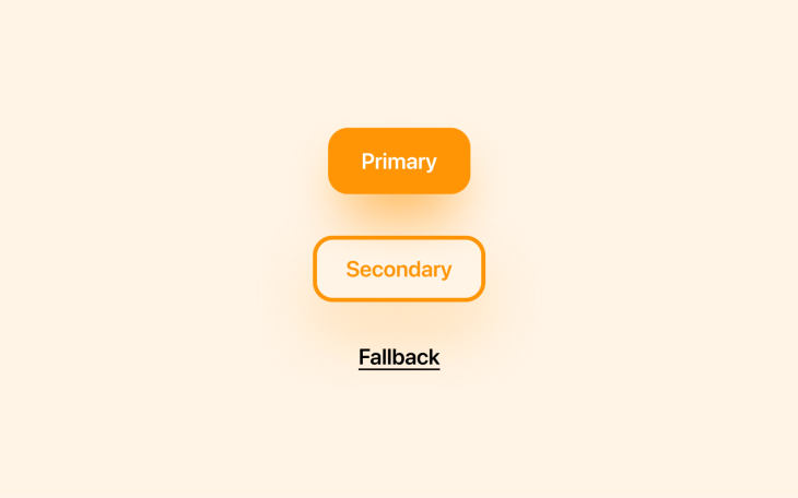
First of all, there are three different types of CTAs: primary, secondary, and fallback.
- Primary CTAs are those that call visitors to do something relating to the app or website’s core purpose. For example, on a SaaS marketing website, the primary CTA would call visitors to subscribe
- Secondary CTAs are for visitors that are unsure about committing to the primary action. As an example, instead of subscribing to the SaaS product, they might prefer to start a free trial instead. Secondary CTAs are important CTAs but perhaps not as important as primary CTAs, and this should be reflected in their design in terms of visual hierarchy
- Fallback CTAs are for those that aren’t interested in what’s being offered or aren’t interested at the moment. All is not lost — perhaps, for example, they would like to follow on social media for now? If we can’t convert them now, maybe we can convert them later. Small wins are better than losses
Things to consider when designing CTAs
Affordance
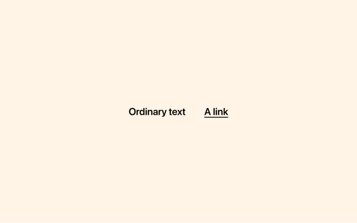
Great CTAs are affordant, meaning that it’s clear what they are and what they do. In fact, some elements are naturally affordant — links, for example — which are often underlined by default to help users tell them apart from text that isn’t clickable.
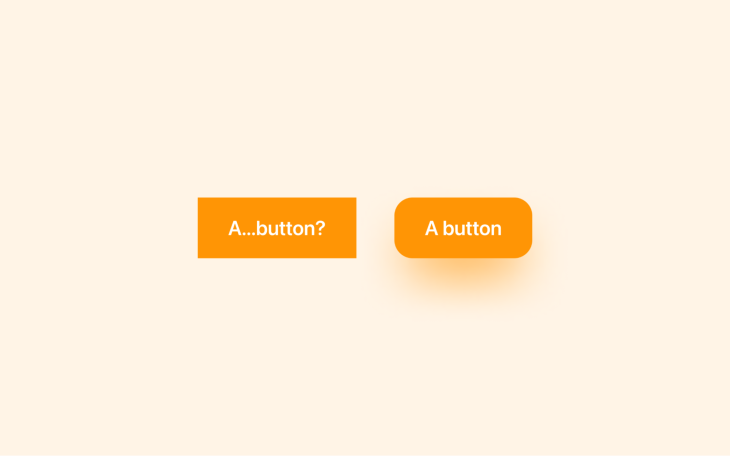
Similarly, buttons often have backgrounds and rounded corners by default since that’s what real-world buttons look like.
However, buttons don’t always cast shadows by default despite 3D objects in the real world doing so, so we must make sure that we don’t forget about them.
Ruslan Galba put together a fantastic guide to button shadows that includes making the color the same as the background, making the spread smaller than the blur, and never making the opacity higher than 40 percent. In addition increasing affordance, this approach looks incredible and ensures that buttons stand out against every background.
Forgoing rounded corners and shadows might seem like an aesthetic choice, but it actually just makes buttons look like rectangles that aren’t interactive.
Accessibility
Great CTAs are accessible to everybody. Firstly, this means ensuring that they’re discernible when necessary. If two buttons do the same thing or two links navigate to the same place, they should have the same CTA copy.
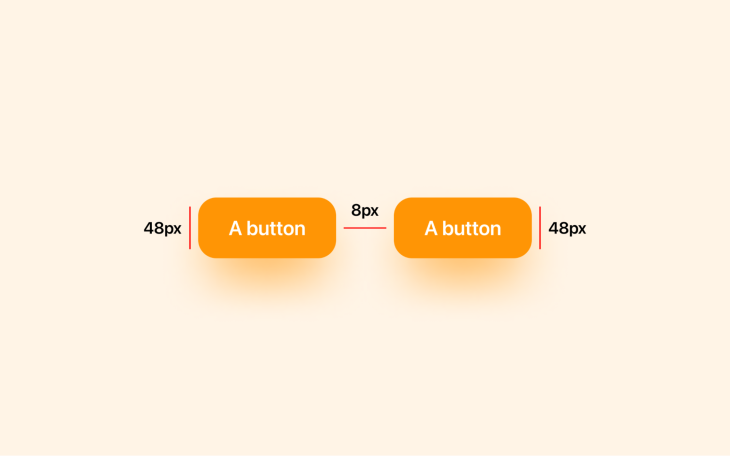
Buttons should be at least 44px wide and tall according to the WCAG, or 48px according to Google, for people to be able to interact with them comfortably on handheld devices.
Similarly, the WCAG also specifies that if there are two CTAs placed next to each other (or two touch targets in general), then they should be separated by at least 8px of inactive space to ensure that users don’t interact with the wrong touch target accidentally.
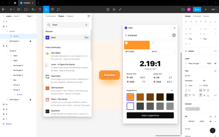
The color of CTA copy should be contrasted with the color of its background in order for people to be able to read it clearly. The WCAG goes into this in detail, but if you’re not interested in the technicalities of how color contrast is measured (it’s a bit of a head-scratcher), the short of it is that you’ll want to use a color contrast checker to check your color combinations.
I recommend Stark for this because it covers a wide range of accessibility concerns and not just color contrast. The macOS version has the most generous free plan.
Aesthetics
There’s something about ugly CTAs that make us not want to interact with them. We’re superficial (there’s no denying it), so it’s important that CTAs are aesthetically pleasing.
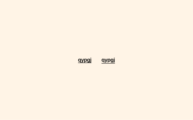
For links, consider indenting the underline to give the text more breathing room and also ensure that it doesn’t cut through the font’s descenders, improving readability.
For buttons, pay close attention to the horizontal padding, making sure that it looks pleasant and proportionate. I find that setting the padding to 0.5x the button’s height looks best. So, if you were to go with Google’s minimum height recommendation of 48px, for example, that would make the horizontal padding 24px. Similarly, I find that setting the border radii to 0.3x the height creates the best-looking rounded corners.
We’ve already covered colors being accessible, but they can also motivate people to take action. In fact, you might want to consider using your brand’s main color (which should be the most powerful color in your style guide) on your primary CTAs.
Plus, since your brand’s main color represents your brand, using it on CTAs makes it seem as if you’re speaking to your audience directly, which is even more powerful.
Visual hierarchy
It goes without saying that CTAs should stand out, but if the page has secondary CTAs or fallback CTAs, they should never stand out more than the primary CTAs. If we try to make everything stand out, then nothing will stand out, so we must establish what’s called a visual hierarchy, where some elements demand more attention than others.
Designing secondary and fallback CTAs relative to primary CTAs largely depends on the content of the page overall, but using different sizes or colors, borders instead of backgrounds, or links instead of buttons are all great options.
Interactivity for CTA links
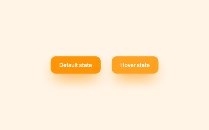
Designing hover states for CTAs makes them more satisfying to interact with. The best way to approach this is to increase the brightness slightly — by 10 percent, for example. It’s a one-size-fits-all approach that ensures complete visual consistency throughout the design.
For focus states, I would advise going against what web browsers and operating systems provide natively, which is a blue focus ring. If working on a design that’s heavy on the blue, you could make an exception and change the color, but in general, it’s best to leave accessibility features as they are.
Build up to the CTA with a value proposition
You can’t tell somebody to do something and just expect them to do it; they have to understand what they’re doing and see the value in doing so. This means that what comes before a CTA — the buildup to the moment — is just as important as the CTA itself.
Ensure that the CTA’s buildup is purposeful, tells a coherent story, and provides visitors with enough information that they feel comfortable taking the leap and clicking on it.
That being said, it’s okay to place CTAs into the buildup itself at timely opportunities, including above the fold after summarizing just the main points. This makes it possible for visitors to trigger a CTA at almost any moment.
How to improve your CTA’s click-through rate
As we’ve touched on briefly, the key metric for measuring the efficacy of a single CTA is click-through rate (CTR), which measures the percentage of people that click on it. This is not to be confused with conversion rate, which is the number of people that actually end up converting sometime after clicking on it.
If you already have ideas for improving the CTR, there’s no harm in setting up an A/B test and jumping right into things. A/B testing involves testing the current version (version A) against a version with just one minor change (version B). If version B proves to have a higher CTR, then you know to implement that version permanently.
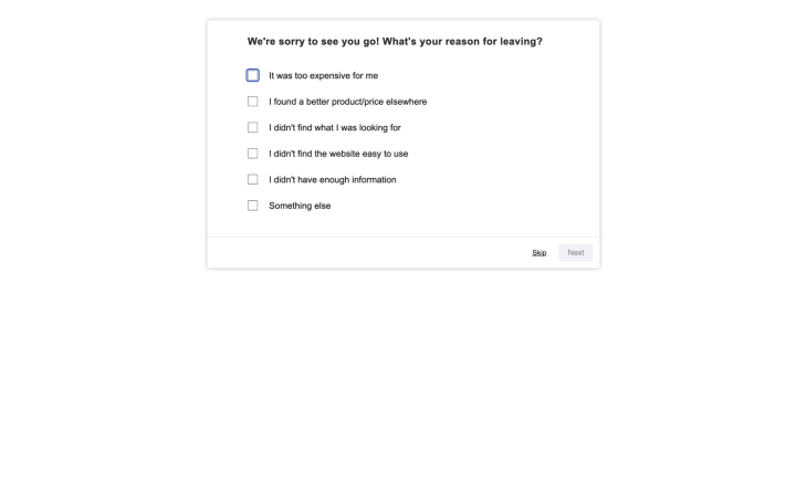
If you’re not sure what to change, you’ll want to consider setting up an exit intent survey (if you haven’t already) that asks visitors why they didn’t click on a CTA. If something’s wrong, you’ll get responses like, “I didn’t understand [x],” “I couldn’t find [x] information,” “I didn’t know where to click,” or even, “The website is taking too long to load.” This will point you in the right direction for A/B testing.
When you’re ready to start A/B testing, the most efficient way to do so is to use a dedicated A/B testing tool like VWO, which will enable you to test a slightly modified version against the existing version. You may need a developer for the initial setup at least.
It’s worth noting that if you wind up with a sizable increase in click-throughs but not conversions, then it’s likely that there are other problems at play, and further product or UX research might be required.
Closing thoughts
With the CTA design tips outlined in this article, you’ll be able to design incredible CTAs and in turn boost click-through rates, a super critical part of the overall conversion rate optimization process.
Conversion rate optimization is a lot of fun (especially if you enjoy sniffing out problems, designing solutions, and watching those numbers go up), but it’s a shared responsibility between design teams and marketing teams. As a designer, it’s your job to present the content clearly, but you’ll be forgiven for not being a copywriting/marketing genius.
That being said, if your company grants you the leeway to write or experiment with CTA copy or marketing copy in general, KlientBoost’s guide to CTA copy is a pretty decent one. If you combine their CTA copy tips with the design advice outlined in this article, you’ll be able to get even better results from your CTAs.
Thanks for reading!
The post How to design CTA buttons: UX best practices appeared first on LogRocket Blog.
from LogRocket Blog https://ift.tt/P2irfVY
Gain $200 in a week
via Read more


