


Pie charts have been used since forever to display data in an aesthetically pleasing manner; they help in analyzing data by showing how different segments of a larger data set break down.
It shouldn’t come as too much of a surprise, then, that we as developers are asked on occasion to implement a pie chart here or there in our projects.
When it comes to displaying pie charts on the web, there are many ways that this can be achieved. Pie charts can be created using Excel sheets, HTML canvases, SVGs, and JavaScript, among other methods.
A popular way to build frontend pie charts is by using one of the many chart libraries available, but if that’s not what you want — or you don’t want to add additional libraries to your project — you can build them from scratch using just HTML and CSS.
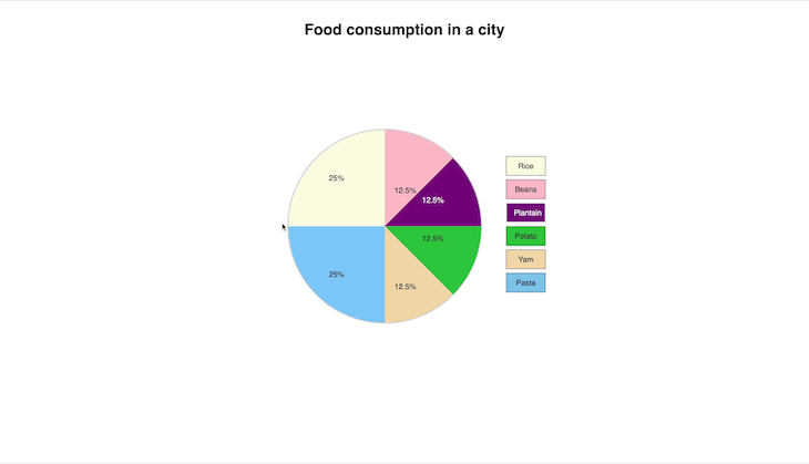
This is what we’ll be doing today! We are going to build an interactive pie chart using only HTML and CSS that displays data about food consumption in a city.
Our project will look like this when we have completed it:
Let’s get started!
Jump ahead:
- Basic HTML structure
- Creating the wrappers
- Basic styles
- Adding pie chart data
- Styling the chart and its keys
- Finish styling the pie chart
- Adding interactivity to the pie chart
- Adding the keys and colors
- Displaying text for entries
- Changing the border colors for flair
Basic HTML structure
We’ll first create the basic HTML structure with the following code:
<!DOCTYPE html>
<html lang="en">
<head>
<meta charset="UTF-8">
<meta http-equiv="X-UA-Compatible" content="IE=edge">
<meta name="viewport" content="width=device-width, initial-scale=1.0">
<link rel="stylesheet" href="styles.css">
<title>Pie chart</title>
</head>
<body>
</body>
</html>
The lines above are the building blocks of any web page built with HTML, as they specify how we want browsers to read our page.
Creating the wrappers
Next, we’ll add the following lines, which will be wrappers for the pie chart and its Key section. We’ll also add a heading to the page, like so:
<h1 class="heading">Food consumption in a city</h1>
<div class="wrapper">

<div class="pie-wrap"></div>

<div class="key-wrap"></div>

</div>
Basic styles
Let’s add some basic styles to the page. In styles.css, add the following:
body{
    font-family: Helvetica, sans-serif;
}

.heading{
    text-align: center;
    margin-top: 50px;
}
The style above will center the text and give it some space at the top. Our page should look like this:
Adding the pie chart data
In the pie-wrap div, add the following lines to serve as the pie chart’s data:
<div class="pie-wrap">

<div class="light-yellow entry">
    <p>25%</p>
    <p class="entry-value">Rice</p>
</div>

<div class="sky-blue entry">
    <p>25%</p>
    <p class="entry-value">Pasta</p>
</div>

<div class="pink entry">
    <p>12.5%</p>
    <p class="entry-value">Beans </p>
</div>

<div class="purple entry">
    <p> 12.5%</p>
    <p class="entry-value">Plantain</p>
</div>

<div class="green entry">
    <p> 12.5%</p>
    <p class="entry-value">Potato</p>
</div>

<div class="wheat entry">
    <p> 12.5%</p>
    <p class="entry-value">Yam</p>
</div>

</div>
In the above code block, we added the various entries and their values. The styles are also named after their respective colors, which makes it easier to identify each entry.
Styling the chart and its keys
There are no styles yet, so we should add them now. In styles.css, add the following styles:
.wrapper{
    display: flex;
    align-items: center;
    justify-content: center;
}

.pie-wrap{
    border: 2px solid lightgrey;
    width: 400px;
    height: 400px;
    margin: 10% 50px;
    position: relative;
    border-radius: 50%;
    color: black;
}
With the styles above, we made the pie chart and keys stay beside one another by giving them a flex position. The keys are not in our HTML file yet, so let’s focus on the pie chart itself.
Our pie chart is now a circle and a bunch of numbers and text. Let’s style it so it looks like a pie chart we’re all familiar with. Add the following styles to your CSS file:
.pie-wrap .entry{
    display: flex;
    flex-direction: column;
    justify-content: center;
    align-items: center;
}

/* *the individual entries* */

.sky-blue{
    background-color: lightskyblue;
    height:50%;
    width: 50%;
    display: block;
}

.light-yellow{
    background-color: lightyellow;
    height:50%;
    width: 50%;
}
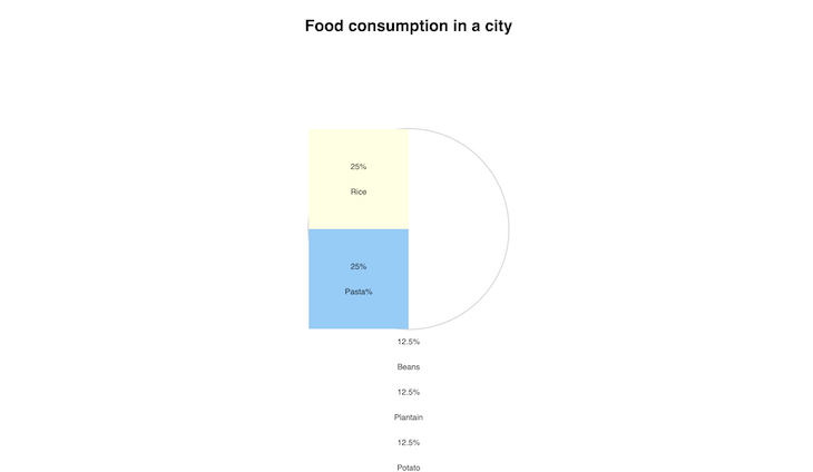
In this block, we have done some general styling for the entry elements, and then we have styled the sky blue and light yellow entries — these represent the Rice and Pasta entries, respectively.
Our page should now look like this:
This is our pie chart as it stands — but these are squares, right? We’ll handle that soon, so don’t worry! Let’s style the other entries first before we get to that.
Add the following lines to your HTML file:
.pink{
    background-color: pink;
    height:50%;
    position: absolute;
    top: 0px;
    right: 0;
    width: 50%;
    clip-path: polygon(0 0, 100% 0%, 0% 100%);
}

.purple{
    background-color: purple;
    height:50%;
    width: 50%;
    right: 0;
    top: 0;
    position: absolute;
    clip-path:polygon(0% 100%, 100% 0%, 100% 100%);
}

.green{
    background-color: limegreen;
    height:50%;
    width: 50%;
    right: 0;
    top: 50%;
    position: absolute;
    clip-path:polygon(0% 0%, 100% 0%, 100% 100%);
}

.wheat{
    background-color: wheat;
    height:50%;
    width: 50%;
    right: 0;
    top: 50%;
    position: absolute;
    clip-path:polygon(0% 0%, 100% 100%, 0% 100%);
}
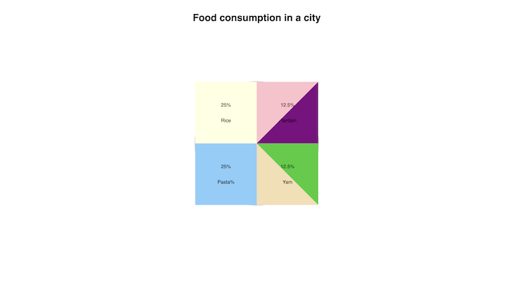
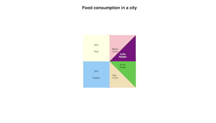
These new lines don’t look like the first two entries. This is because the Rice and Pasta entries have values of 25% each, so they fit perfectly in their wrapper. The others are all 12.5% each, so we’ll need to create their shapes with an additional style.
To achieve the ideal shape, we will use the CSS clip-path property. The clip-path property enables us to create different shapes using CSS.
N.B., you can read more about
clip-pathand how to use it
Each of the entries has a unique style and their clip-path properties also vary. You can adjust the clip-path based on your own entry data. We can also adjust their positions in the container to fit in perfectly with the others.
Our page should now look like this:
You may have noticed that some of the entry values are hidden; this is due to the general entry styles we used earlier — let’s fix this and have all our entry data visible.
Add the following styles to your CSS file:
.pie-wrap .purple p{
    position: absolute;
    top: 140px;
    color: white;
}
.pie-wrap .purple p:first-child{
    top: 120px;
}

.pie-wrap .green p{
    position: absolute;
    top: 20px;
}

.pie-wrap .green p:first-child{
    top: 0px;
}

.pie-wrap .pink p, .pie-wrap .wheat p{
    position: absolute;
    left: 20px;
    top: 80px;
}

.pie-wrap .pink, .pie-wrap .wheat{
    justify-content: flex-start;
}

.pie-wrap .pink p:first-child, .pie-wrap .wheat p:first-child{
    top: 100px;
}
Now, our page should look like this (and all of the text should now be visible):
N.B., we also made the text in the purple entry white, so it can be easily read by users
Finish styling the pie chart
Now that we are done with the entries and data, let’s make our pie chart into an actual round pie chart, as we discussed earlier.
Add the following line to your .pie-wrap style:
overflow: hidden;
The overflow:hidden style cuts out everything that overflows from the pie-wrap container.
Your .pie-wrap style should look like this now:
.pie-wrap{
    border: 2px solid lightgrey;
    width: 400px;
    height: 400px;
    margin: 10% 50px;
    position: relative;
    border-radius: 50%;
    color: black;
    overflow: hidden;
}
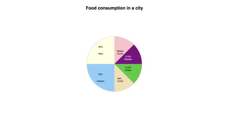
Now, our pie chart looks as it should:
Adding interactivity to the pie chart
We are done with the basic requirements of a pie chart, but let’s add some more elements to ours to liven it up a little and introduce some interactivity.
We’ll hide the name of the food for each entry and have them show only when the entry is hovered over by a user.
Let’s do this with the following styles:
.entry .entry-value{
    display: none;
    transition: all 500ms linear;
}
.entry:hover .entry-value{
    display: block;
}
The names of the food items are hidden now, but the transition when hiding and revealing them is not as smooth as we would like. Let’s add a transition style and hover effects for the entries.
Add the following lines to your stylesheet:
.entry{
    transition: all 500ms linear ;
}
.entry:hover{
    filter: invert();
}
Now, when we hover over each entry, it has a smooth transition to show the name of the food item, while also inverting the color of the entry.
It should look like this:
Adding the keys and colors
We’ve come a long way and our chart now looks ready for use, but we can make it even prettier by adding keys to it!
Let’s do that now; add the following lines to your .key-wrap div that was created earlier:
<!--Pie chart keys  -->
<input type="radio" id="rice" name="values" class="rice-key"/>
<label for="rice" class="rice-label">Rice</label>

<input type="radio" name="values" id="beans" class="beans-key"/>
<label for="beans" class="beans-label"> Beans</label>

<input type="radio" name="values" id="plantain" class="plantain-key"/>
<label for="plantain" class="plantain-label"> Plantain</label>

<input type="radio" name="values" id="potato" class="potato-key"/>
<label for="potato" class="potato-label"> Potato</label>

<input type="radio" name="values" id="yam" class="yam-key"/>
<label for="yam" class="yam-label"> Yam</label>

<input type="radio" name="values" id="pasta" class="pasta-key"/>
<label for="pasta" class="pasta-label"> Pasta</label>
You should see some radio buttons and labels now. They will represent the keys for our pie chart.
Let’s style them, like so:
.key-wrap label{
    display: block;
    border: 1px solid;
    width: 50px;
    text-align: center;
    padding: 10px 15px;
    cursor: pointer;
    margin-bottom: 8px;
    }
The style above adds a border to the labels, padding, sets the width, and then adds some space below each label. Clicking the labels also checks the radio buttons, so let’s hide the radio buttons for better aesthetics.
Add the following style to your CSS file:
input[type="radio"]{
    display: none;
}
Let’s also add some background colors to the labels:
.rice-label{
    background-color: lightyellow;
}
.beans-label{
    background-color: pink;
}
.plantain-label{
    background-color: purple;
    color: white;
}
.potato-label{
    background-color: limegreen;
}
.yam-label{
    background-color: wheat;
}
.pasta-label{
    background-color: skyblue;
}
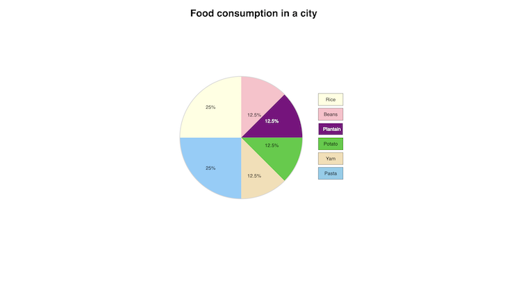
Our keys should now have corresponding colors for their entries and the page should look like this:
We are almost done!
Displaying text for entries
Let’s just put in another piece of additional information. When the keys are clicked, the text should be displayed below with information about the corresponding entry.
Add the following lines of code to your HTML file to do this:
<p class="rice-text text">25% of the people eat Rice</p>
<p class="beans-text text">12.5% of the people eat Beans</p>
<p class="plantain-text text">12.5% of the people eat Plantain</p>
<p class="potato-text text">12.5% of the people eat Potato</p>
<p class="yam-text text">12.5% of the people eat Yam</p>
<p class="pasta-text text">25% of the people eat Pasta</p>
It should be inside your .key-wrap div, just below the label for Pasta.
We’ll hide these texts and only show the relevant ones — let’s do that with the following styles:
.text{
    display: none;
    margin-left: -50px;
    position: absolute;
    margin-top: 50px;
    font-size: 20px;
    padding-bottom: 4px;
    padding-top: 4px;
    border-bottom: 5px solid ;
    border-top: 5px solid ;
}
.key-wrap label:active{
    opacity: .5;
}
.rice-key:checked ~ .rice-text, .beans-key:checked ~ .beans-text, .plantain-key:checked ~ .plantain-text,  .potato-key:checked ~ .potato-text, .yam-key:checked ~ .yam-text, .pasta-key:checked ~ .pasta-text{
    display: block;
}
With the styles above, we hide the text and, when the key is clicked, the corresponding information is displayed. We also added an active style, so when the keys are clicked, there is a quick animated effect.
It should now look like this:
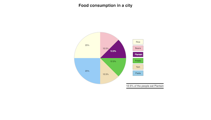
Changing the border colors for flair
It now looks good to go, but there’s just one thing remaining: let’s make each border a different color based on what information is being displayed — we’ll do this with the following lines:
.rice-text{
    border-color: black;
}
.beans-text{
    border-color:  pink;
}
.plantain-text{
    border-color:  purple;
}
.potato-text{
    border-color:  limegreen;
}
.yam-text{
    border-color:  wheat;
}
.pasta-text{
    border-color:  skyblue;
}
Our page should look like this now:

And, that’s it!
Conclusion
We have built a pie chart that displays the percentage of food consumed in a city. When hovered over, it also shows the name of the different food items.
There’s also an additional option if you don’t feel like hovering over it — the keys let you know which food has which percentage. Finally, we have additional information that is displayed when you click on the different keys.
If you’ve finished this tutorial, you should now be able to build pie charts using only HTML and CSS. Building with just HTML and CSS can come in handy when building light projects where performance is a primary consideration.
You can build on your newly acquired knowledge by including additional features or using different values in your own pie charts or datasets. You can find the completed code in this repository on Github.
Thanks for reading and let me know of your own experiences in the comments below!
The post How to build interactive pie charts using only CSS and HTML appeared first on LogRocket Blog.
from LogRocket Blog https://ift.tt/ky8WInA
Gain $200 in a week
via Read more


