


Overlays are effects used to create an additional layer on top of images. Their purpose could be for aesthetics or to improve text readability, especially for people with impaired vision.
We usually create overlays in CSS to get images behind text, icons, or other images. This guide will show you how to apply overlays nicely on both background images and regular <img> elements in CSS. We will cover:
- The positioning layout feature in CSS
- Exploring various image overlay CSS effects for
<img>elements - Displaying an image overlay effect on hover with CSS
- Background image overlay
The positioning layout feature in CSS
Techniques for creating overlays on images involve understanding CSS layout features like positioning. When working with regular <img> elements, this layout feature is handy for placing a box element or another <img> element on top of the image as an overlay.
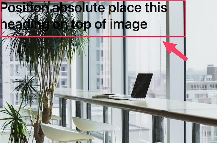
Let’s take a look at a quick example. The following HTML has an image and some heading text, both in a container li element:
<li class="image_wrapper">
  <img src="https://source.unsplash.com/VWcPlbHglYc" alt="" />
  <div class="overlay">
    <h3>Position absolute place this heading on top of the image</h3>
  </div>
</li>
Naturally, every element is a box laid out in the order in which they appear in the source code. For instance, the <img> element in the above code will display before the heading text.
Now, in a situation where we want the text to appear on top of the image, we will alter the default behavior of the text element or its container by overriding its normal document flow using the CSS position property like so:
.image_wrapper {
  position: relative;
}

.overlay {
  position: absolute;
  left: 0;
  top: 0;
}
By adding position: absolute; alongside the left and top declarations on the text container element, we can move the heading text out of the document flow to a position relative to the parent wrapper, like so:
With this positioning feature in mind, we can start implementing image overlays.
Exploring various image overlay CSS effects for <img> elements
One thing we can see in the image above is that the text on it is not readable and, therefore, not good for the user’s experience. To improve user satisfaction, we will add an overlay to ensure text readability.
Starting from the next section, we will create different image overlays with various effects. You can see the project on Codepen here:
See the Pen CSS image overlay examples by Ibadehin Mojeed (@ibaslogic)
on CodePen.
Simple CSS image overlay with text background color
Text overlay can be as simple as adding a background color behind the text. Let’s take a look at the following markup:
<li class="image_wrapper">
  <img src="https://source.unsplash.com/VWcPlbHglYc" alt="" />
  <div class="overlay overlay_0">
    <h3>10% OFF</h3>
  </div>
</li>
We can position the text over the image the same way we did in the first example, then add in a background color:
.image_wrapper {
  position: relative;
}

img {
  display: block;
  object-fit: cover;
  width: 100%;
  height: auto;
}

.overlay {
  position: absolute;
}

.overlay_0 {
  left: 0;
  top: 0;
  padding: .5rem;
  margin: 4px;
  background: #f4208f;
}
The output now looks like so:

This overlay effect is common on ecommerce websites for promotional labels and other similar uses.
Translucent title text overlay covering part of the image
Another popular overlay style features a title or image caption on top of a translucent background. Consider the following markup:
<li class="image_wrapper">
  <img src="https://source.unsplash.com/VWcPlbHglYc" alt="" />
  <div class="overlay overlay_1">
    <h3>Image title</h3>
  </div>
</li>
With position: absolute;, left: 0;, bottom: 0; declarations on the overlay, we can place the overlay text at the bottom of the image:
.overlay {
  position: absolute;
  background: rgba(57, 57, 57, 0.5);

  /* center overlay text */
  display: flex;
  align-items: center;
  justify-content: center;
}

.overlay_1 {
  left: 0;
  bottom: 0;
  width: 100%;
  padding: 1rem;
}
We’ve also applied a semi-transparent background on the overlay. See the output below:

For aesthetics, we also applied flexbox properties to place the image caption in the center.
The examples above are ideal when focusing on both the image and overlay text. However, when the focus is more on the text than the image, we may stretch the overlay to cover the entire image.
Translucent overlay covering the entire image
Consider the following markup:
<li class="image_wrapper">
  <img src="https://source.unsplash.com/VWcPlbHglYc" alt="" />
  <div class="overlay overlay_2">
    <h3>Image title</h3>
  </div>
</li>
On the overlay element, we will use the top, right, bottom, and left declarations to stretch the overlay, so it covers the entire image:
.overlay_2 {
  top: 0;
  right: 0;
  left: 0;
  bottom: 0;
}
We can also use one declaration as a shorthand to replace the above CSS rules:
.overlay_2 {
  inset: 0;
}
The value assigned to the inset will be applied to all edges. The output should now look like so:

Remember, in the previous example, we applied flexbox properties on the overlay to place the text in the center. Since the translucent overlay now covers the whole image, the text is centered both vertically and horizontally over the whole image as well.
Displaying an image overlay effect on hover with CSS
Let’s learn how to display an overlay only when the user hovers over the image. We will also add slide and zoom effects.
Image overlay displaying text on hover with a zoom effect
For this example, we will be using the following HTML markup:
<li class="image_wrapper">
  <img src="https://source.unsplash.com/VWcPlbHglYc" alt="" />
  <div class="overlay overlay_3">
    <h3>Image title</h3>
  </div>
</li>
In addition to the usual overlay style declarations, the following CSS rules also include transform, transition, and backdrop-filter properties:
.overlay_3 {
  left: 0;
  bottom: 0;
  width: 100%;
  padding: 1rem;
  transform: scale(0);
  transition: all .3s ease-in-out;
  backdrop-filter: blur(8px) brightness(80%);
}

.image_wrapper:hover .overlay_3 {
  transform: scale(1);
}
Changing the transform: scale() value from 0 to 1 on hover provides the visual effect of the overlay text zooming into view. Meanwhile, the backdrop-filter lets us apply a blur effect behind the overlay to increase text visibility further. Finally, the transition provides a smooth hover effect.
The GIF below demonstrates the zoom effect on hover:

Image overlay displaying text on hover with a slide effect
We are using the following HTML markup for this example:
<li class="image_wrapper">
  <img src="https://source.unsplash.com/VWcPlbHglYc" alt="" />
  <div class="overlay overlay_4">
    <h3>Image title</h3>
  </div>
</li>
With the CSS rule below, the bottom and height properties let us achieve a slide-down effect when we hover over the image:
.overlay_4 {
  left: 0;
  bottom: 100%;
  height: 0;
  width: 100%;
  overflow: hidden;
  backdrop-filter: blur(8px) brightness(80%);
  transition: all .3s ease-in-out;
}

.image_wrapper:hover .overlay_4 {
  bottom: 0;
  height: 100%;
}
The GIF below demonstrates the slide effects on hover:

Image overlay displaying icon on hover with a zoom effect
Similar to the text overlay, we can also have icons appear over our images. Below, we will create an overlay with a Font Awesome icon that appears when we hover over an image.
We will be using the following HTML markup for this example:
<li class="image_wrapper">
  <img src="https://source.unsplash.com/VWcPlbHglYc" alt="" />
  <div class="overlay overlay_5">
    <a href="#" class="icon">
      <i class="fa-solid fa-camera"></i>
    </a>
  </div>
</li>
In the CSS file, we will import the font-awesome CDN and then apply the CSS rules like so:
@import url(https://cdnjs.cloudflare.com/ajax/libs/font-awesome/6.2.0/css/all.min.css);

/* ... */

.overlay_5 {
  inset: 0;
  transform: scale(0);
  transition: all .3s ease-in-out;
}

.image_wrapper:hover .overlay_5 {
  transform: scale(1);
}

.icon i {
  border-radius: 50%;
  font-size: 40px;
  color: #8c9e54;
  width: 70px;
  height: 70px;
  background: #fff;
  display: flex;
  justify-content: center;
  align-items: center;
}
As you can see, the CSS implementation for an icon overlay is similar to the text overlay with the zoom effect. The GIF below demonstrates the zoom effects on hover:
Image over image displayed on hover with a zoom effect
Like the icon overlay, we can also have a proper image appear over another image on hover. We can find a use case for this implementation on ecommerce websites where a variable product image is displayed when we hover over a product like so:
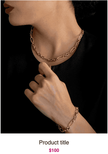
We will be using the following HTML markup for this example:
<div class="product-item">
  <div class="product-image">
    <a href="#">
      <img src="https://source.unsplash.com/GtOo17K-vTg" width="600" height="720">
      </a>
    <div class="hover-img">
      <a href="#">
        <img src="https://source.unsplash.com/3_XeNGVbTQA" width="600" height="720">
        </a>
    </div>
  </div>
  <h3>Product title</h3>
  <span>$100</span>
</div>
See the complete code on Codepen.
The approach for creating overlay is the same regardless of whether we want a text, icon, or image overlay.
In the HTML markup above, we added both images in the same product-image element container.
We will give this container a position: relative; property. Then, we will give the overlaid image container — i.e hover-img — a position: absolute; while also positioning it using inset: 0; or the equivalent top, right, bottom, and left.
The CSS style rules will look like so:
.product-item {
  text-align: center;
  width: 350px;
}

.product-image {
  position: relative;
  overflow: hidden;
}

img {
  max-width: 100%;
  height: auto;
  vertical-align: middle;
}

.hover-img {
  position: absolute;
  inset: 0;
  opacity: 0;
  transition: opacity .5s ease, transform 2s cubic-bezier(0,0,.44,1.18);
}

.product-image:hover .hover-img {
  opacity: 1;
  transform: scale(1.12);
}
After positioning the overlay image over the primary image, we added opacity: 0; to hide it so it only displays on hover with the opacity: 1;. Applying transform: scale(1.12); on hover provides the visual effect of the overlay image zooming into view. Meanwhile, the transition property provides a smooth hover effect.
Background image overlay
Unlike <img> elements, an image included as a background element will automatically live behind the containing text or icons. This makes it easy to apply overlays, as we’ll see in a moment.
We will create different background image overlays with various effects like applying a gradient with linear-gradient() CSS function and blending with the CSS mix-blend-mode and background-blend-mode properties. We will also learn how to use a pseudo-element to create a beautiful background overlay.
You can see the project on Codepen:
See the Pen CSS background image overlay examples by Ibadehin Mojeed (@ibaslogic)
on CodePen.
Background image with a simple text overlay using CSS
We’ll be starting with the following HTML markup for this example:
<section class="bg_image_1">
  <div class="content">
    <h2>Hero title</h2>
    <p>Hero description here</p>
  </div>
</section>
On the <section> container element, we will add a background image using CSS:
.bg_image_1 {
  background-image: url(https://source.unsplash.com/VWcPlbHglYc);
  background-size: cover;
  background-position: center;
 }
The result should look like so:

For aesthetics, we have also applied CSS grid properties to place the image content in the center.
As expected, the text overlay is not so readable.
Let’s try to improve the visibility of the text overlay by applying a lower opacity on the background element, like so:
.bg_image_1 {
  /* ... */
  opacity: .3;
}
The above addition will affect both the image and the containing text overlay, which is even worse:

To control the image’s opacity without affecting the text, let’s see a solution using a pseudo-element.
Using a pseudo-element to control background image opacity
Using this method, we will apply the background image on the pseudo-element to decouple the image and the text content:
.bg_image_1 {
  position: relative;
 }

.bg_image_1::after {
  content: '';
  position: absolute;
  inset: 0;
  z-index: -1;
  opacity: .4;
  background: pink;
  background-image: url(https://source.unsplash.com/VWcPlbHglYc);
  background-size: cover;
  background-position: center;
}
With the inset property, the background is placed relative to the parent element and appears over the text content. We then apply a negative z-index to change the stacking order and move the background image behind the text.
Then, with the opacity property on the pseudo-element, we can reduce the contrast of the background image:

Now, as we can see in the image, we have increased the visibility of the text overlay.
Using the background-blend-mode property
The pseudo-element approach used above can be a bit complex. With the background-blend-mode CSS property, we can apply an overlay on the background image with a small line of code. This property will blend the background image with the element’s background color.
We will be using the following HTML markup for this example:
<section class="bg_image_2">
  <div class="content">
    <h2>Hero title</h2>
    <p>Hero description here</p>
  </div>
</section>
Then, specify the blending mode of our background image to be multiply:
.bg_image_2 {
  background-color: steelblue;
  background-image: url(https://source.unsplash.com/VWcPlbHglYc);
  background-size: cover;
  background-position: center;
  background-blend-mode: multiply;
  color: #fff;
}
The result should now look like so:

The overlay effect, as seen above, is due to blending the background image with the element’s background color.
Using the linear-gradient() CSS function
With the linear-gradient() CSS function, we can achieve a background overlay with just one line of code. It is simple to implement and, like the blend mode approach, eliminates the need to use the pseudo-selector.
We will be using the following HTML markup for this example:
<section class="bg_image_3">
  <div class="content">
    <h2>Hero title</h2>
    <p>Hero description here</p>
  </div>
</section>
Then, we will add a linear gradient on the background image alongside the background URL:
.bg_image_3 {
  background-image: linear-gradient(rgba(70, 130, 180, .8), rgba(178, 34, 34, .8)), url(https://source.unsplash.com/VWcPlbHglYc);

  background-size: cover;
  background-position: center;
  color: #fff;
}
The result should look like so:

With linear-gradient, we have progressively transitioned between two semi-transparent colors to achieve a gradient overlay effect.
Using the mix-blend-mode CSS property
Like the background-blend-mode property, mix-blend-mode lets us blend the element’s content with its parent background.
Let’s consider the following markup:
<section class="bg_image_4">
  <div class="content content_4">
    <h2>Hero title</h2>
    <p>Hero description here</p>
  </div>
</section>
With the following CSS, we have added a background image on the section container element and also applied a pseudo-selector to overlap a background color overlay:
.bg_image_4 {
  background-image: url(https://source.unsplash.com/VWcPlbHglYc);
  background-size: cover;
  background-position: center;
  color: #fff;
}

.content_4 {
  position: relative;
}

.content_4::after {
  content: '';
  position: absolute;
  background: #074f57;
  inset: 0;
  z-index: -1;
}
If we take a look at the result, we will have something like the following:

With the negative z-index applied on the overlay, we may expect the background color to appear behind the text. However, it goes far back behind the background image.
If we temporarily remove the background image, we should see the background color:
.bg_image_4 {
  /* ... */
  background-size: cover;
  background-position: center;
  color: #fff;
}
The result of removing the background image:

To ensure the background color goes behind the text and not the parent background image, we will use the CSS isolation property on the background element to create a new stacking context.
Let’s return the background image and add the isolation property:
.bg_image_4 {
  background-image: url(https://source.unsplash.com/VWcPlbHglYc);
  background-size: cover;
  background-position: center;
  color: #fff;
  isolation: isolate;
}
At this point, the background image now lives behind the background color.
Now, we can apply the mix-blend-mode on the pseudo selector to blend the background color with its parent background image:
.content_4::after {
  /* ... */
  mix-blend-mode: multiply;
}
The result should now look like so:

Now we have a nice background image overlay where the text is readable.
Conclusion
Creating image overlays is useful in various designs and scenarios. It is handy when creating a webpage hero section, responsive image galleries, and many other use cases.
This guide discussed how to create a nice overlay on the background images and regular <img> elements in CSS. If you enjoyed this lesson, share it around the web. Lastly, we would love to hear which of the overlay solutions is your favorite. Let us know in the comment section.
The post Guide to image overlays in CSS appeared first on LogRocket Blog.
from LogRocket Blog https://ift.tt/cUjrwaX
Gain $200 in a week
via Read more


