


Forms are one of the most common interface patterns a user will encounter, and the experience they have with a form will often set the tone for their experience with that entire product or brand.
Since forms empower a user to input text and other information, they can be some of the most critical tools available in an interface. But along with that power comes the responsibility to design and build forms appropriately; a dysfunctional form can lead to customer frustration and a broken form often means lost sales.
When designed well, forms can leave a user feeling delighted and accomplished. That success means that the user will be willing to interact with your form again, or other elements on your app or website, and that type of brand loyalty can be worth its weight in gold. The following guidelines can help you turn a clunky and awkward encounter into a smooth experience for your users.
Types of forms
There are a variety of forms you might need to create for your product. Some are simple, like a login form with a username and password input. Others are complex, with many steps, a variety of inputs, and sometimes even spanning across multiple pages. Knowing in advance which kind of form you might need to create will help you decide how to design it better.
Simple forms
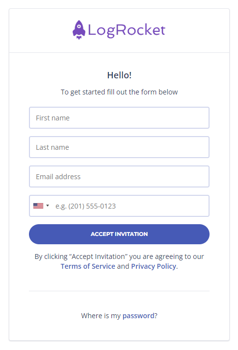
The most basic forms will typically consist of one small grouping of inputs on one page, along with an action button.
Simple forms are a basic exchange of information from the interface to the back end of the system. Assuming the user inputs the information successfully, the interface will proceed to a new screen and the user can continue on to other actions. The form below is an example of a simple form interface.
Wizard forms
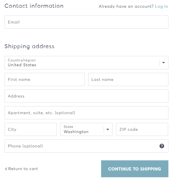
Wizard forms behave as a linked group of simple forms that appear in a guided order. There are inputs or groups of inputs on a page, but completing the set of inputs on this page will proceed to another page with a separate, distinct form of its own.
Wizard forms usually contain not just a single action button, but directional buttons to move forward or backward in the sequence of steps.
Ideally, a wizard form saves all of a user’s input on each page so that if anything goes wrong on a subsequent step, previously entered data will not be lost.
The example below from an ecommerce site is an example of a wizard form. On this one page, a user can enter a shipping address. Paging forward using the action button leads to another form for choosing shipping options.
Navigable forms
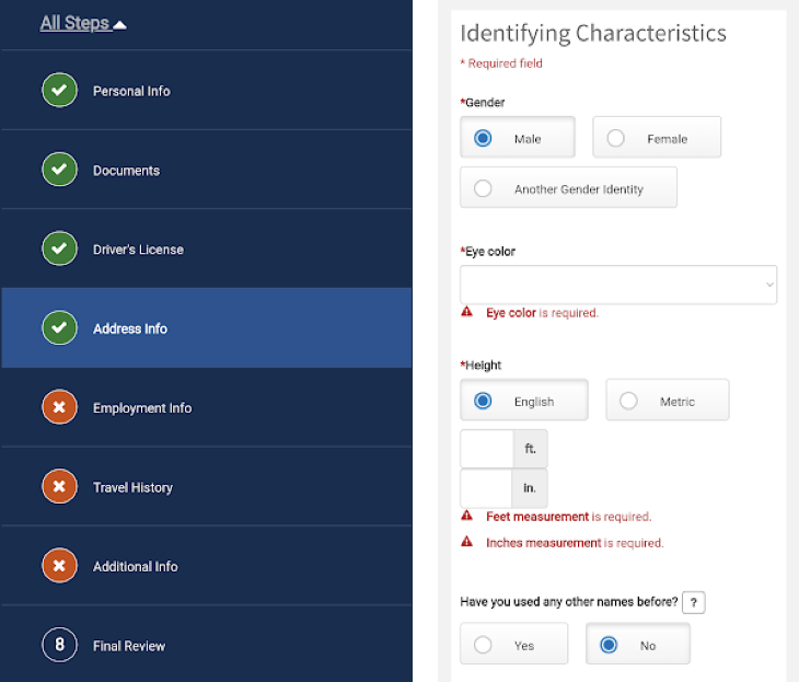
Navigable forms are similar to stepped wizard forms, but rather than each section appearing on a new page in a guided sequence of steps, a navigable form will show many or all steps on one single page that expands or collapses steps as they need to be seen.
Unlike wizard forms, the steps of a navigable form can usually be accessed in any order. Navigable forms make use of modern interface controls, such as accordion content sections or side navigation tabs as a way to hide one group of form fields and show another. Navigable forms are particularly useful when the form content is complex, contains many steps, and is likely to take more than one session to complete.
Navigable forms should save the data collected within one section before allowing the user to move on to another. That way, if the user is on step 7 and realizes they made a mistake on step 4, it is easy to navigate back to step 4 and make that change on the previously saved data.
The government form below demonstrates a navigable form that allows the user to move around among the various types of required information.
Anatomy of a form
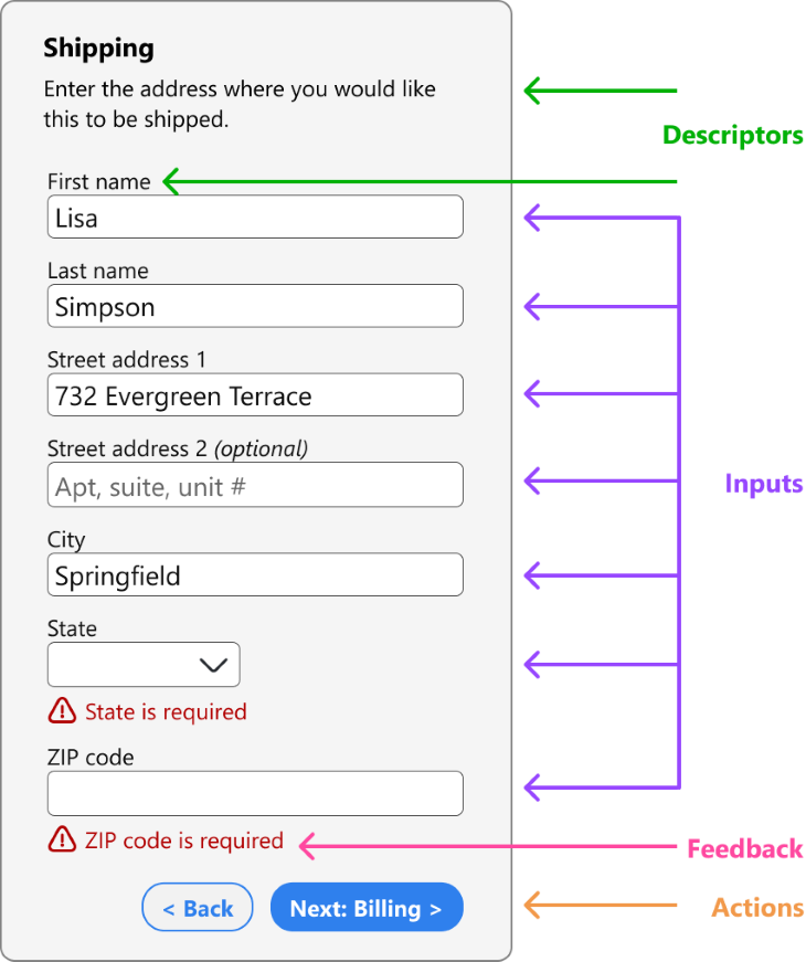
Regardless of the type of form you build, it will likely consist of four main elements: inputs, descriptors, actions, and feedback mechanisms.
Input controls
An input is any way that the user can control what is shown on the page and ultimately what information is submitted in the form.
The input of a form might seem straightforward and obvious, but there are many ways to enter information into a form. The most common input is a short text form, but they can also include long text forms, dropdown menus, toggles, switches, and many others.
Descriptors
Descriptors provide peripheral details around the form inputs without directly impacting the content on the form. Descriptors can be the title of the form, the body text describing what the form is used for, or they can be the label that describes each input.
Actions
Actions are any part of a form that transmits information from the form or otherwise generates feedback. In most cases, this is the button at the bottom of the form that says sign up, log in, submit, or back. An action does not need to be the final step of the form; it can return the user to a previous step or validate an intermediate step.
Feedback
Feedback is any content that responds to the inputs and actions of a form. Feedback can take different forms in different situations.
When submitting an invalid password, the error message that appears is a type of feedback. A validating message, such as “this username is available” is another type of feedback. Sometimes feedback occurs on a new screen, such as when completing a purchase and proceeding to a confirmation page that says “your order has been received.”
Feedback is an important way to inform the user that their input has been completed, acknowledged, or accepted. Failing to provide feedback often leads to frustration as a user submits the form multiple times or unwittingly leaves the page without completing the purchase.
Best practices
Keep the path linear
Forms are already cumbersome. Even when designed well they can feel overwhelming.
One way to reduce some cognitive load is to set your form up to flow as simply as possible. In general, a user will feel like they are progressing through the form quickly if they are moving in a linear path down the page.
For some fields, like a full name or date of birth, you should still align the first, middle, and last name fields across one horizontal row, but for any other field that contains a single distinct input, it is best to leave those stacked in one single vertical column.
Don’t introduce additional columns when they’re not necessary. And when possible, stick to a minimal number of input widths on the page; it can be disorienting for every row to end in a different spot.
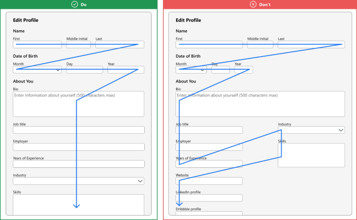
Group similar elements
Another way to reduce cognitive load is to group similar elements together. In doing so, you create a visual separation between distinct sections.
One thing this does is keep the form inputs in a logical order. It wouldn’t make sense to ask for a user’s name, then a city name, then an email address, then a zip code, then a mailing address, then a username, then a credit card number. If you did, your user’s brain would be switching across so many different types of information that it would cause unnecessary distress.
Instead, place personal details into one section and contact information into another. Use text hierarchy or divider lines to distinguish the groups.
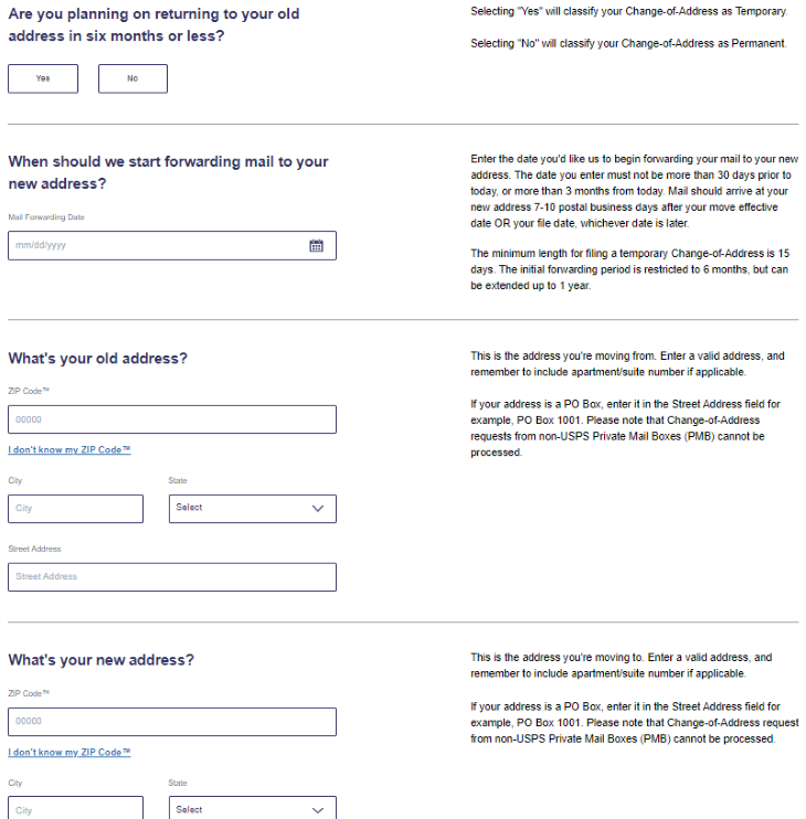
In the example below, from the USPS change of address form, these distinctions can be extra helpful so that the user doesn’t mix up which city input belongs to the old address and which one belongs to the new address.
Break dissimilar elements into multiple steps
Sometimes a form will have elements that are very different. Filling out tax returns, signing up for a government program, or applying to college all involve extremely complex forms with a wide variety of information.
It would be overwhelming to show every single input field for these forms in one page, plus the sheer number of time-consuming inputs a user would encounter before having a chance to save or submit the form introduces more risk of losing their progress if anything interferes with an intermediate step.
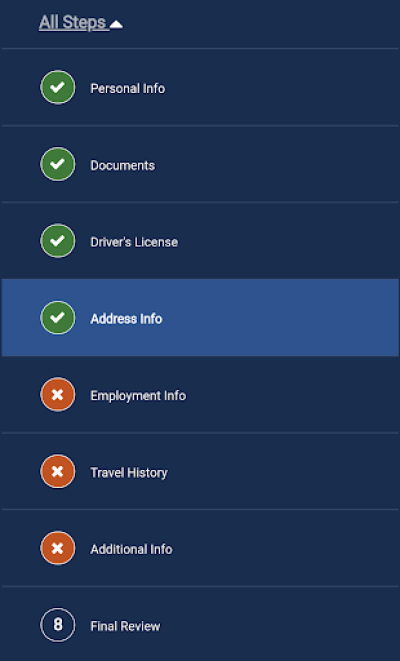
When a form involves many distinct types of data, it helps to break dissimilar elements into separate groups. This can be done using a stepped wizard, where the user can save and proceed to the next step by clicking a button and entering an entirely new page, or using accordion elements on one page that collapse the previously filled section and expand the next one. The government form shown below is an example of a form broken into multiple pages with navigation among the sections.
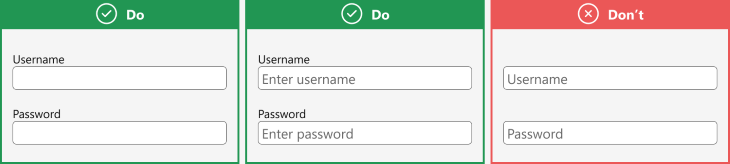
Use text labels rather than relying on hint text
Labels and hint text are important ways to convey the type of information that a user should enter. The best practice is often to use both simultaneously, so your label might say date of birth while the hint text says mm/dd/yyyy to supplement the type of input with additional helpful advice.
You might find that in some cases hint text is not necessary, and that’s okay as well. Just don’t rely on only hint text to describe the desired input. Remember that hint text disappears as soon as a user clicks on the field; don’t leave your user with the possibility to begin typing in an input and then lose context of what should go into that field.
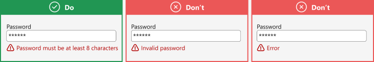
Provide good feedback
All forms should provide feedback, but it’s not enough to give any kind of feedback; feedback should be meaningful, descriptive, and constructive. This is where it’s important to empathize with your user. Yes, a user’s invalid input can have implications on the back end of your system, but your focus should be on your user and their smooth interaction with your interface.
If an input is invalid, be descriptive about the error, and try to do so in an impersonal and neutral tone. Don’t say “you entered the email address wrong.” Say “please enter a valid email address” or “an email address should be in the format ‘name@example.com.’” Your backend might have error codes for common errors and those may be useful to your engineers and IT staff, but avoid showing those codes in your frontend interface.
Again, this is where it helps to be as descriptive as possible. Explain the error in short, common language, and suggest what the user might be able to do to fix it.
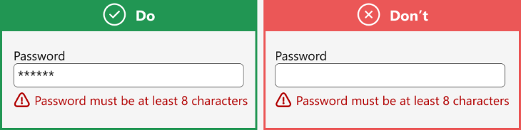
Handle errors gently
Now that you know how to provide good feedback, make sure to only use feedback when necessary. It is good to validate certain input fields, but it can be jarring or frustrating to a user when input fields have error messages before they’ve even had a chance to enter valid data. As a general rule, don’t provide validation on an input until a user has focused in and out of a field.
How to make forms smarter
While most of the guidelines above deal with the static design of a web form, there are plenty of interactive elements that you can build into a web form to make the experience even easier.
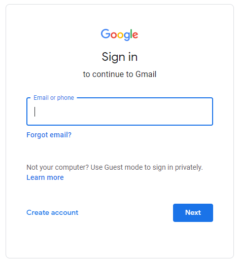
One easy trick is to automatically focus on the first field of your form as soon as the page loads. When you load the Gmail homepage, it automatically brings your focus to the email address input field, which is in a clearly denoted focus state.
Another way to improve your user’s form experience is to enable field masking. This is a technique you can use in your frontend code to automatically configure the user’s input into your desired format.
For example, rather than force your user to comply with your preferred phone number input with parentheses or dashes, your phone number field can be masked to automatically add those characters in as your user types in the numbers.
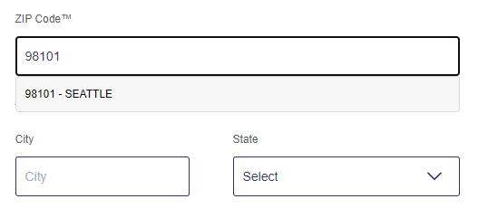
Lastly, use autofill inputs whenever possible to reduce the number of characters your users need to type and to help ensure that the inputs are formatted correctly. This is particularly helpful for fields like country or city names or email addresses that have already been associated with that account.
When the input of one field can be used to fill in other fields, such as a ZIP code that is associated with a specific city and state, allow your form to do this. The example below, from the USPS website, fills in the city and state after inputting a valid ZIP code.
Conclusion
It may not seem like it, but so much of the content people interact with on the internet is some variety of a form. We rely on forms on nearly every website and app and we expect them to perform consistently.
Otherwise, we would struggle to log in to accounts, or to even sign up for accounts in the first place. We wouldn’t be able to edit our profiles and we would fail to ship the things we buy online to the correct address.
We place trust in the forms we encounter online — that our data will be transmitted accurately to the database, that we will be informed if we make an error, that our progress will be saved when we move on to the next page. Forms can foster even more trust when they behave as intelligently as we do, when they appear ready for our input, intuitively complete our typed inputs, and alert us in friendly familiar language. But in order to do all of this, the people designing and building forms need to understand the key concepts of good form design.
Featured image source: IconScout
The post Better form design: UX tips, tools, and tutorial appeared first on LogRocket Blog.
from LogRocket Blog https://ift.tt/itkQoIl
Gain $200 in a week
via Read more


