Histoire is a frontend tool that helps developers sandbox their UI components by creating stories, which can then be observed, tested, and showcased in isolation. A story is defined as a scenario in which you can showcase one or more UI components under specific conditions.
This article will cover the following:
- Why should you use Histoire
- Histoire vs. Storybook
- Storybook features
- Performance and bundle size
- Automatic design token integration
- Histoire plugins
Why should you use Histoire
Histoire provides a great set of features that help developers better organize their components.
Histoire’s speed
The first thing you notice when creating stories with Histoire is its speed. Histoire relies on the power offered by Vite as a build tool, which makes hot reloading almost instantaneous, both with story and parent component edits.
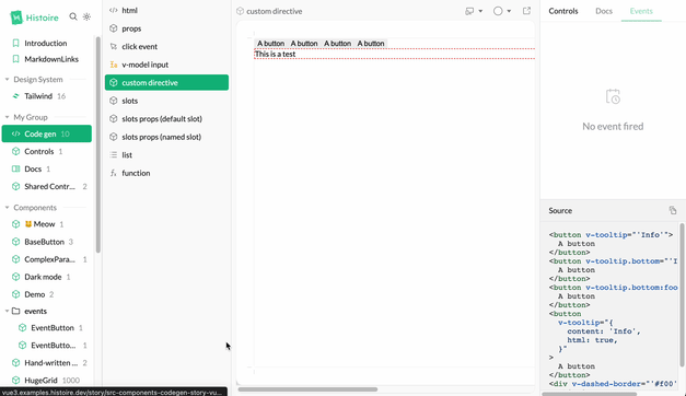
Histoire showcases your components as fast as possible, allowing you to visualize docs, sources, actions, and event changes in real time:

Histoire’s support and compatibility
At the time of writing, Histoire offers first class Vue 3 and Svelte 3 support. You can easily create stories with these frameworks.
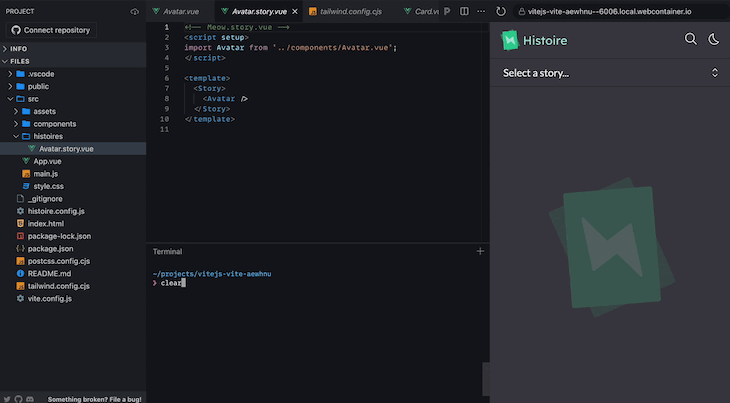
Below is a simple story created for a Vue component. The story is written in a Vue SFC with the composition API and can be extended with Vue’s API features:
<!-- Avatar.story.vue -->
<script setup>
import Avatar from '../components/Avatar.vue';
</script>

<template>
  <Story title="Avatar">
    <Variant>
      <Avatar src="https//image.jpg" name="John Doe"/>
    </Variant>

    <Variant title="Avatar without image">
      <Avatar name="John Doe"/>
    </Variant>
  </Story>
</template>

<docs lang="md">
# Avatar component
A simple avatar component
</docs>
When writing stories with Vue, Histoire provides the ability to generate source code from the story’s current state. This feature is extremely powerful when you need to reuse your components in a specific scenario.
The compatibility table can be tracked here.
Histoire UI and UX
Histoire offers an already beautiful and responsive web app that helps showcase your components. Any Histoire instance can be themed, rebranded, and has a flexible configuration system.
Histoire ships with a dark and light mode toggle for the main app, along with the ability to edit the backgrounds behind your components to better suit the scene in which you want to present them:

Stories and their variants can be organized in folders and showcased in grids and lists.
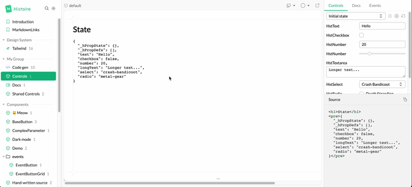
Histoire also provides built-in control buttons, and enables you to build your own scenario controls, which can be found on the Controls panel. These controls can help you create simple and complex states.

Histoire ships with a powerful and very intuitive built-in search feature that enables you to search through your stories and docs without relying on a third-party service.
Histoire’s straightforward documentation
Histoire has a decent documentation website, with steps that are well described and organized based on the framework you choose to write stories for.
The API reference page gives a brief outline of pretty much everything you can use to create your stories and edit your Histoire instance.
Histoire vs. Storybook
Despite being fairly new, Histoire is already a solid competitor to the API reference page for Vue and Svelte 3 story development. The following points outline the comparison between Histoire and Storybook.
Support for other frameworks with Histoire and Storybook
As mentioned above, Storybook provides great Vue and Svelte support, enabling you to write your stories in pure Vue or Svelte syntax. There’s no need to learn a new syntax to help write your stories — they feel native to the framework you are using.
Storybook does its best to support all the major frameworks (Angular, Vue, and React), with community support for Svelte, Preact, and Ember. This support sometimes falls through because Storybook is usually only up to date with React. However, you can track Storybook’s feature support for frameworks.
Histoire has a seemingly different philosophy. It offers developers a very approachable syntax while writing stories and aims to help create stories with very little usage of the library’s API.
User experience with Histoire and Storybook
Storybook provides solid UX on its default web app. However, Histoire has had a very impressive first release. It already provides most of the features that make up what we love about Storybook: searchable stories, organized stories, story variants, documentation, and viewport edits.
Storybook takes UX a notch further by providing tools like color filters, zoomable stories, accessibility checks, and a beautiful control description panel which also controls the URL, giving you the ability to share links to a created scenario.
These UX additions feel awesome. As for Histoire, time will tell, but I already think that it has great potential for creating a web app with carefully handled details.
Developer experience with Histoire and Storybook
Histoire is known to be extremely fast, which is because it relies on Vite and reuses your project’s Vite configuration to help set up the app. Meanwhile, Storybook has multiple builders — one of them being Vite. Nevertheless, Storybook still doesn’t feel as fast as Histoire in terms of both startup and story development.
When writing stories with Storybook, it is necessary to learn CSF (Component Story Format), which enhances your stories, and is already based on what your component looks like. You may also need to learn MDX which helps when writing documentation.
Contrastingly, Histoire provides developers with a much less abstract way of writing stories. With Histoire, stories are written in the framework in which the components are written (Vue or Svelte).
Histoire’s documentation is already good, with a separation based on the framework being used. Each framework has its way of writing stories and interacting with Histoire’s API. The possibilities offered are documented with viable examples. Storybook also has a very intuitive documentation with a plethora of examples, showcase apps, and even an addon page. However, sometimes we may find React snippets under other components’ dedicated documentation pages.
When you start having a complex Storybook instance, you often feel overwhelmed by dependencies, and your project feels impossible to update to the next Storybook version. To remedy this, Storybook has a powerful CLI that can help with upgrading or migrating to more recent Storybook versions.
Storybook features
Undoubtedly, Storybook provides a much larger pool of features than Histoire, with:
- Customizable backgrounds
- Docs
- Viewport editing
- Rulers
- Controls
- Outlines
And these are just the base features that ship with the app. In addition to the features above, Storybook offers a plethora of great addons, ranging from Figma plugins to visual regression tests. All these features provide depth and surface for developers to use Storybook with a very high level of flexibility.
Histoire ships the basic tools you need to write great stories: backgrounds, viewport, controls, event tracking, and docs. These features lay the solid foundation you need to document and showcase your components. You may find Histoire lacking if you need more advanced tools, like component internationalization (i18n — translating your stories). Nonetheless, you can write your own plugins.
Storybook makes a great effort to provide extra features as plugins, yet having such depth in possibility sometimes bloats a software, making it unintuitive. Histoire, on the other hand, ships with just what any user needs to document stories.
Performance and bundle size
Some will argue that bundle size and performance is an important aspect in an app that helps write component stories (since they are often used as component documentation), however I strongly think that this is an important detail that should be taken into consideration when choosing the tool used to document your components. Some UI framework authors use tools like Histoire and Storybook as their sole library documentation. So, these websites have to load quick enough to serve their users.
Automatic design token integration
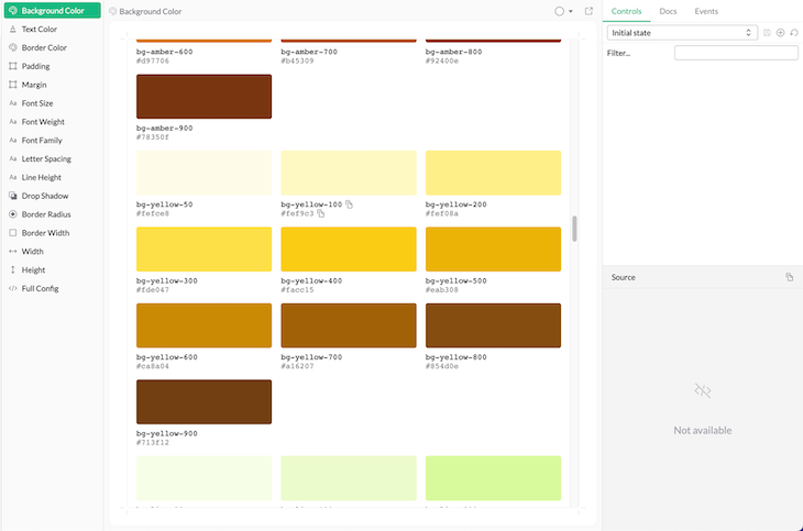
Histoire has the ability to automatically use your Tailwind CSS configuration to generate a design token story in your Histoire’s instance. These stories can be used as a reference/documentation booklet in teams with a custom Tailwind CSS integration:

Histoire plugins
Histoire provides official plugins that feel very native, and are also available to help further your needs in your component documentation. In addition to this, an early but clear plugin development guide is available for you to write your own plugins.
Conclusion
It is difficult to compare Storybook and Histoire. Storybook has been in the game for a long time now and keeps improving at a fast pace. Histoire is very new and feels less bloated because it is still young. However, both tools have their own strengths and weaknesses. If you are starting a new project, the best choice will depend on your specific needs.
Generally, if you have a React project and need a robust tool that is great at creating stories to showcase and document React components, then Storybook is the better option. However, if you have basic component documentation needs or prefer better support for Vue or Svelte, then Histoire is most likely to be the better tool.
The post Improve component stories with Histoire appeared first on LogRocket Blog.
from LogRocket Blog https://ift.tt/rbaiQCy
Gain $200 in a week
via Read more


