As companies become more data-driven, the need to collect and analyze data efficiently continues to rise. This need makes charts increasingly valuable as a tool that helps people simplify complicated data and communicate information quickly and effectively.
It is common for developers to use database information to create visualizations that are easy for users to comprehend. Since charts have become a common feature in websites, it makes sense to use chart libraries that enable the creation of these visualizations without writing hundreds of lines of code or building from scratch.
In this article, we’ll take a look at the best chart libraries in Laravel and how you can use them in your projects. We’ll use these libraries to create line charts, bar charts, and pie charts.
The Laravel chart libraries we’ll be covering are:
I chose these three libraries specifically for their seamless integration into projects and the very few lines of code they require to spin up a full-fledged chart. Let’s dive into them!
Jump ahead:
What is Larapex Charts?
Larapex Charts is a Laravel wrapper around ApexCharts. With the help of this package, we can easily create and render charts in our Laravel application without writing any JavaScript code.
This package provides us with pie charts, donut charts, area charts, line charts, and others. To make use of the Larapex Charts library in your project, install it with composer:
composer require arielmejiadev/larapex-charts
After installing this library with the command above, you should see the below:
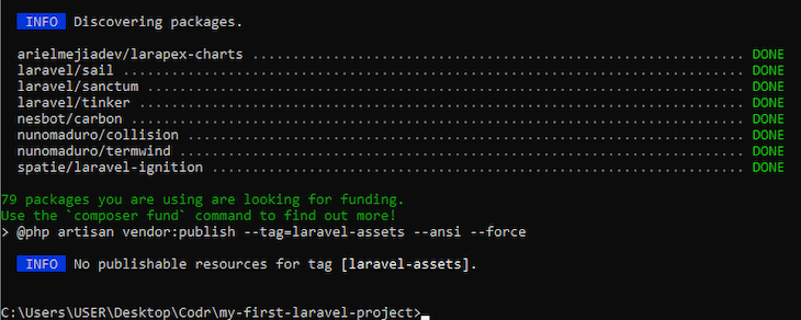
Next, publish Larapex’s config files to make them accessible to your application:
php artisan vendor:publish –tag=larapex-charts-config
Once you see DONE in green text as shown in the image below, you will have successfully set up Larapex Charts:
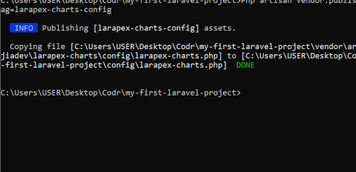
Now you can use Larapex Charts in your project.
Using Larapex Charts to create a bar chart
The Larapex Charts package provides a chart class. We’ll need to create an instance of this class, which I’ll name ExpensesChart for this example:
php artisan make:chart ExpensesChart
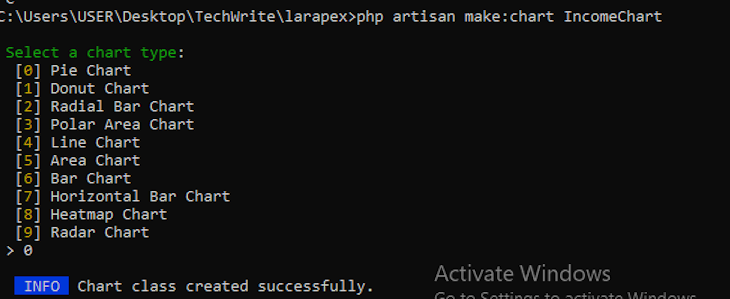
After running the above command, you will be prompted to select the type of chart you want to create. Let’s create a bar chart first:
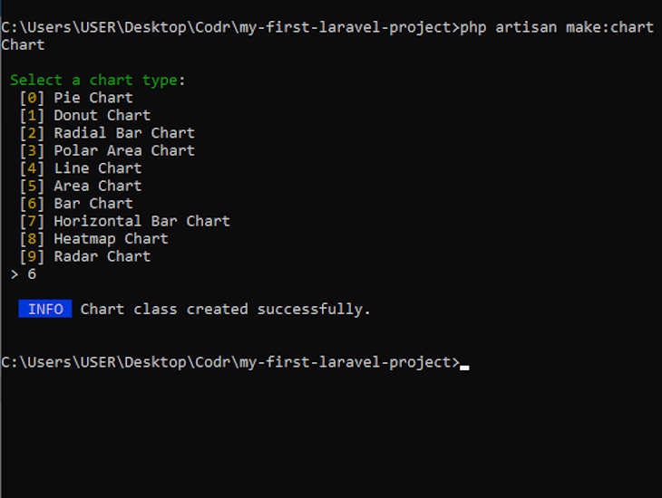
A chart class will be created in app/Charts/ExpensesChart. You can customize the chart by giving values to its properties. Set the title of your chart using setTitle, your chart data using addData, and the values on the x axis using setXAxis:
<?php
namespace App\Charts;
use ArielMejiaDev\LarapexCharts\LarapexChart;
class ExpensesChart
{
    protected $chart;
    public function __construct(LarapexChart $chart)
    {
        $this->chart = $chart;
    }
    public function build(): \ArielMejiaDev\LarapexCharts\BarChart
    {
        return $this->chart->barChart()
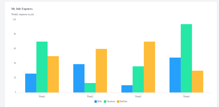
            ->setTitle('My July Expenses.')
            ->setSubtitle('Weekly expenses in july.')
            ->addData('Bills', [26, 39, 10, 48])
            ->addData('Vacation', [70, 13, 36, 94])
            ->addData('EatOuts',[50, 60, 70, 30])
            ->setXAxis(['Week1', 'Week2', 'Week3', 'Week4']);
    }
}
Next, create a controller to help build and render the chart:
php artisan make: controller ExpensesController –r
You should see a message confirming that the controller was created successfully:

Navigate to app/HTTP/Controller/ExpensesController and import the ExpensesChart class you created. In the index function, create an object of ExpensesChart and use the build() function in the ExpensesChart class to create your chart. The chart can then be passed to a view:
<?php
namespace App\Http\Controllers;
use App\Charts\ExpensesChart;
use Illuminate\Http\Request;
class ExpensesController extends Controller
{
    /**
     * Display a listing of the resource.
     *
     * @return \Illuminate\Http\Response
     */
    public function index(ExpensesChart $chart)
    {
        return view('expenses.index', ['chart' => $chart->build()]);
    }
}
In the code above, we passed the chart object to expenses.index, which is an index.blade.php file in an Expenses folder. Here’s where you can find the folder:
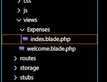
To ensure that the index function is invoked when the view page is accessed, we need to create a route for it in routes/web.php.
First, import your controller ExpensesController. Then create a route /expenses, which triggers the index function in the ExpensesController class and returns the appropriate view file:
<?php
use Illuminate\Support\Facades\Route;
use App\Http\Controllers\ExpensesController;
Route::get('/expenses', [ExpensesController::class, 'index'])->name('expenses.index');
The chart can now be rendered in your view using $chart->container(). At the bottom of the page, add the package’s CDN and script files:
<!doctype html>
<html lang="en">
<head>
    <meta charset="UTF-8">
    <meta name="viewport" content="width=device-width, user-scalable=no, initial-scale=1.0, maximum-scale=1.0, minimum-scale=1.0">
    <meta http-equiv="X-UA-Compatible" content="ie=edge">
    <title>Chart Example</title>
    <link href="https://unpkg.com/tailwindcss@^2/dist/tailwind.min.css" rel="stylesheet">
</head>
<body class="h-screen bg-gray-100">
<div class="container px-4 mx-auto">
    <div class="p-6 m-20 bg-white rounded shadow">
        {!! $chart->container() !!}
    </div>
</div>
<script src=""></script>

</body>
</html>
Now if you navigate to localhost:8000/expenses in your browser, the bar chart should be visible:
Creating other types of charts
Larapex Charts is not limited to just bar charts. We can create other types of charts with it following the same process.
For example, to create a pie chart, after running the php artisan make:chart command in your terminal, select Pie Chart from the list of options provided:
Just like before, customize your chart to fit your requirements, like so:
<?php
namespace App\Charts;
use ArielMejiaDev\LarapexCharts\LarapexChart;
class IncomeChart
{
    protected $chart;
    public function __construct(LarapexChart $chart)
    {
        $this->chart = $chart;
    }
    public function build(): \ArielMejiaDev\LarapexCharts\PieChart
    {
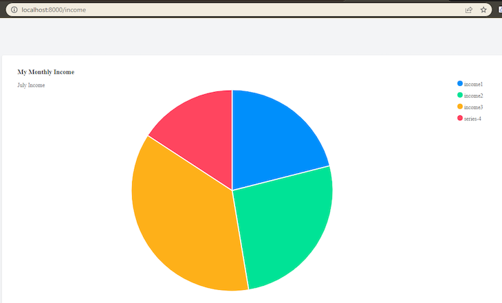
        return $this->chart->pieChart()
            ->setTitle('My Monthly Income')
            ->setSubtitle('July Income')
            ->addData([400, 500,700, 300])
            ->setLabels(['income1', 'income2', 'income3']);
    }
}
Next, create a controller with the following command:
php artisan make: controller IncomeController –r
This will allow you to build and render your chart, like so:
<?php
namespace App\Http\Controllers;
use Illuminate\Http\Request;
use App\Charts\IncomeChart;
class IncomeController extends Controller
{
    /**
     * Display a listing of the resource.
     *
     * @return \Illuminate\Http\Response
     */
    public function index(IncomeChart $chart)
    {
        return view('income.index', ['chart' => $chart->build()]);
    }
Create a route to connect your controller with your view:
<?php
Use Illuminate\Support\Facades\Route;
Use App\Http\Controllers\IncomeController;
Route::get(‘/income’, [IncomeController::class, ‘index’]) ->name(‘income.index’);
Lastly, render the chart in your view with $chart->container().
<body class="h-screen bg-gray-100">
<div class="container px-4 mx-auto">
    <div class="p-6 m-20 bg-white rounded shadow">
        {!! $chart->container() !!}
    </div>
</div>
<script src=""></script>

</body>
The result:
Exploring ConsoleTVs/Charts v6
Although v7 of the ConsoleTV/Charts library was recently deprecated, v6 is still active and functioning. This library helps developers integrate Chart.js into Laravel applications without having to write any JavaScript code. With this library, developers can create charts via an API.
Install the package in your application:
composer require consoletvs/charts “6.*”
We now have the library in our application and can proceed to use it to create charts.
Using ConsoleTVs/Charts to create a pie chart
Run the following command to create a new chart model:
php artisan make:chart IncomeChart
You should see a confirmation message like the one below:

The command above creates an IncomeChart class inside app/Charts. It has a constructor function, which helps to initialize your chart.
Next, we need a controller to help generate our chart data:
php artisan make:controller IncomeChartController -r
Navigate to your new controller app/Http/Controllers/UserChartController.php and add some data for your chart.
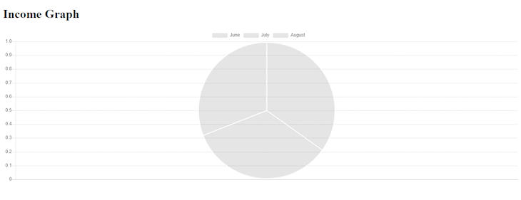
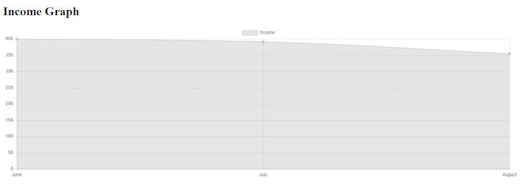
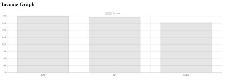
As you can see below, we are creating a chart that shows income for the months of June, July, and August. Inside labels, you’ll find the values on the X axis. Likewise, in dataset, you’ll find the values on the Y axis. Here’s the code:
<?php
namespace App\Http\Controllers;
use App\Charts\IncomeChart;
use Illuminate\Http\Request;
class IncomeChartController extends Controller
{
    /**
     * Display a listing of the resource.
     *
     * @return \Illuminate\Http\Response
     */
    public function index()
    {
        $incomeChart = new IncomeChart;
        $incomeChart->labels(['June', 'July', 'August']);
        $incomeChart->dataset('Income', 'pie', [400, 392, 355]);
        return view('income', [ 'incomeChart' => $incomeChart ] );
    }
}
Notice how we created an instance of our IncomeChart model and used the instance to create our chart data. We then pass the chart data to a view named income, which we now have to create.
Navigate to resources/views/ and create a file named income.blade.php. In this view file, we can access the chart we created earlier by using the container() function, which comes with the incomeChart model we also created earlier:
<div class="container">
    <h1>Income Graphs</h1>
    <div class="row">
        <div class="col-6">
            <div class="card rounded">
                <div class="card-body py-3 px-3">
                    {!! $incomeChart->container() !!}
                </div>
            </div>
        </div>
    </div>
</div>
We also need to add the CDN for Chart.js inside the head tags:
<head>

    <script src="https://cdnjs.cloudflare.com/ajax/libs/Chart.js/2.7.1/Chart.min.js" charset="utf-8"></script>
</head>
Additionally, we’ll need to add some other script files for the library in the body tag:
...
    {!! $incomeChart->script() !!}
</body>
Ultimately, your view file should look like this:
<!DOCTYPE html>
<html lang="">
<head>
    <meta charset="utf-8">

    <script src="https://cdnjs.cloudflare.com/ajax/libs/Chart.js/2.7.1/Chart.min.js" charset="utf-8"></script>
</head>
<body>
    <div id="app">

        <main class="py-4">
        <div class="container">
            <h1>Income Graph</h1>
            <div class="row">
                <div class="col-6">
                    <div class="card rounded">
                        <div class="card-body py-3 px-3">
                            {!! $incomeChart->container() !!}
                        </div>
                    </div>
                </div>
            </div>
        </div>
        </main>
    </div>


    @if($incomeChart)
    {!! $incomeChart->script() !!}
    @endif
</body>
</html>
Lastly, we need a route to call our controller from a web URL:
Route::get('/income', [IncomeChartController::class, 'index']);
Now if you navigate to localhost:8000/income in your browser, your pie chart should be visible:
If you go back to your controller and change pie to line or bar, you should get the corresponding results as well.
For a line chart:
For a bar chart:
What is laravel-charts?
The last chart library we’ll cover is laravel-charts. Just like the previous option, this package also helps developers create Chart.js charts inside the Blade files of a Laravel application without writing any JavaScript code.
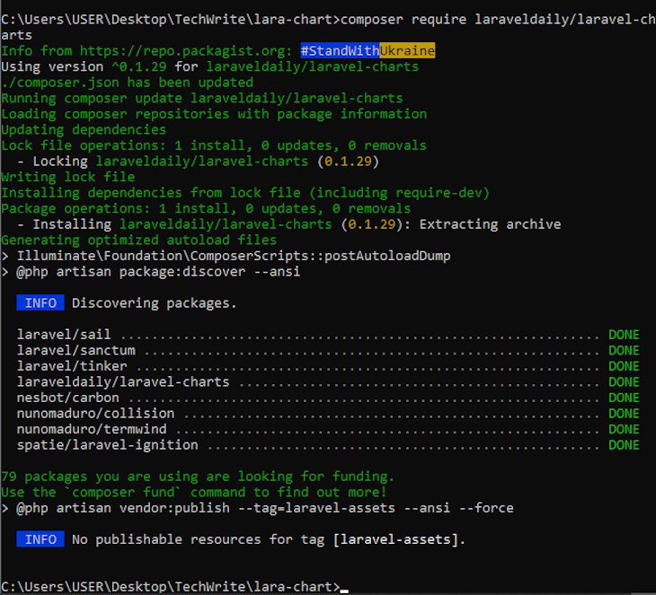
Run the following command to install laravel-charts:
composer require laraveldaily/laravel-charts
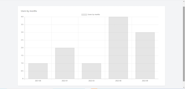
To explore how to use laravel-charts, we’ll plot a chart of users against the month they were added to our database. Go to phpmyadmin and create a database named users, then add the database name in your .env file:
DB_CONNECTION=mysql
DB_HOST=127.0.0.1
DB_PORT=3306
DB_DATABASE=users
DB_USERNAME=root
DB_PASSWORD=
As we create the users table, we’ll use Laravel’s DatabaseSeeder to create some dummy users for our chart. Navigate to Database\Seeders\DatabaseSeeder and simply uncomment the code below:
public function run()
    {
        \App\Models\User::factory(10)->create();
        \App\Models\User::factory()->create([
            'name' => 'Test User',
            'email' => 'test@example.com',
        ]);
    }
Now we are ready to migrate and seed our database:
php artisan migrate --seed
With that, we have created the users for our chart to display. Now, we’ll proceed to creating the chart itself. We’ll create the chart in a controller and then pass it to a view.
First, create the controller:
php artisan make:controller UserController
Navigate to the newly created controller — namespace App\Http\Controller\UserController — and create the chart in the index function:
public function index()
    {
        $chart_options = [
            'chart_title' => 'Users by months',
            'report_type' => 'group_by_date',
            'model' => 'App\Models\User',
            'group_by_field' => 'created_at',
            'group_by_period' => 'month',
            'chart_type' => 'bar',
        ];
        $chart1 = new LaravelChart($chart_options);

        return view('home', compact('chart1'));
    }
We will now create a variable $chart_options and give it an array of options for our chart:
chart_title— text to be displayed in the legendreport_type— determines how chart data will be groupedmodel— the source of chart datagroup_by_field— the field in our database that will be used in thegroup_byclausegroup_by_period— used to specify the date forgroup_by_datereport type- Value can be day, week, month, or year
The next step is to create an object of the LaravelChart class from the chart package we installed. First, import the class:
use LaravelDaily\LaravelCharts\Classes\LaravelChart;
Then, use it to create an object:
$chart1 = new LaravelChart($chart_options);
Lastly, pass it to your view:
return view('home', compact('chart1'));
To render the chart in your view, add the required CDN and boilerplate code in your blade file:
{!! $chart1->renderChartJsLibrary() !!}
{!! $chart1->renderJs() !!}
Now you can render the chart:
<div>
    <h1></h1>
                    {!! $chart1->renderHtml() !!}
</div>
If you need it, here is the entire code:
<!doctype html>
<html lang="en">
<head>
    <meta charset="UTF-8">
    <meta name="viewport" content="width=device-width, user-scalable=no, initial-scale=1.0, maximum-scale=1.0, minimum-scale=1.0">
    <meta http-equiv="X-UA-Compatible" content="ie=edge">
    <title>Chart Sample</title>
    <link href="https://unpkg.com/tailwindcss@^2/dist/tailwind.min.css" rel="stylesheet">
</head>
<body class="h-screen bg-gray-100">
<div class="container px-4 mx-auto">
    <div class="p-6 m-20 bg-white rounded shadow">
    <h1></h1>
                    {!! $chart1->renderHtml() !!}
    </div>
</div>
{!! $chart1->renderChartJsLibrary() !!}
{!! $chart1->renderJs() !!}
</body>
</html>
Below, you can see what the result should look like in a browser:
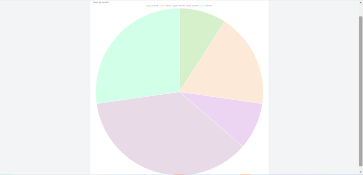
To create a pie chart instead, navigate to your controller and change the value of chart_type to pie:
'chart_type' => 'pie'
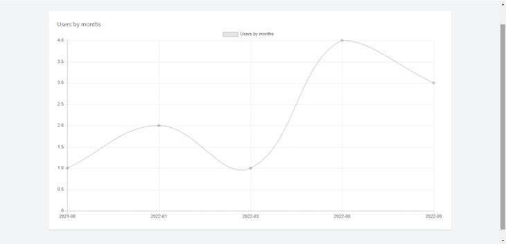
For a line chart, make the value line:
'chart_type' => 'line'
Conclusion
In this guide, we discussed the three best Laravel chart libraries that developers can use to add charts to their Laravel application: Larapex Charts, ConsoleTVs/Charts v6, and laravel-charts.
We used all three of these libraries to create sample line, bar, and pie charts — although none of these libraries are limited to these three types of charts. Hopefully, you can now confidently implement any of these chart libraries in your next Laravel project.
The post Exploring the best Laravel chart libraries appeared first on LogRocket Blog.
from LogRocket Blog https://ift.tt/i712ZvX
Gain $200 in a week
via Read more


