You’ve probably interacted with a file upload component, most likely when you want to update your profile picture across multiple apps or share media, or upload documents to the cloud. They all have different designs, some minimal and others more advanced.
On the desktop, however, file upload components that allow you to drag and drop files into specific zones (usually referred to as “drop zones”) and preview these files before uploading tend to be more intuitive.
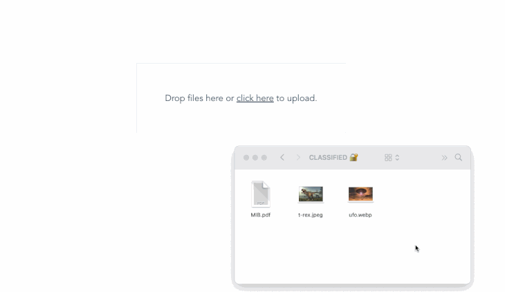
Through this article, we’ll learn how to create our own drag-and-drop file upload component with Vue.js; it’ll have the ability to preview selected files and remove any file at any time before finally uploading. Here’s a sneak peek at what we’ll be building once it’s all finished:
Building a simple drop zone with <input type=file>
Interestingly, the native HTML <input /> with type file supports drag and drop but will only accept a single file by default. We could also easily add the multiple attribute (i.e., <input type = "file" multiple />) to accept more than one file, stretch its width a little, add some border and padding, and we’d have it all working:
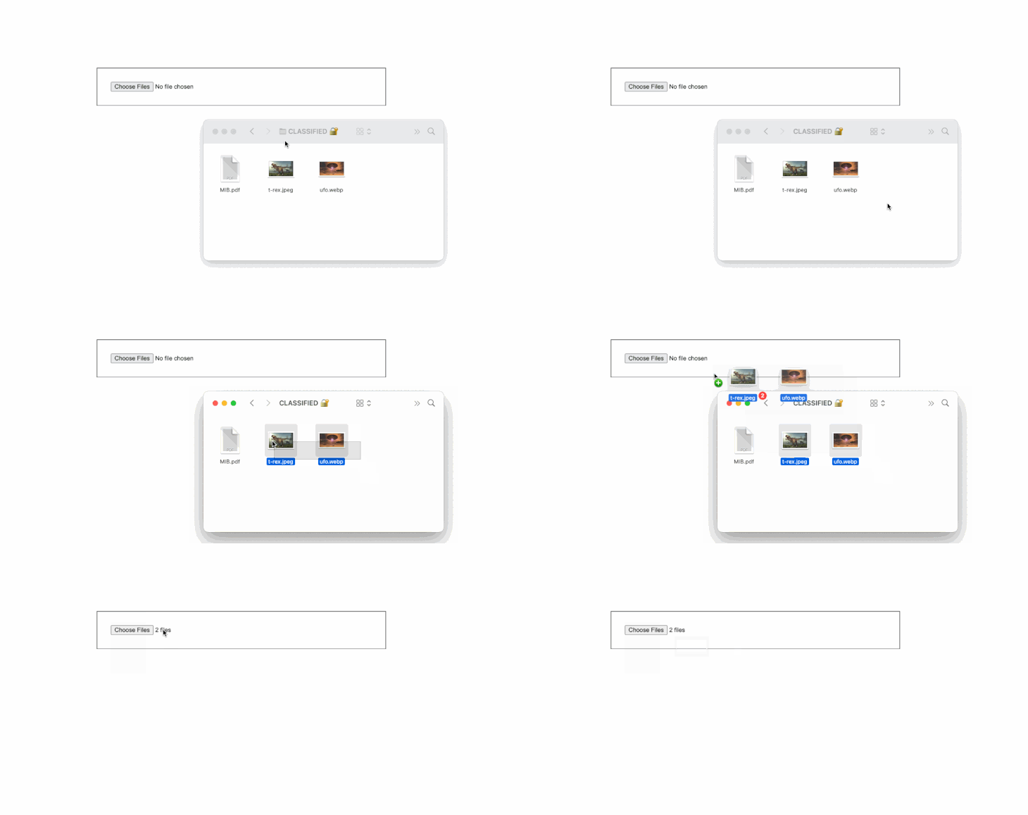
Aesthetically, you’d agree that this isn’t good enough. However, our drag-and-drop file uploader will work in a similar manner in that we’ll still have a file input but with its visibility hidden. Then we’ll add a visible label through which dragging to the aforementioned file input will be possible. We’ll then add some other custom event that’ll change the dragging status and allow us to display and remove selected files.
Creating an advanced drop zone
Let’s get started by creating a new Vue application. If you haven’t already, install the vue-cli, and then run the following command to create a new vue app:
vue create dropfile
Afterward, open the new project in your favorite text editor, then create a new empty DropFile.vue file inside the src/component directory.
Next, let’s import this component into our entry file. Open App.vue and replace its contents with the following:
<template>
  <div id="app">
    <DropFile />
  </div>
</template>

<script>
import DropFile from "./components/DropFile.vue";
export default {
  name: "App",
  components: {
    DropFile,
  },
};
</script>
Let’s move forward by first organizing all CSS-related code; create a new dropfile.css file in the src/assets directory and paste the following content into it:
.main {
    display: flex;
    flex-grow: 1;
    align-items: center;
    height: 100vh;
    justify-content: center;
    text-align: center;
}

.dropzone-container {
    padding: 4rem;
    background: #f7fafc;
    border: 1px solid #e2e8f0;
}

.hidden-input {
    opacity: 0;
    overflow: hidden;
    position: absolute;
    width: 1px;
    height: 1px;
}

.file-label {
    font-size: 20px;
    display: block;
    cursor: pointer;
}

.preview-container {
    display: flex;
    margin-top: 2rem;
}

.preview-card {
    display: flex;
    border: 1px solid #a2a2a2;
    padding: 5px;
    margin-left: 5px;
}

.preview-img {
    width: 50px;
    height: 50px;
    border-radius: 5px;
    border: 1px solid #a2a2a2;
    background-color: #a2a2a2;
}
Next, replace the content in the DropFile.vue file with the following:
<template>
  <div class="main">
    <div
      class="dropzone-container"
      @dragover="dragover"
      @dragleave="dragleave"
      @drop="drop"
    >
      <input
        type="file"
        multiple
        name="file"
        id="fileInput"
        class="hidden-input"
        @change="onChange"
        ref="file"
        accept=".pdf,.jpg,.jpeg,.png"
      />

      <label for="fileInput" class="file-label">
        <div v-if="isDragging">Release to drop files here.</div>
        <div v-else>Drop files here or <u>click here</u> to upload.</div>
      </label>
    </div>
  </div>
</template>

<script>
export default {
  data() {
    return {
      isDragging: false,
      files: [],
    };
  },
  methods: {
    onChange() {
      this.files = [...this.$refs.file.files];
    },
    dragover(e) {
      e.preventDefault();
      this.isDragging = true;
    },
    dragleave() {
      this.isDragging = false;
    },
    drop(e) {
      e.preventDefault();
      this.$refs.file.files = e.dataTransfer.files;
      this.onChange();
      this.isDragging = false;
    },
  },
};
</script>
<style scoped src="@/assets/dropfile.css"></style>
Here, we created two reactive states: isDragging, to denote the state if the user is trying to drag a file into our drop zone; and files, an array to hold selected or dropped files. We then attached a custom ref to the main file input to make it easily accessible in our Vue instance. Additionally, we added an onChange event that basically updates our files array with the files attached to our input.
Afterward, we created a dragover, dragleave, and drop method, and attached them to the container holding our main file input. This way, the drop event and method will capture the dropped file and bind it to our file input, leveraging the custom ref we created earlier.
The dragover and dragleave methods also let us alter the state of our isDragging as required. And finally, we used conditional rendering (v-if and v-else) to check the state of isDragging and then display a custom message for each state.
If we run our app at this point, we’ll have the following output:
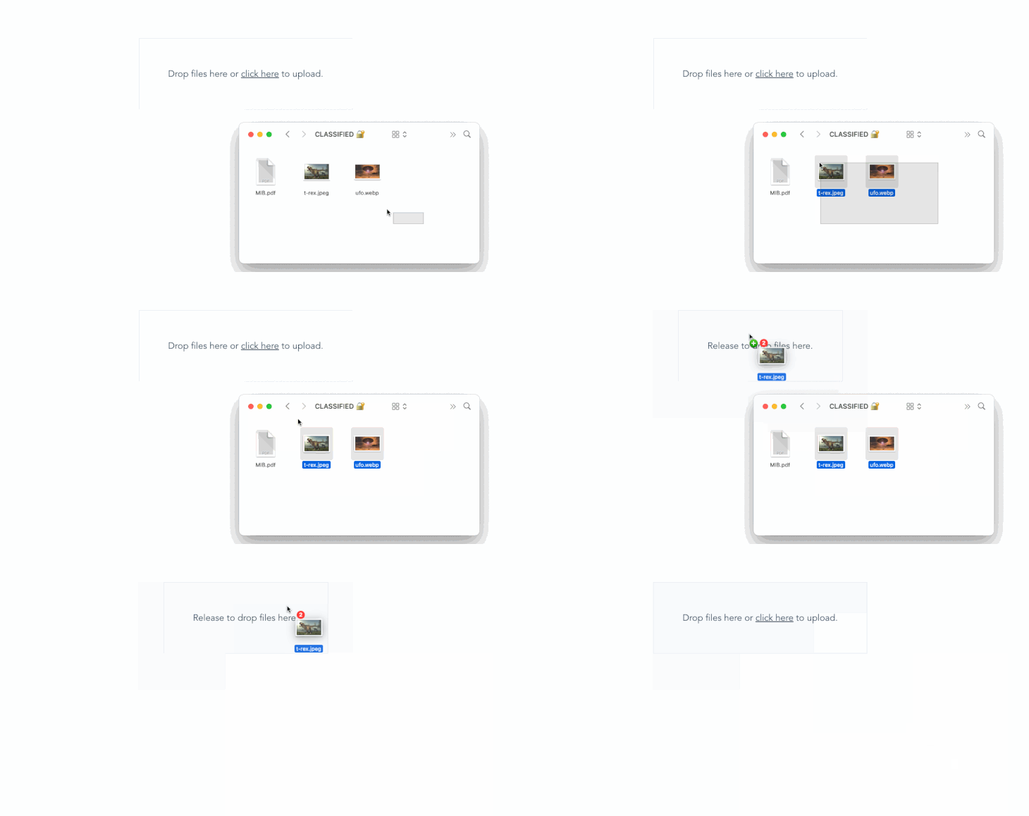
Even though the dropped files aren’t yet visible to us, they are actually there somewhere in the background. To test this, log this.files to the console inside the onChange() method. Whenever you drop or manually select a file, the array should be logged to the console, with each file containing the file name, size, last modified date, and other file-related information.
Listing dropped files
Previewing selected/dropped files is pretty straightforward: we’ll only need to loop through our array of files. To accomplish this, add the following code immediately after the </label> tag in our previous code:
<!-- . . . -->
  </label>
      <!-- Note: Only add the code block below -->
      <div class="preview-container mt-4" v-if="files.length">
        <div v-for="file in files" :key="file.name" class="preview-card">
          <div>
            <p>

            </p>
          </div>
          <div>
            <button
              class="ml-2"
              type="button"
              @click="remove(files.indexOf(file))"
              title="Remove file"
            >
              <b>×</b>
            </button>
          </div>
        </div>
      </div>
Here, we used conditional rendering to check if our files array had a valid length and then looped through all its content while displaying each file name in a paragraph.
Removing file(s)
In the previous code block, you’d notice we also added a button to each iterable item, calling a remove() method while passing the index of the current file as its parameter. If we run our app at this point, we should see the selected file names displayed as expected and also a button to remove them. However, the remove button doesn’t work just yet.
To fix this, append all previous methods with a new remove() method like below:
// ..
remove(i) {
    this.files.splice(i, 1);
},
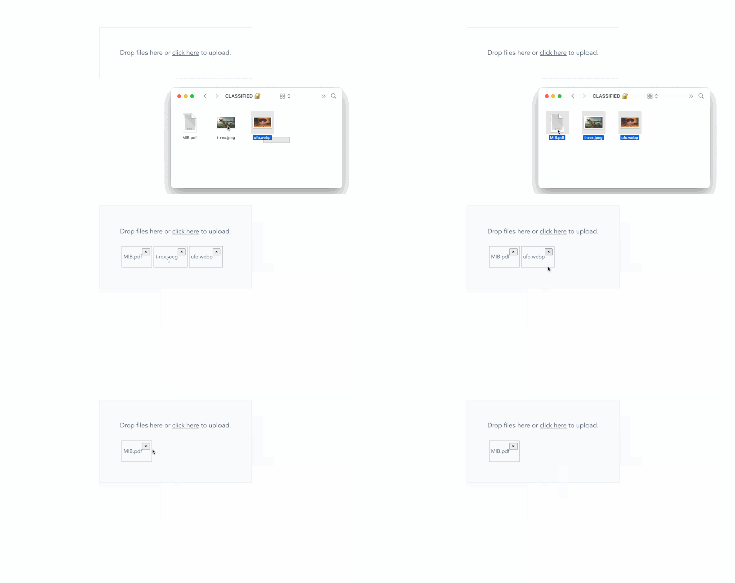
At this stage, everything should work as expected. We should be able to manually select files, drag and drop files, see selected files’ names, and also be able to remove files. A preview of the output is shown below:
Previewing selected image files
One additional feature that’ll make our drop zone component even more intuitive is the ability to preview selected image files. We can easily do this by generating an arbitrary URL using the native URL.createObjectURL() method, passing our file object as its parameter. To implement, append a new generateThumbnail() method to the methods list like below:
// ..
generateURL(file) {
    let fileSrc = URL.createObjectURL(file);
    setTimeout(() => {
        URL.revokeObjectURL(fileSrc);
    }, 1000);
    return fileSrc;
},
It is recommended to always revoke a URL after creating one with the URL.createObjectURL() method so as to avoid possible memory loss; this is why we’ve added an additional timeout to automatically do this after one second.
Next, replace the paragraph (<p> tag) displaying all selected/dropped files’ names with the following code:
<!-- . . . -->
<img class="preview-img" :src="generateURL(file)" />
<p>

</p>
<!-- . . . -->
And, we got it all working! We can now easily drop, select, remove, and even preview selected files:

Showing file size
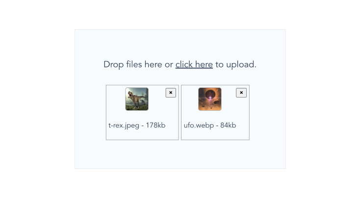
As explained in the previous section, we also have direct access to each selected file size and their last modified date. The file size, by default, is shown in bytes. However, we could easily divide by a thousand to convert to KB. Add the following update to the part of the file showing the file name:
<p>
     -

</p>
And each selected file size will be shown along with its name:
Uploading to the server
Uploading selected/dropped files to a server is also a breeze since they are attached to the files state; and while there are different strategies to achieve this, utilizing FormData tends to be a more common approach.
Here’s an example of how we could leverage FormData and Axios to send our files to an API or server for processing:
// . . .
uploadFiles() {
    const files = this.files;
    const formData = new FormData();
    files.forEach((file) => {
        formData.append("selectedFiles", file);
    });

    axios({
        method: "POST",
        url: "http://path/to/api/upload-files",
        data: formData,
        headers: {
            "Content-Type": "multipart/form-data",
        },
    });
},
We could then use other inbuilt functions or frameworks on the backend to process the files as desired.
Conclusion
We’ve covered how to create a minimalist yet interactive drag-and-drop file uploader with Vue.js. Our file upload component lets us glance through selected files’ names and size, preview image files, and even remove files at will before uploading.
It’s very easy to make mistakes while following a code-along tutorial like this one. To save you the trouble, the complete code for this tutorial is also available on GitHub.
Thanks for reading!
The post Customized drag-and-drop file uploading with Vue appeared first on LogRocket Blog.
from LogRocket Blog https://ift.tt/nsFc7Qz
Gain $200 in a week
via Read more


