Being able to transition our React apps between light and dark mode has become something of a necessity in today’s world and tools like Theme UI can help us achieve it. After all, it is not only developers now who might prefer to look at darker colors, but users too want to have to ability to choose between light and dark themes.
I myself set to dark mode whenever I see it applicable in an app; it looks sleek, is easy on the eyes, and if I don’t like it, I can always switch back to the lighter version. So, it shouldn’t come as too much of a surprise to us devs that users increasingly want that option for their apps. Also, just from a technical point of view, it shows that the team was considerate enough to go for an extra mile for the user experience, which is such a crucial aspect of attracting and retaining users today.
In this article, we will build a React app that can be transitioned from light to dark mode using Theme UI.
Jump ahead:
- Project overview and installation
- What is Theme UI?
- Creating our React app
- Creating the theme file
- Styling with App.css
- Working on App.js
- Final Version of App.js
Project overview and installation
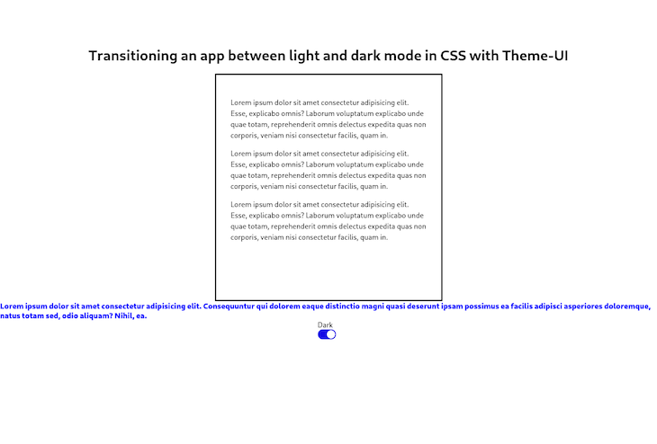
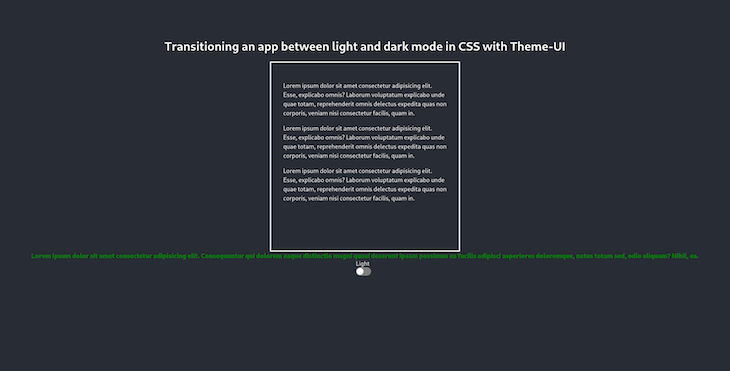
What we will create will be a simple card that has a text component and a title. There will also be a portion of blue-colored text under the card, and when we switch modes via clicking a button, the card text and the title will change into dark mode while this blue text will turn to green to demonstrate the contrast we can achieve.
This is the final version of what we’re going to build:
Light mode

Dark mode

What is Theme UI?
Theme UI is a library that can be used to create themeable UIs using constraint-based design principles. Custom component libraries, web apps, Gatsby themes, design systems, and more can be built using this tool.
In other words, it’s a component library similar to ones familiar to most devs, such as Bootstrap, Chakra UI, and others. The sweet thing about Theme UI in my opinion — and the main reason for this tutorial — is its powerful sx prop and native hooks that can handle color changes seamlessly.
Now, without further ado, let’s start creating our app!
Creating our React app
In this tutorial, we’ll be working with ReactJS. Let’s start with scaffolding a React application by entering the following command into our terminal:
npx create-react-app darkmode-tutorial
You can name the project as you see fit. After our project is created, let’s cd into it by entering:
cd darkmode-tutorial
Then, let’s install Theme UI with its relevant dependencies by entering the following command in the root folder of our project:
npm install theme-ui @emotion/react
After it’s installed, go into the index.js file in our src folder and wrap our React app with Theme UI. We’ll first import ThemeProvider like so:
import { ThemeProvider } from "theme-ui";
Then, wrap our App component with ThemeProvider:
ReactDOM.createRoot(document.getElementById("root")).render(
  <React.StrictMode>
    <ThemeProvider>
      <App />
    </ThemeProvider>
  </React.StrictMode>
);
At this point, we’ve wrapped the ThemeProvider to our application. In the next step, we’ll create a theme file that contains our color schemes and will pass it as a props in the ThemeProvider so that we can use the schemes we define throughout all of our application.
Creating the theme file
In order to use the full power of Theme UI, we’ll create a theme.js in our src folder and define our color schemes like so:
// import type { Theme } from "theme-ui";
const theme = {
  initialColorMode: "light",
  colors: {
    text: "black",
    background: "white",
    primary: "#1408e6",
    inverseText: "blue",
    modes: {
      dark: {
        text: "white",
        background: "#282c34",
        primary: "#8fceff",
        inverseText: "green",
      },
    },
  },
};

export default theme;
As you can see, what we’re doing here is creating a theme constant and defining our colors before exporting it. As we’ve defined the initialColorMode to be light, our application’s default color scheme will be light, and when we change the mode to dark, the corresponding changes we’ve outlined in the code will occur.
For instance, black text will be turned into white, and the white background will take the color we’ve provided of #282c34.
We’ll use the inverseText property when dealing with the sx prop — don’t bother yourself with this just now, we’ll get more into this in a little bit.
Now, since we have our theme.js file, let’s go back to index.js and pass it as props to our application to use it anywhere we like:
import React from "react";
import ReactDOM from "react-dom/client";
import App from "./App";
import "./index.css";
import { ThemeProvider } from "theme-ui";
import theme from "./theme";

ReactDOM.createRoot(document.getElementById("root")).render(
  <React.StrictMode>
    <ThemeProvider theme={theme}>
      <App />
    </ThemeProvider>
  </React.StrictMode>
);
As you can see, what I’ve done here is import the theme (import theme from "./theme";) and passed it as props in ThemeProvider, like so:
<ThemeProvider theme={theme}>
  <App />
</ThemeProvider>
Now that we have passed the theme.js file as props and can use it in our app, we can start working with the App.js file.
Styling with App.css
But, before starting to work with the App.js file, let’s add some styles to make sure that our app looks nice as we build it. We will add the relevant classes as we code along.
.App {
  height: 100vh;
  display: flex;
  flex-direction: column;
  align-items: center;
  margin-top: 5rem;
}
.boxes {
  display: flex;
  flex-direction: row;
  justify-content: space-around;
}
.box {
  border: solid;
  width: 500px;
  height: 500px;
}

.para {
  line-height: 1.5rem;
  margin-top: 1rem;
}
Working on App.js
As I mentioned before, our application will contain some dummy text inside a box and a switch button to change between dark and light mode. So, let’s go to our App.js file and import the following:
import React, { useState } from "react";
/** @jsxImportSource theme-ui */
import { Box, Switch, useColorMode } from "theme-ui";
import "./App.css";
We’ll use the useState hook to handle our component state, Box, Switch, and useColorMode from theme-ui, and the App.css file we’ve created above. This import (/** @jsxImportSource theme-ui */) is for using Theme UI’s powerful sx prop; and yes, it is imported commented-out.
As Theme UI works like a standard UI library, we can use Box and Switch to create components easily. Let’s start populating our component:
const App = () => {
  const [colorMode, setColorMode] = useColorMode();
  const [state, setState] = useState("light");
  return (
    <div className="App">
      <h1>
        Transitioning an app between light and dark mode in CSS with Theme-UI
      </h1>
      <div className="boxes">
        <Box p={4} color="text" bg="transparent" className="box">
          <div className="para">
            Lorem ipsum dolor sit amet consectetur adipisicing elit. Esse,
            explicabo omnis? Laborum voluptatum explicabo unde quae totam,
            reprehenderit omnis delectus expedita quas non corporis, veniam nisi
            consectetur facilis, quam in.
          </div>{" "}
          <div className="para">
            Lorem ipsum dolor sit amet consectetur adipisicing elit. Esse,
            explicabo omnis? Laborum voluptatum explicabo unde quae totam,
            reprehenderit omnis delectus expedita quas non corporis, veniam nisi
            consectetur facilis, quam in.
          </div>{" "}
          <div className="para">
            Lorem ipsum dolor sit amet consectetur adipisicing elit. Esse,
            explicabo omnis? Laborum voluptatum explicabo unde quae totam,
            reprehenderit omnis delectus expedita quas non corporis, veniam nisi
            consectetur facilis, quam in.
          </div>
        </Box>{" "}
      </div>
We start by defining the useColorMode hook. It works almost exactly like the useState hook native to React (which we invoke in the following line to set the state to the light color scheme).
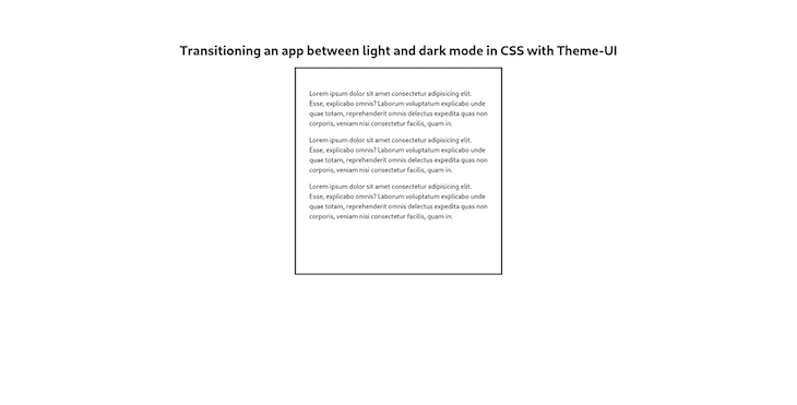
Inside our return statement, we have a wrapper div with the class of App, an h1 tag, another wrapper div with the class of boxes, and a Box component inside of it. This Box from Theme UI makes sure our texts are tucked inside nicely.
If everything went alright, this is how our application should look in its current stage:

In the next steps, we will add another text and our switch button to change between the color modes.
sx prop
Remember when we defined an inverseText property in our theme.js file? Now it’s time to use it.
The sx prop lets you style elements inline, using values from your theme. This should be familiar for those who have ever used styled-components. Basically, you can write inline CSS and use the values you’ve defined in your theme.js file, which is exactly what we’ll do now.
Still inside of App.js, continuing from where we left off, let’s add another snippet:
<div sx=>
  Lorem ipsum dolor sit amet consectetur adipisicing elit. Consequuntur qui
  dolorem eaque distinctio magni quasi deserunt ipsam possimus ea facilis
  adipisci asperiores doloremque, natus totam sed, odio aliquam? Nihil, ea.
</div>
Now, with this sx prop, we’ve defined the fontWeight and fontSize by hand, but for the text color, we’ve invoked the inverseText property that was defined earlier in theme.js.
If we go back and check how it was defined, we’d see that in the light mode it’s defined as blue, and in the dark mode it turns to green. It looks ugly, I know, but it’s a nice way to show the contrast easily!
Adding switch functionality
Now, we almost have everything we need. We just have to add the Switch button we imported from Theme UI and add a click event on it to handle the changes. Check the following snippet out:
<div>
  <div>{state === "light" ? <div> Dark</div> : <div>Light</div>}</div>
  <Switch
    onClick={() => {
      setColorMode(colorMode === "light" ? "dark" : "light");
      setState(colorMode === "light" ? "dark" : "light");
    }}
  />
</div>
In order to change the colors, we don’t actually need React’s useState hook, I just wanted to use it to have a conditional text that indicates which color scheme will follow on from the button click. So if, the state is light, the text will say dark, and vice versa.
In our onClick event, we use the ternary operator to define an if statement: If the colorMode is light, turn into dark. As you can see, the setColorMode hook works exactly like setState, so there should be no confusion here for React developers.
Final Version of App.js
This is the final version of our App.js file — you can compare it with your own:
import React, { useState } from "react";
/** @jsxImportSource theme-ui */
import { Box, Switch, useColorMode } from "theme-ui";

import "./App.css";

const App = () => {
  const [colorMode, setColorMode] = useColorMode();
  const [state, setState] = useState("light");
  return (
    <div className="App">
      <h1>
        Transitioning an app between light and dark mode in CSS with Theme-UI
      </h1>
      <div className="boxes">
        <Box p={4} color="text" bg="transparent" className="box">
          <div className="para">
            Lorem ipsum dolor sit amet consectetur adipisicing elit. Esse,
            explicabo omnis? Laborum voluptatum explicabo unde quae totam,
            reprehenderit omnis delectus expedita quas non corporis, veniam nisi
            consectetur facilis, quam in.
          </div>{" "}
          <div className="para">
            Lorem ipsum dolor sit amet consectetur adipisicing elit. Esse,
            explicabo omnis? Laborum voluptatum explicabo unde quae totam,
            reprehenderit omnis delectus expedita quas non corporis, veniam nisi
            consectetur facilis, quam in.
          </div>{" "}
          <div className="para">
            Lorem ipsum dolor sit amet consectetur adipisicing elit. Esse,
            explicabo omnis? Laborum voluptatum explicabo unde quae totam,
            reprehenderit omnis delectus expedita quas non corporis, veniam nisi
            consectetur facilis, quam in.
          </div>
        </Box>{" "}
      </div>
      <div sx=>
        Lorem ipsum dolor sit amet consectetur adipisicing elit. Consequuntur
        qui dolorem eaque distinctio magni quasi deserunt ipsam possimus ea
        facilis adipisci asperiores doloremque, natus totam sed, odio aliquam?
        Nihil, ea.
      </div>
      <div>
        <div>{state === "light" ? <div> Dark</div> : <div>Light</div>}</div>
        <Switch
          onClick={() => {
            setColorMode(colorMode === "light" ? "dark" : "light");
            setState(colorMode === "light" ? "dark" : "light");
          }}
        />
      </div>
    </div>
  );
};

export default App;
Conclusion
That’s it folks! Theme UI offers us a quick and easy way to handle dark mode functionality that’s often essential these days for providing a positive user experience.
In this tutorial, I’ve shown you exactly how you can implement the color changing functionality, as well as how to import components from Theme UI and how to use its sx prop, which bears similarities to styled-components.
I hope you enjoyed reading — keep calm and happy coding!
The post Transitioning a React app between light and dark mode in CSS with Theme UI appeared first on LogRocket Blog.
from LogRocket Blog https://ift.tt/TfzevJk
Gain $200 in a week
via Read more


