Oftentimes, website backgrounds have plain colors — just a big bland space. In CSS, you can use the background property and all its variations to create a background. Backgrounds are there to enhance the appearance of a site, so it’s important you get it right.
A really cool option is to use a video as a background with CSS, but it can be a bit tricky to get it to work seamlessly. In this article, you’ll learn how to add a video as the background of a website using CSS and JavaScript, as well as how to make it responsive and interactive without taking a performance hit.
The focus will be on a website’s header section, but video backgrounds can go on other sections of the site. You can have full-screen or partial backgrounds. Let’s get started!
- How to create video backgrounds
- Using the video as it is
- Adding an overlay to a video background
- Making video backgrounds responsive
- Making video backgrounds performant
- Other ways to use video backgrounds
- Browser compatibility
How to create video backgrounds
Using the video HTML element, we can set a video as our site’s background. There are two options here: using the video as it is, or adding an overlay. We can then add some text or other elements over it using the position property.
Using the video as it is
This is simply having the video play in its original visual state, then having your text, or any element placed directly over it.
First things first, you need a nice video, ideally one that fits into the overall theme of the website. Here’s one from Pexels:

Let’s get started with creating the video background. The way you set up the HTML is up to you. You can have whichever elements you want on the page, but the most important thing is that the video is in there somewhere:
 <body>
    <section id="#main">
      <video src="walking on the moon.mp4" muted autoplay loop></video>
    </section>
</body>
I added the video using the HTML5 video tag, and there are three attributes you can include. The first attribute, muted, removes the sound from the video. The autoplay attribute will make the video play automatically, and the video will run in a continuous loop with the loop attribute.
For this tutorial, here’s a complete syntax so you can follow along:
<body>
  <section id="main">
    <nav>
     <div class="logo">
        <a href="#">Oscar - LogRocket</a>
     </div>
        <ul class="menu">
          <li><a href="#">Hello</a></li>
          <li><a href="#">Hola</a></li>
          <li><a href="#">Hallo</a></li>
        </ul>
    </nav>
      <video src="walking on the moon.mp4" muted autoplay loop></video>
      <div class="main-text">
        <h2>Let's go for a walk...</h2>
        <h1>...On the Moon</h1>
        <p>
          This demo shows a video background with no overlay.
        </p>
        <a href="#" class="btn">Let's go!</a>
      </div>
  </section>
</body>
It’s the same with CSS, you can style every element to your taste. Below is my styling for the video background:
#main video{
  position: absolute;
  top: 0;
  left: 0;
  width: 100%;
  height: 100%;
  object-fit: cover;
}
Let’s go over each of the above attributes. First things first, the position. It’s set to absolute, meaning it’s relative to the top and side of the web page. The rest of the syntax is to remove any space around the video (top and left) and to ensure the video fits perfectly into the page (since we’re going for a full-screen background).
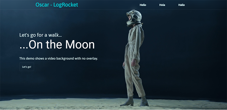
Here’s a screenshot of the page:
And here’s something better than a screenshot, a live demo! The best view is 0.5x:
See the Pen
Video background without overlay by Oscar-Jite (@oscar-jite)
on CodePen.
It’s important that there’s a good contrast between the text and the video. As you can see from the demo, the text is perfectly legible.
Adding an overlay to a video background
Adding an overlay to the background can be particularly useful when the text on the video is illegible. Or maybe if the video is distracting and you want to tone it down.
Here you can have some fun! Overlays can either be plain, transparent colors, or they can be gradients. With gradients, you can use a color-to-color gradient or color-to-transparent overlay.
Color-to-color gradients have two distinct colors blending into each other. With color-to-transparent gradients, the video can gradually fade into the color of the next section.
We’re going to work with a brighter video this time so the overlay can really pop out. Here’s one, also from Pexels:

Let’s see how it looks with no overlay:
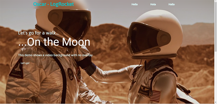
Here, the text kind of gets lost because of the video background. An overlay can increase the contrast and make the text more visible.
Plain color overlays
Let’s get started, we’re using the same setup as before. This time we’re using an empty div in the HTML code to serve as the overlay:
<body>
    <section id="#main">
      <div class="overlay"></div>
      <video src="video.mp4" muted autoplay loop></video>
    </section>
</body>
In the CSS code, start by positioning it exactly like the video background. This is because it’s also going to be the same size. Then, give it a color with the background property:
.overlay{
  position: absolute;
  top: 0;
  left: 0;
  width: 100%;
  height: 100%;
  background: rgba(48,25,52,0.75);
}
And here’s the result:
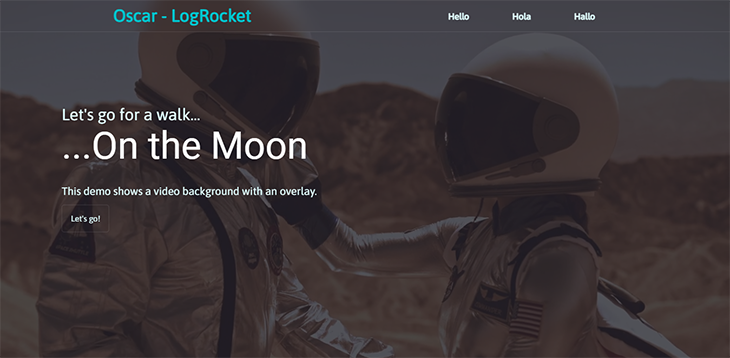
Much better.
Gradient overlays
Since we’re dealing with gradients, we’ll use the background-image property. Specifically, this is going to be a linear-gradient. The direction is up to you, but it’s best to go with horizontal or vertical directions to maintain consistency:
.overlay{
  background-image: linear-gradient(to right, rgba(34,35,46,0.75),
  rgba(0,194,203,0.5));
}

Make sure the part of the gradient that overlaps with the text is not affecting its readability.
Next up, we have the color-to-transparent gradients, that is, one color fading to nothing. You can set the point when the color transition starts:
background-image: linear-gradient(to right, rgba(34,35,46,0.75) 40%,
rgba(0,0,0,0));
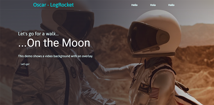
Here, the overlay transitions from a dark blue on the left to the original state of the video background on the right.
You can also have the transition happen vertically. The gradient blends into the next section just after the video background:
background-image: linear-gradient(to bottom, rgba(34,35,46,0.75) 50%, rgba(34,35,46));
See the Pen
Video background with gradient overlay by Oscar-Jite (@oscar-jite)
on CodePen.
Making video backgrounds responsive
The video background is usually static when resizing the window, the aspect ratio will not change. It’ll have some level of responsiveness, but it won’t scale as the viewport becomes smaller.
The most common (or universally accepted) aspect ratio is 16:9. It’s the default for almost all modern devices with a screen. We’re going to set our video background to maintain this aspect ratio using media queries:
@media (min-aspect-ratio: 16/9) {
  video {
    width: 100%;
    height: auto;
  }
}
@media (max-aspect-ratio: 16/9) {
  video {
    width: auto;
    height: 100%;
  }
}
Here, we’re saying that on any viewport wider than 16:9, the width should be fixed and the height scaled accordingly. It’s the opposite with smaller viewports.
We can’t be concerned about responsiveness and not talk about mobile devices. You can disable the video and just display an image for smaller screens to help performance. You should use a screenshot from the video as the image for consistency:
@media (max-width: 768px) {
    video {
    display: none;
  }
  #main{
    background: url(/snapshot.png);
    background-size: cover;
  }
}
Now the video won’t be shown on any device with a screen width less than 768px. Instead, they’ll see a static image.
Making video backgrounds performant
You’ve just learned how to make the video background responsive, now let’s make it performant.
Choosing when to play and pause the video
A video background doesn’t stop playing when it’s out of view. This can cause performance issues because your CPU is going to be working nonstop. You need a way to stop the video from playing when it’s out of view, and you can do this using the Intersection Observer API available in JavaScript.
This lets code register a callback function, executed whenever an element you wish to monitor enters or exits the viewport.
First, give the video an id, and then create an intersection observer:
let options = {
        root: null,
        rootMargin: '0px',
        threshold:1.0
      };
The options object contains the conditions for the callback. The root, set to null, is the browser’s viewport, or parent element. It’ll help in checking the visibility of the target element, the video background.
rootMargin is the margin around the root. You can choose to shrink the area around the viewport. It can hold up to four values, similar to the CSS margin property.
The threshold is what percentage of the element should be in the viewport before the callback is triggered. For this example, it’s set to 1.0, which means that 100 percent of the video’s area should be in the viewport before it plays.
Next, you target the element that is going to be observed. This is when you’ll need the id. The id we’re using is video-bg:
let observer = new IntersectionObserver(callback, options);
observer.observe(document.querySelector('#video-bg'));
Now, let’s create the callback function. It’ll hold two arguments: entries and observer:
let callback = (entries, observer)=>{
        entries.forEach(entry => {
          if(entry.isIntersecting){
            entry.target.play();
          }
          else{
            entry.target.pause();
          }
        });
      }
For each entry, the video intersects with the viewport. When it’s in view, the video, target, will play, and when it leaves the viewport, it’ll pause.
Here’s the complete JavaScript code:
      let options = {
        root: null,
        rootMargin: '0px',
        threshold:1.0
      };
      let callback = (entries, observer)=>{
        entries.forEach(entry => {
          if(entry.isIntersecting){
            entry.target.play();
          }
          else{
            entry.target.pause();
          }
        });
      }
      let observer = new IntersectionObserver(callback, options);
      observer.observe(document.querySelector('#video-bg'));
Now, the video background will only play when it’s completely inside the viewport.
Removing the video’s sound
Having a mute video will be less distracting, and that’s one less thing for the CPU to worry about. If you do want the sound, you can choose not to include the mute attribute in the HTML video tag from the start.
Using the right video formats
Some video formats are not compatible with HTML. Only three video formats are supported on HTML5, and they are MP4, WEBM, and Ogg. So you’ll need to convert your video to any of these formats before using it as a background.
Length and size
Keep the video short and small so it doesn’t take too much time to load before it plays. Compress the video if it’s too large.
The pause and play functions
Normally the video is set to autoplay, but you can add pause and play functionality. You’ve already seen how to pause the video based on visibility, but now you don’t have to wait until it exits the viewport.
First, you can pause the video when the mouse isn’t hovering on it. That is, the video background is active as long as the mouse is sitting over it:
const video = document.querySelectorAll('#video-bg');
      for (let i = 0; i<video.length; i++){
        video[i].addEventListener('mouseenter', function(e){
          video[i].play()
        })
        video[i].addEventListener('mouseout', function(e){
          video[i].pause()
        })
      }
Here, we target the video background using its id and then have event listeners play the video when the cursor is over it (mouseenter) and pause when the cursor leaves (mouseout). This works when there’s no overlay, so you can hover directly over the video.
If you want to keep the overlay, then a play/pause button is your best bet. You’ll need to create a button for this:
<button type="button" class="play-btn" id="play-btn">
          <span><i class="fas fa-play"></i></span>
  </button>

.play-btn{
  background: none;
  border: 1px solid rgba(255, 255, 255, 0.1);
  font-size: 22px;
  padding: 1rem;
  border-radius: 50%;
  width: 50px;
  height: 50px;
  display: inline-flex;
  justify-content: center;
  align-items: center;
  outline: none;
  color: #e0ffff;
}
This should be placed in an easily accessible area of the page, ideally close to the header text. We’re using a play icon from Font Awesome:
![]()
Next up, adding the functionality, we’re going to use jQuery. You’ll need to link this to your HTML file:
<script src="https://code.jquery.com/jquery-3.6.1.min.js"></script>
Here’s the complete function:
 const video = $('#video-bg');
      let playing = false;
      $('#play-btn').click(function(){
        if(playing = false){
          video.trigger("play");
          playing = true;
          $(this).html("<span><i class= 'fas fa-pause'></i></span>");
        } else {
          video.trigger("pause");
          playing = false;
          $(this).html("<span><i class= 'fas fa-play'></i></span>");
        }
      }
      )
Now you can pause and play the video background at will.
Other ways to use video backgrounds
Now we’ll discuss some other interesting ways to use video backgrounds on your site.
As a background video for text
You can add a text overlay over the video background using the mix-blend-mode CSS property. This property sets how an element should blend with the content of the parent element:
  <section>
    <video src="video.mp4" autoplay muted loop></video>
    <h1>AMONG THE STARS</h1>
  </section>
section h1{
  position: absolute;
  top: 0;
  left: 0;
  width: 100%;
  height: 100%;
  display: flex;
  justify-content: center;
  align-items: center;
  flex-direction: column;
  text-transform: uppercase;
  font-size: 7rem;
  color: #e0ffff;
  background: #22232e;
  mix-blend-mode: multiply;
}
See the Pen Video background with Text overlay by Oscar-Jite (@oscar-jite) on CodePen.
There are several values you can use with the mix-blend-mode property, but multiply is the one that allows you to see clean through the text. It adds an overlay to the rest of the page because you set the h1 element, holding the text, to take up 100 percent of its parent element.
As a video background slider
You can have multiple video backgrounds in a slider setup, which can be controlled. Go ahead and add other videos into the HTML:
<video class="video-bg active" src="video.mp4" muted autoplay loop></video>
    <video class="video-bg" src="video2.mp4" muted autoplay loop></video>
    <video class="video-bg" src="video3.mp4" muted autoplay loop></video>
Next, you create the slider control. This should be in the header section of the webpage:
<div class="slider-btns">
        <div class="slide-btn"></div>
        <div class="slide-btn"></div>
        <div class="slide-btn"></div>
</div>
.slider-btns{
  position: relative;
  display: flex;
  justify-content: center;
  align-items: center;
  transform: translateY(50px);
  z-index: 100;
}
.slide-btn{
  width: 10px;
  height: 10px;
  background: #e0ffff;
  border-radius: 50%;
  cursor: pointer;
}
.slide-btn.active{
  background: #00c2cb;
}
.slide-btn:not(:last-child){
  margin-right: 20px;
}
.slide-btn:hover{
  transform: scale(1.2);
}
The .active class is for when the slider is functional. Now, it’s time for JavaScript. You’re creating identical statements for the slider buttons changing color, and the video background changing.
Start by targeting the elements:
const btns =document.querySelectorAll(".slide-btn");
const slider =document.querySelectorAll(".video-bg");
Then the main function:
var slideVideo = function(index) {
      btns.forEach((btn) => {
        btn.classList.remove('active');
      });
      slider.forEach((slide) => {
        slide.classList.remove('active');
      });
      btns[index].classList.add('active');
      slider[index].classList.add('active');
    }
    btns.forEach((btn,i) => {
      btn.addEventListener('click', () => {
        slideVideo(i);
      });
    });
You can have a nice transition effect with clip-part:
.video-bg{
  position: absolute;
  width: 100%;
  clip-path: circle(0% at 0 50%);
}
.video-bg.active{
  clip-path: circle(150% at 0 50%);
  transition: 1s ease;
  transition-property: clip-path;
}
And here’s the result:
See the Pen
Multiple Video Background Slider by Oscar-Jite (@oscar-jite)
on CodePen.
And there you go, you can now use videos as a background on your website.
Browser compatibility
We used a few elements and attributes, and we want to be sure they work on any device.
The main element, the video tag, is compatible with all modern browsers, however, it’s not supported on Safari 3.1–3.2, Firefox 2–3, Opera 10.1, and IE 6–8. Firefox 3.5–19 supports the video element but not the loop attribute.
The mix-blend-loop property isn’t supported on any version of Internet Explorer, as well as Chrome 4–40, Edge 12–18, Safari 3.1–7.1, Firefox 2–31, or Opera 10–27.
clip-path is a bit complex, as there are a lot of shapes that you can use with this property. You can find a detailed analysis on CanIUse.
Conclusion
Video backgrounds are unique and eye-catching. Remember to use videos that match the overall theme of your website and take the users on a journey.
Video backgrounds can look great in their original state, but adding an overlay won’t cause any harm when done right. You can make the overlay a plain color or a gradient. Gradients open the door to a lot of possibilities so do try out different color combinations.
The other great things you can do with a video background are having a text overlay or multiple backgrounds. The choice is yours!
The post Optimizing video backgrounds in CSS and JavaScript appeared first on LogRocket Blog.
from LogRocket Blog https://ift.tt/DKPwho5
Gain $200 in a week
via Read more


