A dropdown menu makes it easy for users to navigate web applications and sites. With CSS, we can create an amazing, responsive, accessible dropdown menu for both keyboard and mouse users.
The CSS dropdown approach in this lesson uses:
- The
:focus-withinpseudo-class to activate the dropdown items - An input checkbox to toggle the main dropdown on smaller screens
- Semantic HTML elements and ARIA attributes to assist screen readers
While these techniques do not require JavaScript, you can improve their implementation with JavaScript, especially for screen reader users.
We will cover the following in this lesson:
- A preview of our dropdown with CSS project
- Dropdown menu markup
- Mobile-first dropdown menu design with CSS
- Toggling the dropdown block
- Using the
:focus-withinpseudo-class - Implementing a transition to the dropdown
- Enhancing CSS dropdown menu for screen readers
- Designing dropdown menus for larger screens with CSS
- Accessibility support for the Safari browser
A preview of our dropdown with CSS project
At the end of this lesson, we will have a responsive dropdown menu with CSS that looks like so:

You can interact with the project on CodePen to see our final project in action. After that, let’s get started!
Dropdown menu markup
Building an accessible dropdown menu with CSS begins by using semantic HTML5 markup and structuring the menu to guide users to their destination.
The code below sets up some simple navigation with three primary menu items — Home, Services, and About. The Services item contains a dropdown with three nested ul submenu items:
<header>
  <div class="header-content">

    <a href="#" class="logo">Logo</a>

    <input type="checkbox" id="hamburger">
    <label for="hamburger"><span></span></label>

    <nav>
      <ul class="menus">
        <li><a href="#">Home</a></li>
        <li>
          <button type="button">Services</button>
          <ul class="dropdown">
            <li><a href="#">Web design</a></li>
            <li><a href="#">Web dev</a></li>
            <li><a href="#">Web</a></li>
          </ul>
        </li>
        <li><a href="#">About</a></li>
      </ul>
    </nav>
  </div>
</header>
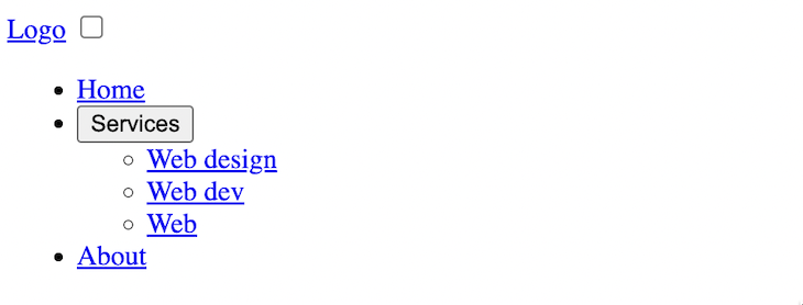
By using unordered list items, screen readers will know how many links are in the navigation. The output should look like so:

The checkbox included in the code and as seen in the image will be used to toggle the main dropdown on smaller screens.
Mobile-first dropdown menu design with CSS
We’ll start by styling the navigation for smaller screens. In the CSS file, we’ll add the following styles:
* {
  margin: 0;
  padding: 0;
  box-sizing: border-box;
}

body {
  font-family: sans-serif;
}

header {
  position: relative;
  box-shadow: 0 1px 3px 0 rgba(0, 0, 0, 0.07), 0 1px 2px 0 rgba(0, 0, 0, 0.05);
}

.header-content {
  align-items: center;
  max-width: 1200px;
  margin: 0 auto;
  padding: 10px 20px;
  color: #212529;
}

.logo {
  text-decoration: none;
  font-size: 25px;
  color: inherit;
  margin-right: 20px;
}

label {
  padding: 23px 20px;
  position: absolute;
  cursor: pointer;
  right: 0;
  top: 0;
}

input[type="checkbox"] {
  opacity: 0;
  position: absolute;
  right: 0;
}

label span {
  width: 20px;
  height: 3px;
  display: block;
  background: #4f3e3e;
  position: relative;
}

label span::after, label span::before {
  content: "";
  position: absolute;
  display: block;
  background: inherit;
  width: inherit;
  height: inherit;
}

label span::before{
  top: 8px;
}

label span::after {
  bottom: 8px;
}

label::before {
  position: absolute;
  content: "";
  width: 58px;
  height: 49px;
  top: 0;
  right: 0;
}

input[type="checkbox"]:focus + label::before {
  box-shadow: 0 0 20px black;
}

ul {
  background: #f2f2f2;
}

ul li {
   list-style: none;
   font-size: 18px;
}

ul li button {
    font-size: inherit;
    border: none;
    background-color: transparent;
    cursor: pointer;
    width: 100%;
}

ul li a {
   display: block;
   color: inherit;
   text-decoration: none;
}

ul li a, ul li button {
  padding: 0.7rem 1rem;
  text-align: left;
}

.menus {
  position: absolute;
  top: 3.2rem;
  left: 0;
  right: 0;
}

.dropdown {
  padding: 2px 1.5rem;
}
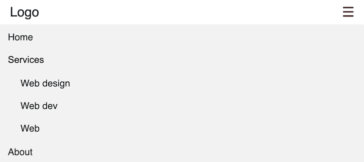
Now we should have a dropdown menu that looks like so:

Let’s get into the code in the next section.
What is happening in the CSS?
Using the CSS position: absolute; on the .menus class selector, we placed the navigation dropdown relative to the header bar, as seen in the image above.
After that, we used the ::before and ::after pseudo-class to transform the input checkbox into a custom hamburger menu to activate a dropdown on smaller screens.
Be aware that we used opacity: 0; to hide the input checkbox instead of a display: none; property:
input[type="checkbox"] {
  opacity: 0;
  /* ... */
}
Meanwhile, with the code below, the hamburger icon can receive a focus when a keyboard user navigates via the tab key:
input[type="checkbox"]:focus + label::before {
  box-shadow: 0 0 20px black;
}
Toggling the dropdown block
Allowing users to toggle the dropdown menu can greatly enhance the UX — especially on smaller mobile screens, where an always-visible menu would obscure most or all of the viewport.
We will first hide the dropdown using the CSS visibility property:
.menus {
  /* ... */
  /* hide dropdown on small screens */
  visibility: hidden;
}
Then, toggle the dropdown when the hamburger is clicked:
/* toggle main dropdown */

input[type="checkbox"]:checked ~ nav > ul {
  visibility: visible;
}
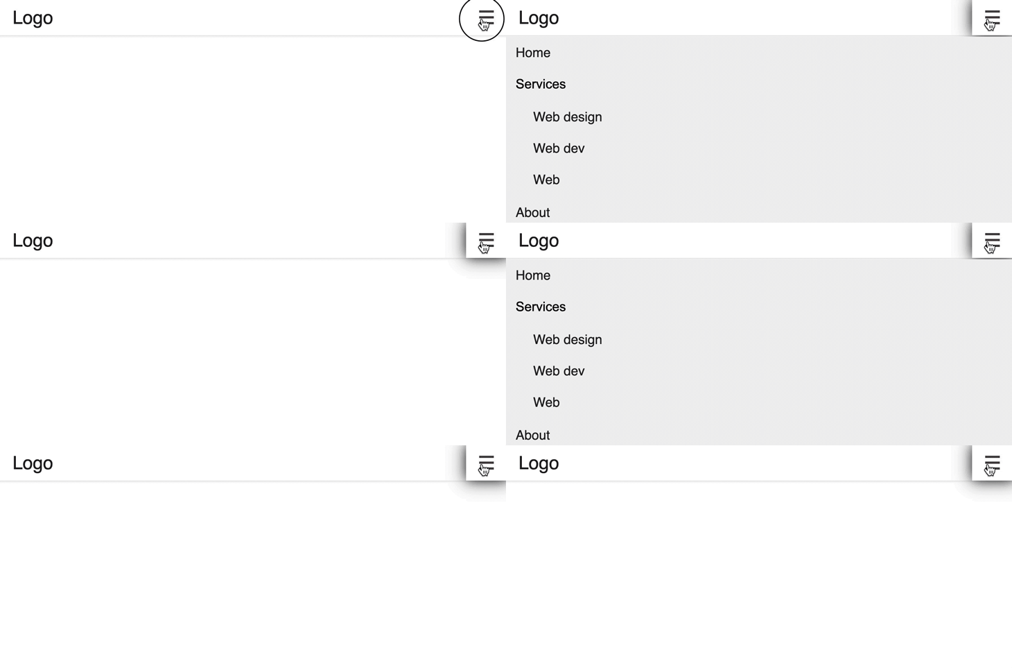
The CSS rule above targets the dropdown ul dropdown that is a direct child to the nav element following the input checkbox. The behavior should look like so:

Using the :focus-within pseudo-class
We will use the CSS :focus-within to activate the Services dropdown items when the Services menu item receives a focus or is being clicked.
Let’s update the .dropdown class selector to hide the Services dropdown items:
.dropdown {
  /* ... */
  height: 0;
  overflow: hidden;
}
Then, add this rule to active the dropdown:
li:focus-within .dropdown {
  height: 135px;
}
The CSS rule above matches the dropdown if the parent li element is focused. In other words, the submenu will display if we click on the Services item or focus on it via the tab key.
Adding a dropdown indicator
We’ll add a dropdown arrow to the Services item to indicate that a dropdown exists. Let’s update the Services item to include a span element with an arrow class name:
<li>
  <button type="button">Services <span class="arrow"></span></button>
  <ul class="dropdown">
    <!-- ... -->
  </ul>
</li>
In the CSS, we will add a style rule for the class selector:
.arrow {
  width: 0.5em;
  height: 0.5em;
  display: inline-block;
  vertical-align: middle;
  border-left: 0.15em solid currentColor;
  border-bottom: 0.15em solid currentColor;
  transform: rotate(-45deg);
  margin-left: 0.38em;
  margin-top: -0.25em;
}
If we save, we should have the arrow placed next to the Services menu item, like so:

To rotate the arrow upward when the dropdown is opened, we will add the following CSS rule:
li:focus-within > button > .arrow {
  transform: rotate(-225deg);
  margin-top: 4px;
}
Implementing a transition to the dropdown
We’ll add a smooth transition effect for when the user opens or closes the dropdown menu. Starting with the main dropdown menu, we’ll update the .menus to include transform and transition CSS properties:
.menus {
  /* ... */
  /* smooth transitioning */
  transform: translateY(-1em);
  transition: transform ease 0.2s;
}
Then, when the dropdown is active, we will use the transform CSS property to move the dropdown back to its original position:
input[type="checkbox"]:checked ~ nav > ul {
  /* ... */
  transform: translateY(0);
}
Next, we will add a transition to the Services dropdown and its arrow indicator. Let’s update the .dropdown to transition the height property like so:
.dropdown {
  /* ... */
  transition: height ease 0.2s;
}
Then, for the arrow, we’ll transition the transform property so we have the following:
.arrow {
  /* ... */
  transition: transform 100ms ease-in-out;
}
If we save the CSS, the dropdown should behave like so:

Enhancing CSS dropdown menu for screen readers
Adding ARIA attributes to the dropdown will help screen readers convey the intended behavior and purpose for visually impaired users.
We’ll add an aria-label attribute to interactive elements so that screen reader software can announce the purpose of the control while navigating through the dropdown menu. Meanwhile, the aria-haspopup attribute will inform screen readers that there is a popup.
The aria-controls attribute will map the controlling element to the expanded widget. We’ll set the id of the expanded widget to the value of the aria-controls attribute on the controlling element.
Finally, aria-expanded will tell the screen reader if a dropdown is presently hidden or not. It needs to toggle between true or false depending on the state of the dropdown. This is one place we can improve the dropdown accessibility with JavaScript.
With our CSS implementation, the :focus-within pseudo-class will immediately open the dropdown when visually impaired users move the focus to the dropdown item. For this, by assigning a Boolean value of true to the aria-expanded, the screen reader’s software will interpret the dropdown widget correctly.
We can install the Chrome extension Screen Reader to observe the interpretation.
Let’s update the HTML markup to include the ARIA attributes:
<header>
 <div class="header-content">
  <!--... -->
  <input type="checkbox" id="hamburger" aria-label="menu button">
  <label for="hamburger"><span></span></label>

  <nav aria-label="main navigation">
   <ul class="menus">
    <!-- ...-->
    <li>
     <button
      type="button"
      aria-haspopup="true"
      aria-expanded="true"
      aria-controls="dropdown1"
     >
      Services<span class="arrow"></span>
     </button>
     <ul class="dropdown" id="dropdown1">
      <!--... -->
     </ul>
    </li>
    <!--... -->
   </ul>
  </nav>
 </div>
</header>
If we use the keyboard to navigate the dropdown, the behavior will look like so:

As we can see, once we move the focus to the Services item, the dropdown opens immediately. Thus, the screen reader will correctly announce the expansion.
Designing dropdown menus for larger screens with CSS
We will use the CSS media queries and define the style rules for a screen width of 640px and above:
/* MEDIA QUERIES */
@media (min-width: 640px) {

 .header-content {
  display: flex;
 }

 .menus {
  position: static;
  visibility: visible;
  background: #fff;
  display: flex;
  transform: initial;
 }

 label, input[type="checkbox"] {
  display: none;
 }

 ul li {
  position: relative;
  font-size: 14px;
 }

 ul li a:hover,
 ul li button:hover {
  background-color: #f2f2f2;
 }

 .dropdown {
  position: absolute;
  right: 0;
  left: auto;
  box-shadow: 0 10px 15px -3px rgba(46, 41, 51, 0.08),
  0 4px 6px -2px rgba(71, 63, 79, 0.16);
  z-index: 99;
  min-width: 10rem;
  padding: 0;
  background-color: #fff;
  border-radius: 0 0 0.5rem 0.5rem;
 }

 ul li:hover .dropdown {
  height: 135px;
 }

 ul li:hover > button > .arrow {
  transform: rotate(-225deg);
  margin-top: 4px;
 }
}
In the above CSS, we started by adding a display: flex; to the header content to position the logo, and navigation menus side-by-side. After, we added a position: static; declaration on the navigation content to override the absolute positioning we used for mobile design and place the nav items in the normal flow of the page.
It is also important to note how we included rules to activate the dropdown on hover with the :hover pseudo-class. The result now looks like so:

Accessibility support for the Safari browser
By default, using the tab key for navigation is disabled in Safari. We can enable it by opening our Safari Preferences and opening our Advanced settings. Then, in the Accessibility section, we can check the checkbox labeled “Press Tab to highlight each item on a webpage.”
We may also notice that clicking on the Services menu item does not show a dropdown in Safari. An element on Safari will get a :focus-within if it has a tabindex="0". So, we will update the li for Services to include a tabindex:
<li tabindex="0">
  <button
    <!--  ...   -->
  >
    Services<span class="arrow"></span>
  </button>
  <ul class="dropdown" id="dropdown1">
    <!--  ... -->
  </ul>
</li>
The dropdown should now work as expected.
Conclusion
Creating a fantastic dropdown menu is possible with CSS, as shown in this lesson. The dropdown is accessible by keyboard, mouse, and screen-reader users. We can further improve on CSS dropdown menus using a scripting language like JavaScript.
Dropdown menus are a common design pattern in modern apps. To learn more about them, you can look at building a multilevel dropdown menu in React.
If you have questions or contributions, please share your thought in the comment section. Finally, endeavor to share this lesson around the web.
The post Making dropdown menus with CSS for your apps appeared first on LogRocket Blog.
from LogRocket Blog https://ift.tt/io7lrZv
Gain $200 in a week
via Read more


