Testing is an absolute essential for any codebase, helping you catch hard-to-find bugs before your users do and serving as documentation of how your code should work. As your project grows and becomes more complex, having thorough documentation along with a bug-free codebase becomes increasingly important for the UX and the security of your application.
If you’re using Vue, Cypress is one of the best tools available for testing your application. In this article, we’ll learn how to test individual Vue components with Cypress.
To follow along with this tutorial, you’ll need:
- A text editor
- Node.js installed locally
- Working knowledge of HTML, CSS, JavaScript, Vue, and Cypress
Keep in mind that this tutorial uses Vue 3 and the Composition API.
Table of contents
- Component tests vs. E2E tests
- Why Cypress?
- Testing Vue components with Cypress
- Project setup
- Building the component
- Writing the tests
Component tests vs. E2E tests
The goal of an end-to-end (E2E) test is to experience your entire application in the same way that an end user would, ensuring that it works as intended. While a component test uses the same general idea, it focuses on testing each component of your frontend as an independent piece without considering how well the component works together with everything else. Therefore, even if all of your component tests pass, it doesn’t guarantee that your app is working correctly as a whole.
So, why bother with component testing? Component tests are quicker to write, requiring much less setup and infrastructure. If you’re building a library, component tests are invaluable because it’s much more sensible to test each component individually. When testing an application, it’s easier to fix issues within a component that might’ve been hard to pinpoint in an E2E test due to the component’s smaller scope. Ideally, your project should have a mix of both component and E2E tests.
Why Cypress?
The Vue docs recommend Cypress for testing components whose behavior depends on rendering styles. In addition, Cypress is free, open source, and easy to set up and install. Cypress tests are easy to read and write, and it has very thorough documentation.
Testing Vue components with Cypress
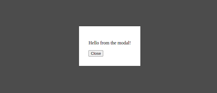
First, we’ll learn how to add Cypress to our Vue project, and then we’ll write tests for our Cypress components. In this tutorial, we’ll test a simple modal that looks like the image below:

Project setup
First, open up your terminal and navigate to the directory where you want your project to live. Next, run the following command in your terminal to create an application with Vue and Vite:
npm init vue@latest
The command will prompt you to answer a series of questions; answer them with the configuration shown below:

Now, you should have a new directory called first-component-test. Run the following commands:
cd first-component-test
npm install
npm run dev
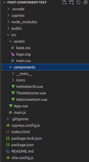
The code above will switch directories for you, install the necessary dependencies, and then start a development server for your application. Now, the first-component-test directory should have the following structure:

Let’s remove some unnecessary files from this project. Go into cypress/support/component.js and remove the following line:
import '@/assets/main.css'
Delete the src/assets and src/components/icons folders. Delete all the .vue files inside src/components, and, in their place, create a file in src/components called Modal.vue.
Replace the contents of src/App.vue with the following code:
<script setup>
import Modal from "./components/Modal.vue"
</script>

<template>
  <Modal />
</template>
Finally, remove the following line from src/main.js:
import './assets/main.css'
With that, you’re good to go!
Building the component
Since the focus of this tutorial is testing, and this modal is a simple component, we won’t spend much time on the code for it. Add the following code into src/components/Modal.vue:
<template>
  <button
      @click="open = true; $emit('modalOpened')"
      data-cy="open-button"
  >
      Open Modal
  </button>

  <Teleport to="body">
    <div v-show="open" class="modal" data-cy="modal-body">
      <div class="content"
           data-cy="modal-content"
           :style="{backgroundColor: contentColor}"
      >
        <div data-cy="default-slot">
          <slot>
            <p>Hello from the modal!</p>
          </slot>
        </div>
        <div data-cy="extra-slot">
          <slot name="extra"></slot>
        </div>
        <button @click="open = false; $emit('modalClosed')" data-cy="close-modal">Close</button>
      </div>
    </div>
  </Teleport>
</template>
<script setup>
import {ref} from "vue";
const open = ref(false);
const props  = defineProps({
  color: String
})
const contentColor = props.color ? props.color : "white"
defineEmits(['modalOpened', 'modalClosed'])
</script>
<style scoped>
.modal {
  position: fixed;
  height: 100%;
  top: 0;
  left: 0;
  right: 0;
  background-color: rgba(0,0,0, 0.7);
  display: flex;
  justify-content: center;
  align-items: center;
}
.modal > .content {
  width: fit-content;
  padding: 2rem;
}
</style>
The code above contains the template for the button that opens the modal and the modal body itself, a close button, and a couple of slots. It also contains the logic that controls opening and closing the modal, logic that lets the modal accept a prop called color, logic to emit events when the modal opens and closes, and a small amount of styling.
Writing the tests
Next, you’ll write a set of tests to check that the modal works correctly. Start by creating a new file in your src/components/__tests__ folder called modal.cy.js. Then, add the following code into modal.cy.js:
import Modal from "../Modal.vue"

describe("Modal component tests", () => {
    const modalBodySelector = '[data-cy="modal-body"]'
    const modalContentSelector = '[data-cy="modal-content"]'
    const openButtonSelector = '[data-cy="open-button"]'
    const closeButtonSelector = '[data-cy="close-modal"]'
})
The code above imports your Modal component and creates selectors that target portions of the modal’s template.
Testing that the modal renders
The first test we’ll write checks that the modal opens and closes and that its structure is intact. Write the following code inside the describe block after the last const statement:
it ("opens and closes correctly", () => {
        cy.mount(Modal)
        cy.get(modalBodySelector).should("not.be.visible")
        cy.get(openButtonSelector).should("have.text", " Open Modal ").click()
        cy.get(modalBodySelector).should("be.visible")
        cy.get(modalContentSelector)
            .should("be.visible")
            .should("have.css", "background-color", "rgb(255, 255, 255)")
        cy.get(closeButtonSelector).click()
        cy.get(modalBodySelector).should("not.be.visible")
})
The test begins by mounting the Modal component, creating it, and attaching it the DOM with the cy.mount command, a custom command that Cypress added while it was setting up to allow you to mount individual components.
The rest of the test is standard Cypress. It ensures that the body of the modal isn’t visible and that the open button exists and has the correct text. Next, it clicks the open button and ensures that the modal body is visible and that its content has the correct background color, white. It then clicks the close button and checks that the modal body is invisible once again.
Now, you can run your test. Open a new terminal window and run the following command to start the Cypress test runner:
npm run test:unit
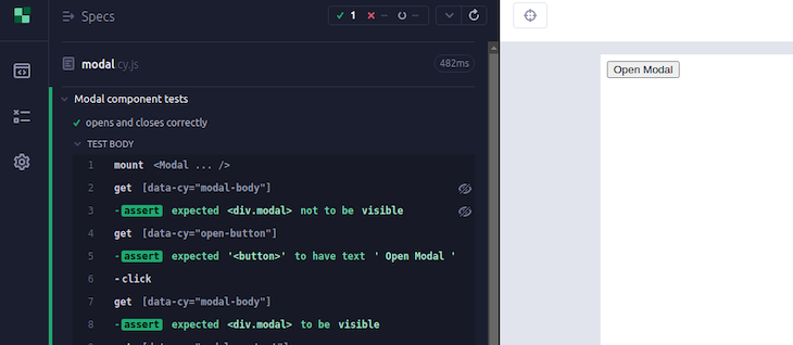
In the dialog, choose whichever browser you prefer, then click on modal.cy.js to run your test. You should see it pass like in the following image:

Now that Cypress is open, the test will rerun whenever you make changes to modal.cy.js.
Testing the prop
Next, we’ll write a test to check that when the color prop passes a value to the modal, the modal’s background color matches the value. Add the following code after the previous it block:
 it ("changes color in response to props", () => {
        cy.mount(Modal, { props: {color: 'red'} })
        cy.get(openButtonSelector).click()
        cy.get(modalContentSelector)
            .should("be.visible")
            .and("have.css", "background-color", "rgb(255, 0, 0)")
})
Just like in the first test, the first step is to mount the component. But here, we’re doing something new. We’re passing cy.mount an options object with a property called props. The props property allows you to pass props to your mounted component. In this test, we’re passing in the prop called color with a value of red.
After mounting, the test opens the modal, then checks that the background color is the same as the prop you passed in. If you open Cypress again, you should see that the new test is passing, and the modal’s background is now red:

Testing emitted events
Now, we’ll write a test to make sure that the modal emits events when it opens and closes. Add the following code after the last it block:
it ("fires the right event when the modal opens", () => {
        const openSpy = cy.spy().as('openSpy')
        cy.mount(Modal, { props: {onModalOpened: openSpy} })
        cy.get(openButtonSelector).click()
        cy.get('@openSpy').should("have.been.called")
})

it ("fires the right event when the modal closes", () => {
        const closeSpy = cy.spy().as('closeSpy')
        cy.mount(Modal, { props: {onModalClosed: closeSpy} })
        cy.get(openButtonSelector).click()
        cy.get(closeButtonSelector).click()
        cy.get('@closeSpy').should("have.been.called")
})
The first test kicks things off by creating a Cypress spy, which is a function wrapper that allows you to track when the function it wraps is called, then aliasing it as openSpy. You’re aliasing the spy so that Cypress can use its alias for debugging purposes.
After creating a spy, the test mounts Modal and assigns openSpy to the modalOpened event. Therefore, whenever modalOpened fires, openSpy will be called. It then opens the modal and asserts that openSpy was actually called. The second test follows a similar process with a spy aliased as closeSpy and the modalClosed event.
Testing slots
We’ll write one final test to ensure that the slots of your modal work as they should. Add the following code after the last it block:
it ("renders the correct content when given slots", () => {
        const slots = {
            default: () => 'Some default content',
            extra: () => 'Some extra text',
        }
        cy.mount(Modal, { slots })
        cy.get(openButtonSelector).click()
        cy.get("[data-cy='default-slot']")
            .should('not.have.text', 'Hello from the modal!')
            .and('have.text', 'Some default content')
        cy.get("[data-cy='extra-slot']")
            .and('have.text', 'Some extra text',)
})
The test begins by creating a slots object with two properties, default and extra. The value of each property is a function that returns a text value, and the names of the properties correspond to the names of the slots you’re testing.
Next, the test mounts Modal and passes cy.mount an options object, just like before. However, this time, instead of having a props property, you’re passing your slots as the value of the slots property. Next, the test opens the modal, checks that the modal doesn’t have the default text, and makes sure that it has the text you passed in with the slots.
If you open Cypress, you should now see that the modal has the correct text content:

Conclusion
In this article, we learned how component testing differs from E2E testing, why you should use Cypress for component testing, and the basics of how to test your Vue components with Cypress. If you’d like to explore more about testing Vue components in Cypress, check out the docs. Thanks for reading, and happy testing!
The post A guide to automated testing in Vue with Cypress appeared first on LogRocket Blog.
from LogRocket Blog https://ift.tt/SYputVR
Gain $200 in a week
via Read more


