


Writing CSS-in-JS is popular when building component-based applications like React. This technique lets us build applications without navigating between components and stylesheets. It also provides a way to enhance our app’s CSS by capitalizing on the JavaScript environment.
Many libraries are available to simplify how we write CSS-in-JS. They provide additional benefits, including automatic vendor prefixes, familiar CSS syntax, CSS component scoping, nesting, and so on.
In this article, we will explore how to use a zero-runtime CSS-in-JS library called Linaria in React applications. We will cover:
- What is Linaria?
- What makes Linaria hard to set up in React apps?
- Setting up Linaria without Create React App
- Linaria syntax and usage
- Using Atomic CSS with Linaria
- Writing global styles in Linaria
- Using Linaria with Create React App
To follow along, ensure you have a basic understanding of React.
What is Linaria?
Some popular libraries, called runtime libraries, include styled-components and Emotion. This means they will parse the CSS-in-JS, generate the actual CSS, and inject it into the project during runtime — i.e., when the page loads in the browser.
These operations introduce additional runtime overhead and may therefore cause performance bottlenecks.
Linaria is a build-time CSS-in-JS library. It lets us write CSS inside JavaScript like the runtime libraries mentioned earlier. But rather than bundling the CSS with JS — which increases the bundle size — it extracts the styles into a static CSS file at build time, eliminating the extra workload in the runtime.
With this implementation, CSS and JavaScript resources can load in parallel, providing an additional performance boost and, in the end, improving the load time.
What makes Linaria hard to set up in React apps?
Adding Linaria in React can be a daunting task. Unlike most CSS-in-JS libraries that require minimal setup, Linaria requires us to customize a bundler like webpack. We can then include a webpack loader to extract CSS from JS at build time.
React projects created with the create-react-app CLI have webpack preconfigured already. But this setup does not support customizing webpack out of the box unless we run the eject script, which is not advisable.
However, we can use external libraries like customize-cra with react-app-rewired to tweak the webpack configuration.
In the next section, we will cover how to add Linaria to a React project without the create-react-app CLI. Later in this lesson, we will cover Linaria integration in a create-react-app setup.
Setting up Linaria without Create React App
Let’s start by downloading a React starter project that I’ve created without the create-react-app CLI. The command below will clone the project from the GitHub repository:
git clone https://github.com/Ibaslogic/react-without-cra-starter
Like every React development environment, the project contains Babel and webpack installations. We will use the webpack config file in the project root to include the webpack loader that Linaria requires.
Let’s run npm install from the project directory and then start the project using the npm start command.
Installing the Linaria library
Run the following command to install the Linaria core library and its dependencies:
npm install @linaria/core @linaria/react @linaria/babel-preset @linaria/webpack-loader
Next, locate the webpack.config.js file in the project root and add the @linaria/webpack-loader after the babel-loader in the module.rules:
{
  test: /\.(js|jsx)$/,
  exclude: /node_modules/,
  use: [
    { loader: 'babel-loader' },
    {
      loader: '@linaria/webpack-loader',
      options: {
        sourceMap: process.env.NODE_ENV !== 'production',
      },
    },
  ],
},
In the rule below, we are telling webpack to use babel-loader to transpile JavaScript files using the Babel presets that we have added in the .babelrc Babel config file:
{
  "presets": [
    "@babel/preset-env",
    ["@babel/preset-react", {
      "runtime" : "automatic"
    }]
  ]
}
In the webpack config file, you may notice that we included css-loader and MiniCssExtractPlugin. Linaria depends on them to extract the styles:
{
  test: /\.css$/,
  use: [MiniCssExtractPlugin.loader, 'css-loader'],
},
The code above is equivalent to the following:
{
  test: /\.css$/,
  use: [
    {
      loader: MiniCssExtractPlugin.loader,
    },
    {
      loader: 'css-loader',
    },
  ],
},
We may also enable the optional SourceMap in development mode, which lets us see the source of class names from the browser’s dev tools for debugging purposes:
{
  test: /\.css$/,
  use: [
    {
      loader: MiniCssExtractPlugin.loader,
    },
    {
      loader: 'css-loader',
      options: {
        sourceMap: process.env.NODE_ENV !== 'production',
      },
    },
  ],
},
Save all files. Restart your application and ensure it still works.
Linaria syntax and usage
Linaria provides access to APIs like css tagged template literals, the styled tag, and cx helper functions. So, let’s apply them in our project.
css tagged template literals
A css tagged template literal is a JavaScript function containing style declarations in regular CSS syntax. To apply it in our project, open the src/components/App.js file, import the css string tag from the core library, and use it like so:
import React from 'react';
import { css } from '@linaria/core';

const App = () => {
  return <h1 className={eleStyle}>Hello React</h1>;
};

export default App;

const eleStyle = css`
  color: red;
  font-size: 3rem;
`;
If we save the file, our application should look like so:
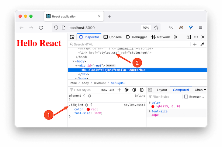
The css string tag evaluates to a unique class name whose style rules are extracted into a styles.css file. This file name is defined in the webpack config.
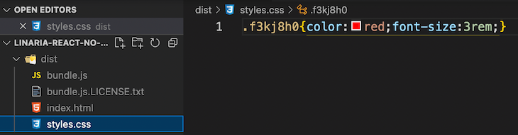
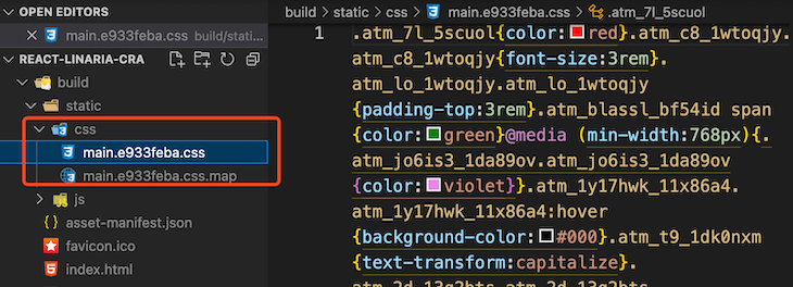
If we run a build command with npm run build, we will generate a build folder called dist in the project root containing production-ready files, which includes the static styles.css file.
Object interpolations
Linaria allows object style interpolations so that we can work with libraries that output object-based styles.
const objStyle = {
  paddingTop: '3rem',
};

const eleStyle = css`
  color: red;
  font-size: 3rem;

  ${objStyle}
`;
The object style is evaluated to a CSS string at build time before being inserted into the stylesheet. The equivalent looks like so:
const eleStyle = css`
  color: red;
  font-size: 3rem;

  padding-top: 3rem;
`;
Nesting
Similar to Sass and other CSS-in-JS libraries, Linaria also supports CSS nesting:
const App = () => {
  return (
    <h1 className={eleStyle}>
      Hello React <span>world!</span>
    </h1>
  );
};

export default App;

const eleStyle = css`

  /* ... */

  span {
    color: green;
  }

  @media (min-width: 768px) {
    color: violet;
  }
  &:hover {
    background-color: black;
  }
`;
cx helper function
The cx helper lets us pass a list of class names to style an element. Like the css tagged template, we will also import the cx from the core:
import { css, cx } from '@linaria/core';

const App = () => {
  return (
    <>
      {/* ... */}
      <p className={cx(class1, class2)}>
        Using the cx helper function
      </p>
    </>
  );
};

export default App;

const class1 = css`
  text-transform: capitalize;
  background-color: blue;
`;
const class2 = css`
  color: white;
  background-color: green;
`;
The output now looks like so:
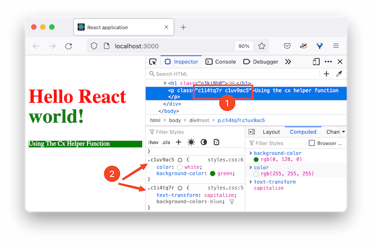
As you can see in the image above, the class list passed to the cx helper evaluates to separate class names.
styled tag
This syntax supports the same features as the css tagged template, but with the addition of prop-based styling. The styled tag lets us write component styles similar to the styled-components library.
Let’s import the styled tag from the @linaria/react module and use it like so:
import { styled } from '@linaria/react';

const App = () => {
  return (
    <>
      {/* ... */}

      <Button>click me</Button>
    </>
  );
};

export default App;

const Button = styled.button`
  background-color: blue;
  border: none;
  color: white;
  padding: 8px 12px;
  border-radius: 4px;
  margin-right: 3px;
  cursor: pointer;
`;
In the code above, we created a Button style component using the styled tag followed by the button HTML tag and its style rules.
Override or inherit style rules in Linaria
We can extend the styled tag to inherit style rules. In the following code, we will render a FancyButton style component that inherits style rules from a Button component. We will do this using the styled(...) tag:
const App = () => {
  return (
    <>
      {/* ... */}

      <Button>click me</Button>
      <FancyButton>Another button</FancyButton>
    </>
  );
};

export default App;

const Button = styled.button`
  /* ... */
`;

const FancyButton = styled(Button)`
  background-color: black;
  text-decoration: underline;
`;
The result looks like so:
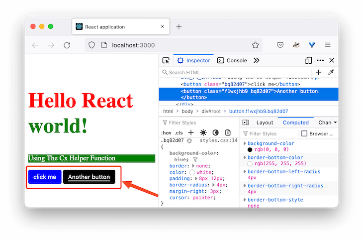
As you can see in the image above, the button labeled click me uses the default button style with a blue background. However, by extending the styled tag, we can also have a fancy button labeled Another button with a black background and underlined text.
Prop-based styles
The styled tag support dynamic styling where we style components based on their props. The code below renders styled components that take primary and success props:
import { styled } from '@linaria/react';

const App = () => {
  return (
    <>
      {/* ... */}

      <Button primary>click me</Button>
      <FancyButton>Another button</FancyButton>
      <FancyButton success>Success</FancyButton>
    </>
  );
};

export default App;

const Button = styled.button`
  /* background-color: blue; */
  border: none;
  color: white;
  padding: 8px 12px;
  border-radius: 4px;
  margin-right: 3px;
  cursor: pointer;
  background-color: ${(props) =>
    props.primary ? 'blue' : props.success ? 'green' : 'red'};
`;

const FancyButton = styled(Button)`
  /* background-color: black; */
  text-decoration: underline;
`;
We have access to the component’s props as a function argument in the function interpolation. Using the ternary operator, we checked whether the prop received is primary or success or none and then style accordingly. The dynamic function interpolation will compile down to CSS variables at build time.
See the result:
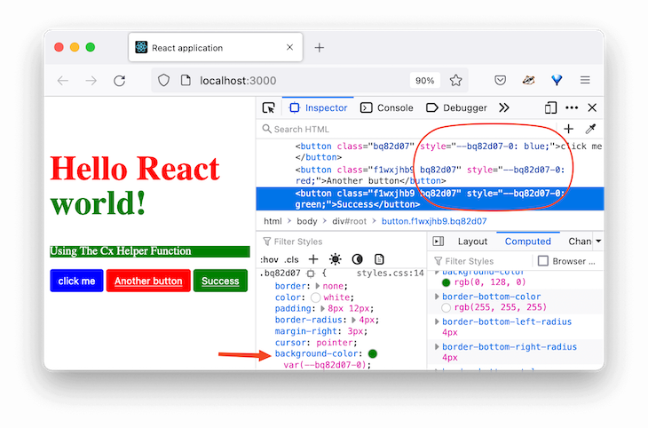
As you can see in the image above, the function interpolation is compiled to a CSS variable and dynamically updated at runtime.
Using Atomic CSS with Linaria
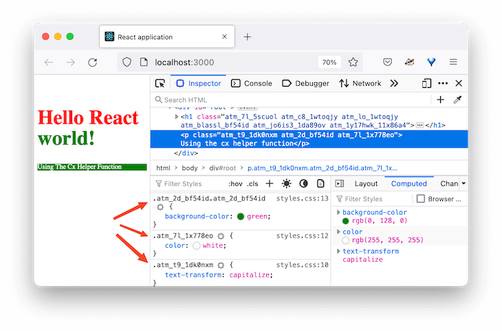
Linaria also supports Atomic styles so that every class selector can only produce one style rule.
In the image above, we can see that the green background color overrules the blue color. That was expected because the rule declared last takes precedence due to the cascade principle.
However, we can tell Linaria to look at the declaration and filter duplicates, thereby resulting in smaller bundle size.
To add Atomic CSS support, let’s install @linaria/atomic with the following command:
npm install @linaria/atomic
To use it, we must ensure that the css tagged template is imported from the Atomic module instead of the core:
// import { css, cx } from '@linaria/core';
import { cx } from '@linaria/core';
import { css } from '@linaria/atomic';

const App = () => {
  return (
    <>
      {/* ... */}

      <p className={cx(class1, class2)}>
        Using the cx helper function
      </p>
    </>
  );
};
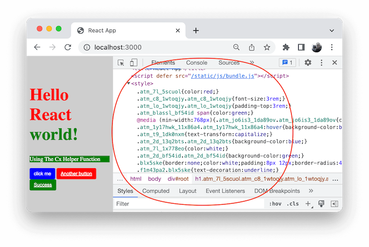
If we save the file, the result should now look like so:
As seen above, every class selector now produces only one style rule.
Note that using the cx helper function — as demonstrated previously — is required to avoid duplication.
Writing global styles in Linaria
Until now, we have created style rules that are either scoped to the class names using the css string or scoped to specific components using the styled tag.
Now, let’s see how to write global styles to define global rules like the browser resets. In the src folder, let’s create a styles/global.js file and add the following global styles:
import { css } from '@linaria/core';

export const globals = css`
  :global() {
    html {
      box-sizing: border-box;
    }

    *,
    *:before,
    *:after {
      box-sizing: inherit;
    }

    body {
      background-color: #cecece;
    }
  }
`;
Then import the file in the src/index.js file like so:
import './styles/globals';
Save and ensure the global styles are applied. The :global() operator used in the code declares the style rules in the global scope.
At this point, you should be able to use Linaria in a fresh React project. Here is the source code for our project.
Next, we will explore how to integrate Linaria into the Create React App CLI project.
Using Linaria with Create React App
If your application is set up with the CRA CLI, you will need to modify the webpack.config.js file.
As mentioned earlier, the default setup does not expose this file for us to use. Without ejecting CRA, we can install customize-cra and react-app-rewired, which provides utilities to customize CRA and tweak the webpack config.
So, let’s start by installing these libraries:
npm install --save-dev customize-cra react-app-rewired
After that, create a config-overrides.js in the root directory to add a rule to webpack. Inside the file, add the following code:
const {
  useBabelRc,
  override,
  addWebpackModuleRule,
} = require('customize-cra');

module.exports = override(
  useBabelRc(),
  addWebpackModuleRule({
    // do stuff with webpack
  })
);
The override function lets us use plugins to modify the config objects. For instance, the useBabelRc() causes the Babel config file to be used. Let’s quickly create the .babelrc file in the root directory and add the following presets:
{
  "presets": [
    "@babel/preset-env",
    ["@babel/preset-react", {
      "runtime" : "automatic"
    }]
  ]
}
The addWebpackModuleRule lets us add a rule to the webpack config’s module.rules array. Similar to what we did earlier, let’s update the config-overrides.js file as follows:
module.exports = override(
  useBabelRc(),
  addWebpackModuleRule({
    test: /\.(js|jsx)$/,
    exclude: /node_modules/,
    use: [
      { loader: 'babel-loader' },
      {
        loader: '@linaria/webpack-loader',
        options: {
          sourceMap: process.env.NODE_ENV !== 'production',
        },
      },
    ],
  })
);
Notice we added a Linaria loader. Let’s install it alongside other Linaria dependencies:
npm install @linaria/core @linaria/react @linaria/babel-preset @linaria/atomic @linaria/webpack-loader
Next, open the package.json file and update the scripts commands except for the eject:
"scripts": {
  "start": "react-app-rewired start",
  "build": "react-app-rewired build",
  "test": "react-app-rewired test",
  "eject": "react-scripts eject"
},
Save all files and run npm start to start the development server.
Adding Linaria styles to our Create React App project
Let’s copy the App.js code from the last project to replace src/App.js in our new project. Save and test your project. It should work!
Next, for global styles, create a styles/globals.js in the src directory. Copy the global styles from the last project and paste them into the newly created file. Save and ensure you import the global style in the src/index.js file:
// import './index.css';
import './styles/globals';
Save the file and see the global styles applied on the webpage.
In a development environment, CRA doesn’t use MiniCSSExtractPlugin, which allows Linaria to extract styles to a static file. It uses a style loader, which enables hot editing, for style extraction in the <style> tags:
However, for production builds, Linaria will capitalize on the presence of MiniCSSExtractPlugin to extract styles to a file.
If we stop the dev server and then run the npm run build command, we will generate a build folder containing production-ready files, which includes the static CSS file:
Find the source code in the GitHub repository.
Conclusion
Linaria is becoming popular in modern development due to its zero runtime capabilities. It’s a healthy project with a good amount of community involvement.
Though Linaria may be tricky to configure and daunting when adding to Create React App projects, using it to style components is as simple as writing vanilla CSS with nesting capabilities.
I hope you find this guide helpful. If you have questions or contributions, share your thoughts in the comment section.
The post Using Linaria for faster CSS-in-JS in React apps appeared first on LogRocket Blog.
from LogRocket Blog https://ift.tt/1cZxRAv
Gain $200 in a week
via Read more
