


Using a component-based frontend makes developing web apps easier and more manageable. Developers can build a decent app in a matter of hours with frameworks like Vue.js, React, and Angular.
Additionally, developers often use UI libraries with pre-made components, such as Vuetify, to speed up and facilitate the development process even more.
In this tutorial, we’ll explore one of the best Vue-based UI component libraries called PrimeVue and how to use it with Vue 3 to create a sample app. We will cover:
- What is PrimeVue?
- Exploring the PrimeVue ecosystem
- Getting started with PrimeVue and Vue 3
- Building a simple note-taking app with PrimeVue and Vue 3
What is PrimeVue?
PrimeVue is a member of a family of open source UI component libraries provided by PrimeTek.
Besides the PrimeVue component library, PrimeTek also provides versions for Java (PrimeFaces), Angular (PrimeNG), and React (PrimeReact). This is great because you can switch from one framework to another and still have almost identical components to work with.
PrimeVue provides a rich set of more than 90 responsive UI components — enough to cover a broad range of use cases. It also offers some unique components like Terminal, a text-based UI, and Dock, a navigation component.
Another benefit of PrimeVue is that it is design-agnostic, so you are not constrained to Material or Bootstrap-like styles. There are tons of different themes you can choose from for your app, or you can build your own.
PrimeVue offers great documentation for each component with dedicated examples for both Options API and Composition API. Documentation is short, clear, and easy to both follow and understand.
Exploring the PrimeVue ecosystem
PrimeVue comes with some great additions to the main library, including PrimeIcons, PrimeFlex, Theme Designer, Templates, and Blocks. Let’s go over each of these in more detail.
PrimeIcons
PrimeIcons is a set of over 200 commonly used icons you can use with all Prime UI libraries. Thanks to PrimeIcons, you don’t need to add third-party packages like Font Awesome to access and display icons in your application.
PrimeFlex
PrimeFlex is a CSS utility library, similar to TailwindCSS. It is perfect match for PrimeVue.
Generally, most UI libraries (including PrimeVue) have more or less opinionated styles for their components, which are often hard to tweak. This is where a library like PrimeFlex can help.
Utility classes give you the ability to adjust or change component’s appearance quickly and easily. As a bonus, PrimeFlex seamlessly integrates with PrimeVue and other members of the family.
Theme Designer
Theme Designer is a web-based tool that gives you complete control over how components will look in your application. If you don’t want to use PrimeFlex, then the PrimeVue Visual Theme Designer can help you to create the look and feel you are striving for.
This convenient tool requires a license to use all its features.
Templates
You can choose from a collection of Templates for your Vue app. While these templates are convenient, most of the PrimeVue templates are for purchase only, starting at around $19.
PrimeBlocks
PrimeBlocks for PrimeVue is a collection of over 350 ready-to-use UI blocks, such as layouts, navigations, forms, pages, etc. Though there are some free blocks, you will need a license to access the full collection.
Note that the last three resources — Theme Designer, Templates, and PrimeBlocks — are mostly paid. However, there is plenty you can achieve through PrimeVue without needing to pay for additional features.
Now, when we have a good understanding what PrimeVue is and what goodies it provides, let’s explore how to use this library’s components.
Getting started with PrimeVue and Vue 3
To get started, we’ll use Vite to scaffold a new Vue project. Run the following in your terminal:
npm create vite@latest
After following the prompts to complete scaffolding, navigate to the project and install the dependencies:
cd your-project
npm install
Now let’s add PrimeVue, PrimeIcons, and PrimeFlex to the project by running the following commands:
npm install primevue@^3.15.0
npm install primeicons
npm install primeflex
Next, let’s look at an example of importing a PrimeVue component. Open main.js and replace its content with the following:
import {createApp} from 'vue'
import App from './App.vue'

import PrimeVue from 'primevue/config'  // import PrimeVue

// import CSS resources
import 'primevue/resources/primevue.min.css'            // core
import 'primevue/resources/themes/saga-blue/theme.css'  // theme
import 'primeicons/primeicons.css'                      // icons
import '/node_modules/primeflex/primeflex.css'          // PrimeFlex

import Button from 'primevue/button'  // import Button component

const app = createApp(App)  // create new Vue app

app.use(PrimeVue)  // register PrimeVue

app.component('Button', Button)  // register Button component

app.mount('#app')  // mount the app
Now you can use the PrimeVue Button component in Vue templates like this:
<Button label="Submit" />
This is how easy is to use PrimeVue components. Simply import and register them, and they are ready for use.
Note that to get code completion and snippets support for PrimeFlex utility classes, you can install the official extension for VS Code.
Building a simple note-taking app with PrimeVue and Vue 3
In this section, we’ll explore PrimeVue components further by building a simple note-taking app.
Here is a preview of what we’re going to build:
Users will be able to create, edit, and delete notes. Each note will contain a title, some content, and a tag or tags.
We will also add functionality for searching notes using a search bar and filtering them by tag, plus the ability to add notes to a “Favorites” collection, which can be explored independently.
Importing and registering PrimeVue components
For this app, we’ll use a bunch of PrimeVue components. To import and register these components, replace the content of main.js file with the following:
import { createApp } from 'vue'
import App from './App.vue'

import PrimeVue from 'primevue/config'

import 'primevue/resources/primevue.min.css'
import 'primevue/resources/themes/lara-dark-blue/theme.css'
import 'primeicons/primeicons.css'
import '/node_modules/primeflex/primeflex.css'

import Panel from 'primevue/panel'
import Toolbar from 'primevue/toolbar'
import Button from 'primevue/button'
import Dropdown from 'primevue/dropdown'
import AutoComplete from 'primevue/autocomplete'
import Card from 'primevue/card'
import Tag from 'primevue/tag'
import Dialog from 'primevue/dialog'
import Inplace from 'primevue/inplace'
import InputText from 'primevue/inputtext'
import Editor from 'primevue/editor'
import Chips from 'primevue/chips'

import Tooltip from 'primevue/tooltip'

const app = createApp(App)

app.use(PrimeVue)

app.component('Panel', Panel)
app.component('Toolbar', Toolbar)
app.component('Button', Button)
app.component('Dropdown', Dropdown)
app.component('AutoComplete', AutoComplete)
app.component('Card', Card)
app.component('Tag', Tag)
app.component('Dialog', Dialog)
app.component('Inplace', Inplace)
app.component('InputText', InputText)
app.component('Editor', Editor)
app.component('Chips', Chips)

app.directive('tooltip', Tooltip)

app.mount('#app')
In the code above, we added all the necessary components, plus the Tooltip directive.
The next step is to rename the HelloWord.vue file inside components directory to NotesWriter.vue. Then, edit the App.vue file to reflect the changed filename:
<script setup>
// This starter template is using Vue 3 <script setup> SFCs
// Check out https://vuejs.org/api/sfc-script-setup.html#script-setup
import NotesWriter from './components/NotesWriter.vue'
</script>
<template>
  <NotesWriter />
</template>
Now, we’re ready to start the fun part.
Setting up our app
Open the NotesWriter.vue file and replace its content with the following:
><script setup>
import { ref, reactive, computed, onMounted, watchEffect } from 'vue'

// Local storage setup
const STORAGE_KEY = 'notes'
const notes = ref(JSON.parse(localStorage.getItem(STORAGE_KEY) || '[]'))
watchEffect(() => {
  localStorage.setItem(STORAGE_KEY, JSON.stringify(notes.value))
})

// Get current state
const currentNotes = ref()
const currentNote = reactive({
  id: null,
  title: 'Give me a name',
  content: '',
  tags: [],
  fav: false
})

// Get notes
onMounted(() => {
  allNotes()
})
function allNotes() {
  currentNotes.value = notes.value
}
function favNotes() {
  currentNotes.value = notes.value.filter((note) => note.fav === true)
}

// Dialog logic
const displayDialog = ref(false)
function openDialog() {
  displayDialog.value = true
}
function closeDialog() {
  displayDialog.value = false
}

</script>
In the beginning of the code above, we imported all the Vue functions and utilities we’ll need.
Then, we set up local storage for the notes. Notes will be fetched from the local storage for the user to view or edit. The storage will then be updated on changes by using the watchEffect function.
The watchEffect function runs every time any of its dependencies are changed. In our case, the dependency is the notes array.
Next, we defined two variables: currentNotes will be used to display the current filtered notes collection, and currentNote will be used when we create or edit a single note.
In the next section, we used onMounted hook to load notes on component mounting.
With the allNotes function, we can assign notes to currentNotes so we can render all created notes. With the favNotes function, we can filter the notes array to get all notes with the fav key set to true, then assign the result to currentNotes so we can render them in the “Favorites” collection.
The last part of the code sets the logic for the Dialog component, which we’ll use to create and edit notes.
Now, let’s add the component templates.
Adding PrimeVue component templates
Put the following code after the script tag:
<template>
  <div>
    <Panel header="Notes Writer">
      <Toolbar class="mb-6">
        <template #start>
          <Button class="mr-3" label="New" icon="pi pi-plus" @click="addNote" />
          <span class="p-buttonset">
            <Button class="p-button-success" label="All notes" icon="pi pi-list" @click="allNotes" />
            <Button class="p-button-danger" label="Favorites" icon="pi pi-heart" @click="favNotes" />
          </span>
        </template>
        <template #end>
          <!-- Add filter and search functionality here later on -->
        </template>
      </Toolbar>
      <div class="flex flex-wrap justify-content-around gap-3">
        <div class="text-xl" v-if="!notes.length">No notes have been created yet. Hit the <b>New</b> button to create one.</div>
        <Card class="w-3 bg-bluegray-900 shadow-4" v-for="(note, index) in currentNotes" :key="index">
          <template #title>

          </template>
          <template #subtitle>
            <Tag class="mr-2" :value="tag" v-for="tag in note.tags"></Tag>
          </template>
          <template #content>
            <div class="overflow-hidden max-h-5rem" v-html="note.content"></div>
          </template>
          <template #footer>
            <Button class="p-button-rounded p-button-text" v-tooltip.bottom="'Edit'" icon="pi pi-pencil" @click="editNote(note)" />
            <Button class="p-button-rounded p-button-text p-button-danger" v-tooltip.bottom="'Add to Favorites'" :icon="note.fav ? 'pi pi-heart-fill' : 'pi pi-heart'" @click="note.fav = !note.fav" />
            <Button class="p-button-rounded p-button-text text-red-500" v-tooltip.bottom="'Delete'" icon="pi pi-trash" @click="removeNote(note)" />
          </template>
        </Card>
      </div>
    </Panel>
    <!-- Add Dialog component here later on -->
  </div>
</template>
In the code above, we wrapped our app into a Panel component and set the app’s title by using the header property. Then, we used a Toolbar component to add the necessary buttons.
We added some bottom margin to the toolbar by using the PrimeFlex utility class (mb-6). This will add some space between the toolbar and notes.
The Toolbar component has two slots, start and end, which serve to position toolbar elements on the left and right sides, respectively. We used the start slot here to add a single button for creating new notes as well as a button set for “All notes” and “Favorites” buttons.
To use PrimeIcons, we need to add the icon property for a particular component and set its value following this pattern: pi pi-[icon-name]. In this case, we set the first button component’s icon like this: pi pi-plus.
For each button, we assigned the corresponding function to the click event handler.
We’ll create the addNote button in the next section. We’ll also use the end slot of the Toolbar component later to add inputs for searching and filtering notes.
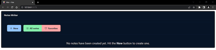
After taking care of the buttons in the code above, we used a wrapping div for notes, which uses flex utility classes to style the notes properly. Then, we have another div that shows a message if no notes have been created yet (i.e., if the notes array is empty).
Next, we used a Card component to represent a single note. We can iterate on currentNotes and use the card’s slots (title, subtitle, content, footer) to populate the note’s data, using a Tag component to render note’s tags and a v-html directive to display the note’s content as HTML.
Finally, we used the Tooltip directive to add a hint to each button. For the “Add to Favorites” button, we used a ternary operator to check note’s fav value and set the appropriate icon accordingly. On each click, the note’s fav value is changed from true to false or vice versa.
I’ve used a few utility classes in the above template to make the design a bit more pleasant. PrimeVue also use its own classes, which you can recognize by the p prefix — for example, as in p-buttonset.
Let’s see what we’ve done so far. Run the project with the following command:
npm run dev
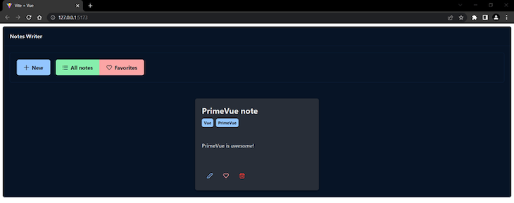
When you visit the app’s address (http://127.0.0.1:5173/) you should see the following in your browser window:
Pretty cool!
Creating functions for adding, editing, saving, and removing notes
Add the following inside the script tag:
// Notes actions
const isNewNote = ref(false)
function addNote() {
  isNewNote.value = true
  currentNote.id = Date.now()
  currentNote.title = 'Give me a name'
  currentNote.content = ''
  currentNote.tags = []
  currentNote.fav = false
  openDialog()
}
function editNote(note) {
  currentNote.id = note.id
  currentNote.title = note.title
  currentNote.content = note.content
  currentNote.tags = note.tags
  currentNote.fav = note.fav
  openDialog()
}
Here, we first set an isNewNote variable, which will be used to define whether we are creating a new note or editing an existing one.
Next, in the addNote function, we set up currentNote with initial values and then opened the dialog. We also set isNewNote to true to indicate that we want to create a new note.
In the editNote function, we assigned the data from edited note to the currentNote so that when we open the dialog, it will show the edited note’s data.
Let’s add the rest of the actions:
function saveNote() {
  if (isNewNote.value === false) {
    let note = notes.value.find((note) => note.id === currentNote.id)
    let editedNote = Object.assign({}, currentNote)
    notes.value.splice(notes.value.indexOf(note), 1, editedNote)
    currentNotes.value[currentNotes.value.indexOf(note)] = editedNote
  } else {
    let newNote = Object.assign({}, currentNote)
    notes.value.push(newNote)
    isNewNote.value = false
  }
  closeDialog()
}
function removeNote(note) {
  if (currentNotes.value === notes.value) {
    notes.value.splice(notes.value.indexOf(note), 1)
  } else {
    notes.value.splice(notes.value.indexOf(note), 1)
    currentNotes.value.splice(currentNotes.value.indexOf(note), 1)
  }
}
The saveNote function above first checks whether we saved the edited note — in other words, if the value of isNewNote is false. If so, we get the note by using the currentNote.id. Then we clone the currentNote by using Object.assign().
We do this to break the link between the currentNote and the edited note. They are linked because in JavaScript, objects are copied by reference; when we edit the source object, the copied object is updated too, and vice versa.
Then we updated our notes and currentNotes arrays. We need to update both for the changes to be visible when we see all notes as well as filtered notes.
If we save a new note, we push it to the notes array and set isNewNote back to false.
In the removeNote function, we check if currentNotes and notes are equal. If so, we need to update only notes. If not, we need to update both notes and currentNotes for the same reason mentioned above regarding the saveNote function.
Using PrimeVue components for our notes editing interface
In the next section, we’ll use the Editor component, which has the Quill text editor as a dependency. We need to install it first, so stop the app and run the following:
npm install quill
Now run the app again with the npm run dev command.
Great! Now let’s add the code for the dialog. Add the following after the Panel component:
<Dialog header="Note" v-model:visible="displayDialog" :breakpoints="{'960px': '75vw', '640px': '90vw'}" :style="{width: '50vw'}" :maximizable="true" :modal="true">
  <Inplace :closable="true">
    <template #display>
      <span class="text-xl"></span>
    </template>
    <template #content>
      <InputText v-model="currentNote.title" />
    </template>
  </Inplace>
  <Editor class="my-4" v-model="currentNote.content" editorStyle="height: 320px">
    <template #toolbar>
      <span class="ql-formats">
        <button class="ql-bold" v-tooltip.bottom="'Bold'"></button>
        <button class="ql-italic" v-tooltip.bottom="'Italic'"></button>
        <button class="ql-underline" v-tooltip.bottom="'Underline'"></button>
      </span>
    </template>
  </Editor>
  <span class="p-float-label">
    <Chips v-model="currentNote.tags" separator="," />
    <label for="chips">Add tags...</label>
  </span>
  <template #footer>
    <Button class="p-button-text" label="Cancel" icon="pi pi-times" @click="closeDialog" />
    <Button label="Save" icon="pi pi-check" @click="saveNote" />
  </template>
</Dialog>
Here, we used the Dialog component to add an editing interface for the notes. It will open a modal window in which we can edit note’s title, content, and tags. We are doing a few things with this component:
- Using the
displayDialogvariable to open or close the dialog - Making the dialog responsive by adding some breakpoints
- Setting the
modalandmaximizableproperties totrue
We also used the Inplace component for title editing along with the InputText component. This allows the user to edit the title by simply clicking on it, then clicking the close button when finished.
Then, we used an Editor component for the note’s content. We’ve added only three formatting buttons, which is completely enough for simple notes.
Next, we created a float-label input where we can add tags to our notes by using the Chips component. To add tags, we need to separate them with commas.
And lastly, we added two buttons in the footer to Cancel note creation or Save a created note.
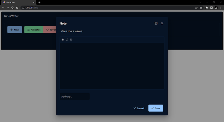
Here is how the Dialog component looks when we create a new note:
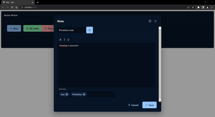
And when we edit the note:
Here is how the created note looks:
Now we can create as many notes as we wish using our app. However, as we add notes, it will become harder to find the ones you need. That’s why the last step in building the app is to add searching and filtering capabilities.
Adding searching and filtering capabilities
Add this code inside the script tag:
// Filter notes logic
const selectedTag = ref()
const tags = computed(() => {
  let allTags = []
  notes.value.map((note) => allTags = allTags.concat(note.tags))
  let uniqueTags = [...new Set(allTags)]
  return uniqueTags
})
function filterNotes() {
  currentNotes.value = notes.value.filter((note) => note.tags.includes(selectedTag.value))
}
Here, we created a computed constant called tags that gets all tags from all notes, then removes the repeated tags by creating a new Set(), which can contain only unique items.
Then, we defined a filterNotes function, which allows us to get all notes with a selected tag.
Now add the following inside the #end template in the toolbar component:
<template #end>
  <div class="flex">
    <Dropdown class="mr-3" v-model="selectedTag" :options="tags" placeholder="Filter by tag" @change="filterNotes" @blur="selectedTag = ''" />
  </div>
</template>
Here, we used a Dropdown component to allow us to select the tag we want. On @blur, we set the selectedTag to an empty string so the input will be cleared.
Next, add the following inside the script tag:
// Search notes logic
const foundNotes = ref()
function searchNote(event) {
  setTimeout(() => {
    if (event.query.trim().length) {
      foundNotes.value = notes.value.filter((note) => {
        return note.title.toLowerCase().startsWith(event.query.toLowerCase())
      })
    }
  }, 250)
}
const selectedNote = ref()
function searchNotes() {
  currentNotes.value = [notes.value.find((note)=>note.title === selectedNote.value.title)]
}
In the code above, in our searchNote function, we first added a setTimeout function to add a short delay before the component displays the search results.
We can use the searchNote function to check if the input query is not empty by using the event parameter. If the input query is not empty, we filter the notes by the query.
We then defined a searchNotes function, which allows us to find a note by its title and put it in an array that we assign to currentNotes.
The last thing we need to do is to add the AutoComplete component in the template, which we will add after the Dropdown component:
<div class="flex">
  <Dropdown class="mr-3" v-model="selectedTag" :options="tags" placeholder="Filter by tag" @change="filterNotes" @blur="selectedTag = ''" />
  <div class="p-inputgroup">
    <span class="p-inputgroup-addon">
      <i class="pi pi-search"></i>
    </span>
    <AutoComplete placeholder="Search notes..." field="title" v-model="selectedNote" :suggestions="foundNotes" @complete="searchNote($event)" @item-select="searchNotes" @blur="selectedNote = ''" />
  </div>
</div>
In the code above, we used an AutoComplete component with an InputGroup component, which adds an icon before the input.
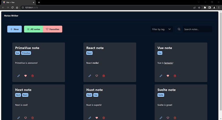
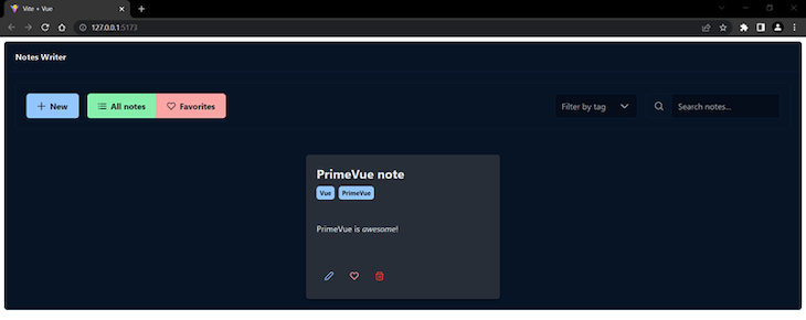
Here is how the app looks like with Dropdown and AutoComplete components added:
Testing and previewing app features
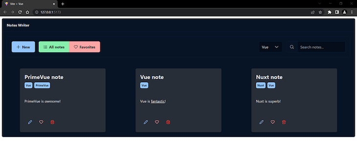
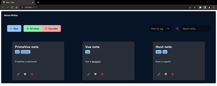
Now that we are finished with the code for our project, we can test and preview the different features we added. The image below shows the results of filtering our notes by the Vue tag:
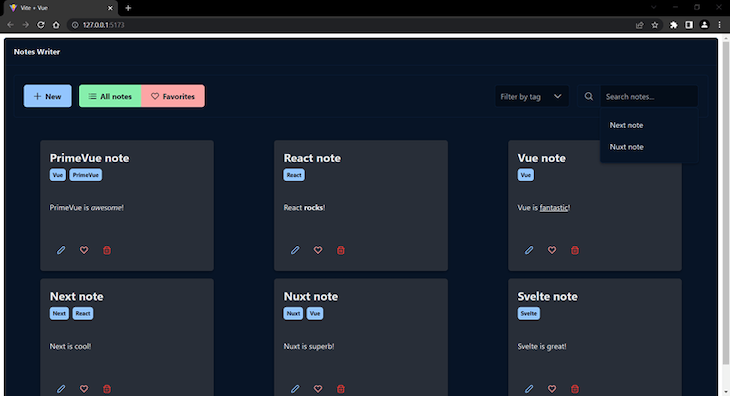
When we search our notes, we should see some suggestions pop up underneath the “Search notes…” placeholder:
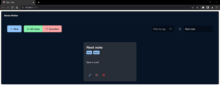
After adding an input query, the app should display the found note, like so:
After clicking the “Favorites” button, the app should display the “Favorites” collection, like so:
Conclusion
As we saw, PrimeVue is a component-rich UI library that offers a complete UI building solution, unique components, easy theming, and great documentation.
We’ve gone through building a simple but functional note-taking app that uses lots of PrimeVue components. We learned how to combine them together to create the features we want for our app.
Armed with this knowledge and PrimeVue extensive documentation, you can start building your own even more complex apps. Happy coding!
The post Exploring PrimeVue, a Vue-based UI component library appeared first on LogRocket Blog.
from LogRocket Blog https://ift.tt/HZOYKB2
Gain $200 in a week
via Read more


